 thick lintel
Hello,
I use DaisyUI and for the theme change (light and dark mode) use Theme.Change: https://github.com/saadeghi/theme-change
As a switch I use the Icons sun and moon from Daisy (swap)
https://daisyui.com/components/swap/
The theme change works without any problems and the user's selection is also saved in localStorage.
Unfortunately, the icon always changes back to the moon icon after the page loads.
Do you have any idea what I can do to display the icon depending on the theme selection?
<script is:inline>
// ☝️ This script prevents the FART effect.
if (localStorage.getItem("theme") === null) {
document.documentElement.setAttribute("data-theme", "cmyk");
} else {
document.documentElement.setAttribute(
"data theme",
localStorage.getItem("theme")
);
}
</script>
<script>
import { themeChange } from "theme-change";
themeChange();
// 👆 you could import the CDN directly instead of these two lines
</script>
<label class="swap swap-rotate">
<!-- this hidden checkbox controls the state -->
<input type="checkbox" data-toggle-theme="cmyk,dracula"/>
   <!-- sun icon -->
   <svg
     class="swap-on fill-current w-10 h-10"
     xmlns="http://www.w3.org/2000/svg"
     viewBox="0 0 24 24"
     ><path
       d="..."
     ></path></svg
   >

   <!-- moon icon -->
   <svg
     class="swap-off fill-current w-10 h-10"
     xmlns="http://www.w3.org/2000/svg"
     viewBox="0 0 24 24"
     ><path
       d="..."
     ></path></svg
   >
 </label>
Thank you
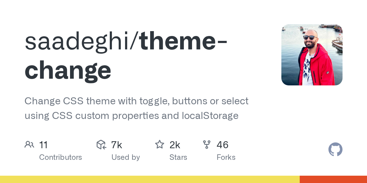
Change CSS theme with toggle, buttons or select using CSS custom properties and localStorage - saadeghi/theme-change

Tailwind Swap examples: Swap allows you to toggle the visibility of two elements using a checkbox or a class name. component
 river viper