
#unify the search button and box
1 messages · Page 1 of 1 (latest)
make icon anson
just make the box bigger with "search for emote/user" 
try to make it look similar to these https://fontawesome.com/search?q=user&o=r&f=sharp
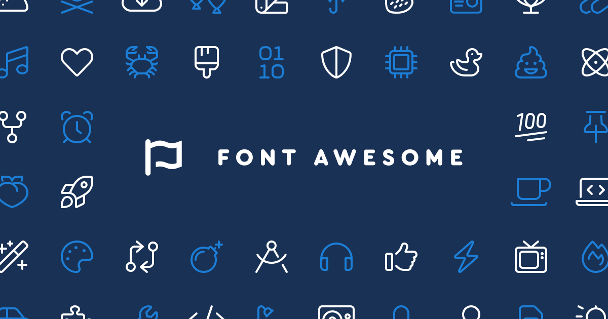
Search all the icons, including the new Thin style, now available in Font Awesome 6.
21mtd just got up:  💤 (1h, 18m ago)

theres just no "user search" icon
yeah it will need to be in line with the style though
it was afaik

this in white

yea this isnt correct style
doesn't need to be that exact one obviously 
@silent lake combine these two with pixel perfection rq, please


alternative: change ALL the icons to another set that has user search  ez
ez
theres legit no other large icon set with a sharp theme
i was considering moving off fontawesome (due to it being paid and thereby making it difficult for people to run the frontend locally) but then they came out with that gem of an icon theme
sharp themes are just too based (unbiased opinion)
found dat shit on google
idc
 rounded themes
what about adding the bar too the profile search to and specify "Search profile" and "Search emote"
Keep the search on the top so it's always on no matter which page
"the search" which one 
Exactly the issue
cope
although searching for emotes should probably take precedence over searching for users, since the whole site is all about emotes and stuff
rounded is literally shit you'd see in the 90s
sharp looks sleek and modern
dont OD 
anatole don't look but badges are rounded 
ok but very small rounding is okay
what isn't okay is like
when your website is made up of fucking circles
DONT look at all the bars and buttons on discord !!!!

How impractical is it to have a single search feature for users and emotes? @stray adder
or maybe a dropdown when you click the 🔍 that lets you pick which to search for
wdym
there is search for emotes on the emote list and search for users in the user area
in my mind, people may want to search for emotes from the home page
since it's an emote service and such
how would that work
It's bad design
you see tiny ass emote icons?
 "doglookingsussyandcute"
Just make the profile search (that appears in every page) emote search
How does it not
ok I definitely disagree that u need a bar on every page, literally just click on the emote tab
????? just click the big EMOTES button
but the two searches do need to look a bit different so it's easier to differentiate
It's annoying
also this screams "this area here is about users"

No it doenst
Don't expect your users to not be retarded 
Apple makes billions because they expect their users to be retarded
the | does separate it idk
Arch linux has dozens of users for the opposite reason
Emote search should be on every page
no it should not
🤮
I don't understand why you want it to be harder to find the emote you want
pixel complaining? 🤨
it is not hard to click the emote tab
it is an extra click though.
there's no reason to search for emote on home page or sub page
Reducing friction should always be a goal
explain to me why you want to find emotes by their name only
?
dont you want to actually look at the image?
What
No, entering an emote name in the search box would take you to the normal search results page
you pepega
hello, what you're saying retard, is that you want emotes to be as small as these user avatars icons

this isnt useful
Anatole is completely retarded 
banned 
neutra 
you were the one misunderstanding him though, tbh
(don't ban me)
that dropdown search results thing could probably be replaced too, with something more like the regular emote search result, except with people instead of emotes
keep to the subject at hand for now 

what about this? @stray adder

this is nice

 maybe the magnifier could be placed in a way that wouldn't affect the size of the user icon
cuz this will squish it in the bottom with the square aspect ratio
I can squish them closer but it gets kinda janky

thats better
the distance between the circles is not ideal icon design
I think I can make it work though
find the perfect icon 


 pretty nice


is this 1:1 
not quite
but it's closer to 1:1 than the original user icon
if you'd be ok with the magnifying glass at a non-45-degree angle, it could be much closer to 1:1
it could look like this

not everything has to be perfectly square though
what about replacing the head with the magnifying glasses
looks scuffed af cuz i was lazy to open ps and used paint

but it can save space if you use it as the head
and just add more of the "buddy" and change it around a bit
maybe
I was thinking about something more like this

but maybe replacing part of the head and body at the same time would be best


🤓 realistically the magnifying glass would make that part larger and distorted
this is way too much detail for an icon like this though
yeah, i meant that this part just looks out of place

can barely tell it's supposed to look like a user icon
maybe smaller border between the glass and the user
I think it looks recognizable as a user icon
I'm still moving stuff around though
so here's what I'm thinking for the final version. Looks pretty good at small sizes tbh

looks pretty nice yeah
at large size it kinda looks like the guy just got a cannonball thrown at him but small its nice 
is it just me or does all the icons on the site look jagged
wym

like the app icons look very jagged
even the 7tv logo
the icons in the top right
?
even this edge is jagged asf

jagged?
 ?????
?????


well thats just how browsers render shit
it's barely noticeable though unless you're on an old monitor
maybe it's just bc the white is so bright
its really noticeable on chrome with my high end monitor
^
it's not noticeable on my high end monitors 
well its noticeable for hyru and i
cant notice it much on the other pages since its dark on dark
try adding outline: 1px solid transparent; on the elements concerned
in theory that should cause the browser to run anti aliasing
how do i do that
i cant really see anything

like sure if you zoom in enough you see it but thats just how pixels work
i.e pixels are squares
it does not
even without zooming in
bro it literally does idk what to tell you
i have a 1080p 144hz monitor
even on my newer ultrawide with like true coloring it's just as bad
im sure that 144hz helps a lot with those static layout boxes
even in this pic you can see the aliasing
without zooming in
unless you have a 15 inch 4k display
barely, but again that is just how browsers render this
there isnt anything that can be done about it
if you made all the angles 45 degrees exactly, it would look fine
it would be better if this specific area used a clip-path rather than a gradient
altho ends up the same really i think
when the shape has less contrast, it's obviously less noticeable. But still noticeable

it's all based on the pixel density of peoples' screens
on mobile phones, pixel density is super high these days and people don't even bother to anti-alias stuff anymore
but on desktop displays, lots of people have fairly low pixel densities
yea the icons look clean on my phone
I like high pixel densities so I always get the smallest screens for a given resolution, and I can still see them
well yeah there isnt a thing to be done about it
unfortunately
im gonna have to tell you that,
you will pixel complain about this forever
and there is nothing that will come of it
 complaaaaaaaaain
sharp theming moment
I know some people get 1080p monitors that are like 24, 27, even 32 inches because they have high refresh rates instead of high resolutions. Those pixels are MASSIVE in comparison
the largest 1080p screen I'll ever buy is 21 inches
that works out to about the same density as 27 inches at 1440p
it's fine on my 1440p and 2160p 32" monitors

me too
this suggestion takes 2nd place behind global emote fixes for most comments


cause u guys are peepotalkers and didnt even keep to the subject
so 1st since that other is hardly a suggestion
 true
true
 true
true