#Back to the Start
79 messages · Page 1 of 1 (latest)
How do you come up with so many ideas for new levels?
😆
I don’t know either. The beginning is the hardest to make, but once I get going, I just can’t stop.
ok this is really unique, but its just sooo confusing ifkwim
there were so many places where i didnt know where to go+went to the wrong place
This sign is more tempting to me than the arrow lol

I got fooled that the floor would stop my dash

This thing doesn't even kill you. In fact, it pushes you forwards. I dunno if you know about this or not

Plus, put a floor here

so players can't go the wrong way
I honestly think the short cut is too easy and gives too much of an advantage relative to its difficulty. But, again, I'm not in lc, and do what you think. I like the idea of a short cut, but I think it should either be a bit harder, or gives less of a cut. Plus, the check point is right there if you mess up
One thing I might do is actually remove that checkpoint, since there's one above thats unmissible
Actually, looking at the skip, I think its fair for a 32 player map, nevermind that
but I would want the floor
okay so like
the start of this is just
ehhh
i really dont like
it
however
the rest of this level actually kinda is really awesome
i think my main point for the rest of the level would be to attach slopes to the ends of these platforms

so like
then it kinda 'slots in' with the ground
yk
once you fix the start and this i'll take another look
but again this level feels kinda messy
but only in some parts..?
some parts feel too messy and others feel too simple i feel
i think you should keep consistency in the amount of decoration/wind/visual features throughout your level
agree
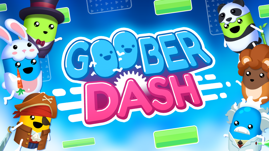
Goober Dash
Goober Dash is a free 32 Player Race Royale with user created levels and customizable characters.
I’ve made some fixes. Can you review it again for me?
@thorny skiff Can you review it for me?
Sure
Later I will tho
Can’t now
put an arrow here, its unclear you have to exit the wheel thing

personally im just not a fan of the design on this level
its a bit overdecorated
wayyy too much going on in the background
please simplify the background decoration
besidse that i think this is really cool
sure
How about now?
@dim olive Can you review it for me?
not rn
for me its sadly same problem as in "sky castle". its very unclear where to go. deco should be used to guide and help goobers through the level and to indicate what is happening. everything should be more or less clear on first sight or after 1 attempt. you just spam forms and movements without any reason. take a look on tilt and compare it to this one. tilt is so much better and intuitive.
Hmm... got it.
you sometimes dont see it yourself as creator. for you everything is clear of course because you created the level
Alright, thank you for your guidance.
First screenshot: I would add a floor here for new players since they might not know that you have to keep jumping. Really nice start by the way.
Second screenshot: I would add something here like a floor sticking out if the bouncy block so it can be a small shortcut.
Third screenshot: These jump zones are pretty much useless but are cool decoration wise.
Fourth screenshot: I agree with plate, you should add an arrow or something so you know where to go.
Fifth screenshot: I would extend this floor a little more. It isn’t that useful since it’s kinda of short.
Sixth screenshot: This disappearing block takes up a lot of place, I was would make it go up and down so it doesn’t block one of the main parts since players will probably dash there.
Seventh screenshot: I don’t really like this obstacle, the blocks stick out and the obstacle wastes some time that doesn’t need to be wasted.
Eighth screenshot: This is kind of a shortcut so I wouldn’t make these go up and block you because it isn’t a short cut then it probably takes the same amount of time with this.
Ninth screenshot: This doesn’t matter but the ice block on the bottom isn’t the same size as the one on the top. I would change that but it doesn’t really matter.
Tenth screenshot: Please make these lasers even, they are uneven and it hurts my eyes when they are like that.


@regal wing
Eleventh screenshot: I would move this down a little since you can die right away from the checkpoint, Ik most people won’t but new players won’t.
Twelfth screenshot: These lasers will be really easy to grief on, maybe space them out a little or just keep one.
Thirteenth screenshot: This part has like no decorations compared to the rest of the level. It’s like a whole new level. I would add some more decoration to fit the rest of the level.
Fourteenth screenshot: This gravity field should be strengthened a little more since it’s not really a short cut. Idk if you were going for that as a shortcut but if you were then I would higher the speed.


@worldly bluff @thorny skiff I’ve implemented some of your suggestions. How is it now?
i can tell you that i think its much better because i found my way through the level first try. so it works sightreading now which it did not last time i played. no time to give you a proper review as i always need to play a level 15-30 minutes minimum to feel confident to give a verdict
Alright, thanks! I’ll wait for you.
This level is a lot better from what it was
@steep plank @burnt jewel Can you review it for me?
@lucid sapphire Can you review it for me?
To me, it feels awkward to play and unpolished on first impression
If I'd give you any advice right now I would probably be wrong
I have to think a bit
Creativity wise I will never complain when it comes to your levels 👍
👍
@dim oliveCan you review it for me?
We’re mods not level council
Narny and greket don’t review
really?
Back To The Start