#UI Practice Feedback
1 messages · Page 1 of 1 (latest)
ok
Youre using 2 colors. Try adding white accents to increase color range, or a nice orange
This designs issue is that it lacks any sort of contrast whatsoever. Revisit the primary contrasts (design principles). Keep in mind for websites you have the option to avoid the grid entirely
what course , I would love to know
slap in some dummy images!
unsplash.com is great
make it real
I also wouldnt really call that vibrant, as it seems to be muted analogous colors, lets up the vibrancy and check it! Aim for 1 muted accent color, 1 vibrant accent color, and then a dark and a light (similar to black and white in luminance)
Thanks
mk mk
oh thx!!
i nvr wouldve thought ppl didnt enjoy it much lol, i wud think its more preferred but ig its just up to the artist + client
this is my recent ui design

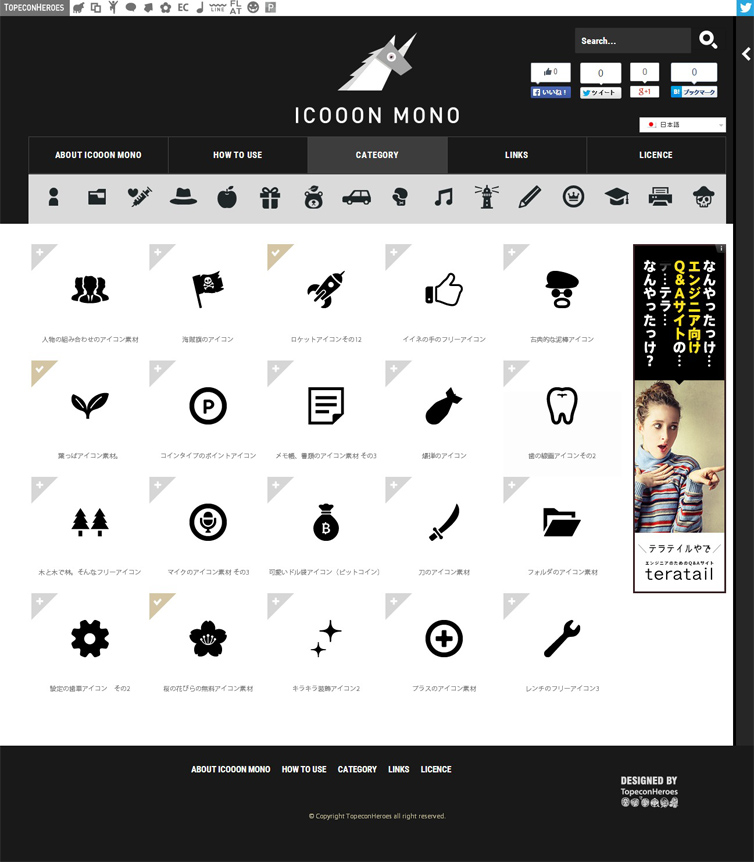
oh no, those came from an icon website (forget the name, it was Japanese) but I created the plants in blender
tht looks nice!!