
1 messages · Page 1 of 1 (latest)
Hey guys! I made my first portfolio recently and was looking to get feedback so I can improve it.
I made my questions into a survey so it's easier for you to respond and for me to read. Feel free to just reply here instead if you'd rather do that!
I'm mainly looking to understand the ease of navigation, how easy it is to understand the story behind each project (have I put or taken away too much information), the visual and interaction design, what type of designer it shows I am, what type of roles I'm most likely looking for and are you curious to learn more about a certain project/or about me.
Portfolio: https://bushrahabibah.framer.website/
Survey: https://forms.gle/cUxGaimtgS5gLy5c7
Thank you for your time if you do take a look! 🙌
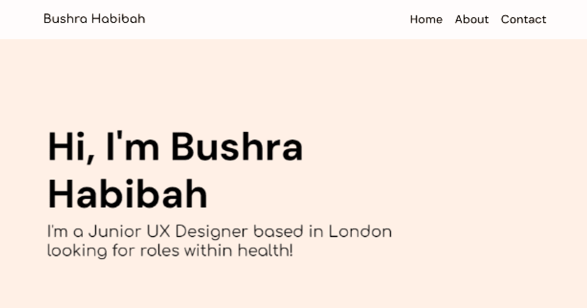
A portfolio showcasing Bushra Habibah's UX/UI work through various projects
Hello!
Portfolio Link: https://bushrahabibah.framer.website/
This is a short survey to help me understand the current experience of my portfolio website and how I can improve it. There are 3 scenarios at the start to help guide your navigation,
If you're happy with me possibly asking any follow up questions, please enter your Discord usernam...
I like it overall, the colors are nice 👍
Only things I noticed is just the hover animation on text
You can remove it
And add a image (ex. photo) the right side, next to the heading
And the aligment on project section, you can align project names and description to the heading "My Work"
Some quick impressions - I really like the text highlights you have in the case studies, makes it feel a lot more digestable. I like the font and overall feel too, gives it a nice personal touch (I would make the heading font match the font used elsewhere).
Suggestions:
The design is clean. I like the color selections as well.
I like how straight forward the presentation is. I imagine myself as an employer and I like that I wouldn't need to go looking for your samples- all I did was scroll.
The only bit of feedback I would give is to make your hero section stronger. It doesn't do anything to stand out or catch interest imo.