
#Seeking Feedback on My Portfolio
1 messages · Page 1 of 1 (latest)
I’ll go into more detail but at first glance, my overarching advice to you is to really move all the time you’re investing into your portfolio
for reference this was the one I had to make for school:
https://campuspress.snhu.edu/tiffanymckee/
I’ll be as honest (and hopefully constructive) as I can be so the feedback is as helpful to you as possible! I’ll give you a tag back once I’m done writing
I'll give feedback on the general portfolio and then dive into your first project.
General feedback:
- Initial impression landing on your website wasn't very strong. I think this is a combination of a few things; Montserrat isn't really the greatest typeface (personally associate it with google slides templates), hero heading as just "portfolio" and layout feeling rather generic. As harsh as this may sound, it adds up to things feeling a little "default template-y", if you will. I definetly think you can benefit from explore some more visually interesting layouts. I don't think you need to go crazy, but simple use of column grids to help organize typographical compositions, left aligning content, selecting a more contemporary typeface, go a long long way.
- I feel as the description underneath "portfolio" is also rather generic and could probably use another pass. Every designer is passionate about creating intuitive user-friendly things — I'd challenge you to think about what it is that makes you stand out. Pretty much just don't state the obvious here. Your landing/hero section is the first moment to make a strong impression, and I feel right now it falls short of that
- Generally way too many projects, especially considering you've just graduated. Highly recommend you cut it down to 2-3 of your absolute best projects. I say this over and over but your portfolio is only as strong as your weakest project. It'll also help you zero in your focus and not spread too thin. I’ve seen candidates get offers off of a single very strong project. It is seriously quality over quantity.
- Also feels like there's just too many types of projects happening. If you're interested in a UX role, the only projects you should have are UX projects. I'd cut all the branding stuff or put it in some subpage.
- Background grid pattern image backsplash is a little distracting, I'd just remove it altogether and keep a simple dark background.
- Project titles are also a little generic and feel like they lack character.
First project feedback (elephaid), part 1:
- You should start with the actual work you did at the very top rather than the current banner/logo/elephant thing you have right now. The first thing a recruiter/HM is looking for is your actual work, and if that's strong, that's when they'll be compelled to scroll
- Doubling down on my feedback about the grid background here; it's super distracting and makes it hard to read
- IMO, there's just too much text to read upfront. I was sharing the same feedback to someone else, but you should only write as a last resort if you cannot find a visual means to communicate your narrative. The overview section could really be 2-3 sentences max.
- Super abrupt jump from intro to personas. It makes me want to ask you more questions. Why did you choose these user archetypes? Where did you get this information from? Why is their occupation/education relevant? I think this is a good example of why personas often make case studies come across as cookie cutter. It feels like you just selected these 2 people to fill in the requirement of being asked to do so as part of the course — which is fine in the context of the class but doesn't make for a great case study for finding a job
- I'd cut the entire deliverables section, it's not important information, and you could instead just show the final screens at the very top as a "TDLR" of the work you did before diving into the process work
- Your problem areas section feels like you're stretching out a half-baked analysis. I feel like it could entirely be summarized into a single sentence: "Parts of the current experience led to 404s and the current form experience was visually overwhelming."
- I'd also challenge you to go way deeper into finding more compelling problems to talk about. People landing on 404 pages is more of a bug rather than a usability issue, because the solution here is simple — just make sure users don't land on 404 pages.
- The volunteer form page could be something more interesting to dive into, and IMO would be a way more compelling project if you just focused on fixing that one page and going into incredible detail on it
- I'd also cut your entire design process overview, it's not really important to the narrative and really just feels like you're trying to teach hiring managers how to design (they already know how to design)
First project feedback (elephaid), part 2:
- When I saw your first drafts, I instantly wanted to ask how you even came to sketching them. What was it that informed what you designed? Why did you do things this way? Which part of that earlier persona section informed any of this.
- Which brings me back to why I think you should either cut the personas entirely or look to expand on them. Everything in your case study needs to be HIGHLY intentional, and everything needs to connect back together — otherwise it's just fluff and getting in the way.
- Would be great to also have visual indicators that point to certain design decisions that you made. Which part of the existing volunteer form was bad? What did you do in your first drafts to tackle it?
- I get these are wireframes, but they could also use a visual touch up. Margins feel excessively large, input labels are far too small to read on mobile which isn't accessible
- Again, to me, it really feels like you could make this project much more interesting if you just dived into how you optimized the form-filling experience. Dig into all the different input field states, which inputs come before others and why, how do you make forms less intimidating to fill out if there's just so many things to fill out, etc.
- Transitioning wireframes to hi-fi is not really a solution
- In what way did you enhance the UI to provide seamless, secure experiences? You haven't really highlighted that yet. Was there a problem with users not feeling like the payment process was secure? If so, where? and how did you solve that?
- You then kinda just go into a gallery grid of displaying all the hi-fi work, but it's a tad confusing to go through them because they're just static screens. Highly recommend you prototype some of these so people can get a better understanding of where these pages sit in the overarching sitemap
- Filling out forms is a very dynamic thing that users do. They need to tap on fields, type, move onto the next field — all things that a good prototype recording could show.
- Another thing a good prototype video can show is how different input fields do different things; some are text inputs, others are dropdowns, perhaps date selectors, etc. None of these states are shown in what're supposed to be your final designs, which gives me an impression of lack of detail and thought into how users are interacting with your designs
- I see you attached a figma prototype towards the bottom, but really encourage you to record and edit a video of it. Figma embeds are really bad to play around with on websites, especially on mobile. And I'd rather have you, the designer, show me as the reader what the intended experience is like vs. have me also click around and figure out what to do.
General next steps:
- I know some of the work is project work from your courses, but I highly highly implore you to take them and redo them from scratch as if they were real projects rather than school projects. It eliminates the need for you to have to just fill in the blanks because a rubric said so, and instead focus on actually digging into an interesting problem and solving it
- Invest a lot of time in studying and practicing visual design. It is the single most important skill that a newer designer can have — and it is what separates the top candidates from the rest. I feel seeing your current work that this is lacking. Things like typography and layout especially. Defintely read up on fundamental UI design principles, study and stare at existing design systems today so you get a better understanding of core UI components and how they function, their states, best practices etc.
- Learn to leverage prototyping as a means to support how you present case studies. It's so much easier to follow a good prototype that walks through a key flow vs. a bunch of static mockups
Even broader next steps:
- Encourage you to look at really strong portfolios from relatively newer designers so you can get a better sense of where you stand amongst the candidate pool. I know this is getting into the realm of imposter syndrome, but it only benefits you in the long run because you'll be able to know exactly where you are lacking in terms of skillset and invest more time in improving
- https://ellencovey.com/the-beakery is still one of the strongest case study examples for an early career designer. It's a few years old at this point but it's still the gold standard.
- I wouldn't waste more time networking in my opinion. If you have strong work, the network will come to you naturally. Believe me when I say this — good work will always speak for itself.
- Attending meetups is fine, but IMO it itself isn't really going to do much to land you a job. A strong portfolio will. It's fine to go and meet new people but that's about it.
- Once you revamp your portfolio, that's when I would consider starting to apply again. Applying with a note/coverletter/email to HM is all standard stuff so I wouldn't really expect those to be the magic wand that gets you an interview — again, a strong portfolio is the only answer.
- Even if you network and that ends up getting you an interview, remember you'd still need a strong portfolio to pass the interview anyways — which again brings me to my point, nothing, absolutely nothing, matters more to an early career designer than their portfolio.
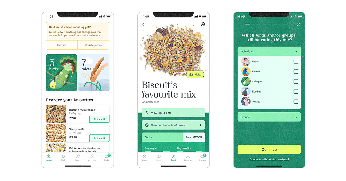
Designing an app-based service from scratch to help bird owners customise their ideal feed. In 2020, I hatched 6 Chinese painted quail chicks in my London flat. It was something I’d planned meticulously—perfecting the incubation, setting up ideal habitats, and even filling their water dishes with marbles so they couldn't fall in. However, there ...
@plush sonnet I know that was a lot. Please take your time going through them. It’ll be tough to address what I said all at once haha.
If you have any Qs, feel free to ask. I only give honest feedback that’s informed from the advice I get from my own mentors and what has proven successful in my own career thus far.