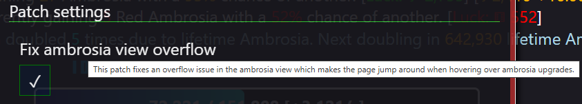
currently, different ambrosia perks have different length descriptions. the longer ones appear off the bottom of the screen, but if you try to scroll down to read them, it changes which perk you are hovering over, automatically scrolling up if its one with a shorter description. This isn't a "bug", but it does make looking at certain perks very frustrating.
I see two obvious possible solutions. Either make the amount you can scroll the same regardless of which perk you are hovering over, so the screen doesn't jerk around, or move some stuff to the side of the ambrosia screen, rather than having everything stacked directly on top of each other