
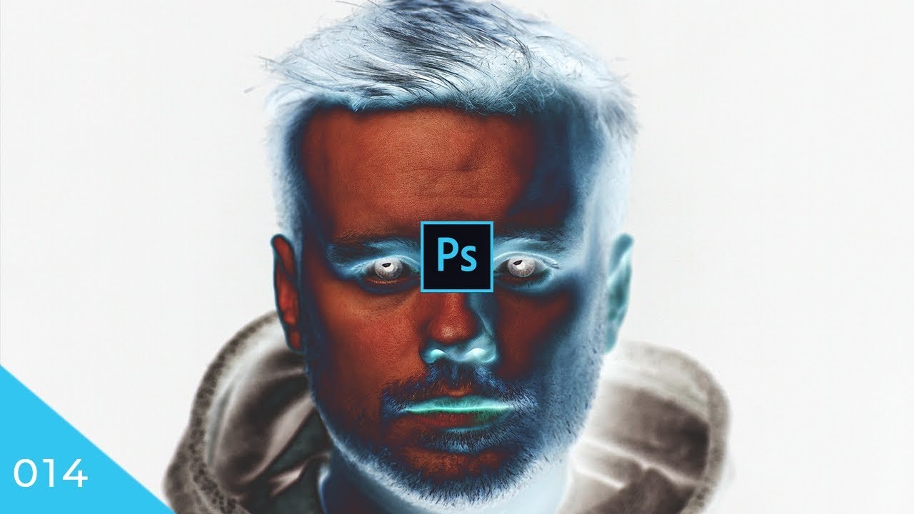
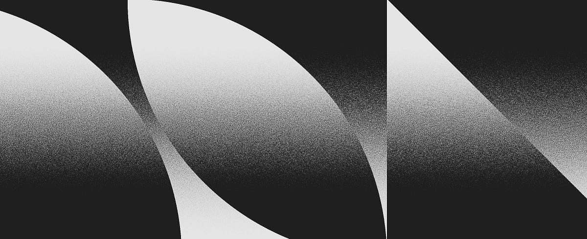
#trying to recreate the crunchiness that borders the black and color zones in this composition
1 messages · Page 1 of 1 (latest)


There is no difference between posting here, or in the #❓ask-a-question channel. Excepet that it's esier to find, and ultimately get more detailled answers when other questions don't get piled up in the middle of answers..
Regarding the effect: I can't be totally sure, but for me it looks like a solarisation effect (basically an effect where parts of an image from from positive to negative in an abrupt manner). It's derived from a analog photo printing technique where you would briefly turn on the light in the lab while the paper was still in the developper bath.
Granted, it could be something else, but the effect, to me looks very much like this.
My money is on a solarisation effect done on a black and white images, with colour added on top (Possibly with the blend if added to the colour layer). Of course we can only conjecture!
https://en.wikipedia.org/wiki/Solarization_(photography)

In photography, solarization is the effect of tone reversal observed in cases of extreme overexposure of the photographic film in the camera. Most likely, the effect was first observed in scenery photographs including the sun. The sun, instead of being the whitest spot in the image, turned black or grey. For instance, Minor White's photograph of...
There are videos that will teach you to solarise colour images like this one
https://www.youtube.com/watch?v=K8gLGbNBIDg
But honestly, I think this starts from a BW image
https://www.youtube.com/watch?v=K8gLGbNBIDg
You'll notice that the tutorials are all very old. It's part of the kind of effect that we could call "novelty", their popularity fades with time 🙂 but don't be put off by that.
I'm sure other people will chime in with better ideas, although I suspect, inverting all or part of a black and white image will be the core of tthe effect.
ok awesome! i'll give your advice a shot! at the end of the day, im onyl trying to learn new things, and this is one, regardless of whether it works for my og effect or not. thank you!
so you think he did this like on a grunge layer almost? or is the grunge look a result of using this effect on some random texture or something
I think the effect itself will give it the crunchy look. However, nothing stops you from using an additional grungy texture.
Hi for noisy textures, check out https://medium.com/@stefanhrlemann/how-to-create-noisy-risograph-style-gradients-and-textures-in-photoshop-in-3-ways-394d6012a93a
or for a grungy look, check out: https://www.youtube.com/watch?v=ZpdP_28N-oQ
Medium
Originally published at Stefan Hürlemann — Designer.

Learn the basic tools for using texture in Adobe Photoshop to create distressed type or logos and use textured backgrounds. Free texture links and more listed below. Thanks for watching and please leave your comments or questions below!
FREE TEXTURES USED IN THIS TUTORIAL:
https://texturelabs.org/tutorials/texture-grunge-essential-tools-photosh...
i think i will implement this and try to find more grunge textures. ive really just had a hard time finding what exactly to call that texture more than anything. its like paint chip? not sure