#✂challenges-feedback
1 messages · Page 69 of 1
@jolly kite lovely texture on the cat, what filter did you use? It looks super cool!
@cold oyster the overlays are looking great! Just a suggestion, you might reduce thickness of the lines and/or the spaces so the text can appear more and be more readable. especially the ones from the bottom part. If that's the effect you are going for, of course 😉
@covert loom super cool work, Mahedi!
Retro
@coral stone Special Thanks, Boos
Gave +1 Creative Carma to @coral stone
@coral stone Torn edges,film grain
Your comments will make me want to do better. Thank you @bleak fossil
Gave +1 Creative Carma to @bleak fossil
@bleak fossil Hey, Sam! I applied the blur filter to the reflections. Hopefully, this looks better! 🙂
Challenge 7, Retro, comments welcome
@south adder Yours is amazing! I love it! My comment is only to use a different font. I'd go with a retro slab serif. I think it would work better. But the design itself is epic!
@worn yew Cool image. How did you get the multiple colors behind the lines of your burst layer?
Here is my retro challenge
#6 Screenprint
Thanks @coral stone 👍
Gave +1 Creative Carma to @coral stone
HI I was thinking about the space launch and 60's tv shows and what if a boy's tv exploded while he was watching it.
oops sorry I though i had a couple diffferent versions but they seem to have gotten lost in space
I love it @ruby panther !!!!
Mine didn't turn out that abstract, but it's from the ❤️
Here's one I did previously. Posted to inspire.
Thanks @brittle slate
Gave +1 Creative Carma to @brittle slate
PSDC #6 The Horseman of Italy
Very creative @young karma! My suggestion is to position the apple
lower to where the mouth area used to be 😅 You might also use the clone stamp tool to create some parts of the hair at the back of her head and darken them a bit. Nicely done, Valentina!
@coral stone
@young karma nice image. Dont you think the lighting on the castle is off from the rest of the image?
@young karma nice image. Dont you think the lighting on the castle is off from the rest of the image?
@eternal mica yes it is
Here yall go
i dont know why its got so fuzzy and weird when i finished with the filter
My entry for day 8
I call it daring to dream
@coral stone I made the lines a little smaller and brought some of the objects I wanted to highlight forward, what do you think now?
Great improvements @cold oyster! I like the new colors and the readability of the text is definitely better. Awesome work 🙂
i don't know what to call this art
Abstract Geometry
@cold oyster looks very different, I like it!
light portal i just created in 10mins
my screen print challenge. love color halftone and the other tricks from this lesson!
original image used for the screen print challenge(my photograph, taken in brooklyn years ago)
Abstract Geometry? Please STOP!
Screenprinted poster 🍩
And my retro collage 🙂
Day 8 - Abstract Geometry
@primal fulcrum I finally watched the video. I wish I'd seen it first! 🙂
@sacred field You can always do more LOL
My retro try. Super busy week. I'm way behind.
From Tuesday's Screenprint assignment, enjoyed trying all 3 methods on this collage. Especially like the "Noise" setting on the Gradient Map
Here's the original collage
Day 8
Lady Madonna
today challenge with @brittle slate
Creative Challenge 7 finally catching up
Revisited...
@wraith sierra this is looking great! I loved the vintage style of your work, especially how you managed the burst and the cyan tones of the car. Nicely done!
@vocal drift very nice! Loved the way that you positionated the shapes on different places. I have two suggestions:
1 - if you want, you can turn these two dinossaurs into the same color as the mountains, just to enhance the effect that they are really far away 👇.
2 - You might consider to export it into a Jpeg or a Png format. GIF has a limitations of colors that's why the transitions of them aren't looking so natural.
@flint lintel I loved the overprint effect on the letters, it looks amazing! Great job with the textures as well! Also about the retro collage, I like the effect that you applied to the balloon and the burst, nicely done!
@charred imp very impressive! Loved how you played with the scales of the patterns and blended them together resulting into an interesting effect. Great job!
@sacred field very nice job overlaping the stop sign and the mountain! I also like that the font that you chose for "please..." it has kind of roughen edges. Well done!
@queen dew once you start playing you can't get enough haha. The variations are looking very nice. Keep creating 💙 
Very interesting work @fickle marten! Loved how you played with the positions of the fishes and the overlapps you made with the mountains. I also like how you composition has kind of a movement that is super cool approach on composities, nicely done!
@coral stone thanks for the feedback :)!
Gave +1 Creative Carma to @coral stone
Had some more challenge #3 smudge fun and was inspired by https://publicdomainreview.org/collection/the-comet-book

The Public Domain Review
Stunning set of images from a 16th-century treatise on comets.
Challenge #6
Challenge #7 All assets from the Smithsonian
@primal fulcrum super cool job, Sig! I like the halftones on the corners and the illustration style of your work! I have just one little nitpick, it would be to align the "high" to the center, just like the other words, it looks a bit to the left. Also, if you want to play with some depth, you can create some overlaps with the smoking pipe and the "Grandpa" letters. Well done!
@loud mist very nice job, Stephanie! Just a suggestion: you can try to add a subtle shadow (it can be a drop shadow layer style) to the pieces, just to see how it looks, I believe this will enhance the collage effect. It's already looking great!
So many wonderful images are passing by. Great work everyone!💯 👍.
Thanks @brittle slate for the free-stuff-tip, love it!
Thanks @coral stone I'll give that a try.
Gave +1 Creative Carma to @coral stone
Peace
PSDCC #8 Abstract Geometry
Great job blending the images @young karma! I also like how you took care of the shadows and highlights, my only suggestion would be to brighten the shadow of this one 👇 just a bit, so it can have a smooth transition just like the circle from above. 🙂
Very nice colors on this one @thorn geyser! I also like how you played with the width of the circles' strokes, well done 🙂
These are a lot of fun to do, I just fell in love with the colors in this one soooo
Bubble (Less Scary Orb)
Ghost Regatta
PSDCC #8 Abstract Geometry
@tacit condor doesn't know if she should squeak or bow down and pledge loyalty, maybe both
Once again thank you @coral stone - this place keeps you busy! I shall look at that shading in the morning.
Gave +1 Creative Carma to @coral stone
Took this on a hillside on my way to work in the morning. It's about a mile away from the HS.
Fun with shapes. Couldn't get the knack of the Shift-Opt-Cmd T so used the burst pattern from prior assignment. Does that keyboard combination even work in Windows (?Shift-Window-Alt-T?)
haha no problem @young karma! have a good night 🙂
DCC6 08 200604
all that is missing is a mars lander or a melted watch.
A dolphin dreams of flying. Heavy on the Abstract!
@prime temple now that's a Ray of Light haha! Awesome color adjustments, I loved that you played with some images on the background and the text is looking great as well. I think you can even make the text bigger, the same with the burst just to fill the areas that are on the top corners. Another thing that you can do, is to create a layer mask on the Madonna's layer (never thought I would say this haha) and paint with black with the brush, just to hide these parts that are in front of the mountain. Let me know if you need any help. Great job, I think this could be her next album cover. 💙
Challenge #8
Very nice blending @young karma! I loved the 3d look of the shapes. My only suggestion is that you might place the reflection of the yin yang closer to it. Since the yin yang seems to be touching on the sea the starting point of the reflection would be on the base of it. Lovely work, Lori!
@charred imp very impressive! Loved how you played with the scales of the patterns and blended them together resulting into an interesting effect. Great job!
@coral stone thanks much for the feedback on this, and also my dogowl one 🙂
Beautiful work on the day 7 @safe linden! Loved the font that you used for the Summer 1970. What's the name of it? If you want, you might apply the color halftone to the text as well, just to unify the look of the composition. Nicely done!
Beautiful works @plain sable! The smudge work looks amazing, I loved the texture that you used on it and the day 6 and 7 as well. 🙂
Thanks @coral stoneI used a dot pattern instead of halftones
Gave +1 Creative Carma to @coral stone
Loved your mask work @young karma, really impressive! The halftones worked pretty nice as well 🙂
#8 Abstract
A Forest. { stone photo }
@floral frigate this looks great! The warped text with the stroke is an awesome touch for the image, I also loved how you placed the elements, it creates a nice balance to the whole image! 💯
@reef glacier Really awesome to see this challenge taken and animated like that! I really like how the image gradually appears and gets clearer. Really adds to the sort of dreamlike/whimsical feel of that image. Awesome work!
@cold oyster Great retro feel to this gorilla poster image with the textures and colors you have! This is just a personal opinion, but it seems to be a bit tough to tell what the focal point is with all the different elements in the design in terms of what is the primary read and what is the secondary read. I like the read of the text in the bottom corner, but it seems like if the text at the top and gorilla were more prominent and the yellow graphics on the left were a bit more faded the whole image might have a more clear read. Just a thought. Really great job with this design and the abstract geometry one is looking good too!
PS Daily Challenge 6.3
@sacred field Great image Marc, I really like the masking behind the hill as well. It could be a nice touch to give the bottom of the sign a slightly faded effect to mute the color/contrast of the sign to get the blend with the mountain to look a touch more natural. Just depends what you're going for. Well done. 👍
@glass basin Excellent job on the lighting on this design! The lighting hitting the skull matches very well with the light off to the right side on the hill, and the waterfall is a really cool touch! Really nice job with the masking of the trees in front of the waterfall too. I wonder if a bit of a vignette, specifically around the left side might help pull focus into the center just a bit more. Great work!
@charred imp Some really great textures in this screen print challenge! The middle has some nice contrast to break from the background and pull attention to the text. Really liking that hand drawn text style. I feel like perhaps the overall contrast of the image could be boosted a bit, particularly the light tones? Just a thought. Very nice work!
@bleak fossil thank you! I’ll be looking forward to doing more challenges when I have the time
Gave +1 Creative Carma to @bleak fossil
@flint lintel Really liking that simplified color palette! Nice retro look while still having some bold colors. Very cool!
@flint lintel Great half tone texture on this image! Really unifies the whole design nicely. I really like the limited use of color too, adds some nice pop without being overwhelming. Nice job compositing all this together!
@fickle marten Great mix of graphic elements with this photo! I like the repeated elements to give a nice balance between the two, and the colors you used for the gradients work really well with this image. Really nice visual hierarchy with the shape sizes too!
@primal fulcrum This is great! Really liking the sizing and style to the text in this one. Really great graphic elements too! I wonder if a slight increase to the brightness of the background might look nice? Either way really solid work, great visual balance 👍
@loud mist The collage is looking good! I like the aged look to most of the photos. It could be nice to see a version of the bottom one with a subtle half tone effect over it. Nice work!
Thanks for the feedback @bleak fossil :)!
Gave +1 Creative Carma to @bleak fossil
Abstract Geometry
I would like to thank Paul Trani for providing so many optional starter files which allows us to focus on skills!
What a fun project this was.
Those Arrows 💯 *️⃣
@tacit condor super cool approach on this one! I loved the yellow circle around the head, well done!
@heady stirrup awesome effect on the circles, especially on the bubble one. Also the colors and lights of the first version created a super cool 3D effect on the circle. Great job!
That's a beautiful photo @vale sandal, thanks for sharing! The subtlety of the dashed strokes and the opacity of the circles turned out into a super cool effect. Good job!
Gave +1 Creative Carma to @vale sandal
Wow @eternal mica you took it to the next level, really loved the patterns of the shapes! The transparency between the lines is a great touch for the image. Amazing work!
retro collage.. I am slow...😀
@bleak fossil Hey, Sam! Is this what you were thinking?
i think i need more items haha
PS Daily Challenge 6.4
@primal fulcrum super cool job, Sig! I like the halftones on the corners and the illustration style of your work! I have just one little nitpick, it would be to align the "high" to the center, just like the other words, it looks a bit to the left. Also, if you want to play with some depth, you can create some overlaps with the smoking pipe and the "Grandpa" letters. Well done!
@coral stone thanks. I can interweave the pipe - good idea. I can't really move the High over to center because of the "l" in quality. I played around a bit and had too much space if I dropped it down enough to center. Should I make High smaller so I can move it over? I would love your thoughts on that.
all that is missing is a mars lander or a melted watch.
@safe linden Looks like the arch at St Louis 🙂
@bleak fossil thanks! I added the corner/grunge layer as screen and was leery of going too bright. I can bring it up a tad easy enough. 🙂
Gave +1 Creative Carma to @bleak fossil
Retro Collage challenge
@primal fulcrum you can try both. You might play with some strokes (like some vintage posters) and overlaps just to see how it looks. One thing that you can do as well, is to add a little more spacing between Grandpa and Quality and skew the High. If none of these works, you can position the high behind the L and apply a shadow like the L is casting a shadow on the High, just to see how it looks.
@coral stone oh some interesting ideas! I didn't think of those. Thanks so much
Gave +1 Creative Carma to @coral stone
@plain sable Very cool! thanks for sharing
not quite sure what's happening here lol
Thanks @gusty urchin
Gave +1 Creative Carma to @gusty urchin
Thanks @primal fulcrum
Gave +1 Creative Carma to @primal fulcrum
Challenge 8. Abstract. The background image is mine. I present a complicated-for-me attempt to exhibit a flying saucer come out of the ocean. My mind is completely stretched out right now. Sure had fun! Thank you!
Updated Challenge #6 Had to add a rainbow
@charred imp Some really great textures in this screen print challenge! The middle has some nice contrast to break from the background and pull attention to the text. Really liking that hand drawn text style. I feel like perhaps the overall contrast of the image could be boosted a bit, particularly the light tones? Just a thought. Very nice work!
@bleak fossil thank you so much for the feedback! i boosted the contrast in the highs, via 2 adjustment layers - a levels tweak on the highs, and a brightness/contrast with a sort of luma key. subtle but it does make it pop a bit more. thanks for that note!
Abstract image
Daily Challenge 200604 - Abstract Geometry using Vectors
Day 7 - Abstract Geometry
Challenge #8 Abstract Geometry
thanks @coral stone for your comment - appreciate the feedback.
Gave +1 Creative Carma to @coral stone
@young karma Really liking the colors in this one! Really cool cohesive green feel to it which gives it an interesting mood. Really great texture in the sphere too!
@thorn geyser Super cool! Really loving your choice of colors, the blue contrasts very nicely against that orange/yellow background. Great design too, the gradient and radial pattern looks really interesting. Great work!
@prime temple Loving the radial background pattern here! This is totally just personal preference but it would be interesting to see a version with blue text to contrast the background and mirror the blue/green from the top. Great image!
@young karma Really nice blending of the graphic elements with the background photo! The lighting and colors seem to fit very nicely together. Nice work with the reflections too 😄
@safe linden Loving the simple blue-pink color palette in this! Really gives it a nice cohesive feel and retro vibe. And of course the halftone texture does a great job of pushing that effect too. Great background graphic, nice work!
@cerulean beacon great designs Jane! Really like the colors in this image. It could be nice to give the graphic shapes a gradient across the whole thing to darken parts of it down to make it contrast against the bright sky a bit more. Currently everything is a bit bright, but giving it some value contrast might give the whole image a bit more pop. Really nice work!
@winter tinsel Great graphic in the center! Really loving the texture you masked inside it. The swirl shape on the left looks a little out of place, I wonder if it might be better removed, either that or repeat the element to make it look a bit more thematic through the design. Just a thought. The colors give the image a nice otherworldly feel too, well done!
@hollow yarrow Love it! Great sense of depth and perspective with the 2nd version of the Day 7 challenge. The masking on the line looks great and the brighter colors in the triangle shape make for a nice focal point. 3rd version looks great too, really nice depth with the lighting on it! These are all really solid. 👍
@young karma Great cohesive color scheme to this whole image! I really like the subdued color palette, though it still has a really nice warm/cool contrast between the colors. Great designs, really liking the effect of the lines at the top!
@fickle garden Really nice work on the graphic elements in this challenge! The warm/cool color contrast works really well and does a good job of drawing the eye into the center. The swirl/spiral pattern also makes for a nice focal point, looks good!
@plain sable Hah, great image. The bold colors of the suit and frog do a nice job of contrasting the background. Though I feel like the overall contrast of the suit (both darks and lights) could be boosted to better match the deeper contrast of the background while still brightening it up a bit to give it more pop. Just a thought. Nice work with the color gradients!
@tropic knoll Really cool! Definitely a great challenge for an image. You got a really great sense of lighting in this one, the background matches with the flying saucer very well and looks really natural. Awesome job!
@young karma Hah, sometimes that can be a fun way to approach a design. Really nice colors in this. The masking is looking really solid too! Adds some nice depth. 👍
@fluid wharf Really liking the background gradient on this! The whole design has a nice cohesive color palette. Nice strong focal point in this image too, great overall balance to it!
@sterile tinsel The graphics are looking good! It also makes for some nice color saturation in the center of the image which makes for a nice focal point. Nice job!
Abstract Shape "Cloaked Warbird"
@bleak fossil , really appreciate this curations. Thanks
Gave +1 Creative Carma to @bleak fossil
Thanks @bleak fossil for the comment. I remember that texture from a while back for creating a stainless steel effect but I don't think I got it quite right, probably missed a step somewhere. It was for CS 4, in the days of cassettes!
Gave +1 Creative Carma to @bleak fossil
@hollow yarrow Spectacular work. Makes me want to do more.
Abstract
This is my DCC 8 from Thursday.
@hollow yarrow Spectacular work. Makes me want to do more.
@vale sandal Thanks for your comment 👍 ... Happy to push you!😋
Fluid text from the other day's challenge! Tried using a lighter background with... moderate success 🤷♀️ :)
DCC Abstract
My Day 8.
@young karma Great cohesive color scheme to this whole image! I really like the subdued color palette, though it still has a really nice warm/cool contrast between the colors. Great designs, really liking the effect of the lines at the top!
@bleak fossil - Thank you
Catching up with the retro collage. Suggestiond welcome
Challenge 8, Abstract, comments welcome..
Had some more challenge #3 smudge fun and was inspired by https://publicdomainreview.org/collection/the-comet-book
@plain sable another terrific effort
The Public Domain Review
Stunning set of images from a 16th-century treatise on comets.
@primal fulcrum You were absolutely right! 😉
I just noticed how nobody has done something with Godzilla yet with the most recent challenge
Wow @eternal mica you took it to the next level, really loved the patterns of the shapes! The transparency between the lines is a great touch for the image. Amazing work!
@coral stone Thanks Valdair. I struggle with these type Challenges. Your encouragement and support motivate me.
Updated Challenge #6 Had to add a rainbow
@plain sable 🤣 🤣 🤣 never forget the rainbow!!!
@young karma WOW, Thats impressive!!! So much to like in the image
@young karma WOW, Thats impressive!!! So much to like in the image
@eternal mica Thanks
@hollow yarrow Watching you develop the technique fom Ver #1 to Ver #2 to Ver #3 is fascinating. The last one is super
My Day 8 effort
@tawdry frost i love the concept. Just a thought, I think a darker background will hellp the text stand out more.
Nice work @covert loom! Loved how you added some splashes and kind of a smoke, the blending is looking very nice! My only suggestion would be to complete the right part of the rainbow, just to see how it looks, if it gets a lot of attention you can reduce the opacity. This is just personal preference 😉
A Coastal Labyrinth for Ch-8
@tardy ridge this turned out great! I loved how the shapes match really well the context of the background image. I also like how it blends with the background without having too much going on. Great job!
Super creative work @tawdry frost! I loved how you extended the tea for the cup and teapot. Contrast in this case is really challenging it might be the case of darkening the background juust a bit like @eternal mica said. Well done!
This is looking great @ocean pine! Loved how the shapes have other images giving kind of a fantasy mood to your composition, nicely done!
Good job @barren ice! I like how the shapes has some movement and the overlaps you made with the mountains, if you want, you can create some variations of positions of them! 🙂
@young karma this is beautiful, how did you made the text effect? It's looking great!
Very nice @south adder I like how your work tells a story, also I loved that you added some fire, and the combination with the dinossaur is great!
Thank you @coral stone
Gave +1 Creative Carma to @coral stone
Thanks @coral stone . I was digging into PTC training channel on Youtube and find an incredible useful tutorial on neon type by @fierce valley . Fill opacity down to zero, bevel and emboss, inner and outter glow and dropp shadow. plus playing with blending mode and some adjusment layers. TKS again for your time to review all
Gave +1 Creative Carma to @coral stone
@wooden shorename
Beautiful work on the day 7 @safe linden! Loved the font that you used for the Summer 1970. What's the name of it? If you want, you might apply the color halftone to the text as well, just to unify the look of the composition. Nicely done!
@coral stone Thanks Valdair, I struggled with the decision of readability vs authenticity, and opted to try and make the type pop a little more. The font is called Fretine, you can find it on dafont.com among other places
This is looking super cool @safe linden! I loved the color of the background of your day 3, also a nice job with the smudge tool on the text and the clouds. Did you use the smudge tool to create that glow on the clouds? It's awesome! 😉
@coral stone Indeed the smudge tool, created a new layer, then smudged then dropped it behind the original for a little wispy look. Thanks.
cultivate your mind 🌼 Retro Challenge
Thanks @bleak fossil with both of these I was trying to combine two completely contrasting images. With the screen print one I was trying to have both of the images carry equal importance which might have been a bit much with the bright yellow Woodstock bird. What are your thoughts on the revision?
Gave +1 Creative Carma to @bleak fossil
Your comments inspire me to do better. I've tried a lot with the rainbow, I don't know why. But I hope I can one day learn from teachers like you. Especially if you have a teacher like you, it will never be a problem to do. @coral stone
reworked per suggestions given. Better?
I had a hard time with the step and repeat. My PS did not have any shortcuts for that. I don't know why I keep losing the keyboard shortcuts but seems that I have to keep turning them back on. I used that behind the High. Not sure if it was a good idea or not. I just felt it needed "something" there
#7 PSdcc trying to catch up and stop playing all the time 😉
Thanks @bleak fossil Challenge #6 Took another wack at the rainbow not sure I got where you were going...
Gave +1 Creative Carma to @bleak fossil
Screenprint Challenge
Day 8 - Abstract Geometry
challange ,screenprint
Day 8 - Abract Geometry (last one)
So simple, easy, effective and addictive technic... 😜
Retro Collage
Sorry I haven't been on for a while, moving to Florida from Illinois and had to load up a uhaul and drive here. I will work on some of the challenges I missed once I get more squared away.
@hollow yarrow I really like that! I can't wait to catch up to get to that one!
Thank you @bleak fossil! I really appreciate your words of inspiration on my image with the flying saucer. I've learned quite abit through these challenges. My skill level climbs slowly but surely!
Gave +1 Creative Carma to @bleak fossil
@cerulean beacon great designs Jane! Really like the colors in this image. It could be nice to give the graphic shapes a gradient across the whole thing to darken parts of it down to make it contrast against the bright sky a bit more. Currently everything is a bit bright, but giving it some value contrast might give the whole image a bit more pop. Really nice work!
Hi@bleak fossil, thanks for your very helpful feedback 😃! Revised - hope this reflected your comments suggested. By the way, I made the planet a little bit busy now.
Doh! Stream got cut off.
Yep, that was somewhat abrupt, lol.
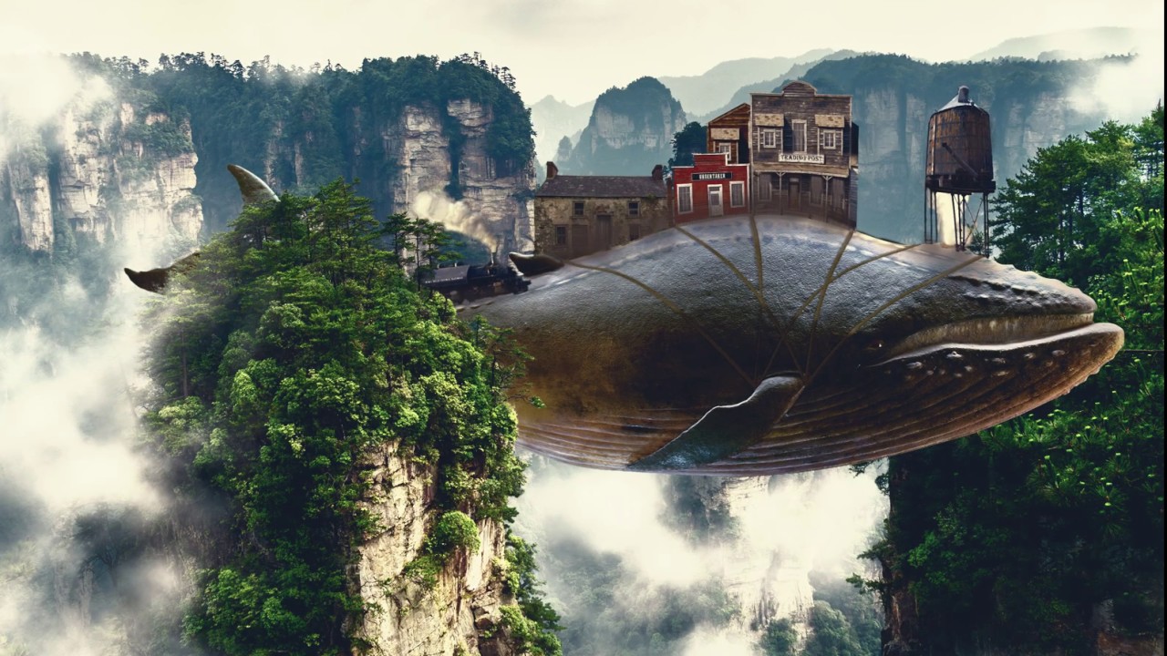
Here is my quick attempt at the composite side of the project... 'The Whale Rider' 😅
@south adder Nice! Looks like you used quite a few tools to create a fun image. Your starship is impressive.
Sending a message to the world. Challenge 8
Thanks @south adder Yeah, Earth could use a little more love at the moment!
Gave +1 Creative Carma to @south adder
Thanks for the map, @brittle slate! and for the aamazing past two weeks.
Gave +1 Creative Carma to @brittle slate
Awe thanks @tropic knoll ! It was fun! Sorry I ran out of time for the last segment. Story of my life.
Gave +1 Creative Carma to @tropic knoll
Here is the map of our Journey through Photoshop. Enjoy!
Great work @prime temple !!!
thank you
Here's the whale we were animating.
Wow
I like how all the fish in the sample file have human names, .e.g "Mandy, Bryan" 😂
ha!
abstract geometry from an old photo of mine. I had to make it look like a gloomy rainy day LOL
abstract geometry from an old photo of mine. I had to make it look like a gloomy rainy day LOL
@primal fulcrum So it's not a lie? Seattle is a rainy area for real?😝 ... Well done!
thank you @brittle slate für these lovely photos for dreamscapes
Gave +1 Creative Carma to @brittle slate
A Coastal Labyrinth for Ch-8
@worn yew I found the exit😎 ! I like the way you played with contrast between sea and sand...
Your shape reminds me seashell. Well done!👌
@brittle slate Thank you Mr. Trani for sharing your knowledge and photos with us.
Gave +1 Creative Carma to @brittle slate
retro collage.. I am slow...😀
@soft arch Don't worry it's not a race. Quality matters... Great work!👌
@primal fulcrum very nice! the colors mesh well together. one note: the shadow under the umbrella is the thing i look at first since it has the most start contrast. i would try a version where the top of the umbrella is the dark part so the words are the first thing you see (you might need to lighten 'rain festival' a bit). hope that helps!
Dreamscape (Challenge 9) Special Thanks @brittle slate
Gave +1 Creative Carma to @brittle slate
@hollow yarrow your Day 8's are mesmerizing, but I think I still like # 3 the best. Keep em coming.
Feeling a little like Monty Python https://youtu.be/2EXrcjwe6dQ Day 9
A photoshop animation
All Good In The Wood by Audionautix is licensed under a Creative Commons Attribution license (https://creativecommons.org/licenses/by/4.0/)
Artist: http://audionautix.com/
@hollow yarrow your Day 8's are mesmerizing, but I think I still like # 3 the best. Keep em coming.
@eternal mica : Thanks!...#3 is the one I spent more times on , #1 and #2 are just ideas I had during the process...
I did not post my images in order , I made #2 and #1 after #3 then posted from the simple to the more complex. Thanks for your comments, I appreciate
A little behind. Abstract Shapes DCC. Not there yet, but have to move on! So many fun things to do with abstract shapes!
A little behind. Abstract Shapes DCC. Not there yet, but have to move on! So many fun things to do with abstract shapes!
@sage urchin Great One!👍
Abstract Sunset 🌞
Thanks @hollow yarrow! Just saw yours. Awesome work! We're on the same wavelength. 😄
Gave +1 Creative Carma to @hollow yarrow
screenprint
Love your animation @safe linden! Music is perfect. 😁
A little behind. Abstract Shapes DCC. Not there yet, but have to move on! So many fun things to do with abstract shapes!
@sage urchin Very nicely done, I really dig this one
Thanks @heady stirrup!
Gave +1 Creative Carma to @heady stirrup
@sage urchin that's awesome
Wasn't feeling animation today so this is as far as I got. Its my place where everyone who loves cuttlefish can go.
thank you @hollow yarrow
Gave +1 Creative Carma to @hollow yarrow
I love learning new things about photoshop.
Wanted to credit the photos I used. All from Unsplash, photographers as follows: landscape from Boris Baldinger, moon from Alexander Andrews, and sky from Ferenc Horvath.
Challenge 5 Liquid Type. It was not easy, did it so many times...yet I need to redo it again. Cound not get the same effect like it was in tutorial👀
Challenge 6😅 😂
Challenge 8 ☺️ 🙏
Challenge 9!!!!!!!!!!!!!! Wow, this is the first time that I challenge myself to do all challenger in 3 days. It is possible, but it was not easy at all. Good luck to everyone. All of you do really great jobs.
Challenge #9
Challenge 9. Took a few times watching the video but I got it. I have a feeling that Select and Mask might become a good friend now that I'm starting to get the hang of it. What a lovely two weeks this has been. Good luck to all!!
Challenge #9 changed the color lookup think I like this version a bit better
@cerulean beacon Looks good! Really nice read to it
Thanks @eternal mica
Gave +1 Creative Carma to @eternal mica
Thank you all for a great 2 weeks of creativity. Learned a lot.
The 1st project I've been happy with
I spent a little more time on the composite for today's challenge... "The Whale Riders" 😅
@covert loom I like the high contrast of your image and how vibrant the colors are, it is a very nice effect, especially for the colorful fishes. Super cool work, Mahedi!
@tacit condor awesome animation! The chains are super cool details for the composition, also I loved that you added a blur to the turtle it really creates a sense of movement to it. Great challenges!
@safe linden the bending of the buildings is looking pretty nice! I loved how you added a train and distorted through the curves of the whale, and the country song is an amaziiiing touch! Awesome work! Can't wait to see your works for the next set of challenges 🙂
@wheat marten great job, Mike! The combinations of the colors and the halftone pattern worked out very well on your image. 🙂
@sage urchin wow super cool composition! I loved the consistency of colors and lights, also the grain is a great touch for the overall image. Awesome work!
@tardy heart very nice colors, I like that you added some blur to the reflections on the mountains. If you want you can play with the width of the bursts, making the areas near the sun small and as it spreads, it gets bigger, just a thought. Well done!
@floral frigate nice job, Mzev! Really like how the text has a nice contrast against the red background. The halftones worked really great on your image. Keep creating 🙂
@coral stone woohoo! rocking the feedback!
@heady stirrup nice job adjusting the contrast of the cuttlefish! My only suggestion would be to reduce the contrast of the trees on top of it as well, just to match to the ones form the area that it is positioned. There are many ways to do that, here's one: You can use a Curves adjustment layer clipped to the tree's layer and click and drag the left point up. If you see that it got more white you can create a Color Balance adjustment layer and add more Red and Yellow to the highlights and/or midtones. Let me know if you need any help 🙂
@sterile bane 😂 https://tenor.com/view/cat-typing-type-gif-5142304

@heavy ruin wooww great color mood on this one! Loved how the low saturated colors create an interesting effect on the overall composition. I wonder if the shadows could be a little darker. You can keep the one that you created, just apply a darker one near the areas where the buildings touch the whale surface, an occlusion shadow, just to match the lights adjustments you made. Awesome work and awesome challenges as well 💙
Thank you @coral stone I will try that.
Gave +1 Creative Carma to @coral stone
@haughty cape loved the saturation work on your image. The vibrant colors create a cool fantasy look to the whole composition. Great works on this set of challenges, can't wait to see more for the next one 💙
@thin spade super cool works! About the challenge 5 it might be helpful to play with the liquify tool, like Paul did, to get the water distortions, also you can try to use a lowercase version, since on the script fonts, the letters tend to connect to each other just to see how it looks. Loved your day 8, super creative!
@plain sable loved the subtle texture you applied! I also like how you built a community bringing another whale :D. The dreamy mood looks pretty nice, my only thought would be to apply some shadows on the areas where the buildings are standing on the whales like Paul did on the live stream, just a thought. Amazing job as usual!
Thank you so much for participating @loud mist! I loved the 3d look you applied to the ropes, my only suggestion would be to refine this area 👇, you can easily fix this using the brush and applying the shadow again, just like you did to the others. Great job! 💯
Gave +1 Creative Carma to @loud mist
@tropic knoll loved that you added a building on the turtle and created an overlap with its paw. Great job on the layer mask as well! 🙂
@spark tapir super creative work! Loved the reflections and the cards that seem to be hiding in the mountains and the grass. Lovely work!
Thanks so much @coral stone ! That means a lot! Looking forward to the next set of challenges next week!
Gave +1 Creative Carma to @coral stone
Thanks @coral stone that crossing area needed reworking several times when I warped the lines. I didn’t notice another gap had formed - thought it was a shadow. easy to fix!!!!!!!!!!!!!!!!!!!!!!
Gave +1 Creative Carma to @coral stone
No problem @loud mist it happens 😉
Thanks so much @coral stone!!!
Gave +1 Creative Carma to @coral stone
@plain sable loved the subtle texture you applied! I also like how you built a community bringing another whale :D. The dreamy mood looks pretty nice, my only thought would be to apply some shadows on the areas where the buildings are standing on the whales like Paul did on the live stream, just a thought. Amazing job as usual!
Thanks @coral stone I'll get some shadows going 🙂
DCC6 09 200604 I have a GIF of this file but im having trouble learning how to save it. I'll work on that tomorrow. Thank you @brittle slate for a wonderful DCC. I learned so much. Thank you @coral stone and @atomic echo, you guys are so awesome. Your critiques are invaluable to this process.
Gave +1 Creative Carma to @brittle slate
Here is the link to my Behance portfolio. Id love for any of you to view it and give me your impressions.
I will update it once I learn how to save my GIF file. https://www.behance.net/gallery/97637215/Photoshop-DCC-6-May-25-June-5-2020-Paul-Trani

Behance
Photoshop DCC 6 May 25 - June 5, 2020 Paul Trani
abstract geometry, not too abstract
Thank you @coral stone! Everyone of these challenges is thrilling. The challenge with the whale was liken to riding a roller coaster. I hung on and didn't throw up! Loads of fun!!
Gave +1 Creative Carma to @coral stone
Thanks @coral stone I added some building shadows, added some wind in the banners, realize my water tower lighting was off fixed that, also played with the color lookup, thanks again for the input.
Gave +1 Creative Carma to @coral stone
Day 9, Animated Whale. PSdailychallenge. Thanks, Paul!
Still Life.
had to reupload because there was a white space 😅
Thanks @coral stone
Gave +1 Creative Carma to @coral stone
Daily Challenge 200605 - Animated Dreamscape - GIF
Daily Challenge 200605 - Animated Dreamscape - COMPOSITE
@heavy ruin Nicely done! The lighting and colors of everything in this image fits together very well. Really liking the texture and dimension on the rope too. Great work on the masking as well!
@heady stirrup Very cool! Looking good, nice sense of atmospheric perspective on this. The colors really help it fit together as well, nice work!
@floral frigate Very nice! The text contrasts nicely against the background and the half tone texture does a good job of unifying the images. I wonder if tinting the panda head slightly red might help the lighting fit together more, though the color contrast does make it stand out very well. Looks good!
@tardy heart Really nice job with the shapes and masking in the abstract geometry challenge! Colors are looking good too, good work!
@sage urchin I love it! Really great shapes in this one. The way you handled the edges and gradients gives it a really nice sense of dimension and creates a really interesting design. The composition of the shapes, as well as the colors and design all make this a really excellent image!
@safe linden Hah, I definitely feel a little bit of the Monty Python vibes from it. Really cool to see this all animated. My only suggestion would be to edit out a bit more of that white under the water tower for a cleaner mask, but other than that it's looking great!
@wheat marten Really cool color gradient on this one! I like how the horse has the greatest contrast in the image which works well to make it a strong focal point. Not sure if you were going for a retro feel with the colors, but turning that saturation down might work for more of that sepia look, though stylistically the bolder orange looks cool. The halftone texture is working well too!
@tacit condor I love what you did with the blur on the turtle for the Day 9 challenge to really give it a sense of motion and like it's coming into focus towards the camera. Really cool to see that in addition to the whale. Excellent work with the masking and sense of depth in this one!
@covert loom Really liking the bolder colors in this design for the day 9 challenge! I wonder if cooling the color temperature of the whale down a bit could help make it fit in with the background image a bit more? Though the warm color does provide some bold contrast. Really nice work compositing all these images together!
@primal fulcrum Looking good Sig! Always interesting to see time of day and weather transformations with photos like that. I feel like perhaps the text could be a bit brighter (maybe around the level of the tower) to give the image a little more pop and focal point to the title, though that's really just personal preference. Nice job!
@haughty cape Very nice, liking the bold colors of this design! It could be nice to see a subtle drop shadow under the buildings and rope to really push that realistic effect a touch more. Great work on the masking too, looks good!
@prime temple These designs are looking great! Loving the colors in the first one, awesome effect. Really great sense of lighting and color of these elements to match the background. My only suggestion would be to darken the shadows of the castle layer a bit (though the brightness level looks good) to more closely match the contrast of the island below it. Might fit them together a bit more. Really nice work!
@fickle igloo Nice job with the graphic elements and gradients on Challenge 8! Liking that font as well. Nice work 👍
@south echo Really cool image on this portrait! Some really interesting effects on this. It would be really interesting to see the original image for this one too. The abstract geometry challenge has some really great shapes going on too. Very nice!
@sterile berry Hah, very nice! The lighting and colors are looking really nice on this too. My only thought is I think the left side of the mountain/trees overlapping the whale tail could use a little more masking with the refine edge brush tool. Might even look nice to fade the tail slightly just to match the fog/atmospheric perspective effect of the trees in front of it. Really nice work!
@thin spade Even as it is I think the text has a really cool effect on it. I like the sort of soft charcoal coloration to this. My only suggestion would be to get rid of the seam in the middle of the background. Extending it to cover the whole background might back for a more clean and cohesive look. The other challenges are looking great too, loving the colors for Challenge 6. Nice job!
@plain sable Oooh, very nice, really cool to see all these elements you fit together. The way one whale is in front of the mountain and another is behind adds some great depth. I think it might look good to vary the sizing and position of the hot air balloons at the top so they're not all in a line. Maybe raise the middle one up so it's cropped a bit by the frame, and vary the sizes to add some depth. Just a thought. Really nice work!
First submission.. From Nepal 👋
@tropic knoll Very cool! I think masking is a huge fundamental in Photoshop, once you get more comfortable with it the faster and stronger your work becomes. This looks really cool, great job on the masking! It might look nice to add a bit of a shadow under the buildings. Maybe just a subtle shadow with a soft round brush and multiply layer. Looking good!
@fickle garden Great retro feel to this image! I like the way the color contrast really pulls the eye to the person as the focal point of this image. Nice balance of sizes too which makes for a good visual hierarchy. My only small suggestion is that the refine edge brush tool might help to get a softer more natural edge on that hair. Nice work!
@hollow yarrow The flipped image makes for a really nice visual balance of those blue tones. Really nice color contrast overall, great take on this challenge!
Thanks @bleak fossil
Gave +1 Creative Carma to @bleak fossil
@coral stone thanks for the great feed back, I really enjoyed making it
Gave +1 Creative Carma to @coral stone
@bleak fossil Thanks for the feedback. Loving these daily challenges!
Gave +1 Creative Carma to @bleak fossil
Thank you so much @bleak fossil for your feedback.😆 🙏
Gave +1 Creative Carma to @bleak fossil
@eternal mica I like your Behance profile! You've got it so organized! I think mine is beyond repair! 💯
@sacred field Marc, thank you for viewing it. What I lack in creativity I make up for in organization. 😁 😊 😊 what is the link to yours? I admire your posted work and would like to see the portfolio(s)
Gave +1 Creative Carma to @sacred field
Challenge 9. Thanks @brittle slate
Gave +1 Creative Carma to @brittle slate
Ver. 2.
@coral stone thank you so much for your feedback. I appreciate it. I mentioned that I couldnt get the same effect like it was in tutorial. Even though I used a chrome filter/s, it didnt get the same effect for some reason. I was doing this challenge for 3 days. And I will try it next week again, I want to figure out why it didnt work for me. Also I wanted to use a lower case...but all the time I press any font it was just uppercase, so I decided to leave it as it is for now. I am so grateful for lessons that we have on behance we learn so much from them. And I cannot believe that I did all challenges in 3 days. And I am very grateful for students` works because they are very inspiring. Great weekend for everyone. Cannot wait next Monday 😃
Gave +1 Creative Carma to @coral stone
@bleak fossil - Thanks
Gave +1 Creative Carma to @bleak fossil
@thin spade open your font panel and check to see if you have all caps turned on. Hover over anything and you should get a pop up telling you what that button or slider does. I think the all caps is the two Ts (I don't have PS open yet). For the filter to work you have to have several shades of gray (he mentioned that sort of fast in the video). You can rewatch on Youtube.
So great to hear that @thin spade! The icon that @primal fulcrum mentioned is this one 👇 🙂
Gave 1 Creative Carma to Sig (current: #16 - 38)
Gave +1 Creative Carma to @bleak fossil
Thanks @bleak fossil ! I’ll give that a try!
@eternal mica I'm afraid my Behance page isn't in very good shape. I started putting the projects together after my first 9 day challenge. https://www.behance.net/marc_allen

Behance
@young karma Hahah it's really well done. Just there is layering problem I think. Because we see half of the fish is passing front the rocks and trees there. Probably you should make a new layer with all that left part.
Daily Challenge 200605 - Animated Dreamscape - GIF
@young karma Well done but there is an issue to fix with rock in front... The fish is passing through... you should review your masking. Your whale is amazing 👍
Day 9. Will try and do the animation later!
PSdcc #8 tried to figure out what to do, used shape tools, blending modes and brushes, hope you like it , have a nice weekend 👍
@barren ice Here is the link to my animated GIF. Couldn't post the image as it's too big, and I haven't been able to work out how to make it smaller. https://mir-s3-cdn-cf.behance.net/project_modules/disp/01dc8597828315.5edbc1718a8eb.gif

Work in progress I think i'll call this. Observations welcome.
@young karma the orca isn't very well defined. It took a moment before I realized it was there. Maybe play with the color to make the whale pop?
Animation later! Although Liquify and I had a bonding moment. 🤣
@arctic rover Thanks for your thoughts - went too far with colour lookup I think. Nice that you bonded with the liquify - sounds a bit like woodwork! You've been very busy fishing too - love how the colours add the depth to it.
Gave +1 Creative Carma to @arctic rover
@plain sable Oooh, very nice, really cool to see all these elements you fit together. The way one whale is in front of the mountain and another is behind adds some great depth. I think it might look good to vary the sizing and position of the hot air balloons at the top so they're not all in a line. Maybe raise the middle one up so it's cropped a bit by the frame, and vary the sizes to add some depth. Just a thought. Really nice work!
@bleak fossil Here's another whack at it...
Thanks @bleak fossil
Gave +1 Creative Carma to @bleak fossil
Couldn't get the video to render. I will keep trying. Maybe too compplex.
V2...
#9 Dreamscape: I would like to make fish, turtle and whale move at different speed, but do not know how to do this 🤔
@cerulean beacon That made me smile 🙂
@young karma can you make the whale pause for a bit at the end???
@plain sable I am so glad to hear this, I shall say 😆! have a lovely Saturday.
Gave +1 Creative Carma to @plain sable
You too @cerulean beacon
Dreamscape! Thank you @brittle slate for the challenges.
Gave +1 Creative Carma to @brittle slate
@worn yew and @hollow yarrow - I have difficulties with animation .. thanks for the feedback and I will give a try at correcting the layers.
Gave +1 Creative Carma to @worn yew
Please don't burst my bubble. (all images my own.)
added elements.
Screen print challenge, and then another similar attempt with different images :)
@young karma can you make the whale pause for a bit at the end???
@plain sable I dunno, Can I? 😆 I'll give it a go.
first attempt
Animated Dreamscape Composite
@worn yew and @hollow yarrow Here is my second try at the animation. I hope it seems like the lure is swinging around in front of the mountain.
screen print 1 = I stopped here and left it. I thought I was in trouble. but I still like it.
screen print 2 = i like it
Tried my hand at animation.
Lovely works @cunning needle! I loved the colors and the texture in both of them. The flowers on the bird version worked out, they act like a "natural vignette" to the image. Great job!
Another amazing work @sturdy vault! The butterfly carrying the buildings and the circle is super creative. 💙
Loved the cat and the dog on the second version, their expression seemed to match really nice the pose haha @tawdry frost! Nicely done!
@soft arch the green grass worked really great on the blending to the whale surface, impressive work!
@fickle garden good job on creating a mood for the composition, the color grading is looking pretty nice!
@young karma I think it's so much better 🙂
hello @coral stone thank you, I am still struggling with the animation.. it is my first time using this 😅 and the file mp4 is too big for discord
Gave +1 Creative Carma to @coral stone
@sturdy vault that's super cool! i actually like it a lot - it gives off such a summer-y and playful vibe 💛 but what if the butterfly's package was swinging? just an idea if you're going back to do any edits ^^ great job!
@soft archwhen you have the render dialog box opened you can try reduce the quality on Preset and/or reduce the document size 🙂
Didn't get to add the animation yet
@young karma thanks I tried but couldn't get it to do what I wanted. If I knew AE I would use it. AE is my retirement program to learn.
okay thanks @coral stone I am experimenting with this...
Gave +1 Creative Carma to @coral stone
@coral stone Thanks. I spent one evening with my grandson taking pictures of bubbles. We were playing with refraction.
Gave +1 Creative Carma to @coral stone
@coral stone nice picture.
Gave +1 Creative Carma to @sturdy vault
Thanks @sturdy vault 🙂
Finally I finished! Im very happy,
this was my first challenge ☺️
This is the jpg of the Challenge #9
and here is the gif. I learned I had to bring the file size way way down for it to save.
made it 😃 @coral stone still searching for the reason, why the Atlantis sign disappears...
Yay @soft arch 😍🎉
Try to see if the Atlantis sign layer has the length until the end in the timeline, if not, that’s why it disappears (or maybe it is going deep into the ocean 😂)
and here is the gif. I learned I had to bring the file size way way down for it to save.
@eternal mica It looks like old 8 bits videogame... Wel done 👍
@young karma Nice improvment! Awesome
@coral stone it is one smart object with the plant underneath, the plant stays and the sign disappears, may be I should split them? Can't stop watching this 🤣
@eternal mica It looks like old 8 bits videogame... Wel done 👍
@hollow yarrow Thank you for your evaluation. Very much appreciated.
I think that might be the case of spliting it, so you can have more control on the timeline. If you don't want to rasterize the Smart Object, you can right click on the smart object layer and choose convert to layers. Ps will make a group of what the SO layer had inside @soft arch If it doesn't work, then you try rasterizing it 🙂
thank you for helping me @coral stone I split, I rasterized and now the sign disappeared 😭 but I have a copy😅 , I might need a break and try again tomorrow, but before the break I will watch this whale once more ( or twice or ...)
Gave +1 Creative Carma to @coral stone
@queen dew i love your shapes project. powerful lighting and masking
@sturdy vault i like the idea and the execution. One small suggestion: im not sure if the clouds in the circle shape are supposed to be a mask of whats behind it or not. Maybe change the color of those a bit to have them stand out more from the cloud in the background.
@young karma 2nd animation works much better. looks really cool to have whale behind mountain and fish in front.
@cunning needle 2nd screen print is very nice
@sturdy vault good work on animation
@gritty violet HEY, this is a one way ocean, your whale is swimming against the traffic!!!
@eternal mica My whale forgot his umbrella
@eternal mica Thanks the bubble is a picture of a bubble I took. I didn't play with it at all.
Gave +1 Creative Carma to @eternal mica
my Dreamland and Retro collage
Screenprint one
Screenprint 2
Had issues saving as gif, and my mp4 is too big, so to start off here is my animated dreamscape but not animated
Animated whale
Catching up! Day 6- Screen Print. This is for the school where I teach. I think my students will like it!
I animated this in After effects. I think some of the quality is lost when i reduced the size to 8 MB. You can't see the tail moving.
Abstract Geometry
Thank you to the amazing @brittle slate , you are inspiring and have helped me learn so much about PS.
Gave +1 Creative Carma to @brittle slate
already 9:30! Thank you so much @coral stone and @eternal mica! I considered screen print as a Japanese woodblock prints. https://www.rawpixel.com/category/53/public-domain
"So many activities" by stepbrothers

rawpixel
Public Domain images. Free design resources: photos, vectors, psd mockups. Sign up now to access your free images.
Gave +1 Creative Carma to @coral stone
Challenge 9 done old school in PS 2019, no select subject or remove background. Challenge 8 killed CC2020 on the step and repeat transform. Next project is a reinstall of 2020, then try out After Effects. I'm taking a break from the Photoshop Challenge, but start my own project in Behance.
Challenge 7 Retro Collage
Abstract Geometry.
@cunning needle wow
Day 7 Retro Collage
@cunning needle This looks really cool. The only thing I could suggest is reducing the blacks on the birds' head maybe. You can get reference about luminosity values from your water drop texture.
@queen dew i love your shapes project. powerful lighting and masking
@eternal mica Many thanks for your feedback 👍
Rainy day in Switzerland... A few days late, I made some "splashes" for the "Liquid Type" challenge #5. Thanks @brittle slate for all the tricks! Got lot of fun to make it, and learn each time thanks to you! 👍
Gave +1 Creative Carma to @brittle slate
Here is my last Challenge. You can check and give review my whole DCC project by visiting my Behance page. Thank you everybody 🙂

Behance
Photoshop Daily Creative Challenges May 26th - Jun 5th.
My final Behance project (and the animation for day 9 which was way too large to put on Discord!) https://www.behance.net/gallery/97814695/Photoshop-DCC-25th-May-to-6th-June-2020

Behance
Photoshop Daily Creative Challenge from 25 May to 6 June 2020
Another set of challenges attempted...https://www.behance.net/gallery/97776979/PHOTOSHOP-Daily-Creative-Challenge-255-056-2020

Behance
PHOTOSHOP Daily Creative Challenge 25/5 - 05/6 2020
@thorn geyser love this and love your Behance profile of all the challenges. Well done.
@tidal bloom Thank you! 😊
Gave +1 Creative Carma to @tidal bloom
@thorn geyser I've checked your whole DCC series and loved your style 🙂 Good job!
@worn yew Thanks! 😄
Gave +1 Creative Carma to @worn yew
Where did all the old creative challenges go on Behance? I loved watching them back....
Challenge 9, dreamscape, comments welcome
Still fiddling - this will be it I think! V3. I am (again) so impressed by some of the work here. Its nice to see it - encourages me to keep at it. Ok - the gif...
@brisk flower Thank you for posting your portfolio. I enjoy your posts. Your work is consistently creatively designed and beautifully executed. I hope you continue to participate in the DCCs. (Im also a CPA by day and frustrated photographer by night, but nowhere near as proficient at the second as you.)
Gave +1 Creative Carma to @brisk flower
@thorn geyser Thank you for your portfolio. Another well done job by you. Is it coincidence or plan that all of the works (except day 7) and your text images have a definite blue tone them?
Gave +1 Creative Carma to @thorn geyser
@worn yew 🌟 🌟 🌟 🌟 🌟 portfolio
Oneness
@eternal mica Thanks for your kind words. I may not be an accountant for long as I am just waiting to be sacked - but at least it gives me more time to play in Photoshop!
Gave +1 Creative Carma to @eternal mica
already 9:30! Thank you so much @coral stone and @eternal mica! I considered screen print as a Japanese woodblock prints. https://www.rawpixel.com/category/53/public-domain
"So many activities" by stepbrothers
@cunning needle Thanks for sharing👍
rawpixel
Public Domain images. Free design resources: photos, vectors, psd mockups. Sign up now to access your free images.
Gave +1 Creative Carma to @coral stone
https://www.behance.net/gallery/97795915/PS-Daily-Creative-Challenge-(May-26th-Jun-5th)
@worn yew Nice project!👍
Behance
Photoshop Daily Creative Challenges May 26th - Jun 5th.
@thorn geyser Thank you for your portfolio. Another well done job by you. Is it coincidence or plan that all of the works (except day 7) and your text images have a definite blue tone them?
@eternal mica Thanks! I do have preferred colours that I like to use in my images, mainly blue, purple and some pink, but those colours didn't fit with what I wanted to do for day 7!
Day 9 - Dreanscape (inanimate version)
Day 9 - Animated Dreamscape
"I'm definitely not a motion designer!!!"🥵
@hollow yarrow its a cool and interesting take on the challenge tho - works well.
Where did all the old creative challenges go on Behance? I loved watching them back....
@cinder sigil All the Adobe videos are available on Youtube. Search Adobe, choose the red CC one, then videos and you can go back years if you want
Reworked with changes suggested by @bleak fossil @sterile bane and @coral stone
Great - all my brushes have vanished AGAIN. All the ones I made, all the imported ones, all my organization. It took me days to go through all the brushes, delete what I didn't like and sort the others into groups. Seems the more I customize PS, the more likely it is to wipe it all out. It did this 3 times with my gradients!
@primal fulcrum - Do you save them someplace after you create a set?
You can delete, reset and load sets at will. Save and Load Brushes from the flyout menu.
Create a backup of the brush sets someplace so you have them. Create different sets. Zip them up. Dump them to a cloud storage device as a second backup. 😀
The final challenge and my first After Effects effort
Here's my "Animated Dreamscapes" Challenge #9, in which swiss cows dream of flying like whales and turtles around the Cervin. Gotta compress a lot the final GIF to make it light for Discord. I made the dreamscape simple because I wanted to concentrate on the final process of Puppet animation in After Effects that i learned to do with other tutorials found on youtube, since @brittle slate didn't had time to finalise his demo of this part in his so usefull and fun live. "I got the idea", ... even if I didn't "tweak"! 🙂
@covert ridge superb tail action from your whale!
My project on behance https://www.behance.net/gallery/97833175/Photoshop-Daily-Creative-Challenge-with-Paul-Trani
Behance
Photoshop Daily Creative Challenge with Paul Trani
retro collage attempt , i came up short on masking some of the images completely .the flower in left corner didnt come out well
@covert ridge superb tail action from your whale!
@young karma Thank you Loan! Was fun to experiment something new! 👍
Gave +1 Creative Carma to @brittle slate
Challenge 9 Re-Do. Thank you @bleak fossil! I have added shadows to the buildings atop the whale and on the turtle. I must study shadows in more detail. This is something I feel I am taking for granted. Thank you for the eye-opener.
Gave +1 Creative Carma to @bleak fossil
I need a Master Class in Timeline Animation! Much to learn. Not happy with this, but will keep tweaking it. Thank you @brittle slate for a great session!
Gave +1 Creative Carma to @brittle slate
for the retro collage challenge. thanks for all the knowledge in the challenge videos, @brittle slate and for all the feedback from the mods and fellow learners. look forward to learning and doing more when i have the time!
Gave +1 Creative Carma to @brittle slate
PSdcc #9 couldn’t make gif in PS, used Giphy instead (?) thx to @eternal mica @sterile bane @coral stone for the feedback during the different challenges. And of course @brittle slate for the brilliant shortcuts like: ‘remove background+convert to smart object+bam’ 😆👍
Gave +1 Creative Carma to @eternal mica
@sterile berry no, I didn't save them. Guess I'll have to start over and save them this time. Hope it works different than the gradients. When I saved it, it saved ALL of them so it was a none or all when I went to reload them.
Here's my abstract shape. As an AI user, it was kind of frustrating to try to do vectors in Ps, but I can see where it would be useful!
@queen dew Hahah it's amazing 😄 I think you can also make your eyeballs follow the puppet.
@covert ridge Awesome! I'm sure you enjoyed a lot while making this video. It's really a big example of how AE makes designs more alive and dynamic.
Hello. I am new
Hi @short oracle, welcome! 🙂
Very nice @vernal herald! You can get creative combining Ai and Ps 😉 I loved the texture that you applied to the shapes and how the stroke seems to be a subtle shadow of a cut effect. I also like the flare and the reflection that you added. Well done!
catching up with Hibryd animal, here is my Xispa pegasus. I´m having some issues with the front wing , dont know how to fix it
Again big thank you to @brittle slate and moderators for a great challenge!
Gave +1 Creative Carma to @brittle slate
traveling roun the world with her odd wing, which one works better for you?
PS Daily Challenge 6.5
Day 4
Going back and redoing the challenges since i have 9 days experience under my belt
@hollow yarrow i love the dreamscape
@hollow yarrow i love the dreamscape
Thanks @eternal mica... I appreciate!👍
@soft arch I really like your portfolio. The final dreamscape recap is awesome.
thank you @eternal mica
Gave +1 Creative Carma to @eternal mica
where is yours @eternal mica ?
@soft arch I posted it last night. As well as in my Behance portfolio. Just a tip, If you'd like to see a particular person's work, go into upper right corner lookup menu bar and using the "from:" prompt, type in that person's name. All of the posts will pop up.
thank you @eternal mica discord and behance are still labyrinths for me 😃
Gave +1 Creative Carma to @eternal mica
I got way behind this week. Here is Challenge 5...
...Challenge 6...
...Challenge 7...
...and Challenge 8. Challenge 9 will have to wait until tomorrow.
@covert ridge Awesome! I'm sure you enjoyed a lot while making this video. It's really a big example of how AE makes designs more alive and dynamic.
@worn yew Yes! AE seems to be a great app for animation. I wish I could have more personnal time outside my job to experiment and learn. That time is hard to find, sadly. Thanks for your feedback.
Getting ready for @sterile bane and her Ps DCC.
Photoshop Daily Creative Challenge - Touch Ups
Here is my share 🙂 Just followed what Paul did 🙂 Thank you I've learned a lot 🙂
Challenge 8
A little late but here's my dreamscape for day 9
@primal fulcrum and @coral stone, thank you sooooo much for helping me with the Liquid text Challenge!!! Here is the result 🙂
Gave +1 Creative Carma to @primal fulcrum
Beautiful work @modern halo! Loved how the blue tones interact with each other and the blending effect of the pink ones. Nicely done!
Nice splashes on the day 5 @stable ravine I wonder if you could make the type in lowercase, just to see if the letters will be able to connect since it is a script font.
Really loved the screen print effect and the collage, also the heart with the fire looks really nice. Well done!
Super interesting atmosphere in youe work @cold oyster. I loved the colors that you chose and how the dark red tones seems to suit very well with the smoke and the dark blue ones. 💯
Thanks @coral stone really appreciate it. I want to go back and retry day 5. That was the first challenge in the past six weeks that really frustrated me.
Gave +1 Creative Carma to @coral stone
Oh Sorry to hear that @stable ravine if you need any help, feel free to ask me 🙂
@coral stone honestly, it was just a lack of patience with adjusting the filter gallery effects. It is a cool effect. I just need to spend more time with it.
@cobalt void Check your GIF. I dont think its working
Thank you @coral stone I wanted that eerie feel to it and the colors really did that for me.
Gave +1 Creative Carma to @coral stone
Had so much fun with this one
Missed the last days due to computerproblems. Try to combine all in this last post! Thanks @brittle slate for the challenge!!
Gave +1 Creative Carma to @brittle slate
@young karma That is brilliant 🙂
Friday's Challenge 9 finally done!
@young karma I need this portal in my life. Awesome work!
Added ropes
Composite
With Paul Trani
Retro collage with a bit of that screen print effect thrown in like Paul suggested at the end :)

Behance
New to Photoshop. I decided to do the challenges with Paul Trani. I had so much fun (and aggravation).
Challenge 9. Transporting thru Paradise. This is a .mp4. It took me forever to figure out how to get this far. Learned alot through my mistakes. Thank you for this opportunity! Wow, the setting is incredible. Makes me smile. 😄
@young karma super presentation
I cant wait for tomorrow!!!!!
And I ordered my Ps Pillow!!!
@stable ravine Chris, try uploading a slightly larger version of the gif. Most of the ones posted are larger than yours. It will make it easier to see the detail you put into your effort. I think I used a 500 setting
@gritty violet Really good job on your portfolio. I learn so much just from seeing your imagination and creativity. Thanks for posting it.
Gave +1 Creative Carma to @gritty violet
@lime meadow nice job. The coloring fits the image so nicely.

Geometric shape
Great job @lime meadow. Loved the overlap with the hand! The texture on the triangle gives a nice sense of depth as well!
Beautiful project @young karma! The hybrid animal from day 4 and the animation from day 9 are my favorites. 💙 Great challenge!
Inspired by the work of @brittle slate I like to use my own pics and tools available on the theme retro collage
Since the new challenges start tomorrow I've decided to post my entry for Day 9 from last week in this channel, the animated dreamscape 🙂
@deep mango - Cool animation!
Thanks @sterile berry 🙂
Gave +1 Creative Carma to @sterile berry
That looks very cool @deep mango the cyan tones and the moon on the background look very nice!
Thank you @coral stone 🙂
Gave +1 Creative Carma to @coral stone
Challenge #6 Screen Print Effect Just catching up! (Thank you to Michael LaRosa for the Wolf image via UnSplash.)
Big shout out and thank you to @brittle slate and moderators for amazing weeks! I was into brushes. The message is I made a mess. Another magic of PS. love it.
Gave +1 Creative Carma to @brittle slate
@cunning needle Wow it's looking really cool. I got some Indian vibes from the texture. It's like Dhalsim will jump on the whale from somewhere 😄
Day 0: Project Cover Design
@worn yew thank you so much! "Dhalsim" I googled it. Very interesting! the objects on the whale is myths creature in Japan. tiger and fish. Happened to learn last night.
Gave +1 Creative Carma to @worn yew
Re-did Challenge 5. Thanks again @coral stone. I'm much happier with it now.
Gave +1 Creative Carma to @coral stone
Still working through last weeks challenge.. Retro Montage - images from my youth.. me and my twin sister 😀

Behance
Daily creative challenge done in May. Made each piece in Photoshop in a day.
Thank to all for helping me raise the bar https://www.behance.net/gallery/97847385/Photoshop-daily-Creative-Challenge-526-65

And I can't get enough of whales (Whale & fish assets from https://www.rawpixel.com/category/53/public-domain Plant life from petco and chewy 🙂 )
rawpixel
Public Domain images. Free design resources: photos, vectors, psd mockups. Sign up now to access your free images.
Thanks @cunning needle for the heads up on rawpixel
Gave +1 Creative Carma to @cunning needle
Hi @plain sable I believe you sent the link from the project editor. This might not work for us, make sure you share the link of the published project 🙂
Thanks @coral stone updated the link
Gave +1 Creative Carma to @coral stone

Behance
Photoshop Daily Creative Challenge May 25, 2020 - June 5, 2020
Hello! My name is Irina and this is my first time participating in adobe challenge. I am a photographer and I use photoshop in my work.
Hi @hybrid island welcome 😀
Welcome @hybrid island
Still catching up - Abstract Geometry - so happy to know about the flame filter 😀 Thanks @brittle slate
Gave +1 Creative Carma to @brittle slate
Looking foward the next two weeks... Last Creative Challenge with Kathleen was my first...
https://www.behance.net/gallery/95666505/PS-Daily-Creative-Challenge-April-2020

Behance
9 challenges in 9 days driven by Kathleen Martin#PSDAILYCHALLENGE
@cunning needle Beautiful portfolio. Not only this one. I looked back at your past ones also. I think your work is superb. I hope you join the future DCCs.
challenge cover
@plain sable great again.
I got my dreamscape finished!! Have I been bitten by the After Effects bug now? Maybe!
@sudden hawk very nice font. what is it called? where did you find it?
I'm ready!
Looking forward for more challenges
@tropic knoll Really nice work on the animation! I like the tail movement and how varied the speed between the different elements. Gives it a nice realistic feel. Great job!
@gritty violet Really excellent job on all of these! Really nice to see them all together and the variety of techniques and styles used. Really liking the contrast in the whale image and the graphic elements in the one with the camel, tree, and giraffe. Well done!
@tawdry frost Really nice work! I really like how the radiating lines come out from the girl on the left. Really helps to make her the focal point but still move the eye outward into the various other elements. The only small suggestion I’d have would be to lower the contrast in the Polaroid cameras a bit by lightening up the dark tones a bit to match the lighter dark tones and contrast of the other elements. Really nice cohesive color palette too, looks good!
@young karma Ooh, really cool and foreboding effect with the black sun in the sky. I like the really dramatic contrast of the dark tones in this image, really reinforces that ominous mood of the image. Really nice job compositing these elements together, I like the composition and way you have a strong foreground, midground, and background!
@lime meadow This looks awesome! Really liking that muted color palette and sense of depth you have with the different sizes of the UFOs. My only thought is it might help to give the underside of the UFO on the bottom left a bit more shadow to match the lighting of the scene a bit more. I often do this with a multiply layer and soft round brush using a clipping mask. The masking on the plant in front of the UFO looks great too!
@wheat marten Really liking the colors and lighting on this image! The way you added the cloudy/fog effect really gives it a nice sense of atmosphere too. Kind of reinforces that dream like quality as well. This is totally just personal preference, but currently the dark shadow of the tail draws a lot of attention due to it being on such a light background. Fading it out ever so slightly with some fog might help strengthen the focal point of the whale's head area. Really nice work!
@stable ravine Looking good! Nice work with the animation and masking. The sense of perspective on the movement of the turtle is looking good as well!
@young karma Great concept! The graphic elements work really well with this photo and the pop of yellow makes for a nice focal point while still looking in place in the sky. Nicely done!
@thin spade I really like the outward spread effect the splash coming off the letters has, gives it a nice sense of motion. The texture and effect on the text is looking really nice too 👍
@cold oyster Really nice mood to this one. The colors and fog really help reinforce that sense of atmosphere. I really like how the surreal feeling of the city in the sky is a secondary read as well. very cool!
@modern halo Really nice work on these graphic elements for challenge 8! Nice use of overlapping shapes and different colors/gradients. My only small suggestion is it might look nice to move the graphic up just a bit so it's not creating a tangent with the bottom of the frame of the image. Nice colors in this design 😄
@vernal herald Very cool! AE and animation can definitely open up a new world of possibilities. Nice work with animating these two different elements! Really nice work on the masking as well, looking good!
@bronze thorn I love how well the graphic trees of the background blend into the photographic elements. Really nice use of the lighter colors to get that sense of atmospheric perspective. The yellow of the deer makes for a nice focal point and contrasts well against the photo background. Really nicely done!
@bleak fossil thanks Sam always appreciate your feedback.😀
Gave +1 Creative Carma to @bleak fossil
@cold oyster Really great collection of work here! Nice job with all the different techniques and challenges. I especially like the mix of the bird/tigers! I especially like the one with the blue belly, though I think it might look good to boost the bright tones of the tiger head a bit more to fit the lighting of the rest of the image. Really great job on all of these!
@plain sable Excellent work! Really nice job on all of these, and it's great to see you include all the source images to see how you approached each challenge. Just a small note on Challenge 2, I think it might look more natural to give her more of a neck so the head doesn't sit right on the shoulders. Just a thought. Either way, these turned out great, very cool!
@cunning needle Really awesome set of challenges, well done! I really like the colors in these and the abstract geometry challenges turned out awesome. Really great designs. The gold effect on the last challenge looks great too, impressive work!
@winter tinsel Really cool designs for Challenge 6! The wolf head has some really nice color contrast against the background. I especially like the second one, the half tone and slightly more muted colors gives it a nice cohesive feel. Nice job!
@deep mango Excellent work! Really impressive animation on the whale, I like how you get a bit of movement in the center of the body as well as the tail. The way the whale increases in size really gives a great feeling of perspective too. Well done!
@lime meadow Really cool! Definitely has a nice retro vibe to it. I like the tilted contrast of most of the objects around the TV, makes the TV stand out even more. The variety of sizes is nice too. Nice work on the geometric shapes challenge, the masking looks good!
@young karma Great collection of challenges! I especially like the first and last ones. Really nice work with all the different techniques!
@cobalt void That's great to hear! The challenge with the skull came out great! The lighting in this is looking really convincing and the skull fits that back lighting perfectly. The reflection in the water turned out great as well, impressive work!
@outer fossil Really nice work on the challenge with the skull! The lighting is looking really nice on that. I think it could look good to match the lighting on the plane so it has a bit of that rim light effect the skull does to look like it's catching some of the sun light. I often like a screen layer or color dodge layer for that type of effect. Just a thought. Really liking that dramatic lighting, nice work!
Gave +1 Creative Carma to @bleak fossil
Thanks @bleak fossil
Thank you Sam, I’ll make that adjustment, I totally agree now you’ve pointed it out, great to get real feedback, I am learning so much from these challenges! 🙂
Dreamscape: Inspired by the Photoshop Daily Challenge on 5 June 2020, I created the piece ‘Redemption’. This was produced using the same techniques applied in the whale composition – manipulating a variety of images to produce what you see now. Any feedback would be appreciated.
Welcome to all the new peeps! The starter images will be posted in Discord at 8am PDT. Look on the side at the top where it says Announcements/read only and then creative-challenge for the link to download. also take the time to read Community info/read only and then welcome. It will give you a good overview of Discord. We have a thread for chatting, and for intros too 🙂 Look around, there's lots here for you
June 8 - June 19 2020
Looking super cool @young karma I like how the white stroke helps the text to have contrast against the background. The graphic fill of the text looks very nice as well. Good job!
Welcome
@covert loom very nice. My only thought is that you might use the cover dimensions, so there won't be any cropping on important areas of your image. The dimensions are: 808 x 632px 🙂
@coral stone Thanks boss. How many resolutions will I keep it in this size when I save.
Gave +1 Creative Carma to @coral stone
@covert loom you can create a new document 808px x 632px and use 72ppi 🙂
@coral stone I am especially grateful to you. In your opinion, my path will be easier.
hi Kathleen
Cover image, excited about the Challenge!
post it here
What do you think of the distortion? Too simple or just enough?
Hi Kathleen
This is Amazing 👍
Inspired by Kathleen's outfit. I'm not sure if the white background works? What do you all think?
Challenge 1, now with more skew!
@deep lintel ha! very nice. hmmm I think the white background would work better if the background text was almost white as well
@mint vigil 😆 nice job! my only feedback is the text in the bottom right is difficult to read since it's a similar value to the BG - I would try going lighter or darker
@sterile bane Sounds good. I'll give it another go and post an updated version later. I tend to have trouble finding a tertiary color that looks good and has contrast.
Challenge One - Cover. Does the yellow work on this? 🤔
Day 1 🙂
Hi, Here is my challenge DAY#1. Really enjoyed!! 😆
@ocean pine It's not bad! i think the gradient is so nice in the BG and plays nicely with the yellow. Maybe the dark text in the background could fade to be closer to the gradient? you could trying getting rid of it completely, too!
@wicked orchid yeah! nice!
@severe flame oh nice! you even got a drop shadow in there! i love how the flowers & background letters start to mesh together to create a texture.
This is my first challenge! So excited to learn more.
@sterile bane thank you for reply!! background is hydrangea.
Gave +1 Creative Carma to @sterile bane
Keeping it simple - you like?
Day #1, What do you guys think of the font?
New to Photoshop, just followed the tutorial and added a texture. Is it good for a starter?
My Cover for Day 1. The seed in the background is an Honesty seed here in the UK. Love the way the light shines through.
Day 1 🙂
@wicked orchid Awesom!
What's the easiest way to create this shape in IL? This used to be a two move thing and now i have no idea...
Too much?
@twilit granite the turquoise lettering is a bit too much for me, it may be the angle compared to the other lettering?
💯
PS Daily Challenge, Cover art. Day 1 with Kathleen Martin.
Challenge Day 1- Cover Image. Really looking forward to getting better at this.
Really enjoyed my first every creative challenge! Here's what I came up with. Do you think the text is easy to read where it's placed? What about the colours, do they work?
Learning Photoshop, Behance, and Discord. I am enjoying the challenge.
Day 1 Cover picture
Thanks for your feedback @jolly quest & Ann, Font is Rig Shaded x
Gave +1 Creative Carma to @jolly quest
Day 1 Challenge
PS Daily Creative Challenge - Day 1
@cedar sapphire I really like the gradient color on your background text 😍
Day one cover image.
Thanks, @terse crescent!!
Gave +1 Creative Carma to @terse crescent
@zinc elbow love the background text!
My first attempt at a daily challenge, looking forward to following along over the next 2 weeks!
Ps june 9 2020 - French version
like everyone's gradient additions
Day 1 - Cover Image
already making changes... 😊
Hello everyone here is my cover project for day 1 with Kathleen, as always comments are always welcome thanks
I'm not too creative as yet but getting there.
I think I am going to work in monochromatic pallets only this challenge. And I am kind of liking the idea of distressing them all to look like old photos. Eh, we will see.
SO MANY GREAT SUBMISSIONS. i don't have time for feedback now, but will be back this afternoon/evening!
Day 1 Cover 😀
Day 1 Cover 😀
@kindred kernel I am always a sucker for green and purple
I'm not too creative as yet but getting there.
@wheat marten I dig the texture you have in the background text, don't be afraid to fill the whole background with a closer crop. Looks good
Background might be too bright but wanted it to look like zoomed in LCD
first attempt
Day 1🙂
Day 1-cover page
In place of skew tool I used wrap tool
And tried two version of it .
I would love to know your opinion on this
DCC7 Challenge 1 200609
Creative Challenge 1 - Keeping it simple
new here and looking forward to catch some tips&tricks 🙂 this one is an updated one..
Cover Photo
Cover Photo
I misunderstood Kathleen. I thought only the portion in the "safe text" area would be visible. Here I utilized total canvas
@eternal mica I'm not sure you did misunderstand but a Behance cover project will only force you to crop out areas of your image if it is bigger than the area it permits so I think the 'safe area' refers to that 808x632 area. Thats what I understood anyhoo.
Modified cover, I really like balboaplus gradiant text
That's a super cool approach to the challenge @peak creek! Loved how your work transmits an action feel. The glitch effect is a great touch. Awesome work!
@ocean oar loved the subtle blur and distorions that you applied to the background text. Well done!
@young karma very nice colors on this one! I believe an optional step would be to apply some subtle texture, not to compete with the other elements, but just as a final touch. 😉
@modern halo beautiful colors Willi! I loved how you made the perspective consistent and created an interesting movement to the cover. Just a nitpick, you might consider reducing the scale of the main text just a bit, so it can have a breathing space in the safe area's edges. Great job!
@young karma very nice cover, the 3D look of the text is super cool. My only suggestion would be to work on the readability of the text on the bottom. You might try to play with opacity on the background or make it thicker, just some ideas... 😉
@rocky reef Great job! Loved your fonts choice and how you managed the elements of the background without losing any contrast and creating competition with the main text. Well done!
@coral stone
Thanks 😊
Gave +1 Creative Carma to @coral stone
@eternal mica yes, considering the aspect ratio of the Behance cover, the safe area is going to be where your text will be protected against any cropping. Nice work, my only suggestion is to work a little bit on the contrast, right now the background is getting more attention than your main text. There are many ways that you can play with, maybe changing the colors, playing with opacity... just some ideas 😉 Great to see you on this new set 🙂
thank you @coral stone
Gave +1 Creative Carma to @coral stone
@dry mortar loved the textrure you applied to the background text, I can see that it has some 3D look on the edges, did you use Bevel & Emboss? Looks great!
Not sure I love it...but had fun anyway.
@coral stone @young karma I had already made up a project cover page. Im not intending to use this one for that. so I decided to fill the canvas. Valdair, I'll play with the text color and the bg opacity and make the main text stand out more. Thanks for your comments.
Gave +1 Creative Carma to @coral stone
Use of my former college colors. Northern AZ University
What do you think about the colors? I've always liked the combination of a very saturated red and a dark background.
Day 1, v.2 Daily Creative Challenge
Day 1: another cover
day 1!
I redid by adding some texture and removing a layer. What do ya'll think.
Day 1 Cover Image
@coral stone Thank you Valdair. I changed BG to hard mix and went with more black on letter Gradient
Gave +1 Creative Carma to @coral stone
D1 flying with excitement with new challenges😃
Challenge #1 Cover Image (Sign Post background image by Junior Usuanlele-Oshodi on UnSplash.)
🌴
@soft arch this is looking pretty nice! I loved the complementary colors and how the perspective of the text creates a very nice movement context combined with the other elements. Nicely done!
First challenge complete and new to the behance/discord community. Let me know what you think of this cover image!
thank you @coral stone 🌻
Gave +1 Creative Carma to @coral stone
@exotic slate this background is amazing! I loved the 3D long shadow you applied as well. My only teeny tiny suggestion would be to brighten up just a bit this area of the letters 👇, so it can pop a little more from the background. Well done!
Daily Challenge 200609 - Use Transform controls to create a custom cover
Wow, there’s so much to learn! Gotta start somewhere I guess...
Cover Image
Great to see you’re back. @kindred kernel! Loved the flowers on the background and how you played with the opacity on the pink text. My only suggestion would be to darken juuust a bit the pink tones so the Daily Creative Challenge will be have more contrast. Great job, Gerard!
@cold snow loved that you included some 3D, it looks pretty nice! If you want to remove this shadow from the base you can select the 3D layer and under the properties panel uncheck Cast Shadows. Lovely work, Shelly!
This is the option
The monochromatic palette work you great @heady stirrup! The textures and the frame are looking awesome.
Very nice @wheat marten if you want, you might apply some or a dark color on the background and apply a subtle texture just to see how it looks. This is totally optional, of course 😉
Gave it my best shot
@hot thicket the background colors and texture look super cool. My only point of feedback would be to place the text on the safe area. Since the cover dimensions are smaller horizontally on Behance, your text might be cropped when you set as a cover, you might consider the Safe area that Kathleen put on the starter file, it will help you adjusting the text 🙂
Lovely effects @blazing surge! I like how you played with the blue tones, also the glow and the cursor are a great way to catch attention. Great job!
@sharp spruce The green tones are looking super cool! Just a nitpick, you might align the main text to the center, right now it looks a liiiitle bit to the right. Great job on the contrast!
@cold oyster wowww this turned out fantastic! I loved the perspective and the metallic look of the text. Just make sure you have a version for the thumbnail of the Behance Cover, since it is smaller horizontally some crop on the text might occur when you upload it as a cover. 🙂
Super cool work @plain sable! I loved the effects that you applied to the text and to the background! You might consider reducing the scale of all the center elements just to fit on the bechance cover and to ensure that when you upload it as a cover the text won’t be cropped. Well done!
The effect on Creative is looking amazing @arctic rover! I also like how you played with the letter A. Sometimes that is the creative process, fine tuning to see what works and what doesn’t. Keep creating! 😉
@autumn granite great color choice! I like how the yellow stands out from the blue tones of the background. Nicely done
My first ever challenge! I am new to Photoshop and looking at everyones work, there is a lot to learn! What is a very basic step I could have taken to enhance my cover?
Thanks @coral stone I'm having a lot of fun with textures from texture library... It should fit (greatest last words) I'll modify if needed...
Gave +1 Creative Carma to @coral stone
@young karma The colors are awesome, you achieved a great effect on the combination. The dark tones on the background are a great choice it makes the composition look like there is not a lot going on, which is very pleasant to the eyes. Fantastic job!
Loved the texture you applied to the text on the background @sacred field! It looks like a hot stamping effect which worked really well. Great to see you are back for this new set 🙂
Thank you @coral stone 😊
Gave +1 Creative Carma to @coral stone
@digital lotusnks, Valdair! I really appreciate it! 😃
Very nice job @forest aspen! Loved the combinations of the tones on the background. The pink matches really well to the dark blue tones. I also like how you applied a subtle blur to it. Well done!
Added wind effect. Windy!
These tones are awesome @flint perch! I like how you chose some bright tones for the front text allowing it to have a great contrast to the background. Can’t wait to see your next works!
@grave canyon the subtlety of you work is really nice! I like your color choice and how they seem to match really well to the distortions. Well done!
Super cool @sturdy vault! Loved the work you made on the text! My only suggestion would be to brighten up this area of the text just a bit so it can pop a little more from the dark background!
Changed the background color, what do u prefer?
@thorn geyser lovely work! The text on the background is looking very nice. Is that the Pulpo Rust font? I used it in one of my projects client a long time ago and he loved that font (and me too haha).
My only suggestion would be to darken the background a bit, just for increasing the contrast on this area. Great job! 👇
Hey all! here's my day one. What do you all think? Does it have enough contrast or is it too subtle to be eye-catching?
Very nice effect @fathom sail! Really loved how the effect you applied on the background text, it creates a super cool sense of movement. I wonder if you could brighten a bit the Daily creative challenge text just for it stand out more from the background. Well done!
Hey! Do you think that this image is too flat, do I need more depth? Thanks!
A whole different approach
New to this. First time on Discord and doing any type of PS challenge.
@young karma I love your colors and how you used the Daily Creative Challenge figure in it. I think it reads well and stands out from the rest of the submissions. (I am not a mentor, just one of the people participating and wanted to let you know I really like your design)
@somber crow Really like it! The Wind is subtle, but there a all at once.
Hey Discord! Took the last challenge off, what a crazy few weeks it has been. Hope you're all safe medically, and inspired by where we're going civically. @coral stone worked on all the notes you gave for my last challenge round- can't thank you enough. Day 1: Everyone, Any notes are welcome. Anything at all, I don't know what it needs, but I'm sure it needs something.
Daily Challenge 200609 - Use Transform controls to create a custom cover - Resized for Project Cover standard
@young karma I love your colors and how you used the Daily Creative Challenge figure in it. I think it reads well and stands out from the rest of the submissions. (I am not a mentor, just one of the people participating and wanted to let you know I really like your design)
@verbal dirge Thanks so much
@winter tinsel Nice!! If you don't mind sharing, what typeface/techniques did you use to get the date so realistic?
@peak creek These are both great! Personally like the first one. It feels bolder, more depth.
My first attempt to follow the whole challenge. I'm just going to follow Kathleen's process with colors, sizes, etc. What do you think?
@coral stone Thanks. I debated before I put out there about making it lighter. You were correct it looks better lighter however I made two options. 1. Lighten the letters. 2. Keep the same but added white stroke. Two different looks.
Gave +1 Creative Carma to @coral stone
The outline help a lot
Thanks!
@vernal ice Thank you for your nice comment. The font I used for the date is called, “Flood STD.” on Adobe Fonts. I just used the Vertical Type Tool, transform the perspective slightly to match the roundness of the post.. After that I was trying to follow the shadows and highlights of the post with a little white. I used “Kyle’s Eraser-Natural Edge” to add some texture. Seems more complex than it is when I explain it. Lol
Gave +1 Creative Carma to @vernal ice
Hi all, for my cover I distorted the background text using warp effect then added a pencil drawing texture effect over that - same with the pointer. Tried to match the light colour in the big pointer to tie in with the light blue border around the Ps logo icon. Let me know what you think...
Here's another option... please let me know which one you prefer - cheers.
Hi All my day one intake in this challenge! Feedback is always welcome, thanks!
@bronze thorn I really like the second one! It creates a nice composition and really pulls and keeps the eye towards the center. The arrow also matches up nicely with the text. Great textures in this one too!
@grave apex Very cool! Welcome on in, glad you're joining us. This is looking really nice, great contrast between the different colored text. Nice work!
@eternal mica Really cool direction with this design Ted! Really liking that blue-orange gradient against the background. Though I feel like the brightness of the blue and orange text could be boosted a bit to give the whole image a bit more contrast perhaps. Nice work on the perspective effect with this!
@craggy laurel Looks good! I'm not sure if it's too flat, but it might be nice to scale up the text in the center to make it more of a focal point. Maybe scale it up, change the color, or something to make it the dominant title in the image. Though that really depends on what you're going for. Nice job!
@icy heart Really cool texture/gradient on the text here! I definitely think the contrast could be pushed a bit, but it just depends on how you want to do it. Once easy way would be to darken down the background overall and let the main text be the brightest element in the image. Another could be to give the main text a bit of a drop shadow and/or a darker/thicker stroke on the outside to separate it a bit more from the background. Looking really good!
@somber crow Very nice! I really like the punchiness of the bold colors on this second one. I feel like scaling up the main white text (maybe even a subtle drop shadow?) might help it be a stronger focal point. Nice work with the text effect!
@keen hearth Woo, very cool, welcome on in! These challenges are a great way to practice and pick up techniques and tricks along the way. I think this is looking pretty solid. You have a really nice contrast with the bright text against the dark background. I feel like the main text being scaled up a touch could look nice but that's really just personal preference. Well done!
@hollow moat Looking good Diana! I like the cohesive blue color palette on this one. Really great contrast with the light text against the background, nice work!
@vernal ice Thanks Melis! It's been a crazy week, hoping things are good with you too. Glad you're joining us again! This is just personal preference, but both colors are quite bold and bright. There's some really nice color contrast but perhaps darkening the background down a touch might create some nice value contrast and really let the title text shine. Just a thought. Really liking this color combo!
Gave +1 Creative Carma to @vernal ice
@young karma Really digging that halftone pattern in your cover image! The subtlety of the the background text really gives a nice focus to the title text. I feel like the title text could be a bit bigger perhaps, but that just depends on the look you're going for. Nice job 👍
thanks @bleak fossil that's what I was thinking too.. think I might actually use this one and make a start on my Behance PF - thanks for your feedback, really appreciate it. Cheers R
Gave +1 Creative Carma to @bleak fossil
@halcyon trail I like it! The background pattern and gradient is looking really nice. The title text also has a great value contrast against the darker background. Looks good!
@deep lintel Hah, great idea! I really like the color scheme and think the background colors work well but I think fading the background text out even more to be a lighter color will make it clash less with the title text. Currently both texts are a similar brightness. Nice work!
@cedar sapphire Loving that background gradient, really great colors! The title text has some nice contrast against the dark background too. Nicely done 😄
@brisk flower Very nice, I really like how subtle the backing text is. Gives the whole thing a nice sense of dimension along with the perspective of the text. My only small suggestion is that brightening the yellow text might help give the whole design a little more contrast and pop. Good work!
@torpid adder Nice work with the different text effects in this one! The ghosted effect to the title text makes for a really cool look. 👍
@tropic haven Really liking the bold colors of the background text on this one! Though I wonder if darkening it down ever so slightly might make the title text compete with it a bit less. Text effect is looking good!
@winter tinsel Haha! Totally love all the detail. Thank you!
Gave +1 Creative Carma to @winter tinsel
@short mica Really liking that 3D effect of the background text! Really nice contrast in this image between the background and bright title text. Looks good!
@young karma Really interesting color grading in this image! I wonder if darkening down the background overall a bit might help the title text pop a bit more? Nice job with the text effects too!
@golden ravine Really liking the font style and how the background text is large enough that it almost becomes an abstract graphic pattern. The faded contrast of the background text really helps pull focus into the main white text too. Nice job!
@terse crescent Very nice, welcome in, glad you're joining us for these! The texture adds a really interesting look to this design, and also creates some nice contrast with the title text. Great value contrast between the 2 as well!
@barren ice Really interesting! I had to look that seed up. Nice work! Though I think it might help to frame the image a bit differently. Currently it almost looks like it should end where the white box frames it. It's hard to tell how it's supposed to be cropped at the moment with the white box and blue background. I think removing the white box and extending the textured background to fill the whole space and cropping it so it's not too close to the text on the left side might give it a more professional look, if that makes sense. Good job 👍
Challenge 1
day one! glad to be working with kathleen again! <3
First project ever - I have Adobe Elements 2019, so a little harder to follow along... What do you think?
@icy heart I think it shows up just fine when it's viewed at a larger size!😃
First project on Photoshop! What do you think?
👍
@bleak fossil I increased brightness on all the layers. If I made the text too bright, I lost too much of the coloring.
@bleak fossil Thanks for your critique. I like the result.
Gave +1 Creative Carma to @bleak fossil
Let me know what you think of the effects and the colors. This was something fun that I wouldn't normally do.
here's my offering for today's daily creative challenge 🙂
My take on today's challenge
Hi everyone, my attempt on today's challenge. I am new to photoshop and i'm taking advantage of my summer break to sharpen my skills. I went with my favorite color green and wanted to play with the gradient effect. 🙂
Day 1 Challenge - Title Screen
@next notch Not sure if it's just me, but it's hard for me to see red on blue. It could just be my eyes. Otherwise I like the design of it
Thanks Dani-bananny I will see what other comments I get on it and will change it if others say it is hard to read.
Also @verbal dirge Love how your Red and Blue liquids interact into sort of a Yin-Yang shape
@next notch Thank you! That's what I was going for 🙂
Gave +1 Creative Carma to @next notch
@twilit granite Great sense of perspective on this one! I don't think it's too much color wise, but I think you could separate the contrast between the title text and background since they're both around the same value/brightness. Darkening down the background overall might help subdue it a bit and really allow the brightness of the blue title text to stand out as the dominant focal point. Nice job with the text effects 😄
@young karma Really cool text effect in the background, digging that 3D look. I notice a subtle white square outline around the middle of the design, it might help to remove it. This whole design gives me a bit of a 90s vibe with the bold colors, very nice!
@sacred field Looks good Marc! Really great contrast in this image and the glow behind the text is a nice effect 👍
@hasty oracle I really like that subtle texture you used for the background. Makes for a clean design but still adds some interest. Nice job with the font choice and hierarchy in the text size, looks good!
@small ibex Woo! Very cool, welcome in, glad you're joining us for these. Great job with the text effects. If I had any suggestion it might be to make the background text's gradient to have a little less contrast overall. Maybe make the dark blue a little lighter and the white a little darker. That way it will compete with the title text a bit less, especially the white part. Really nice work 😄
@zinc elbow Great style to that background text! Creates a lot of interest without competing with the title text. Both crops look really solid!
@shadow mural Very cool! If you're new to these challenges and Discord welcome on in! The text effects are looking really solid and the title text reads very nicely against the darker background 👍
@gritty violet Really nice style to this text! I think that darkening down the purple background to be a little closer to the value of the background text might help separate the background from the title text a bit more and give the whole image a cleaner read. Just a thought. Nice job!
@outer spire Loving the way you handled the text in this one! Really nice style to the whole thing. Great contrast and readability too, well done!
@dusty pond Really nice work on the Day 1 challenge! The background text effect looks really good. The only suggestion I might have is that both the background and text are really bright at the moment and darkening down the background just a touch might subdue it a little bit to put a bit more focus on the title text. Just a thought. Nice work 😄
@young karma Really great use of graphic shapes in this one! Really nice balance of values and shapes as well. Great design!
@jade swift That's great to hear, Bret! Glad you joined us. It's looking really nice! Text effects and contrast are all looking really solid. The design reads very well!
@next notch Really nice sense of perspective with the tilt of the text and the drop shadow! Nice job 👍
@sudden schooner That's great to hear, welcome in! These challenges are great for picking up new techniques. I really like the gradient across the title text, the yellow/green transition gives it a nice contrast. Looking good!
@tribal jacinth Really liking that subtle pattern you got with the text in the background. It creates a lot of interest while not competing with the title text. The gradient adds some nice dimension to the piece as well!
@charred imp Great dramatic contrast in this design! Really makes the title pop and the way you created a very large background text pattern almost gives it a somewhat abstract graphic look. Really nice balance between these elements, I like it!
@bleak fossil Thanks warm welcome back and the advice! Subtle change, but it made the text pop.
Gave +1 Creative Carma to @bleak fossil
@slim plume Very nice use of texture in this one! Definitely adds another element of interest. The orange-blue contrast gives the whole thing a bold look to it too. I feel like the title text competes a bit with the text behind it, I wonder if the background could be toned down slightly, or even if sizing up the title text might help with that. Just a thought. Well done!
@vernal ice Ahh, perfect! Yeah, subtle, but just enough to help with that readability while maintaining the same overall feel. 👍
Cover Image
@left abyss I like your colors!
@bleak fossil Thanks very much for the feedback! 😄
Gave +1 Creative Carma to @bleak fossil
Challenge 1. I brought back the chair spin for @sterile bane
@thorn geyser lovely work! The text on the background is looking very nice. Is that the Pulpo Rust font? I used it in one of my projects client a long time ago and he loved that font (and me too haha).
My only suggestion would be to darken the background a bit, just for increasing the contrast on this area. Great job! 👇
@coral stone Thanks for the feedback! I have darkened the background and it has made quite a difference 😄 . The font is Pulpo Rust, one of my favourite fonts and it is not the first time I have used it recently!
@bleak fossil Thank you for the feedback. Greatly appreciated!
Gave +1 Creative Carma to @bleak fossil
my mouse likes to transform into a tron bike !!! 😄 Tell me what you think ?
one thing leads to another when I start 'adjusting' ... V4
Still prefer my previous scratchy typeface tho...
I'm stopping now! The beauty and the curse of Photoshohp is the ability to tweak unto infinity!
DAY 1_ Cover Image
I did mine it wasn't good for some reason could not download to comeputer well I did got it on site and no longer on computer , I am not very good at this have to learn all over again 😦
@astral hedge I'm sorry you're having issues. Anything I can help with? It's ok to start over and start learning again...I had to do that not too long ago because it had been so long since I had used the software
that's what doing now
Summer Surf
🌴
My attempt on day 1 challenge
PSdcc #1 used one of my play@home designs, perhaps a bit too much info for a cover?
@queen dew love the colours and the gradients, maybe is a bit 'busy' in parts but that might be what you're going for. Not an expert by any mens but what if you lightened the main text a bit more to separate it further from what's behind?
here is my work I am just learning so pls be kind
@young karma thank you very much for the feedback, much appreciated, I will try and change the colors of the text 👍
Gave +1 Creative Carma to @tame gorge
@young karma The colors are awesome, you achieved a great effect on the combination. The dark tones on the background are a great choice it makes the composition look like there is not a lot going on, which is very pleasant to the eyes. Fantastic job!
@coral stone Thank you for taking the time to comment on the image.
My day 1 cover art.
Day 1 Title Card. Is it a bit loud?
Day 1, Cover art, comments welcome.
@south adder love the narrative!
Thank you @young karma
Gave +1 Creative Carma to @tame gorge
@coral stone Thanks for the feedback! I have darkened the background and it has made quite a difference 😄 . The font is Pulpo Rust, one of my favourite fonts and it is not the first time I have used it recently!
@thorn geyser Great work! Is there a trick to getting the text to repeat please? Currently I copy and paste to achieve this effect.
Gave +1 Creative Carma to @coral stone
@hasty abyss Not that I know of...I just copied and pasted and put all of the text in a Smart Object 😄
day 1!
@flint perch Nice job... I think you just should hide the "Safe Text Box". Great!👍
Creative Challenge 1 - Keeping it simple
@ocean oar Simple but efficient. Love the wavy effect on the background.👍
#1 can’t stop playing 😉 ready for #2👍
These DCC series help me a lot for practice thank you all.
Thank you @coral stone. I used Bevel & Emboss leaf texture🙂
Gave +1 Creative Carma to @coral stone
@icy heart I agree with @sacred field . It looks great in larger format. You obviously wanted a subtle look, and thats what it is. Very nice job.
@hasty abyss Not that I know of...I just copied and pasted and put all of the text in a Smart Object 😄
@thorn geyser thank you!!!
@charred imp Is the "y" in your text normally that way in that font or did you flip the letter? What font did you use?
Thanks @coral stone I did a smaller version for my actual cover.
Gave +1 Creative Carma to @coral stone
@bleak fossil Thanks, Sam! 👍
Gave +1 Creative Carma to @bleak fossil
@queen dew It does seem a bit too busy for my eye. Sometimes less is more.
Challenge 1 psdcc with @sterile bane
@south adder I think youre showing off the stuff you learned in the earlier challenges!!!! 😂 😂 😂 I like the text positioning. very eye catching. And interesting font selection.
Day 1 - Cover
@hasty abyss look back 3 weeks at a tutorial by @brittle slate called Fancy Text. He has a great tip on how to quickly create a pattern.
Loved the colors @left abyss. The subtle dark blue tones on the background really enhances the text from the front.
It's spinning season @ruby panther! haha, I like the colors and texture that you used. The blur on the chairs is looking very nice as well. My only thought would be experimenting putting the white text in perspective, like the "daily creative..." just to see how it looks. It might look even more consistent and enhance the movement effect the main text already has 😉
@young karma Super cool effect! I like how you added a shadow to the text. It really helps to create depth and makes it pop from the background! Nicely done!
You achieve a great contrast in this one @young karma! I also like the texture you applied, it looks like I can touch it. Well done