#✂challenges-feedback
1 messages · Page 30 of 1
@raven atlas Thank you!
Gave +1 Creative Carma to Ess
Getting a late start on Jesus July challenge this is all my attempts on adding a drawing pattern to image.Started with class example then had a go at my own photo
added a moss pattern as wellas sketch marks also used Grutbrushes art surface.
a bold complimentary color version
@unreal hornet Very nice! I think the key to getting the shadows to look right is mainly the perspective and color of the shadows. Luckily you have a nice reference for both in the original glass. Since I don't have the original file and layers here's a rough paint-over to illustrate it. Hopefully that helps a little. These types of images can be tricky when you have to match the perspective. Great work on the transparency of the glass BTW!
Hello. I am new here. I am new to PS. and Getting a late start on the July Challenge today. Your posts are inspirational!
@potent mesa Your challenge share for (day one) with the photo and drawing pattern is fabulous!!! I'm just getting PS updates so may be tomorrow before I am finished with Day One.
@bleak fossil
So I went back to the Day 1 Challenge to try and get more hatching on her clothes. It showed up when I moved the hatching around, so I thought I'd make a gif out of it.
One thing I just realised that I didn't do was go to the color channels... hmmmmm. I probably need to go to bed. After all, it is 3:15 💤
Day #6
Hello everyone, my Day 3 challenge. any feedback is welcome.
day 5, didnt get any feedback before uploading so im assuming it looks fine lol https://www.behance.net/gallery/83586027/729-Photoshop-Daily-Creative-Challenge-Day-5

Behance
I did something a little different from the tutorial to see if I could get the same effect on another pattern. So I tried it on broken glass. I'm not the best with typography and definitely not the bevel and emboss effect.
Day 6 of the photoshop challenge. Should I try to darken the image a little bit as well as incorporate some text ?
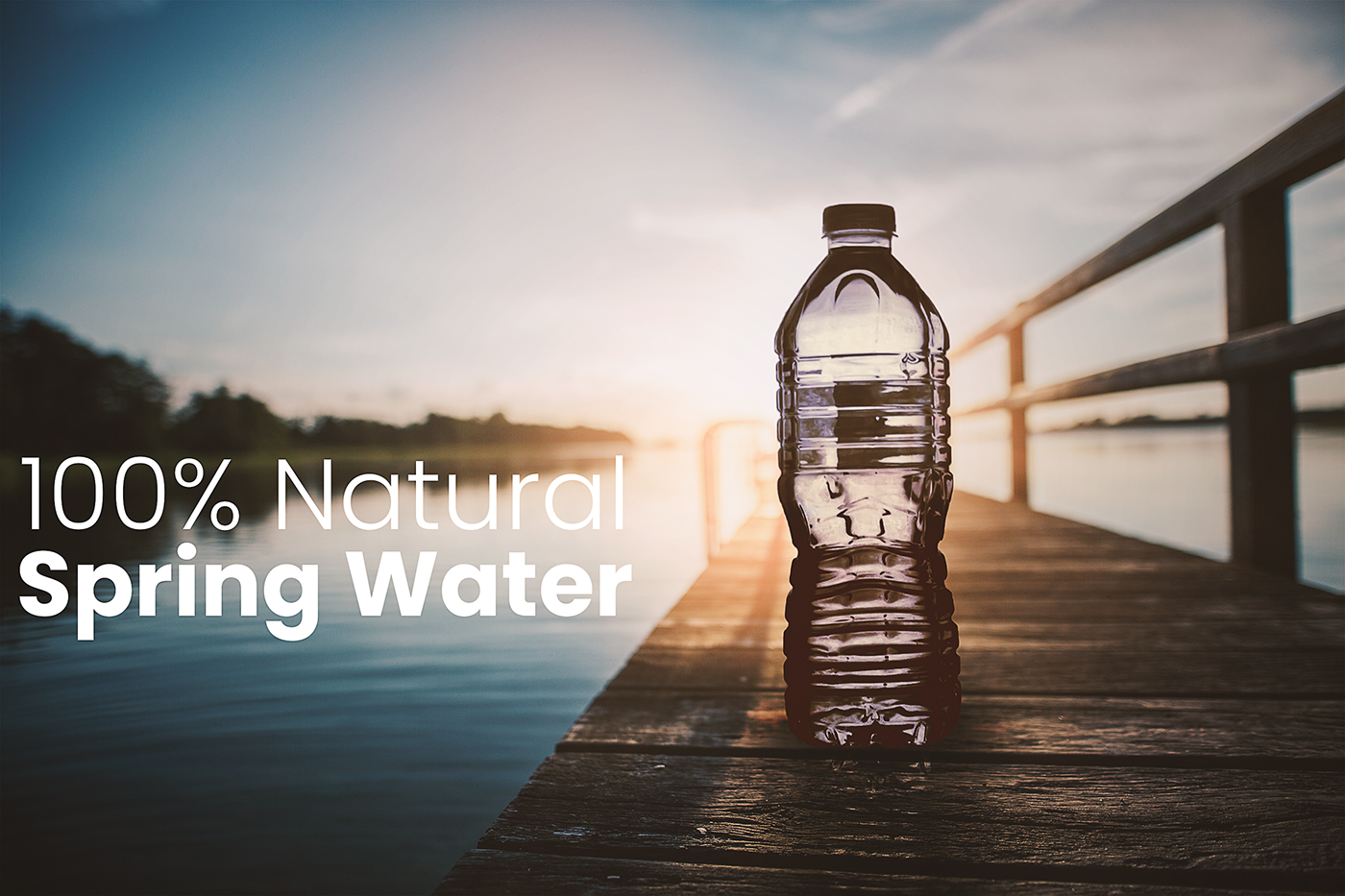
It was difficult to get the bottle as transparent as Jesus example. Creating the bottle shadow was also challenging. Any comments?
@fiery trail Nice work Ish! I think the brightness of the image is working really well. I think perhaps the bottle's shadow could be adjusted to fit the color and perspective of the shadow of the starfish. Here's a quick example. I selected the bottle, made a new multiply layer, and filled in the selection with a blue/green that I though matched the shadow of the starfish. Of course the bottle is a transparent blue, so that would likely be the color of the shadow anyway. I then pressed ctrl+shift to grab the top control of the selection and drag it down to fit the perspective and direction of the shadow of the starfish. I also blurred the shadow slightly. I then created a mask on my multiply layer and faded out the top of it, and a little of the inside. Since it's a transparent bottle, the shadow wouldn't be as dark or intense. Hopefully that's helpful!
It's really challenging to find the perfect photo!
(original photos from pexels.com)
@wind viper I love how realistic your picture is. Can you tell how you did the "chill" effect please ?
@wind viper I really like the typography and the image looks fun, but I feel like the glass could be edit to be transparent like in the video. But great work looks very cool!
@wind viper Wow! Great choice of an original image, your additions fit really naturally with it! Also really like how you handled the text, it all looks very cohesive. Great work on the shadow too, very impressive! My only suggestion is giving the glass a small shadow or something where it digs into the sand. It seems like there should be a simple dark line or something like this:
You really nailed this one, great work!
@jade glade Thank you! Sure, all of them just came from playing around inside the blending options, I used 'stroke','drop shadow', and 'pattern overlay'. Try them it's fun!
@ember frost Thanks! The glass is transparent, but it's not that obvious since it's really near the background( which is the sand) that makes it look like it's not transparent
Gave +1 Creative Carma to julie
hello photoshop friend I been struggling with this composition I have watch @lethal mural composition 3 times alredy but I dont want to desaturate the sky too much
😰 it looks so fake
@wind viper That glass is in my stack of images. LOL.
I donk want to play to much with hue and saturation
can someone help me real quick in #❓ask-a-question lol
Thanks for your feedback! @bleak fossil I was trying a lot of experiments on it. Decided to end it before my PS crash on me haha
Gave +1 Creative Carma to SamPetersonArt
@wicked nexus I think the main issue I'm seeing is a rough looking selection. If you still don't think it looks natural after fixing that then a little color correction often goes a long way. Try checking out the 14:00 mark on the Day 3 challenge here about expanding or contracting the selection to make it cleaner and avoid the white outlines: https://www.behance.net/live/videos/2979/Photoshop-Daily-Creative-Challenge-03 and this video is great for nuanced selections as well: https://www.youtube.com/watch?v=c2I7X92IVGk&list=PLD8AMy73ZVxUuKFHp5BTdVKW37-k6Qhcj&index=3&t=0s
@cold cedar I spend more time looking for good images! 😅
@hallow trench Challenge #5 is looking good! I think the color gradient and font you chose is really effective. Great contrast against the moon too!
@short mica Hah, nice work! I like how the girl on the right is looking at it. I feel like maybe the top of the bottle could be a bit brighter and warmer to fit in with the lighting of the rest of the image a touch more. Looks good though!
@bleak fossil thanks I'll review it again I really don't want to give up in this piece.
Gave +1 Creative Carma to SamPetersonArt
@wind viper I totally understand you.
@bold valley Great work Ralph! I like how you tried this technique with a different object and scene. It looks like you did something to the top of the glass to make it fit the lighting, really nice job. I think perhaps the shadow on the left side of the glass could be lightened up a bit as there would likely be more light hitting that side. Currently it looks a little too deep in shadow on that side. Might help it fit in the image even more.
@gilded pelican Nice, I really like the concept behind this design! Great use of the challenge. I think the bottle could use a little space between the frame, currently it’s cropped a bit oddly and makes for a bit of a tangent. It’s also hard to tell if it’s supposed to be sitting in the sand or sort of floating below the text as part of the ad and not directly in the scene. If it’s in the sand I’d add a cast shadow like the rest of the object have, and if it’s floating it might help to raise it up a bit more. Nice work!
@raven atlas Hah, nice job Ess! I think perhaps the distortion of the wooden boards behind the bottle could be adjusted a bit. Currently there’s part of the crack between the boards that’s unaffected, but then the seam breaks off and gets all wobbly. I’d try connecting the lines so it’s one single seam, and maybe making the distortion a bit more subtle. I also thing a cast shadow might help plant it in the environment a bit more. Looking good!
@hallow trench Really nice, selections look pretty solid! It might just be me, but the way there's a darker blue at the bottom of the gradient of the sky kind of makes it look like there's dark clouds down really low, or even almost looks like the ocean far away, hard to tell. The gradient might look more natural with the lighter part at the bottom and slightly darker at the top. Just a thought. Nice job!
@wicked nexus Really great adjustments on the sky replacement challenge Dama! Looks really natural and gives the image a very different mood. Great work on the color correction as well.
@urban berry Looking good Cindy! I think in this particular image the blur wouldn’t be quit so intense since the vehicle behind her is so close. Typically you see that more intense depth of field on objects further behind the subject. Maybe reduce it to the lower level of blur we’re seeing around the bottom of the image, that looks a bit more natural. Nice work on the selection by the way! I’m not sure if you used the refine edge tool on the hair but that might help soften up the selection as seen in this video. https://www.youtube.com/watch?v=c2I7X92IVGk&list=PLD8AMy73ZVxUuKFHp5BTdVKW37-k6Qhcj&index=3&t=0s
@plush osprey Nice work! I really like how you matched the shadow color to that of the dragonfly, looks good! I think it might help to not have the bottle so close to the edge of the frame. It's a bit awkward compositionally and might help to give it a little more breathing room. Also, if it helps I gave Ish an example of how I like to do drop shadows right below your original comment on this challenge. Might help to sharpen the edges of the shadow up a little bit to match the dragonfly's shadow a bit closer. Great work 😄
Haven't put up any of my finals here yet (mostly because I didn't want to upload photos of family members to a public chat) but I thought I'd share my day 4. Here's before
and my sky photo:
(which I took myself, btw, no filter!)
...and my final.
...Aand I just realized I forgot to create a clipping mask on my adjustment layers. Facepalm. New version.
@neat shale Ahh, really great photos for this! Love how you chose for the sunset to be coming through the bottle, great idea. Really solid work overall. I wonder if the water bottle could use a levels adjustment to increase the darks, but then masked out near the top so just the lower portion has deeper darks. I think the top looks good but the bottom of the bottle near where it's touching the ground seems like maybe it could be darkened down to match the contrast of the dock it's sitting on, if that makes sense. Would be very subtle, but might give it that extra layer of realism. Great job!
@bleak fossil Thank you! I felt like something was missing but couldn't figure it out, thought it was more shadowing on the outside but you're right there needs to be more dark layer masks on the inside lower portion. thank you so much!!!
Gave +1 Creative Carma to SamPetersonArt
@bleak fossil
Thanks for your feedback, mate.
Yeah, I kinda knew I needed to go back to it, specifically to the Liquify tool (of which I'm a fan, just not for this project).
Also, I had included a shadow, but because there is no sun, I kept it quite faded. I still haven't brought it up too much.
Again, thanks for your feedback. Lemme know what you think now.
Gave +1 Creative Carma to SamPetersonArt
Just started with the challenge🙃 ..Hope its not too late!
PsDCC6 It took me beaucoup (New Orleans -speak for innumerable) hours and images to get this done — and yet, I still feel it is not right. I just didn't want to quit on it. Suggestions and recommendations appreciated, always.
@neat shale Very nice!
@sturdy vault Rocking! I think all you need is to brighten the bottle top some.
@cold cedar It is really cool. An improvement might be the shadow on the glass should be angled. It should look like the glowing light is the source for the shadow. It currently is directed straight toward the viewer with no convincing light source. Maybe you can see the shadow from the glowing light is really strong and angled. The shadow from the bottle is different from that shadow. I hope that makes sense. However, I really like the composition, and coloring and seeing through the bottle.
@cold cedar I would make the shadows warmer. So add yellow to the shadows. She how the shadows are warm in the background? You can use the Selective Color adjustment layer for that. Which is the adjustment layer that we will work with in tomorrows stream!
Just found this site while looking for photos to use in the challenges. Its free and no sign up required.
http://www.pics4learning.com/
Thought I would share my find for other newbies with a low budget! : )

Pics4Learning
Thousands of copyright free and copyright friendly images and photos for teachers and students.
I really enjoyed that one 😄
@shadow mural Thank you for taking the time to explain. I will work on it more.
Gave +1 Creative Carma to hgt3
@lethal mural Thank you for taking time to review my submission. I look forward to the stream tomorrow (today, haha) since this one really worked me and I want it to work better.
day 6
Thank you for the feedback @bleak fossil and @glacial path . I updated the image and put it on my Behance 😃
Gave +1 Creative Carma to SamPetersonArt

Behance
Photoshop Daily Creative Challenge with Jesús Ramirez
Learned a lot from this transparency technique, powerful, thanks Jesus & Adobe Live
Day 6 Design with masks
Day 5...
@tough bone - great design, just maybe try to see what it would look like if u enlarged the lion's head to fill the left side and set the L from the text to sit on the bridge of his nose? The space above the lion's head needs something
It was all going well with challenge 6 until I linked the files to create a smart object and PS told me it couldn't do it because there was a linked smart object missing. But what a fabulous challenge! PS never fails to amaze me...
@high mesa here I was about to go to sleep. Lol.. I see what you mean. Will definitely play around with it.
@bleak fossil💙the feedback. 👌
#6
This is My Challenge 5 3D Title
SamPetersonArt thank you for the feedback. You are right I need the shadows or put it floating. Thank you.
Mykul pretty cool
@high mesa great job! Looks like it could be an actual beer ad
@high mesa that’s one big beer lol. Nice job integrating the bottle. I think the lighting and transparency effects look good. The cast shadow looks off to me though. I sometimes have a tough time with them but I think when the shadow goes off the edge of the building it would go down the side, along the road and then up the building. Now it looks like it goes straight out into the air. Does that make sense ?
Ya just did little experiment here
I think you can see the shadow on the napkin stack going vertically.
@hard sable it looks like you adjusted the focal plane to make the string of lights closer to the subject in focus which I think looks good. But the other wire on top of it would also be in focus then. It’s based on how far away it is but all on one angle or plane. Like imagine a piece of glass vertically moving away from the camera. Everything on that plane would be in sharp focus. And things in front and behind would progressively get out of focus. The angle of the glass doesn’t need to be vertical if your trying to do a tilt shift blur effect. Sorry if you k ew that. I Don’t mean to be condescending but figured someone else would benefit either way 😃
@void ermine That’s okay. Focus is very hard..😭 I tried tilt shift blur effect. It is second picture. But I think I use it timidly. And I think it's kind of ambiguous, so I'll try to fix it again. Thank you for your feedback anyway.
Gave +1 Creative Carma to Jon Leo
This is day 5. Alpaca king!!😂
Loved the Alpaca King @hard sable 😂
@coral stone Thank You!!
Gave +1 Creative Carma to Valdair Leonardo
Thank you @bleak fossil for your feedback, @glacial path also advised me the same. Here's the fixed version with lighter sky at the bottom. Indeed looks more natural.
Gave +1 Creative Carma to SamPetersonArt
This is my Challenge 6 Design with Masks
@high mesa Love your Big Beer ad. To make it more realistic, you might want to stop the shadow at the edge of the building.
My Day 6 challenge
Hello everyone, this my challenge day 6 and I realized I did a dark humor ads.
Day 6
Learned a lot again during this challenge - thank you so much Jesus Ramirez 😄
It would take some practice but it is a good to know technique
@young karma Thank you so much! I'm glad that you found it useful!!!
Gave +1 Creative Carma to Cris
Please help, i have two problems: 1. when i do gaussian blur on the background copy inside the group and put "color" to its blend mode, the gaussian effect is cancelled.
2. For reasons i don't know, i cant make smart filters to make level adjustments in my layers.
@young karma You did a fantastic job!
@bleak fossil Thanks for the feedback. I'll play around with the left side. And yes, I did put some light on the top edge.
Gave +1 Creative Carma to SamPetersonArt
@hallow trench The blur layer is set to 61% opacity. That might be too low for you to see the colors. The blur effect will disappear just leaving behind the colors. You just have to fine-tune the blur. For your second question. Your layers are not smart objects. you need to right click on the layer and convert it into a smart object.
It seems that in challenge 6 @novel flare is using direct adjustments instead of adjustment layers. Am I seeing this correctly? Why not use adjustment layers?
Daily Challenge #6 Design with masks
@lethal mural but even if i set it on 100% i'm still missing the blur effect. Could it be due to my layers not being smart objects?
When the layer is normal, blur effect is clear, but when i adjust it to "color" , blur is missing.
Or maybe i'll choose different elements and re-do it again. Maybe this elements are a bit complex?
@hallow trench Yeah, the blur effect will disappear with color. Because you are only keeping the color. That's what happened on mine. you should see the colors maybe the effect is subtle on your image because the glass and the table are white. So it wouldn't show a big change. But it sounds like you are doing it right
@void ermine - thanks for feedback, mega props for the experiment, luv the physics that you imparted with the image, will try to change it.
Gave +1 Creative Carma to Jon Leo
@fallow bough - thanks for the feedback, appreciate it and the advice too, will readjust
@young karma thx for the feedback
Gave +1 Creative Carma to Jesús Ramirez
@lethal mural Well it seems i need to copy bg and liquify it and fit onto the bottle. Thanks for all the feedback.
@hard sable lol Love the Alpaca King!
@hallow trench I was going to mention dont forget to put the background in. Once you do its going to look really pretty!
Design with masks - Day 6
@jade glade I like your ad. The bottle looks a little small though compared to the hand. I think you did a nice job putting the hand behind the bottle though!
@cosmic sparrow yeah! silly me... i was missing steps but it was kinda confusing, i thought blur was for the background of the bottle and it was for the color of background in the bottle.
@cosmic sparrow thanks! Are you say that I should make the bottle a little big?
Gave +1 Creative Carma to ahud2011
@lethal mural Thank You!!😊
Gave +1 Creative Carma to Jesús Ramirez
@jade glade Yes. You can tell that is a large bottle anyway like it would be in real life. Honestly I think it should be almost twice the size. Image the fingers opening the top and how it would look in its current state.
Day 7: Dark Tint..
vertical is the new 2.39
@cosmic sparrow thanks for the tips, and how about now for this size?
Gave +1 Creative Carma to ahud2011
@jade glade That looks better! Can you put the thumb on top of the bottle like you did the pinkie? Also, your finger shadows in the back might be off.. The ring finger you wouldnt actually see behind I wouldthink since its above the bottle.. JUST what would be behind the bottle should be behind. Like also, the shadow by the thumb wouldnt be there, so it makes it look like you have an extra finger back there lol
I feel like the fingers are too rippley
these are my fingers through a glass of water, they don't look as distorted as that
and yes, I agree with ahud, the thumb should be on the water bottle, otherwise this would be a pretty uncomfortable hold lol
Tried to create feel that wasn't in original. Added green-teal grade and cropped to give feel of ticked off kid with possibility of trouble.
Original
Darkened a bit to increase tension.
@fallow bough I love the narrative you are telling in this image. Lol the girl behind her definitely looks ticked off.
@supple lion I like that you put focus and emphasis on the punching bag and blurring the guy in background. Grey scale for this image really works!
@ember frost Thanks. Searched for kids photos that I could add "evil" feel to. This one's not quite evil but does the trick.
Gave +1 Creative Carma to julie
@fallow bough I think the green tint is creating this scary movie vibe. Maybe you could add a vignette around the image.
@ember frost With vignette
Day 2 - Had a bit of extra fun with moving the dancers closer to the centre of the circle area. Its a bit rough and I think I could do better if I started over but I am keen to move on. : )
@cosmic sparrow and @young karma how about this? And thank you!
Gave +1 Creative Carma to Yazeed
https://youtu.be/ZtfaqYo1_KQ
https://youtu.be/RJojeJ3Wzgc
Here two videos may help, the second one is a color vignette. @fallow bough

In this video we'll be covering a non-destructive way to add vignettes to your photos. If you have any questions or suggestions feel free to comment below or...

In this Photoshop tutorial, learn how to add a color vignette to your photos and designs with the gradient overlay layer style. Free Illustrator Course: http...
Day 7 / Color 😀 Gradient
@jade glade looks great, good job!
Day 6. Anyone else find this super challenging? I had a difficult time with photo realism and I am not sure what my issue is. My choice of images? What?!
Looking good! I personally would choose a different background, only because I'm not sure what's going on with it honestly, but that's just preference.
😀
Day 7 Colour grading
First attempt, might try again later.
Blur and color grading
Day 7: Before color grading
my attempt🙂
Day 7: After teal/orange color grading!
After Research Color Correction vs Color Grading. 😀 😋
Day 7 - Challenge
@ember frost Thanks. Didn't realize you were suggesting color vignette. Tried with 21:9 version and had no top/bottom vignette. Recropped to 16:9 to get a little. Not sure that it adds much though.
Gave +1 Creative Carma to julie
Here's my contribution to PSDCC - Day 7. I definitely need to read up on colour grading to get a better understanding. Great, interesting challenge, @lethal mural!
As always, constructive feedback welcome.
catching up to day 3D text
you can find the original creation to: https://www.etsy.com/listing/686768246/red-titanium-aura-crystal-hedgehog?gpla=1&gao=1&utm_campaign=shopping_us_CrystalCarving_sfc_osa&utm_medium=cpc&utm_source=google&utm_custom1=0&utm_content=17909796&gclid=CjwKCAjw-ITqBRB7EiwAZ1c5Uz7_5wzXr47b6zO81sT1p60JQ5FXJhHE9rlpzisbf8bveijmA_8sjBoCgqEQAvD_BwE

Etsy
Material: Aura Crystal Size: 55x45x38mm Weight:117.4g SKU: HE220 ★★Please Note: ★★ After you buy it, please add your ★ PHONE number ★ to the order. Then I could write it on the waybill. Thank you. The item is the exact one you will receive.
only the text
Challenge 7
Went for a bit of a spooky adventure feel as the playground was next to a graveyard 👻
Day 7 challenge
So I've slightly reduced the overall intensity (thanks, for the suggestion, @gilded pelican). I've also desaturated the subject's red trainers a little and added a bit of grain to the whole image. Hopefully, it's a little more pleasing to the eye.
Oh yeah... those adjustments made me also take another look at the 3D text; the bevel direction was set to down instead of up. I also took some of the brightness off, so it would better blend with the adjustments made on the image. I tell you, these challenges really open your mind up! So does constructive feedback. Thanks again, Iggy!
Gave +1 Creative Carma to IggyPop_PBT
Day 6
Here's my Project Jesús, to date. I'm sharing it because I'm pleased. I'm pleased because I've learned soooo much in the space of two months (haven't forgotten your input, @sterile bane)! You guys, mentors included, make me feel like I should be doing this for a living! I'm already looking forward to the next series of challenges!
https://www.behance.net/gallery/83442419/PSDCC-July-22nd-August-2nd

Loved your cover @raven atlas , and great job with the color grading, I like the way that the left light is emphasizing the title! 😃
Color Grading - Day 7
Thank you, @coral stone. That's what I mean... I'm now thinking about what I need to do instead of just doing anything and hoping it turns out ok. Furthermore, feedback is underrated, man.
Gave +1 Creative Carma to Valdair Leonardo
@raven atlas Yes! It's all about learning the concepts. Once you learn about them you can combine the tools and get a better result. Feedbacks helps a lot in this, whether you are giving or getting.
@silent ermine I really like your take! Great job!
@wide cave Try making the bootle larger. It and move it up to get a better perspective.
@neat shale
I absolutely love your bottled water representation!
Here is my Challenge Day 07. Thank you.
Wow @gilded pelican! This feels very magical ✨ , great job! My only suggestion is to remove or reduce the effect on this part of the grass. 😃
My entry for day 7✌ Any feedback is welcome. Thanks!
@bleak fossil Thank you for the feedback and the gif demonstration for the day 6 challenge it helped me out😀
Gave +1 Creative Carma to SamPetersonArt
@bold musk
Very nice! I'm loving that background and the fact that you've got the raised hands in the middle of the sun.
Because the statue is in front, it might be an idea to darken it [the statue] a little more, just so it stands out against the beautiful background.
Nice work, though!
@viral ibex I like the added text. I am curious how it would look with "The Fight"in the upper left and the "RStrong" in the lower right. In my mind I see a strong line as they lead the eye through the action but that is just a wild thought after a sleepless night. What do you think?
@raven atlas Yes, the challenges teach us so much more that just the steps. We learn to look, to discern and to seek the je ne sais quoi.
@cold cedar
Absolutely!
It seems the best idea is to make a blue-orange selective color, but i wanted to explore purple-yellow.
Image after color grading
I retouched the image according to @coral stone Advice, hope it is better
Image before grading; I decided to use an image from 2011 which was shot with a poor quality sensor, just to see what is possible with lower quality imagery
Re worked the shadow and it looks much better
@void ermine - thx for the tip, looks much better
Gave +1 Creative Carma to Jon Leo
Before - original photo
@gilded pelican nicely done! The cool tones really add a new look 😃
@blissful badge Nice, the blue/orange color scheme looks great 😃 If you like, try out other color combinations! You could move the blue-ish color wash to a more green-ish teal color 👍
@blissful badge the action shot also is really cool! Just make sure to refine the mask here:
Day 7 / I was more extreme with this😆
@glacial path Thanks, yes I will improve on that. Always great feedback!
Gave +1 Creative Carma to evil
@thick vale ha! now THAT'S a bold color 😄
@thick vale I think you could mask out the shirt and person so you don't have pink everywhere (instead of masking him out entirely, you could leave a hint of pink on him) 😃
@vagrant sorrel yes! the new color grading makes so much more sense! You have brought more warmth do the image while simultaneously adding a contrasting blue tone which absolutely works 😃 I wouldn't go too dark though 😉
@glacial path Thank you for the feedback, refers to the dark edges?
Gave +1 Creative Carma to evil
@vagrant sorrel mostly about the shadows between the leaves and on the hair. Some people say you should never ever use a vignette - I'm not one of them. If you like the look - go for it! As long as you don't lose too much detail, it's an artistic choice 👍
Well done @wind viper! Did you apply a vignette effect?
Thank you @coral stone , yes I did, thought it would go well with it?
Gave +1 Creative Carma to Valdair Leonardo
@wind viper It's awesome! I really like how it draws the attention to the family. Great job 😍
with the correction of @Tim Mebest, apply a less dark contrast to the leaves surrounding the child.
@bleak fossil Thanks for the feedback. I didn’t refine edge tool on the hair. I will fix that and the background blur.
Gave +1 Creative Carma to SamPetersonArt
I think I fixed that area. The original photo was not masked by someone who was taught by Jesús!!! @glacial path @lethal mural
Day 7
@bold valley great work on the colors, one thing I will say is the masking the skin you could go back and clean it up with the brush tool it will help to refined the edges. 👍
@vagrant sorrel Very effective changes! Your color grading and changes seem to really suit the image better. Makes the child's face more of the focal point than the jacket and adds a nice mood to the whole thing. Well done!
@wind viper Looks great! The color grading definitely adds a certain mood and cinematic element. Always interesting how a simple color shift can change the feeling of an image.
@short mica Nice work J Lewis! Color shift looks solid.
This is my day 5 - A bit behind....
@thick vale Hah, he's a man who really loves pink. The way you kept the skin tone in tact really make it feel more realistic, like everything is pink rather than just a filter that changes the color of everything including the man. Though I wonder if taking the color grading off the glass reflection of the window might make it look more natural, as if the lights in the reflection are still a normal color. Looks solid!
@blissful badge Nice work Leslie! The droid is looking solid, really makes it pop. The karate guy looks good too, it just looks like his sleeve could use a little clean up where the color pass seemed to miss. Might also be nice to add a bit of a vignette to the image too so the white space doesn't feel quite as empty and directs focus to the figure. Though that might depend on the feel you prefer.
Day 6: Design with masks. When someone ask me to recommend Polish alcohol. How did my bottle turn out?
This is my day 7, this is my original picture
This is the after picture:
This story is a lighthearted comedy action movie about cat. The cat is adorable and innocent. But what you don't know that the cat have a sneaky, horror, and mischievous dark side.
Day 7 Before and After
@bleak fossil Thank you for your feedback
Gave +1 Creative Carma to SamPetersonArt
Running a bit behind here again. So I did kind of a different idea with the bottles. I took an image and tried to put it inside the bottle instead of behind. Most of the techniques worked great so thanks @lethal mural - awesome stuff . It got a bit complicated as there were extra layers to deal with the image inside the bottle and the background image - which I decided to just go with something simple and made it a poster. I feel like I cheaped out a bit with the background, but I wanna get this done lol.
Gave +1 Creative Carma to Jesús Ramirez
Thanks @bleak fossil ! Yes, it's really interesting, especially the unlimited possibilities PS can do!
Gave +1 Creative Carma to SamPetersonArt
Here is my Day 6~ Masking/adding a transparent item. Any feed back would be appreciated. Thank you
Definitely not the greatest, but I really enjoyed the tutorial . 🤓
Hello everyone, here is my fixed for Day 3 challenge. Any feedback is welcome.
@lunar abyss I think it is a good job. Just need to get rid of that whitish part.
@scenic anchor great job! The bottle really looks like a part of the scene, very realistic!
Thank you @coral stone I am so happy to be here and learning so much. I appreciate your encouraging words.
Gave +1 Creative Carma to Valdair Leonardo
Revised my designing with mask image. @shadow mural @lethal mural is this better?
@cold cedar thanks for the feedback! I tweaked it a little but I can see what you mean. 😃
Gave +1 Creative Carma to ValentinePierce
Day 6 Challenge – Not stoked with the perspective of the bottle
#7
PsDCC7 working with color.Feedback appreciated.
This is my Day 5 challenge
@rough tangle Perfect...
@scenic anchor excellent work! I think you could make the bottle look even cooler if you added a little more distortion to the part of the scene that is visible through the glass!
Thank you @jolly quest I will try that.
Gave +1 Creative Carma to VooDoo_Val
@cold cedar great! Love that the color of his skin is so vibrant! Looks awesome
@oak ermine ooooh nice! I bet it would look awesome with some text coming of out of the clouds, shrouded in fog
I am not sure if I over did this one. I do appreciate feed back. Thank you.
That’s such a great image. The water is so clear it’s almost like they are just standing on the rocks!
@scenic anchor is love to see a version where the ducks are slightly warmer but this looks cool as is
Thank you @jolly quest Those are fish. lol. There were so many.
Gave +1 Creative Carma to VooDoo_Val
@cold cedar love the first version of the light and bottle where the lamps light is reflected more on the side! Also a great added touch blurring the background within the bottle
@mint kayak nice! You might even want to make the bottle shadow thinner in its center since the bottle is so clear
@urban berry love the day 3 piece! I wonder if the girl would pop more if you desaturate the bold colors in the top left corner? I say that because my eyes go to the girl and then straight to the corner and my focus should probably stay on her
Great work @hexed geyser you could even as a soft blur at the edges if you want
Nice work @wind viper !
@jolly quest I pushed the yellow tones. What do you think?
Thanks @jolly quest
Gave +1 Creative Carma to VooDoo_Val
Day Color grading
Before and after ...Challenge 2...any feedback would really be nice as i'm trying to up my skills🙂
Challenge 3..before and after🙂 i'm actually learning some stuff that i didn't know much on Photoshop..😃 so cool
Day 5 3D title
hi
@bleak fossil😆
Challenge 4.....it was quiet tricky😔
cimenatic effect
Color Grading challenge from one of my photos I took..
Challenge 5🙂
Before Color Grading Challenge
@cosmic sparrow Great job! I love the change. It really makes it feel more gritty and determined and yet with some hope. Like her efforts are going to pay off. Nice job! The original photo was great too I think though. 👍
@void ermine Thank you! I agree.. I was going for a more gritty darker appeal.
Gave +1 Creative Carma to Jon Leo
@willow idol I love your bottle & design concept 👏🏼👏🏼👏🏼
Thanks @jolly quest.
Gave +1 Creative Carma to VooDoo_Val
@ember frost Thanks, Julie. I'll work on that a little more.
Gave +1 Creative Carma to julie
@silk heath thanks.😀 i wasn't sure if i did the bottle correctly😖
Hey everybody! @reef rover and @vale socket will be reviewing two portfolios on Adobe Live in 1 hour! Fill out this form for your chance: https://forms.gle/ktbHxJdnYQYiGRPQ7 and tune in at: https://www.behance.net/live/adobelive
@wide cradle I like the white particles!
Day 8 - Make a composite
This is super cool @fallow bough! I love the flow of the path blur you made. This is totally optional, but if you want to play with the position of the shoelace you can use the Puppet Warp tool. Great job! 😃
Day 8 - Make a composite
Wow @young karma I really like these flares!
@coral stone thank you ☺️
Gave +1 Creative Carma to Valdair Leonardo
PsDCC8 Compositing. I'll do this one again with other images when I have some time.
I loved this challenge! So cool
@gilded pelican Love it! https://www.youtube.com/watch?v=8bmbSC9c2ys - Put on your High Heel Sneakers!

Writer: Robert Higginbotham ● Releasing date: Feb. 1964 [UK] ● Format: 7" single ● Label: Checker Records (#1067) [Usa]; Pye International (7N 25238) [UK] ● ...
Day 8 / Make a composite 😀
@thick vale Super cool!
@coral stone Good suggestion. about warping the shoe lace to turn it around. Other was too much trouble so masked. Also added old Converse tag line.
@fallow bough Amazing ❤
@fallow bough very good Converse are my fav sneakers you did a great job!
@tulip fern Cool composite!
Original image
Day 7 Before and After!
Thanks @gilded pelican !
Gave +1 Creative Carma to IggyPop_PBT
@thick vale Yours is my absolute favorite of the day.
Challenge #8
I really like your Day 7 @thorn geyser . I was wondering if you would combine this one with your Day 4 sky to make it even more powerful?
@C thank you C
Day 6 Design with mask
Not sure if its all gone a bit off piste
@tulip fern I could give that a go! 😄
Make a composite
Day 8
Just having some fun combining a little of all the challenges from the last few days.. Any thoughts what else I could add?
Original before^^^^
@cosmic sparrow either saturate the background or desaturate the cup, right now they seem very out of place
@young karma I definitely get where you are coming from.. I wasnt so much trying to have it blend and look natural. If that makes sense. Kind of wanting the hand to really just stand out against the background.
Try blurring the background then, might look better than washing all colors out of the background
Also, it looks like you've put a drop shadow below the hand, do the same for the other elements, the cup and coffee, to make it stand out even more
@young karma Ok, i just blurred the bottom of the hand, which i think looks a bit nicer. Ill blur the background more.. and Ok to the shadow! Thanks!
Gave +1 Creative Carma to Yazeed
You're welcome!
Anyways, here's my try at the day 7 challenge, color grading, before
After
😀
@young karma your challenge for day 7 would look even cooler if the guy were in the center of the circle. I love the color grading by the way.
@gilded pelican Thank you! I could try and move the carpet and erase the guy's arms using the healing brush tool, but this challenge's about color grading, not carpet moving, so maybe I'll try it later.
Gave +1 Creative Carma to IggyPop_PBT
Day 8 Make a composite
Day 8 Challenge
@dusty pond looks great! just be careful with his part right here. maybe you can soften this edge 😃
@short mica I think you should add something to the background - or you could add some really bold, white text next to it. Just something so the background isn't pure black 😃
@glacial path had linkage issues with the download starter kit , did figure out the library relink procedure f,... Surprisingly had a lot of technical issues.... best way to learn. Your time feedback and knowledge much appreciated🕊️
@jolly quest Thank for the feedback, I will try to fix that.
Gave +1 Creative Carma to VooDoo_Val
@fast moth I love how vibrant everything is 👍 The selection is pretty clean! Here is one very minor thing you could improve: there is a super thin white line around the shoe
@fast moth to fix this, you can select the shoe and pick this filter:
@kindred kernel You did a great job with the contrast! The shoe looks very crisp and the colors are punchy! I think you can add some saturation to the sparks 😄
@young karma ah! the classic orange-teal look 😃 I don't think you have to go with such a rich and vibrant skin tone. You can bring it back just a bit to make it look more natural. The background is just lovely! Now if you could combine the background blur of the previous challenge with this one.... hmmm 😉
@cosmic sparrow yes, like Yazeed mentioned I would get rid of the drop shadow. The saturation of the hand is not too bad but the liquid is just to dark 😃 But I love the pastel colors in the background so you should totally keep them!
@wind mason Now that's an interesting idea - pretty abstract 😄 . I think you should tale a closer look at the lighting of your scene. The white bears are a bit too bright - the shadows could also be darker
blend modes could be the way to go
especially the multiply blending mode 😃
@hallow elk wow! well done - this looks pretty much photorealistic! maaaaybe the shadow caused by the transparent plastic could be a bit brighter and the bottle cap could slightly darken the shadow
a bit late but here is my challenge 5
@hearty karma Nice job! the texture looks great and the colors are on point! I think you could add a subtle texture to the background just so it's not pure black 😃
@glacial path Thank you for the feedback! and yeah, I may have overdone the skin tones a little bit, also, if you look closely, there is a little bit of blur around the edges, same place as the vignette.
Gave +1 Creative Carma to evil
Still playing catch up ! Gahh! Here's my colour grading assignment : It's a composite of a video game screen shot and a photo I took.
Original
Day 7 of the photoshop Challenge.This is the before image.
This is the after image. I was trying to go for something that has a cool colors that has a pop of action .
Challenge 6. It was quite difficult finding an image that was a water bottle so I found this image. made it look as if there was Ice Tea instead of water lol. I tried
Day 8 🔥
Day 8 challenges 🍃
Day 7 - Color Grading
Day 7 Challenge
sans sparks but turned out ok I think. Let me know what you think 😃
Day 8 attempt at being creative.
@cosmic sparrow Very nice! The way you structured the format of the image and the faded background looks like there should be some sort of text, like this would be an advertisement somewhere. The space to the sides almost looks too unused as is. So I'd say try adding some text or maybe give it a tighter crop and allow the background to be less faded. Really nice job on this image!
@regal prawn Haha, nice work. It could be cool if some of the hard edge around the speed blur parts was broken up and warped into the blur. I think in a product image it's good to keep the whole product in tact but it might work better with this image. Looks good!
@void ermine I think without the sparks works pretty well since everything is in a more calming blue tone and the sparks might not quite fit the image as well. I think perhaps the shoe could pop a little more. Maybe by using a levels adjustment to boost the lights, and darkening down the background slightly? Nice work 😄
@mint kayak Nice! The bolder tones definitely give the image a nice feel
@wispy compass Nice work Babsams, there's definitely a noticeable contrast between the warm and cool colors. I think a levels adjustment could really help this image to draw more clarity and focus into the main subject by boosting the lights up.
@jade glade Really cool! Great animation effect, really neat to see someone take it in that direction. Love the consistent color palette too! It might be nice to have a frame or two show the entire shoe unobstructed , so the whole product can be seen a bit but still have that cool effect coming in and out.
@void ermine Cool idea with your color grading challenge 😃 Maybe nice to try that myself as well.
@bleak fossil thanks! I am still new to animation, do you mean I need to make more or slow down more?
Gave +1 Creative Carma to SamPetersonArt
@jade glade More like fitting in a frame or two where you can see the whole shoe unobstructed. Currently there's always an effect on the back of the shoe so the view never gets to see the whole thing. So it might look good to have a quick couple frames where the effect flashes off and then right back on. So you still get a cool effect but get to see more of the product. Just a thought, not quite sure how it would look without seeing it.
@ember frost Whoa, nice work! Really great concept with the flames and sparks representing the color and style of the shoe. The black background really helps the shoe stand out in a very effective way. Great job!
Okay, thank you again for explain it to me @bleak fossil!😊
Gave +1 Creative Carma to SamPetersonArt
@hearty karma Well done! It's always fun to try something a little different and challenging. Really nice job on the warp inside the glass. Maybe the dark lines between the wood could be a bit more blurred or faded to a less dark color? I feel like the tea might cloud the details in the wood in that way a bit, perhaps on the straw a bit as well. Might also help to extend that dark color towards the bottom a little bit more. Looks good!
@glacial path thank you for your advice Challenge #6
Gave +1 Creative Carma to evil
Challenge 6
Update 😀
@void ermine - Hey, nice colour work, blurs compliment the shoe; as a comparison, fade the BG even more, the patterns take u away from the shoe, and try duplicating the blurs a few times to thicken the effect. See how it compares. Good clean image on the shoe though.
challenge 8
@bleak fossil Thank you! Yes, I was going for an advertisement look. Still working on it, thanks! 😃
Gave +1 Creative Carma to SamPetersonArt
Gave +1 Creative Carma to SamPetersonArt
@bleak fossil thank you so much for your feedback!
Day 08! (this is just a screenshot so it doesn't look very sharp)
I'm late as always - I've put colour grading and 3d text together...
#6 comes late...
@paulvansomerren hi, I made a mistake, here is the correct file. When I export the file it gives me the one on shutterstock, I actually just print-screen this one. I don't know what I am doing wrong when exporting this file. Thank you for the correction, never my intention to plagerize, anything, not at all.
@bleak fossil @glacial path here it is a new version, I hope it improved some features you mentioned. I hope you like it.
@wind viper I really like the idea and the color platte from the shoes. I feel like the white cloud sparks (idk what you call it but near the shoe) I feel like the white it bit too intense maybe lower the fill opacity so that we can see more of the shoe. I hope that helps but other than that great idea👍
@zinc lava @jade glade here it is the cat blur corrected. While using the Quick selection tool, I missed that spot.
Updated Pic from yesterday combining some of each challenges through the week. @bleak fossil @young karma
Thanks @high mesa and @bleak fossil will try to implement all those ideas! 👍
Gave +1 Creative Carma to SamPetersonArt
@bleak fossil thank you... I will work on increasing the light!
Gave +1 Creative Carma to SamPetersonArt
Now it is prefect, @gilded pelican! 😊
@jade glade Thank you, I had to change the software language to English to find the Blur gallery, it was really hard for me since it was in Spanish. Thanks for your input.
Gave +1 Creative Carma to Bubbles
I am glad it work out for you and no problem @gilded pelican.
Day 7 Color grading
@bleak fossil Thanks for your feedback. I was trying to use my own picture and should have made my original edits to picture - then saved and opened that file as making edits first then continuing left me with extra bits. Still learning! which feels good.
Gave +1 Creative Carma to SamPetersonArt
challenge nº8!! and ready for the final one.
@gilded pelican some of the cat face is cut out near his/her whiskers and something else is added to his/her face. maybe its part of the background
day8: Make a composite
@cosmic sparrow looks amazing, great job my dude
@willow idol Can you advise me what tool to use to get rid of this detail? Quick selection tool is not such a great choice.
Did this before in PS timeline using frame animation
@gilded pelican i would recommend to zoom in on his/her face really close and use the quick select tool with the + and - to get select what you want to crop. another way to get the details is by using the using the short cut Q, it turns everything red but what you want to crop out. you can correct your crop but painting with white to add to your crop and black to remove from your crop. I also cut out the whiskers when they are out like that. i just follow the head shape. i used my last work to show you how the shortcut Q works. tell me if you don't understand me. if possible you can message me.
how does this look? try to make a girly one and support business women's
Day 9 Finally :
@wide cradle that is really cool! Nice work.
thanks @pastel spade
Gave +1 Creative Carma to Chad
@willow idol Thank you that was really helpful. Third time is the charm. Here it goes .
Gave +1 Creative Carma to Catherine_Jablonska
@gilded pelican Looking good! I think the text/water could even be scaled up a bit more to really make it the focus of the ad. Maybe something like this to really push it as the focus a bit more: (I also brightened the water bottle slightly)
@gilded pelican your welcome. its a lot better now😺
Day 8: Design shoes advertisement. Any thoughts?✌
@bold musk i like it but my focus goes more on the tattoos. maybe because i like tattoo.
😊
@willow idol Yep, tattoos are pretty good. They are suitable for shoes, I guess
Day 9 Practice https://youtu.be/528NSlxS5kY

How do you save the timeline as a gif? I ended up with a mp4 file.
@viral ibex I don't know if this will help but this is the link: https://www.google.com/url?sa=t&source=web&rct=j&url=https://helpx.adobe.com/photoshop/how-to/make-animated-gif.html&ved=2ahUKEwjnmeLH5OTjAhXwuFkKHS6VCv4QFjABegQIDxAH&usg=AOvVaw2lF7iIkleWZmG-WAXmPzbP
Or this video: https://youtu.be/omdfcGYEqPY

Get more details on Adobe Photoshop here: https://www.adobe.com/products/photoshop.html Learn how to export drawings or images from Adobe Photoshop layers an...
@bleak fossil Wonderful, it is great, this really helps. I have learn so much in this challenge, you have no idea. I'm no longer afraid of photoshop!
@bold musk very nice I love the whole aesthetic and the red and black and the typography complement the image really well
Day 9, A lot to learn, planning the timeline, a lot of fun though
I think I'll just use after effects for this one thanks lol
I had to reduce the quality in order to post it here. But you get the main idea. Thanks for a great 9 days...see you next time.
Monty Python inspired animation.
Day 9 :):beetle:
Forgot the shadow.
That's funny
Finished version of day 6. Haven't had a chance to share bc I've been offline a couple days. Now photoshop is acting up on me D: https://www.behance.net/gallery/83613169/730-Photoshop-Daily-Creative-Challenge-Day-6
Behance
I've tried doing water bottle mockups before but my issue was it never really looked realistic. So I'm really proud of creating this!
@young karma the first one to me, because on the second, the leaves seem to me a bit overexposed. The effect of particles on the first composition is also better. Nice composite.
@gilded pelican Thank you 😀
Gave +1 Creative Carma to IggyPop_PBT
Day 9 (Day 8 recycled)
@young karma very nice work!
Thank you @ember frost
Gave +1 Creative Carma to julie
Something goes wrong when I downsize the image so that the video has lower resolution (as required to be loaded) - the moving object starts to appear in weird places 😦
Decided to combine Days 8 and 9.
@young karma I had the same problem. Tried resizing the PSD file because I kept crashing the Save for Web due to running out of memory (wishing I went with 32GB instead of 16 when I bought the PC). I found closing all the programs, including Ps and then just opening the PSD freed up enough memory to resize in Save for Web..
@young karma If you're going for MP4 instead of GIF and you have CC, you can resize or compress the MP4 file a bit with Media Encoder.
Take 2 on the shoe... Levels tweak, and blurred bkg...
@bold musk Looks really nice! I'm not sure what to critique because I'm not sure what you did, but I think it looks cool. I like the tattoos, the exaggerated colour and brightness and shiny shoes. I think the typeface works, but I thin it could be higher. There's a lot of neg. space on the top left. That may leave too much neg. space between the text and the black stuff - which also looks cool. So creating another problem to solve there. The quote ' for special women' and 'seviller' I'm not sure if that's a real company or what, but it sounds like.. I'm not sure ... sometimes special can mean special, and sometimes it seems like a sarcastic 'special' I'm not sure how it comes across here. But overall, I think it has a pretty rad kind of vibe and works pretty well despite what I may have sounded like here.. trying to come up with things i'm unsure about to hopefully help you out 😃
@gilded pelican Looking good! I think the text/water could even be scaled up a bit more to really make it the focus of the ad. Maybe something like this to really push it as the focus a bit more: (I also brightened the water bottle slightly)
@wet thistle Nice work Carry, I’m liking that repeated yellow color through the image, gives it a nice balance! I feel like the background being darkened down a bit more help the focus onto the shoe. It doesn’t have to be much, but a slight adjustment might make the two images compete a touch less. Nice work!
Done! I think my file is too big so I'll just share the link here along with the other challenges that I compiled on my Behance project: https://www.behance.net/gallery/83718837/Photoshop-Daily-Creative-Challenge

Behance
Batch 9 of the Photoshop Daily Creative ChallengeJuly 23- August 02, 2019.
This is my first ever project I uploaded and hoping to add more awesome creations! Thank you everyone for your help!
@wind viper Wow! What a beautiful presentation! Amazing job ❤
@gilded pelican Nice work on the cat animation! I like the way its face animates when its coming down to the ground. The scaling looks cool, makes me thing of squash and stretch in animation. Could be cool to try making it hop up in the air using that idea. Nice job!
@coral stone Thank you! All done with Photoshop magic! 😊
Gave +1 Creative Carma to Valdair Leonardo
https://twitter.com/i/status/1157456795297886208
not sure if this will work, but the file was too big for discord, so here's a link

@ame2019 @fabriclondon @Fac51hacienda @ronisizebristol Never underestimate the power that a nightclub brings to culture, memories, emotion and community https://t.co/uncK27HgYn
@wind viper Very cool! I've used Photoshop for simple GIFs before but it was interesting to see how it can be used for smoother object animation as well.
Also great work on your entire DCC project! Really cool to see everything you’ve done the past two weeks. Well done!
@high mesa Haha, I was wondering if one of these would have audio. I realized I automatically expect it when seeing a video or animation. Did you use Photoshop for the audio? Just realized I'm not even sure if Photoshop supports that or not. Love the color scheme too!
@willow idol Really solid looking! I like the color scheme on this, that blue/green color is looking good. Might be a nice look to darken it down a touch to make the shoes pop even more? Also really nice job with the blur behind the shoes, adds a cool effect without being too overpowering. It might also look nice to scale the shoes up slightly, make them a bit more of a dominant element in the image. Looks good!
@bleak fossil - yes, just edited a track and placed it in; its not brilliant for syncing animation too like AE, but hey, its pretty cool what u can do in a short time
For sure, very cool!
@bleak fossil - once again, thanks for your support, and the DCC live sessions
Gave +1 Creative Carma to SamPetersonArt
No problem! Always happy to help when I can
Thanks @bleak fossil couldn't have done it without you and everyone's support! I redo(re-did?) my animations for a few times, I even have a separate document just to test things! 😅
Gave +1 Creative Carma to SamPetersonArt
@hallow trench Really nice work with the color scheme and the sparks! I like how you matched the text color to the shoe, very nice.
@hallow elk Definitely pushes the contrast and bold feel of the image. Nice work!
@gloomy marsh Looking good! Nice work on the Lion King and water bottle challenge! It could be nice to see the Lion King image with a subtle gradient. Maybe something that goes slightly darker and more red at the bottom, and brighter at the top. Might push that feeling of contrast and make it pop a bit. Water bottle looks solid as well! I’d just have the crop of the image so that it gives a bit more space to the bottom of the water bottle. Currently there’s a bit of a tangent there where it cuts off. Well done!
@cosmic sparrow Oooh, nice work! I’m liking the edits on the coffee image. The text definitely seems to fit with the background you have. I’m not great when it comes to typography, but I wonder if a subtle gradient on the brown text could help? Maybe somewhere where it gets slightly lighter at the top? Just a thought. Nice work!
@fallow bough Very nice Ken! It's really interesting to see how much can be done with just Photoshop. I think in terms of this being an advertisement the shoe could maybe use a levels adjustment to brighten it up a bit, and maybe something done with the colors just to make it really pop out and look good. Well done! Also really nicely done with the man on the sidewalk, haha. Lots of good movement there.
@blazing quail Great work Ant! Definitely seems like a whole new workflow to learn once you introduce animation. But really cool to see how much versatility Photoshop has. One suggestion I think might help would be to slow the text down slightly. It seems like it might be good to have each block of text pop up at a natural reading speed. Might make the whole thing flow a bit better. Well done!
@young karma Wow Cris, lots of elements going on this bird animation, nice work! If you wanted to add even more it could be nice to see a subtle pulsating of that background glow while the bird is flying forward. Might give the whole thing a more dynamic feel with animation in both the background and foreground. Looks good!
@neat shale Very nicely done on Day 6! Looks really solid. If I had to nitpick anything it might be that the text looks a little crowded being so close to the edge. A little more room between the edge and text might help.
@blissful badge Really nice work Leslie! Really glad you could join us for this DCC! It could give the animation a more natural look to have the first balloon still drifting slightly at the point where it currently stops. So the stop feels a little less abrupt and static. Just a thought. Nice work with all the masking as well!
@viral ibex Really nice, looks like you were able to play with a lot of different elements for keyframing. Nice work Dee!
@kindred kernel Nice work Gerard, you got some nice motion in there! Might be nice to have the text/image at the end match the color scheme of the animation for a more cohesive feel. Looks good!
@bold musk Really like the bold red and black you have repeated in the image! Nice cohesive look to the whole thing. It's a small nitpick, but the area underneath the shoes looks a bit visually confusing. The kind of light blurry area seems like it might read better if it was just a shadow. Really liking that white background by the way, works really well.
@gilded pelican In regards to the cat face, it seems like some simple selection refinement might help. I personally found this quick little video extremely helpful in getting a nice clean selection. Specifically the step where they use the "refine edge brush tool" vis the quick selection tool. https://www.youtube.com/watch?v=c2I7X92IVGk&list=PLD8AMy73ZVxUuKFHp5BTdVKW37-k6Qhcj&index=3&t=0s
@wide cradle Very nice, definitely a cool approach for this challenge! I'm liking that smooth transition from one design to the next.
@willow idol Looks good, I like the theme you went for! The main issue I see is that the text and orange graphics seem to be contrasting more than the shoe itself. That orange is a strong contrast against the blue, but the sort of neutral color of the shoe isn't, and also the value of the shoe is really close to the value of the blue. Maybe try and see if you can increase the contrast between the shoe by darkening the background, lightening the shoes with a levels adjustment, fading out the graphics behind the shoe a little, or some combination of these adjustments. Nice job!
@pale lichen The 3D text and water bottle images are looking really nice, great job! I really like how you masked the text behind the girl a bit, but I think you could push it further. At a glance it reads more like a tangent with how the upper part of the "S" is touching her side. Might sell the effect and depth more if you move the text a couple more notches to the left. And the bottle looks great, the only thing is it looks like there's a small selection at the very bottom of it that could be cleaned up. Good stuff Darius!
Here's my take on Day 9 Challenge, need to work on the timing and get the ship going in the right direction! 😃 Uploaded as .gif, mp4
file was too large.
@young karma Looking good! I like the little addition of the sparks on the top area like it's scraping a wall or something. Really nice contrast of the shoe against the background as well. It might help to scale up the texture in the background to fit the whole image. Nice work!
@unkempt field Nice, you got a lot of good motion in there. Timing is definitely the key in antimation, but once you figure out the tools you can really go deep into really fine tuning timing. Liking the addition of the text too! It might be nice to cut to the text before the animation in the previous scene stops to give it a more natural look.
Hello everyone, my Day 3 challenge. Any feedback is appreciated. https://www.behance.net/gallery/83287325/Adobe-Photoshop-DCC-July-22-August-2-2019

Day 9 Final Challenge
@bleak fossil thank you so much for your feedback . I changed it a bit with your suggestion and a couple more tweaks
Gave +1 Creative Carma to SamPetersonArt
Day 9 Animated graphics
@fallow bough Thank you for the feedback - my laptop was very slow but not crushing. But I did not know where to look for video formats and changed the image size - that went wrong - now I located the Video Presets option on the Render Video window - that worked much better 😋
Gave +1 Creative Carma to Ken Cawley
@hidden pendant wow very nice change of water lighting 😍
Thank you @bleak fossil I will follow your advice 😀
Gave +1 Creative Carma to SamPetersonArt
@wind viper Very nice page with the whole project 😍 👏
Thank you @young karma 😊
Gave +1 Creative Carma to Cris
@young karma Thank you
Gave +1 Creative Carma to Cris
Thank you SamPeterson
Day 8 - Thought I would try something a bit different with pixels
Many thanks to @bleak fossil for the advice
Gave +1 Creative Carma to SamPetersonArt
@blazing quail No problem! Nice work on this!
@thorn geyser Really great design! Loving the neon colors, and the background you chose fits perfectly with that theme. The cool background colors really makes the shoe pop too. I really like the pixelation idea, but I feel like you could push it even further. Maybe vary the size of some of the pixels a bit, and have some trailing off a little further, and above and below the blur effect to give it a more randomized breaking apart look. Either way it's looking solid!
@wind viper Your work is excellent and I really love your layout/presentation in Behance.
Day 9 completed the challenge! Had alot fun!
@loud urchin Wow, awesome job! Everything is very well done, from the lighting, to the text, the depth, etc, really great work, the whole image fits together very cohesively!
@fast moth Hah, very nice and clever use of this challenge! I haven't tried it, but I wonder if it's possible to keyframe masking so that the fireball disappears into the portal. If not I suppose it could be possible to duplicate part of the background right where the portal begins and have the fireball disappear behind that. Either way, great job!
@young karma Nice work Cris, looking solid. Definitely cool to see all those elements come together.
@hidden pendant Great work Trish! That blur really draws focus to the girl on the horse very well. The only small nitpick I have is that the blur seem to come on very abruptly on the bottom left side. The grass doesn't seem to have any blur, then the gate suddenly looks fully blurred. It might help to have a more gradual transition, maybe where the line of the grass and dirt already start to have a slight blur at that point. Nice work!
@ember frost Nice movement on the animation! I like how you used some variation in speed to make the jump over the moon look convincing. I think it might be nice for the animation at the bottom over the text be more gradual over the course of the whole animation. Might add to the calm mood of the subject matter a bit more. Looks good!
@bleak fossil thank you for tip! I will give that a try!
Gave +1 Creative Carma to SamPetersonArt
Day 9 completed ! 💓
@jade glade Haha, you went all out with this one! Was this all done in Photoshop? You nailed it. That text looks fantastic by the way! Cool to see techniques from multiple challenges coming together into one epic animation. 👍
@gloomy marsh Really great work on the challenges with the shoe and the punching bag guy! Couple thoughts for both: The blue-orange contrast on the punching bag guy is working well, but the skin almost seems a little too unnaturally orange tinted. I think maybe if those warm tones were eased off in the shadow areas it might fit a little more. Also the shoe looks great, it could be cool to see some of the sparks extend out even a little further from the background. Well done!
@bleak fossil Thanks! Yes, I was able to do this Photoshop and that what I was aim for this challenge.
Gave +1 Creative Carma to SamPetersonArt
@forest ivy Aww, hah, nice job with this! Really good smooth motion with the butterfly, I like how you used the flip horizontal function in this, works extremely well. I feel like I can picture this having some sort of subtle calming or playful music in the background. Great work 😄
@urban berry The subtle blur works really well! It really draws focus into her while still looking natural and not too heavy. The color contrast does a great job of that as well. I like it!
@hearty karma This looks great, really cool to see how you took a fairly monochromatic image and got a nice blue-orange contrast between the figures and the background. From a photography perspective it definitely helps highlight the figures and adds a really nice dramatic feel. Very nice!
@bleak fossil Thanks for the feedback, I added more pixels and I think it's looking better! 😄
Gave +1 Creative Carma to SamPetersonArt
Challenge 8
Day 9 / Animation 🙌🏻 It's done
@tulip fern Day 7 with the Day 4 sunset! Was a bit of a challenge to try and strike the balance between keeping the colour grading tones, and making the sunset look convincing in that photo!
@thorn geyser nice! The colors look epic! but I think you should add some orange to the highlights since the sky is orange 😃
@thick vale I love it! The blue glow could be a touch brighter at the beginning. Which blending mode are you using? Maybe try the color dodge blend mode 😃

In this video I show you how to add realistic light spill / reflections using Photoshop's COLOR DODGE Blend Mode. Each week I also produce a Photography, Pho...
@thorn geyser Wow I love those colors. Indeed maybe a touch of orange in the highlights and it is a powerful composition! Thanks for taking the effort 😃
Gave +1 Creative Carma to Vylaris
@hearty karma The glow looks awesome! I like the background texture and the overall electric colors 👍
Day 9 - In progress....Thank you @lethal mural for hosting this challenge, I have learned a lot!
@hearty karma Very nice! Really liking that color theme you got going! Great blur effect too, the whole thing looks really solid. Just a couple small suggestions I think could help would be maybe making the shoe a bit bigger and the text a bit smaller to really highlight the shoe as the focal point. The second thing would be to mask out the background cracks around the shoe blur area. Due to the blur's brightness the cracks become much more apparent and compete with the blur effect. Might be nice to fade the cracks out in that area with the blur. Really nice work!
@thick vale Awesome fluid motion with that animation! Nice job on the masking too!
@thorn geyser Ooh, really cool feel to this image! I think if you darkened the background slightly, and made it a warmer color it might fit in with the sky more naturally, especially on the highlights of the water. Usually during a sunset everything gets cast with a warm tint. It might also help pop the character out if there's more of a warm/cool contrast between the figure and surround environment. Really nice job on this, very cool! Here's a general example of the adjustments, not perfect but hopefully it gets the idea across:
@wet thistle Great work, you got some great smooth motion going on there! All the elements you layered look really nice together as well. I feel like maybe the "Happy Birthday" text could use a little more punch. The shadow give a nice contrast, but I feel like the brightness in the light area and/or saturation could be tweaked up a little to really make it pop. Very well done!

This is great! I don't know who the artist is, but he's on top of his game, and at a young age. Well done, sir! (y)
Amazing animation a friend shared.
@fallow bough that is very cool! Remind of Zach King kind of work.
@fallow bough @ember frost I believe his name is Braden Ashton. He is just 17 years old
@coral stone thank you for the info!
Gave +1 Creative Carma to Valdair Leonardo
@scenic anchor Thank you! ❤
Gave +1 Creative Carma to BobbieBlakely
@bleak fossil Thank you so much for your feedback. I made the small adjustments you suggested. With your help it does feel like it looks a lot better.
Gave +1 Creative Carma to SamPetersonArt
Thank you @bleak fossil. Is this better?
Gave +1 Creative Carma to SamPetersonArt
Day 6 - Design with masks - now I know how to fix another design I started that looked like crap .
@cosmic sparrow nice composition overall,splash ends hard if you add some blending in splash will look more natural
@hidden pendant add some shadows in bottom according to background
@glacial path think I solved the problem
@bleak fossil Thanks for the suggestion and example! I had a go at making the background warmer and I think it blends with the sky much better now! 😄
Gave +1 Creative Carma to SamPetersonArt
@thorn geyser looks great!
@hidden pendant the bottle could be slightly more transparent 😃 And the bottom is a bit too bright 😃 The colors look great and the size is pretty realistic 👍
@bleak fossil Thank you 😀
Gave +1 Creative Carma to SamPetersonArt
@pulsar walrus I love how there is something in the bottle other than just water 😄
I think this area should be transparent
the shadow could be slightly darker with more soft edges 😃
but this bright spot doesn't really make sense. if it is the sun, the shadow should be coming from the other direction and the mountains wouldn't be that bright
@glacial path thanks appreciated a detailed feedback on all mistakes specialy on shadow and trancperency.😍
Gave +1 Creative Carma to evil

Day 8 Make a composite
I've corrected as you mentioned...
This is the pasta I was cooking while watching the final PS DCC. Again I learned a lot and really appreciate all the effort Adobe puts into her community 😃 Till next time 😃 !!
PsDCC9 instagram ad - wacky but done. @lethal mural What do you think?
Day 8 of the photoshop challenge.
Thanks Tim Mobest, see what you mean. Intend going back to any images with feedback and applying changes. Just want to finish all challenges first.
My complete Challenge Project on Behance: https://www.behance.net/gallery/83312627/Photoshop-Daily-Creative-Challenge-with-Jesus-Ramirez. See you in the next one 😃
Behance
Photoshop Daily Creative Challenge with Jesús Ramirez
Challenge Day 7 Before & After.
PSDCC 23rd july till 2nd Aug
Day 9 Animated graphics
Where can i find current challenge ??
https://www.behance.net/challenge/photoshop this link is showing white blank card for tomorrows challenge

Daily Creative Challenge
Day 7 A bit behind. On vacation!
@eager ginkgo yeah, today begins another 9 daily challenge cycle, don't worry it will show 1hour before starting
Did a color correction and added some layers. Did this for my Instagram profile #Elkroadgarage
@eager ginkgo if you go to Behance and click on Live there is a countdown to the welcome video.

Join us right now to get inspired by leading creatives. Get your questions answered and share your work with the community.
By ;e 😋

Behance
Hey everybody! Elle and Andrea will be reviewing two portfolios during their livestream at 11am PT over on http://www.behance.net/adobelive
If you'd like a chance for your portfolio to be reviewed, fill out this form: https://forms.gle/4Td9U9JH8q4DTd8u8

Behance
hello fiends good morning this may sound silly but did @lethal mural said who was the winner of Photoshop subscription just wondering!?
hello Dama! The winner was announced in the #🗣general-announcements channel 😃
Hello everyone, I'm new here and wondering where can I find the challenge video? (Create animated graphics for Instagram stories)
@uncut ginkgo thanks I didnt see it until now.
Gave +1 Creative Carma to gus
@echo vapor https://youtu.be/ItOyCVI9sqQ here the video for animated graphic

Join your host each morning at 9:00am PT to learn how to approach each challenge using Photoshop. Complete 9 challenges by Friday, August 2nd and you’ll be o...
@ember frost Thank you so much!
Gave +1 Creative Carma to julie
@hallow elk Really cool effect! It took me a second to realize what was going on in the image. I think the shadow across the ice really helps, but it might help to extend the ice trail off the page in a slight "s" curve. I think it might sell the idea better as well as act as a nice graphic element leading the eye to the shoe. I also this scaling the image up and adjusting the crop might help really show off the design better. Really like what you did with the frost effects coming out the back and the color contrast of the whole image BTW! Here's a quick example:
@hallow elk Very clever use of the animation technique! I like how you extended the shadows during the sunrise as well. It might be nice to see a slower animation that's a couple seconds long to really showcase the animation, and give it a more calming feel. Really nicely done! Great work on these challenges.
Challenge 9.
@pulsar walrus Really cool idea for a mockup! Though it could be nice to do one where the artwork is a bit easier to see and takes up more of the frame. Always cool to see all the work that people have done for the DCC together, nice job!
@pulsar walrus Great work on the transparencies of the bottles! I think on both images it could help to use a levels adjustment to brighten the bottles up a bit, especially the image of them on the road. It could be cool to use masked levels adjustment layer on the bottle on the dock to give the left side of the bottle a little extra light to fit the lighting of the scene. Very nice work!
@bleak fossil thanks appreciated your detailed feedback😍
Gave +1 Creative Carma to SamPetersonArt
@bleak fossil thank you very much for your feedbacks and ideas how to improve my works.
Gave +1 Creative Carma to SamPetersonArt
Day 8 Challenge
@hidden pendant Nice work with the blue-orange contrast. It really draws a lot of attention to the faces of the two figures. I think typically the warm tones are reserved for the skin and the hair is left for the cool tones. I think adjusting that might help the heads fit in more naturally with the rest of the scene. It might also help to ease the warm tones off of the shadows just a touch on the faces. Since warm light sources typically result in cool shadows, that might help unify everything together. Really nice work, the color grading adds a lot of drama and interest!
Thank you - I will go back and play further after I finish last 2 of those tutorial.
@tulip fern Great job! It's always really cool to see all the challenges people have produced together in once place. Glad you could join us for all these challenges, well done!
@fiery trail Love it, really great job with the blur! The sparks are looking really solid too! Small nitpick but it might help to adjust the cropping so there's a little more room on the left and top of the image. It looks a little cramped on the left side, and it's often nice to give image a little more headroom than the bottom. Great work Ish 😄
@cold cedar Hah, very nice job! I love the movements of the man, makes it look like he's dancing dramatically.
@tulip fern Nice work on the animation! The food is looking really good too. One suggestion is that it might help to have the transition be a little quicker, and the freeze frame of the food show for a little longer. As of now it’s a bit hard to see the first few images. Nice work with this one!
@pale lichen I think that's looking a lot better! Makes the effect a bit more clear visually. Nice work!
@pulsar walrus Really cool style to this! I think it might help the feeling of it being an advertisement if the size of the bottle was increased a bit. It could ever help to move the bottle to the left more so it doesn't interfere with the text depending on how big you want to make it. Either way it's looking good!
@hearty karma Well done! It's been great seeing all the different ways people approach the animation challenge. Nice work with the smoke trails!
@young karma Nice work! Getting that hype going for this week 😄
Thanks
Gave +1 Creative Carma to SamPetersonArt
Thanks for the feedback @bleak fossil ! And ready for the next one 😃
Here's my cover for the upcoming challenges. Love the theme , looking forward to it.
yeeshh
Ready for the new challenge!
@fast moth How have you given this texture in fonts?
Thanks @bleak fossil.
Gave +1 Creative Carma to SamPetersonArt
Here is my fantasy avatar for todays challenge!
Val has finally ascended into her true Voodoo Wizard form
@jolly quest You should try doing one to look like Storm from X-men. I think that would rock.
@white temple YESSSSSSSSSSSSSSSSS
i WILL DO THAT
Im also gonna do one that makes me look like a night elf from Warcraft
Im gonna be PURPLEEEEEE
@jolly quest Yes!!!! I was thinking that too! I'm a purple fanatic, too.
yesssss one of us, one of us
Always PURPLE!
YES
Definitely excited to see what people come up with for this one
@jolly quest I had my hair solid purple for a long time, I miss it. My daughter wants me to be a redhead again, though, so that's next.
@jolly quest what size did you make your project?
This project is so great! Very inspiring.....
I'm a troll! Kinda....
👽
I did a orc portrait of myself.
with the challenge i kinda forgot to do rpg fantasy thing so it doesnt look too good... im also new haha
@young karma no worries! You don’t have to make yours look fantasy if you don’t want too! You can do whatever you want!
Maybe if you post what you have and tell us what you want to improve me and the community can give you some pointers!
ok im just finishing up thanks 😃
This is a space for learning after all. We aren’t expecting you to make a masterpiece first try!
Can’t wait to see!
Thanks! This was super fun to do and glad I started doing Photoshop challenges.
very funny, great job @stable mulch 👌
@jolly quest i also didnt want to use my own face so i ended up using Joe Triviani.
@restive otter I used the font BadNeighborhood
Day 1, Trying to capture the carpet look!!!
This is mine. I'm really bad at this art stuff but i want to improve. first time doing this.
It is day1. Drawing is very hard 😥
Day 1 / Avatar
@hard sable totally agree but you seem to have it down.....hopefully have my out PM EST
I'm either from a marvel movie or a smurf, lolz
I really like that! The shadows look super nice on it.
@short mica haha thank you 😃 What is PM EST??
Gave +1 Creative Carma to J Lewis
CHALLENGE 1: Fantasy Avatar!
@hard sable eastern stranded tine / evening
@short mica ah!! I thought it meant something else. 😂
SOOO i'm bad a drawing in ph but i can do other things(?)
I may have been carried away a little.. 😅
Here is my "Miauvatar" It was fun!
@hard sable I think I'm afraid to ask...... Incredible creations on this stream/site.,. 🕊️
@tulip fern Thanks! Love yours too! ❤
Gave +1 Creative Carma to unicaNL
Thanks @stable mulch
Gave +1 Creative Carma to michaelmillerart
@short mica I think so, too. All people do best! And don’t be afraid 😄
hi this my avatar 🙂
@hard sable my favorite hashtag is. just post it😉😨
Is this all avatar designed in Photoshop ?
Day 1 Avatar
@upbeat laurel looks cool!
It’s basically just me with elf ears and a different skin tone, but darn it I tried 😃
@wind viper yours is really good! What kind of brushes do you use?
Didn't do RPG style, I was just trying to get my head around doing it normally, let alone extra creativity, but am pretty pleased that it does kinda look like me
@hexed tree I like that both of ours have a black circle frame and a gradient background 😂 great minds, right?
@reef crag Haha yeah must be 😃 (Don't admit that I just put a circle around it because the one in the video had a circle 🤔 ) Took me way longer than it should to not just have a full gradient page.
I had a hard time with this challenge, but I learned to keep it simple and leave out the details.
@reef crag Thank you! I always collect lots of brushes from different sources, this is the name of the brush file maybe you could search on Google for it?
Gave +1 Creative Carma to Janos
I'm new here and this is my first attempt using photoshop in this way. I quite like the result.
I'm looking at the amazing avatars and wanting to start all over . Here's mine 😃
@wind viper that’s perfect, thank you!
Gave +1 Creative Carma to Tibs
@nova swan great avatar 😄 I think you could add a shadow on one side of your face. This could add some depth to the drawing. This could be a hard shadow, like with @pastel spade 's avatar or a softer shadow like Diannes
love the blue, by the way @pastel spade 🎉
@young karma I love how you have stylized your avatar 😄 It really adds character to an otherwise normal drawing 😃 The background is great and the colors work well together. I think you could slightly lower the contrast of your hair by making the shadows a touch brighter. Some shading on your face would also be awesome 😃 And if you like, you could add a glow to your eyes! Just add a layer above the avatar, fill it with black and paint with a soft white brush over your eyes. Then, set the blending mode to Color Dodge. Finally you can adjust the intensity by reducing the "Fill" slider of your layer (below Opacity)
I decided to work on my avatar some more and pushed myself to use a full opacity brush just to get better at color interaction.
@viral ibex I think you did a fantastic job! The green is probably a bit too bright and saturated - but that's very easy to fix 😃 I wouldn't remove the shadows entirely though. Keep some to make it look less flat 👍
@glacial path Thanks for the advice! I appreciate it! 😄
Gave +1 Creative Carma to evil
@reef crag looks great!
@stable mulch Well done 😄 ! I like all the detail you've added. The green looks great and the circle around your avatar is a cool touch. I think you could add some other hues to the image. The shadows could be slightly more blue and the highlights could be more yellow (or try out different colors!).
Tried to be "realistic" with this stylizing, very difficult. Did stretch my comfort zone with some good learning
@plush osprey I'm glad you're pushing your comfort zone and I hope you will push it even further with the tomorrows Daily Creative Challenge! The colors look lovely and the background image is spot on. If you add some highlights and shadows to your avatar, it would elevate it to the next level 😃 Well done
@hexed tree Love it! I think you could make the shadow a bit more tight, so it's solid
and I think you could scale up the avatar so you don't have this gap here 😃
@hexed tree I love the hair by the way 👍
@reef crag Woah! Dude! That's awesome 😮 I'm really impressed - I think you could try adding a shadow to the nose
@upbeat laurel You nailed it! The colors, the shading and the background - lovely! Maaaaaybe you can get rid of the stroke here. but that's only a minor detail
@mortal solar I like the realistic style and the pop-out effect! I think you could refine the avatar by adding some detail to the hair and making the edges a bit smoother
@mortal solar to smooth out the edges, blur the image slightly (!) before applying the posterize effect 😃
@tulip fern Well done It's a great mix between realism and stylization! The only thing I would change is this gap
maybe you can crop it slightly tighter to remove it 😃
@glacial path thank you! And yes I think some shadow on the nose would help a lot 😃
Gave +1 Creative Carma to evil
@lucid harbor I don't think you need the foreground for an avatar 😃 I would crop in on your head and maybe even remove the background 😃
@stable mulch second go looks a lot better, nice job!
Day 1 - Stylized Avatar ... hmmm...still learning...
PS Daily Challenge with Voodo Val. First time I attempt to do this, is crazy the first one looks like a nun and the second like a saint. Definitely a work in progress but here it goes.
Playing with the background and layer effects was fun
My day 1! This got me so excited for the rest of the challenges. I decided to go for more of a superhero look than fantasy. I guess I like how it turned out. It was starting to get too uncanny-valley so I tried to add some stroke effects and more cel shading. I've done something sorta like this in Illustrator before and that usually turns out better.
finished my avatar!
hmmm. i wanted to have elf ears, they've gone!
@young karma very cool avatar!
Thank you Tan
VooDoo_ Val how you made the eyes ,the brows and the eye lashes?
You can watch the livestream, it's been uploaded to youtube
Wow, great work everyone! Lots of awesome stuff coming in
Definitely! Also I appreciate the advice I received on here. It helps to have somebody give you feedback. Like Tim made a good point on mine about bringing more colors in there with blues for the shadows and yellows (or whatever) color for highlights. I definitely felt it could help push my piece, so I probably keep working on it as it help me grow with my color choices and finding the right color harmony and color selection.
My avatar of one of my D&D characters I made for today’s challenge
very challenging and fun!
@short mica Looking good, glad to see you joining us for another DCC! I think a couple simple edits could really help balance this image out. Changing the deep shadow on the face to be a bit more towards red, and a bit more saturated (I also made it a bit lighter), darkening down the shirt a little or adding a gradient via a multiply layer since currently now the saturation is really intense compared to the rest of the image. I also think a gradient on the glasses could look really cool. Here's a rough example of what I mean, nice work!
Day 1 Challenge Have mouse will travel
Hello, here is my Day 1 challenge.
Here's my day 1 challenge, feels good to get back into the photo-shop!
Day 1 : Any feedback or comments are welcomed. This is the after image.
This is the before image of myself.
day 1 - avatar attempt 😅
Hi @bleak fossil @jolly quest just cannot draw!! i did this , so can you tell me if does it fill the requirements. Thanks in advance!
Gave +1 Creative Carma to SamPetersonArt
Day 1: Stylized Avatar / First Attempt at anything like this in PS...
Never really done much with photoshop so this was a fun experiment!
So here's my challenge for day 1. Some feedback would be appreciated. Also including the original
@young karma Whoa, nice! You took this one really far, great job! One suggestion I have would be to increase the contrast around the eyes to really make them work as a strong focal point. Adding more of a white tone to the eyes, darken down the iris/pupil area, and maybe even mask out the eyes and use a soft round brush to add a deeper tone or smokey eye look. Any of these could be great ways to get those eyes to really shine. Looks good!
@hearty wharf Hah, nice! You could always have some sweet elf ears popping out from the hair! Really nice texture going on this especially in the hair.
@quiet sluice Wow, nice work! Did you fit your face onto an existing image of 3D model from a game? Very well done, the composite is quite seamless! Small nitpick, but a levels adjustment to the face might boost those deeper darks a bit more to match the high contrast of the 3D model. Especially in your eye.
@radiant geyser Nice, this looks great! Really great job on the hair! I feel like a couple small highlights on the eyes and nose could really make this pop a bit. Also might help to lighten the background up slightly to show off the hair a bit better. Well done!
Hi everyone, my name is Rohit Khosla, I'm trying to create a portrait of mine. Hope you like it
Wow I really need a stylus.
@torpid rose Nice work, looking really good! I like what you did with the color gradient. I think if you have the hair swoop in around the neck a little on the left side like you do on the right it might look a bit more natural. Currently the neck looks a bit wide or like it's a cone shape. Just a thought. Nice work Martie!
@young karma Really cool style and texture to this! Liking your use of colors too. The background color is cool, but it almost seems a bit intense to where it seems to compete with face for attention. Maybe toning down the saturation a little bit would balance it out? Good job 😄
@kindred gate Nice work Jackie! I like how you themed the color scheme around the lipstick color, it's working well! It might be cool to try and get the lighter tones from the hair in the photo via a gradient at the bottom. Might sell the effect of it being hair a bit more.
@wispy compass Good job Babsams! There's definitely a lot of possibility and a lot to learn in this challenge. I think it could tie the image together pretty nicely to add a bit of a gradient in the hair like you have in the shirt.
@lucid harbor Nice! Definitely a great effect to make a photo look more illustrated. I think editing out the background and choosing a flat color or gradient could really push that avatar look.
@plush osprey Always great to push those comfort zones. Really digging the drop shadow and texture which adds a really cool paper cut out effect. Nice work BD!
@mortal solar Wow, really nice job, this turned out great! My only suggestion would be to not have such a deep black tone for the shadow under the jaw area. Maybe something a bit lighter and more red, like a deeper version of the orange tone right above it. This will separate it from the tone of the hair and look more natural as a shadowed skin tone. Really awesome work, shirt texture works really well too!
@tulip fern Nailed it! Really great image The realistic background is a cool contrast to the stylized avatar, and the colors work well together too. I think the main thing that stands out to me is that the inside of the mouth could be a decently darker reddish color. The contrast looks great everywhere else but just seems to be missing in that area. Looking solid!
@wind viper Oh wow, great job Tibs! This turned out really well. Really awesome work on the hair.
@rustic ledge Nice! Drawing in Photoshop can definitely be tricky without a tablet, but this turned out great! The skin tone instantly made me think of the witch from the Wizard of Oz. Really liking that round glow behind the head too. Almost looks like she’s appearing out of a magic mirror or glowing crystal ball or something. Great use of textures and the flower crown too!
@feral torrent Nice work Jordan, really liking the eye flames against the white hair. It could be cool to put some color in the eyes, or if they're glowing, maybe a light yellow with a soft glow around them? The background has a cool texture, but I wonder if a simple gradient might suit the image better. Maybe a fairly neutral dark or midtone blue? Really nice work with this one, loving the direction you went with the colors and design.
@bleak fossil thanks and it is tricky without a tablet!!
Gave +1 Creative Carma to SamPetersonArt
@lone maple Looking good Nick! It's always cool to see the variety of techniques and looks you can get in Photoshop with all the different DCC challenges we've done. This turned out nicely.
@alpine ravine Awesome, always cool to try something really new and different, great way to learn new approaches. It could be good to add some ears in to make the portrait look a little more natural. It also might be good to shift the skin a little more towards the reds and away from the yellows, unless that’s the effect you wanted. Really neat texture/effect on the hair by the way!
@north scaffold Very nice! That’s a good photo to work form, really nice lighting on it. I like how you went for some lighting on the head and nose with a soft brush, looks good! It could be nice to get a little contrast with some darker lines to act as the eyelash area, and darken down the iris/pupil area too. Could really bring some nice contrast into the eyes to look a little more natural and balance out the nice contrast you have in the rest of the facial features. Great work!
@trail rose Hello! Nice work, it can definitely be tricky to draw in Photoshop without a tablet, but the smoothing option on the brush tool can really help a lot. The effects you added really give it a more illustrated look, but if you wanted to try some of the techniques from the DCC it might be cool to add some lines or graphic shapes for different areas of the facial features or hair. If you don't want to draw everything by hand there are a lot of cool things you can do with lasso tool selections and the fill bucket for nice graphic shapes. Good job!
@sudden kayak Oh my goooooodness, was this all done today for this challenge? Fantastic work, love the clean inking and coloring style you used for this. Great color scheme as well!
thankyou @bleak fossil
thanks a lot @bleak fossil !!!! i will try hard to do what you suggest!!!!😅
Gave +1 Creative Carma to SamPetersonArt
Day 1 - Stylized Avatar
Before
Attempt at Pirate ended turning into bandito; still okay with that.
Also, any feedback would be cool and thanks ahead of time.
It's the illustration and the original picture for today challenge !
What do u think guysss????
@glacial path Thank you 😃 Yes, I can see how that would tighten up the image, I will try and update it
Gave +1 Creative Carma to evil
PsDCC 5-16ag19 stylized avatar Totally outside my realm so comments and suggestions encouraged.
@cold cedar wow, love it - great colours!
@bleak fossil hi sam, thanks for your comment! yes, i think the avatar now needs some fantasy accessories ...
Gave +1 Creative Carma to SamPetersonArt
The first challenge done! 😄
@young karma I love the details on the hair 😍
Hi guys, for this avatar challenge, is it strictly on photoshop or can we incorporate illustrator?
@bleak fossil WOW Thanks.... Can't wait to have that kind of control of the tools and the options. Detailed feedback much appreciated.
Gave +1 Creative Carma to SamPetersonArt
Thanks @bleak fossil It's fun to do digital painting!
Gave +1 Creative Carma to SamPetersonArt
Made a cover with it for Behance project
I tried.
@sturdy vault Looks cool, I like the ears!
@young karma. Thanks.
Gave +1 Creative Carma to 1996 Toyota Camry
Here goes my avatar. Happy to be back!
@sudden kayak loarhit5 cool man, I love the effects on the skin and shirt!
here goes nothin'.......
Never done anything like this, man awkward but satisfying
@bleak fossil Thanks for the feedback! If I have time in the next few days, I will definitely play around with it some more and post an update 😃
Gave +1 Creative Carma to SamPetersonArt
my avatar has now got some fantasy head gear and ears ...
@pale lichen love the bow tie!
Wow @hearty wharf your avatar looks awesome 😍
thanks so much @coral stone - what a fun challenge ...
Gave +1 Creative Carma to Valdair Leonardo
@bleak fossil thanks for the help...This was a struggle for me... I’ll try adding gradient to my hair ...I really need better tools...like a stylus...it would help with the details 😁
Gave +1 Creative Carma to SamPetersonArt
Fanatastic work everyone! WOW
Thank you all for the advices and the appreciations 💖
OMG EVERYONE!!!!!!
THESE ARE ALL SO AWESOME!!
I will dig in to some feedback today. I didn't expect to see so many when I woke up!!!
SO COOL!
@lavish geyser Wow! Great job on your avatar. I really like it. she reminds me of Yennifer from witcher. I couldn't figure out the shadows. You did great. 👏
Thanks @hearty wharf
Gave +1 Creative Carma to Tan_2019
@jolly quest It was a tough challenge.
@hasty coral thank you so much! When looking for images of the character I did find a lot of Yennifer art lol and I am listening to the Witcher audio book right now...totally unintentional hahahah
Gave +1 Creative Carma to SamZilla
@lavish geyser that's realy funny. I am a huge witcher fan. I played the games and have a huge book but haven't read through it all yet. Enjoy the audio book!
the second one avatar is cool @pale lichen
i brightened up the background. I realized today it was really really dark.
I ended with something unexpected ... Brushes seems very difficult to use..☹
A radical transformation, begs to be tinkered with further
just more practice and enjoy the process! @restive otter 👌
Yes!
yessssssss
That is some quality ham
now i'm hungry
here is my entry. I mistaking delete the one with the helmet 😩
@bleak fossil you might say its....HAMAZING
For todays challange what presets do you choose for the project?
Thanks @uncut ginkgo
Gave +1 Creative Carma to gus
I tried 😬 could still improve it, but this is what i got for now)
yay - i've selected my items and just need to colour them in ...!
great challenges, thanks so much @jolly quest
Gave +1 Creative Carma to VooDoo_Val
@white temple great idea with cheese icon!
@hearty wharf thanks! cheese is the best way to heal mid-Skyrim battle.
Gave +1 Creative Carma to Tan_2019
@hearty wharf they look awnsome
I figured we should bring a mana potion along with us in case Val's Voodoo powers get depleted.
aahw, thanks @rustic ledge - getting really into this!
Gave +1 Creative Carma to LocaDesquiciada
wow - love the potion, @bleak fossil
@white temple happy to share my cheese with you, fellow adventurer!
@bleak fossil not to be picky but maybe there should be some blue over the bottle stopper thingy thing. That’s a technical term.
Not a bad idea! Thanks 😄
@hearty wharf thank you. I haven’t been the same since I took an arrow to the knee back in the service.
Gave +1 Creative Carma to Tan_2019
@hearty wharf I love the stinky cheese! 😃
thanks @hasty coral - cheese must be stinky so it can be used as a weapon ...
Gave +1 Creative Carma to SamZilla
Just did a quick bow. Really fun challenge. These challenges are proving to be challenging for me. lol
oh cool @hasty coral - the arrow must still be stuck in your knee @white temple
@hasty coral that’s really good for a challenging challenge (I’m making great word choices today)
Lol @hearty wharf actually it kind of still is- I have a chronic pain condition that messes with just about everything and a head cold. The cold is what I’m mad about rn lol
@white temple thank you. I chose an easy subject since I don'r have much time to work on it. I really want to make a dagger
Gave +1 Creative Carma to UrsaMajora
aaaahw, poor you @white temple hope head cold goes away ... try sam's potion?
@hasty coral is your potion FDA approved? Lol
@white temple wrong sam I think . lol
32
@hasty coral oops.
@bleak fossil the question stands 😂
hi guys, im new to photoshop daily challenge. not sure whether i should upload my work here or to #💎past-challenge . but here is my version of stylized avatar! 😃