#✂challenges-feedback
1 messages · Page 7 of 1
@young karma It's fine for your first poster. I'd highly recommend you to take reference banners/images and try to mimic them to develop your Ps skills and design sense. 😃
Hey guys, having a bit of a creative block the last few days. Anyway here is my attempt at the first challenge. Any comments, suggestions would be welcome.
Hi this is my work. https://www.behance.net/gallery/77166615/PS-Daily-Creative-Challenge
looking forward for some feedback please!

@young karma It's too dark, cannot clearly see the subject and the text. Try to have some reference images when you are making something. It will help you with your creative block as well. 😃
I'd also say the words are maybe a bit small. One problem I always have when making something for print is remembering how big it will be in the real world. For something the size of a postcard, anything small on your image will be even smaller when it's printed!
I've taken to doing a sketch on paper the size I want it, and then photographing it to bring into Ps. It helps me keep my sizes straight when my sense of scale goes off the rails (I make everything too big myself, it's a problem)
@young karma That looks cool, Very dark do it could be my screen but finding it hard to make out the text and the figure. is it a man in a space suite . maybe try add like a spot light
@young karma That looks great . maybe add some lines like you see on an old tv .that might look cool TV INTERLACED SCAN LINES
https://photoshopcafe.com/tutorials/scanlines/scan.html
PhotoshopCAFE
This is a very requested photoshop tutorial that simulates the interlaced lines of a TV screen, this effect is used all over the graphics world and very popular on movie posters.
@rotund lark Thanks Mark! I agree that it should have a VHS look to it. I'll make the changes right away.
Please let me know if there is anything I can do to make it look better. Thank You! 😄 https://www.behance.net/gallery/77165265/Level-Up-Photoshop-Daily-Creative-Challenge-01

Behance
Retro Games Art Banner made for PS Daily Challenge.
Hi guys! this is my work for the day 01 challenge. https://www.behance.net/gallery/77168687/Level-up-Daily-Photoshop-Challenge-day-01? . Some feedback is appreciated ....

The text at the bottom feels a bit hard to read, but the rest is great Santhosh 😃
Hey Guys! This is my work for Day 1 Challenge https://www.behance.net/gallery/77168955/PSdailychallenge-Creative-Challenge-1

@young karma I like the second version better. It’s got a very “Hotline Miami” look to it. Is that intentional? (Or did Hotline Miami swipe their style from someone else?)
Anyway, strong piece. Made me really notice.
@warm agate like the vertical text on the invite
@narrow cedar looks very promising game night .
@warm agate Very cool concept having the image within the image. The only thing I might consider adjusting is your type in the bottom corner. The leading between the lines is a little inconsistent and tight. Overall, great work!
@young karma I like where this is going! Your color palette is 👌 . I'm curious how you would incorporate the party details in with this.
@young karma Thanks 🤗
@young karma Thanks 🤗
@swift stream Thank you for your feedback. I will work on it. 🤗
@young karma @uncut kayak @rotund lark thanks for the feedback and comments. Version 2 but still trying to resolve this design?
Is this background too busy?
@young karma Thanks!
@young karma It's definitely clearer, but I think maybe now the words are overwhelming the image by being so bright? The grim half-light style of the previous image was really good (especially given the subject matter), it just needed a couple of tweaks to make the elements stand out more.
Also: darn it I never did finish Half Life 2. I'd feel bad about it, but Valve never finished Half Life 3 so I guess we're even.
added some color to make it pop.
Hi! I have incorporated the minor changes. Would like some feedback... https://www.behance.net/gallery/77168687/Level-up-Daily-Photoshop-Challenge-day-01

I used for the first time the app Capture and photograph a game that I have at home, I place a the jot down notepad as part of the composition on top of the Scrabble game, then added the info for the invitation in other layers. (Daily PS Challenge Day 01)
@uncut kayak thanks again for the feedback. I'm at the point of abandoning it at this stage. You're totally right about the text. I have changed it, but again I'm worried that it's too dark again. On my calibrated monitor it looks fine?
Oh wow, that's super sweet! @young karma
It totally brings back that moody feel but makes it much more legible at the same time. Nice job!
Hey guys, just joined the Discord. Seeing some great stuff here! Here's my submission. I feel like it lacks something, perhaps a graphic element (?). I tried to challenge myself with the invite format and keep Kathleen's dimensions, while I prefer a poster format. Any feedback appreciated!
I like it, it has good balance. I do worry about those poor pets being stepped on by people in goggles though 🤔
@uncut kayak Thanks! Haha, thats a great point, actually...maybe they are tamagochis😎
Hello this is my invitation!!! 🙂 someone had ATARI?
@kindred gate That's amazing! You did a really great job! "Join Us" gets a little lost with the background But WOW that's amazing thanks for sharing your process!
Thank you!
@young karma I don't think it's missing anything. It looks great. If you feel like it's lacking try making the font a bit bigger? That will fill some of the space. Great work!
@thick vale That looks great! So retro 😃 I only started with Commodore 64
@short isle Thank you Lisa. I think if I made the font of "Get ready to play" bigger, there wouldnt be enough negative space between it and the date. Thats why I thought some graphics might be better. But perhaps the space above lets it breathe, too
Thanks @young karma I just once in my life I saw a coomodore64 and it was many years ago It was very similar to Atari

hello, here's my game night invite for PS Daily Challenge day 1; yes I twisted the concept a little but I wanted to have some fun 😜 feedback on design elements would be handy, ta ever so
Hi everyone, here's my games night invite. Let me know what you think.
@limber fossil wow! well done 😄 I like the idea of making it look like a sign! I wonder if a darker background would help it stand out even more. Then you could even play with some glow to imitate lightbulbs! Great design ^^
Uploaded mine to Behance! My first post on behance.~ was so happy about all the positive feedback I got yesterday!
https://www.behance.net/gallery/77141137/Level-UP-PS-Daily-Creative-Challenge

Behance
Made this for the PS daily creative challenge! Went for a colorful vapowave aesthetic, which I always just love making.
@woeful rune Aw yeah! I love those memphis patterns! I think you could make them even more prominent! Go bold 😄
Memphis patterns are awesome! I was making some memphis style patterns recently.~
@glacial path Thanks Tim, I'll try a darker background.
@woeful rune love the look of this! Good job! ⭐
I hadn't made a pattern in a really long time, but I made the small controller pattern that is on the blue and remembered why I used to do that a lot
I love textured backgrounds
@woeful rune Thanks, If I had more time I would have made it look more 3D . Adding light bulbs could be cool.
@woeful rune yeah the textures can make such a difference!
Hi guys! Happy to be here with you. Here is my result of the day challenge)

Here's my day 1 challenge ...
didnt wanna spend too much time cause im late https://s.jmax.io/nYQU8V.png

Hello everyone, here is my day 1 challenge.
@thick vale That's great! I like the X-acto look on the cutouts around the joysticks. The BG texture is perfect.
My day one challenge! Just over 4 mins for the next one
I tried a darker background and added some bulbs.
@limber fossil nice! I think you improved it 😃
@wet river One person point that out. She told me that I should work the negative space.
@limber fossil niiice 😄
hi live stream!
@glacial path @wet river Thanks guys. I definitely think it looks better. Thanks for the suggestions....!

Behance
Photoshop daily challenge, Game Night invitation design.
What do you think? )
There are 3 variants of my invitation designs here: https://www.behance.net/gallery/77155929/PS-Daily-Challenge-2019-Invitation-Design-Day-1
I will appreciate all your comments )

Behance
PS Daily Challenge 2019 | Invitation Design | Day 1
Postcard V1
@storm rock I love your pink VR Game Night invite. The texture is great. Did you do it all by hand in Ps Sketch?
Love to here feedback on my second day.😀
Well late to the overall challenge but would still love feedback on this game flyer (which I know was yesterday's challenge..)
https://www.behance.net/gallery/77141021/Level-Up-PS-Daily-Creative-Challenge-March-2019 2nd challenge up

Behance
Level Up! | PS Daily Creative Challenge | March 2019
this is my day 2 challenge interpretation of the futuristic card with a twist. What do you think about it?
It absolutely is a cool look, but you would probably need a silver marker to write on it without losing contrast @tropic dome 😄
@glacial path will change the bg for text :))
A small adaptation of my postcard! Is this better?
cool idea with the fireworks and good use of blending modes @young karma . It is a bit tough to read though, especially the first "e" in "we're". you could fix that by adding some brightness to the text 😃
thoughts? i dont think im done yet.
I did my changes as well 😃
We will also review your work on stream if you submit it on Behance (be.net/live) via the challenge tab 😃
wish you were here
so i just post the link from behance there? the one from the project?
there is a form inside the challenge tab where you can upload your postcard.
ok, done, thank you
Day 2 - Futuristic Postcard. Instead of using cities or places to travel, I use 2020 for my postcard. Feedback?
@young karma cool background and beautiful colors! I wouldn't make the 2020 transparent though. Make it really prominent and bright! Go bold 😄
@glacial path Okay. Good advice.
What do you guys think?
Please let me know what I have to correct.
Here comes my submission for today.😀
Psdailychallenge day2 golden sunkissed islands
Six layers, one mask, two blend modes (difference and overlay). One vacation to mars. Feedback welcome.
haha "one vacation to mars" @stiff depot - hope it was relaxing
@thick vale what is that typeface?! it's crazy 😃 I would love to see it slightly bigger since it's so visual / graphic. It would also make it easier to read.
@gaunt hill nice job and a beautiful picture. For the text placement - if you're going to go off center - I would emphasize it a little more with the top sentence.
Bring it up and over to the left! 😃
ok sure! @thick owl
@glacial path a little brightness and curves on the txt. Is this better ? Isn’t it too light though? I feel like i’m losing contrast
Thanks! @thick owl
@young karma hm. yeah. it is a difficult background 🤔
@turbid junco 😍

Behance
Photoshop Daily Creative Challenge Day 2, Futuristic Postcard
@thick vale The font is Exodar (but I can't remember where I got it). Thanks for the feedback!
@errant echo oh, so sad!! Really emotional ! ❤️✨
@gaunt hill Thanks for the feedback!
Please let me know about the text placement @thick owl
@young karma Thank you!
Day 1 challenge - Game Night Flyer 😃 https://www.behance.net/gallery/77183675/PS-Challenge-Day-1-Game-Night-Flyer

Behance
PS Daily Challenge to create a fun game night flyer. I used images from Unsplash to create this retro looking flyer.
@gleaming halo liking your use of blend modes. I would suggest changing the format of the date text since it could be a bit hard to decipher (i.e. 04-01-19 , April 1st, etc.)
@tender phoenix Thanks for the feedback! I see it can be confusing. I went for a far out space look but maybe too far out that people wouldn't be able to understand it... 😂
Day 2 Challenge - Blending
@tender phoenix
Day 2 - Futuristic postcard redone
@young karma where are the clipping masks?
@echo dawn I forgot. I'll re -do it and put the clipping mask in.
Nice job @young karma ! I really like it... I think I see what you mean about the graphic element... I alsmost wonder if you do something a little more to frame the text on the right hand side.... Maybe another line/bar but on the bottom, but maybe a bit thicker, and then raise that whole section of text up just a tad? Hard to pin down what it could use. Great work!
Very cool @echo dawn I like it! I think possibly making the "see you" text a bit bigger and using a blend mode that makes the text overlapping the astronaut become lighter rather than darker could help. Same for the "soon" across his facemask, so that it pop out a bit as a lighter value. Really like how you warped the text to fit his helmet btw, looks good!
Great designs @ivory finch ! I personally like the blue one, seem to fit the VR vibe well. Great use of shapes and composition!
Looks great @limber fossil ! I think you could even go darker with the background to further separate it from the rest of the design. Might also add to that late night casino/Vegas Strip feeling if it's darker as well. Great design!
Very cool @young karma ! I think challenges like this are a great way to break out creative blocks. I think one change that could really help this image is just lightening the smoke in the background to show the hand a bit better, and lightening the text to read a bit easier. Currently everything kind of gets lost in the black of the image. A background that is maybe closer to this value: https://steamcdn-a.akamaihd.net/steam/apps/209160/header.jpg?t=1447355542
Nice work!

Sorry this is late!!! I was super busy yesterday and had no time to finish! So heres my WIP!
@bleak fossil can you check mine out please?
Hotel branded postcard. The kind they put in your desk drawer, and you almost never use. Text of "W hotels LEO" purposely done with low contrast, because W corporate style does that.
feedback welcome, ofc
@young karma nice! Here's an idea: maybe you can use the magenta color from the background to color the text? And if you're feeling adventurous: how about a purple glow on the ground?
@glacial path Okay
Added some copy so WYWH is understandable.
just an idea! if you don't like it, no problem @young karma 😃
@knotty sapphire That looks wild. It makes me think of procedural tools, like KPT. How did you do that?
@glacial path I like it.
Hoping for feedback on my earlier one too ^^;
@haughty violet Julia and Jasmine will take a look at it on stream in 90 minutes 😃
@glacial path oh I meant my delayed post for yesterday...I joined the challenge late >.<
Really cool @turbid junco great image and mood. I feel like it could be nice to have a little contrast somewhere in the image. Either having a light text over the dark background, or lightening the background slightly so the text pops more. Could even be cool to have the waterfall a bit lighter to give off an almost glowing/illuminated effect. Either way nice work!
Nice work @young karma I like the way the character is overlayed over the text but still readable. Could be kind of cool to duplicate the character and set it to a blending mode so the text shows through, and have the original on a normal layer mode with the opacity slightly down, that way you get a slight see through effect with the text. I’d have to try it out to see if it looks good, but just an idea. My main suggestion would be to lighten the background a bit to create some more contrast. Currently the values are all fairly similar which can sometimes flatten the image a bit. Either way, it’s looking good, really like how you handled the variation in font sizes!
Great design @deft pawn Really clean and effective! I almost wonder if it would help the composition if you just scaled up the entire design element in the middle just a bit? Really like the nice balance of shapes you got with the text, Pikachu, and the controllers!
Hey @young karma glad you joined us! Nice work. I think it might be nice to see a little contrast in color temperature. Currently everything is a blue tone except for the red on Mario, it might be nice to see you introduce a warmer color somehow and have that repeat a couple places throughout the design. Maybe through text or a border/frame around the image. Usually picking 2-3 colors for a color palette is a good way to begin a design. Nice job!
@bleak fossil Thank you! I agree. I'll keep working on it.
@leaden granite I like the subtle use of blurring in this! I'm not sure about the dark blue shape. Maybe if the color matched the text a little closer it would feel more cohesive. Nice use of masks as well!
@gaunt hill I think the text size of "wish you a great vacation" works well. It gets a little close to the top of the dome - maybe you could move it up a little? I'm guessing it's placed there so that the firework will be the dot in the i. You might be able to move the firework a bit upwards.
@thick vale very cool! feels cosmic and cool. I agree with leigh, although enlarging the text will be difficult if you want them to fit within those geometric shapes. Perhaps you could increase the size of the two outermost shapes and decrease the center one?
@knotty sapphire awesome! I'd love to see some text on there. Where are the ilsnads?
@stiff depot haha! love it. I think it works well from a design standpoint, too.
@young karma I love the energy in this. Maybe you could put a solid color over the entire background and use a blend mode to make it slightly see-through.. so the background has a little more cohesion but you can still see the fireworks. This might allow you to see the text more clearly
@errant echo nice layout & combination of images! I think the text layout is pretty strong.
@gleaming halo cool! the glow is awesome. The bottom feels a little empty, you could crop it or add some more info like what times, details about the activities, etc.
(will cont. feedback in a bit! don't fret 😃 )
@sterile bane Thanks for the feedback, that's helpful! I'll make adjustments this week.
buenos dias a todos , here is the work of the day
@echo dawn Sam just gave you feedback but I'll share mine as well :)
Like what you did with text inside the astronaut visor, very original! Agree with Sam and the text feedback. Another option is to experiment with adding background shapes to make the text stand out more. Kinda like what Kathleen did with the triangle in the video today.
@tender phoenix thanks! will do
day 2 Blending
Here's my Day 2 Challenge! Feedback are welcome! Thank you! 😄
Day2 challenge. Feedback please ...
@tender phoenix @bleak fossil this better? https://s.jmax.io/fNnABC.png

Feedback for Day1 task please
Day 2 project - distributed the WEB country codes trying to match country flag colors, then oriented them to their spoke positions. Then I grouped all of those individual layers together. Can all of them have their type size changed simultaneously so they are more obvious?
@gaunt forge what a great use of blend modes! the only thing I would change is: make it landscape and write the text horizontally. vertical text is often difficult to read 😃
@deft pawn I love the channel separation effect on the font! and the glitch "filter" is also super nice. well done ^^
@deft pawn I agree w/ @glacial path - really nice use of the filter!
@gaunt forge nice job w/ the smoke!
What do you think? 😃 @sterile bane
@young karma cool! is this for a real event? i don't think you necessarily need such a wide bar at the top of the image, or you might not even need it at all. It's a little distracting with the contrast between the grey and blue drawing the eye away from the info. Also, the type on the left is a little thin and spread out to be easily read.
@signal creek love seeing the blending mode play! it's interesting to see the typography exploration as well. Perhaps the vertical text on the left and right could be kerned out a bit more (more space between the letters) to better match the airy feeling of the other type and the movement of the background
@young karma greetings from 2020! I think the text fits nicely in that space on the background. Personally, I would think about changing the font color to mesh with the background elements a bit more. The rich navy of the text feels a bit disjointed from the bright neons.
@coral zodiac very cool effect on "GAME NIGHT"! How did you go about achieving it? The overlap of the trophy and text adds some nice dimension. I think the line of text at the bottom of the invite could decrease in size and possibly become a bit tighter (less space between letters) since it is secondary info
(will be back with more feedback soon!)
before https://cdn.discordapp.com/attachments/548226274645245952/552914394963640320/unknown.png after
https://s.jmax.io/fNnABC.png

@glacial path @thick owl Thanks for the feedback 😄
The triangle connects stars and stars. It is a lot of fun to try while trying various things.
Day 2 - Photoshop Challenge - Blending
Bigger text?
Good afternoon guys. Went for an on-Earth, aufofuturistic-ish, digital-postcard-transparent feel.
I changed my postcard.
@blissful badge I really like the flat color of the spaceship, I personally associate that with a very sleek, future-forward look so I think that suits this challenge well. And of course the type - fantastic.
@fiery pivot we both went for geometry! I'm biased toward the use of triangles. I like the use of the outer-glow on it. I also dig how there's like ... a hint of retro-futuristic? style? if that makes sense? The only suggestion I have would to try and mask out the stars that are in front of the moon perhaps
@gaunt hill again I like the use of geometry, something about clean lines must invoke some degree of futurism in us. This is funky and cool
@gaunt hill I just wish the text would pop more
Thanks @grim frost ok I will work on it @echo dawn
so this is my try at it 😃
@young karma wow did you take that pic?
@echo dawn yep, it's in Austia
looks great! maybe you can add some futuristic color correction? @young karma
@short isle love the lights!
@deft pawn I LOVE yours! The colors are GREAT!
@echo dawn I'll have a go 😄 thanks 4 the suggestion
@short isle Thank you!!
np
Thanks @eternal marsh
Thank you @grim frost Hide the star in front of me...Is it such a thing? Still a good idea has not come out...I have to learn more about Ps.
Day #2! Please comment 😃
@gaunt hill MUCH better
@lone hare I like it. The font is getting a little lost though
Thanks @echo dawn
@echo dawn It is a vintage photo of a library in San Diego.
@short isle Thanks Lisa, I didnt have a whole lot of time today to fine tune things, I just slapped some font on there and gave it a drop shadow. I should have darkened the shadow a little more.
@lone hare well... it looks great (it was just a little tweak)
here is my second design of the day.
I'm a little late, but I didn't had time yesterday, so here's for Day 1. It's an Online Banner Skyscraper.
added some color to it as suggested. I feel like this might be a lot for a photo but the overedit suits the futuristic theme
Inspire by "Alita: Battle Angel" because I share the same sentiment PS Day 2 Daily Challenge. Images from Adobe Stock, eyes mine 😃
@young karma much better
please share your reviews https://www.behance.net/gallery/77188805/Level-Up-PS-Daily-Creative-Challenge

👌🏼
https://www.behance.net/gallery/77188805/Level-Up-PS-Daily-Creative-Challenge Please share your reviews.
finally had time to do yesterday's challenge, too. Who wants to play D&D?
all my versions.
https://www.behance.net/gallery/77189821/Level-Up-PS-Daily-Challenge


didn't know you have to re-upload the images for every live session to get feedback
Hey! It was interesting to learn the blend mode.
@sterile bane thanks for the feedback! Here’s the edit!
WYWH
@sterile bane I moved the firework and the text. Thanks!
Level Up! PS Daily Challenge


Behance
Day 1 of the Photoshop Daily Creative Challenge! The challenge is to create an invitation for game night by layering shapes and text in Photoshop.
@lone hare nice! i like the thin geometric lines on top of the photo. Did you use blend modes to add the texture/star layer on top?
@wicked nexus your design feels really retro! the purple and orange/brown is an awesome combo. nice!
Hey everyone, I'd love some feedback! Thanks!
@simple cradle Nice job on challenge 1, I like the use of the fonts you chose and different colors in the font. It makes it very clear to read and I like the color balance.
@woeful rune I like the coloring effect in the font, almost wish it went the entire way! It's such a cool effect
@turbid junco great glow around your font and the effect you chose to cut out the letters. Interesting image too!
@primal zephyr love the custom cover image! nice. I think the design and color are strong for your game invite, but the writing is difficult to read. Maybe you can keep the design the same colors and lighten/simplify the text?
@primal zephyr I like the second one, it really plays well with the color scheme you have.
@sterile bane Thank you! Yes just a few space photos masked and blended. I wasn't sure about that particular geometric design, but I didnt have much time to play around with it.
I just finished this, what do you guys think?
@gray badge thanks so much! Love the neon lights. great uses of color too.🙂
@simple cradle thanks!
@fierce vapor cool color palette! I love how graphic the design is. the hand and controller feel very "realistic" when placed within the graphics. I wonder if you could try adding color overlays to those objects and blending (maybe using overlay or color dodge?) to gain a graphic effect.
@lyric dome Ooh the colors are nice, like the sun is setting! Great layout and use of space. The small bridge addition to the back is a nice touch
@gray badge Great work with the neon light effect. Did you make the beer mug too?
@lone hare thanks! I did, I'm trying to learn to get more comfortable with the pen tool lol
@wet thistle WOW! WOW! WOW! LOVE LOVE LOVE your work!!!!!!
@gray badge Really great job nailing the lighting from it. Such a smart idea making a whole neon postcard!
@gray badge super creative! nice work
@young karma I do! I've never played but listen to a lot of D&D podcasts :D
@thin prism i love the simpliied graphic in the background! It's fun and clean. Since it is so clean, you could play with using a sans serif font to match the style. Also, I like the use of the red and blue in the text, but it's slightly difficult to read. Perhaps one of the text layers can be set to multiply to darken it a bit.
@young karma nice! I like the type face you chose
@signal creek awesome!
@turbid junco i really enjoy the glow around WYWH. It can be difficult to get an outer glow to look good in PS and I think you nailed it
@woeful rune the stacked text is really cool and graphic!
@simple cradle Great text hierarchy. My eye immediately goes to the title and travels down the page to gain more info. Nice!
@gray badge hah! did you use outer glow and a certain blend mode to achieve the neon effect?
@lyric dome I love the composition and the orange BG. The blue and red don't seem to mesh well with the orange (although they are the literal colors of the bridge and the water). It would be cool to see the bridge and the water in slightly different hues (maybe a terracotta or salmon and a more aqua blue?)
Thanks @gray badge, i really do love the colour pallet aswell
Here is my PS Daily Challenge. Day 1 - Party Invite. I am open to all feedback! Not too sure on colors and it seems like it's missing something. Thoughts?
@sterile bane thanks! I used Inner and Outer Glow and Color Dodge blend mode
@sterile bane @glacial path
@minor bloom nice! The retro style on the image actually works really well with their gestures! Maybe see about getting that text to fill the space more, the smaller text feels a bit random, maybe structure that some more?
Hey guys, here's my contribution for today's challenge. Feel free to comment 😄
I like how clean this is considering you picked a skyline! I wonder how a light moon with darker text would look for more contrast?
@coral stone
Thanks @bleak inlet I'll try to change the colors 😄
@cursive pawn nice! I like how the moon integrates the colors from the background. the text is readable. well done!
Really impressed with all of these submissions. Awesome work everyone!
Thanks. @sterile bane
@wet thistle I tooked the photo you used, it´s my eyes 😃 I shared free on pexels and unsplash
Hello All just a quick question before i go to bed.
Is there a way to comment on peoples work directly or do you just have to comment on the bottom and hope they see it ? also are people getting notifications ? I saw a few @mark for me yesterday but i didn't get anything telling me i had notifications ?
https://www.behance.net/gallery/77124835/Daily-Creative-Challenge-Photoshop-CC-March-2019

Behance
#PSDailyChallenge Photoshop daily challenge
You can check your mentions by clicking the "@" symbol in the top right (not sure if interfaces vary though!) @rotund lark
Thanks @severe dust I never noticed that @ before 😃
Also, the team was going to check on adding subthreading like we had on Slack! @rotund lark
@severe dust I changed the color and created a mask with the text. I also added some noise
What is subthreading from Slack @severe dust I'm no expert, but I've used Discord for about 3 years now
@obtuse marsh you can comment directly on a message. It keeps comments attached and not jumbled in a general feed. Slack uses it but it was unclear if this is a functionality of Discord
That is not a feature of discord at the moment, to my knowledge, the only way to have a response on a specific message is a reaction using an emoji
@coral stone has a nice mood to it! Very tonal
@cursive pawn I love the colors and font!
@severe dust Thanks for the feedback 😄
Right @obtuse marsh that was what it was looking like. When people revise their work, it'd be nice to tack it onto the original post so we can see the development over time and to avoid redundancies in commenting
Messages and posts can be 'pinned' by admins, if they are of importance using the three dots at the side then 'pin'. These can then be accessed by the Pin icon at the top right of the screen/text channel
@signal creek Thanks! 😁
If pinning messages is any help that is @severe dust
Today I was out of ideas for the challenge, I started with another one, and now I got this idea... What do you think? 😁
It's more about the overall management of a feed hierarchy for all users. @obtuse marsh Thanks!
It's no problem, sorry i couldn't really help
So vibrant! @dusty karma Nice job creating contrast for your header! Actually maybe the subhead could get a little contrast too, you might be able to achieve with either light or dark text in this case
I also like the contrast! Nicely done 😄
I'll try that @severe dust !! Thanks Guys! 😀
@bleak inlet thanks for the feedback! Yes, I was struggling with the text. Was unsure of the font style. I will try to resize or change the style and see if that helps. 🙂
@sterile bane thanks for the feedback
feedback? i dunno what to do with it.
Kind of late, but here is my challenge for the first day!
@coral stone i like much more with the changes, the noise is a nice touch
Thanks @loud dawn 😄
Quick one I did using a Tesla Ad.
Here is my postcard from the future! I figured the layered light panels would be a good way to use a bunch of different blending modes, also used a bunch of different blending styles to get the texture of the planet! Hope you like it!
@wet river Love the design!! The colours especially!
@deft pawn Thank you! I love how blue and pink light look together, I thought it was very suitable for a futuristic look!
@lucid summit Nice work, I really like the sense of the scale you get with that image, very cool. It could be nice to see the text in “future” brighten up just a tad, and maybe even giving the bottom road/car image a slight tint of blue could help tie it into the scene more. Looks really cool!
@loud dawn Very nice! I like how you made your design match the B&W aesthetic of the card game. Hah, love that game by the way, always fun with friends. My only possible suggestion is that the “E” in “where” forms a bit of a tangent with the side of the black card. Could be nice to scale all of that text up a bit so that it’s overlapping the card slightly. Nice work :D
@primal zephyr Cool image, definitely has a certain mood to it. I think I see what you’re going for, but I think the transition may be a bit abrupt. Might be nice to have a more gradual gradient with the orange color and texture. Currently the sharp drop-off kind of splits the image in two. Glad you joined us!
@dusty karma Cool design! I almost wonder if this image would work better in a landscape format due to the text being a bit crowded on the sides. Could also be nice to make the blue triangles in the background a bit bigger to get the text to pop. Also, a small nitpick, but I think making “be prepared” all lower case letters might fit a bit better. Either way I really like the vibe of this design, nice work!
Thank you! I had actually tinted blue and than I changed it to green haha. Agree about the text as well.
@wet river Love you design, the color are beautiful, the only thing i notice its the planet color on the underside, its kind of weird? Maybe correct the color to a purpleish shade? it might go better with the color palette
@bleak fossil Thanks! I´ll try what you suggest
@coral stone I love your contribution from today's challenge! Nice work 😃
@bleak fossil Thanks!! I'll try that too!
@lucid summit that's so awesome
Thank you so much @young karma!! 😍
@wet river Oooh, awesome shapes on this one! Definitely a cool futuristic, almost cyberpunk feel. I think that making the inner part of the text closer to white might giving more of a glow feeling as well as making it pop out from the rest of the image. There’s a lot going on as is, so giving it that extra contrast could help it be a bit more visually dominant. Great work!
@haughty violet Hah, very cool futuristic vibe on that, I like it! Two suggestions that may be worth trying. One is that I think using a Levels adjustment on the girl might help give her more contrast to match the high contrast look of the rest of the design. Secondly I think a simple vignette could help focus some of that heavy texture and contrast towards the center which might balance it a bit more. Nice job.
@coral stone Great design! I kind of like how the first one had brighter text. Currently everything is kind of a midtone value, it would be nice to see some lighter lights in the text and stars or even in the city lights. You can really control where the eye goes by where you choose to add brighter contrast on an otherwise fairly dark image. Great work and glad to see you joining us!
@lilac iris Love the colors and texture! It’d be cool to see you blow up the size of those triangles so they reach the bottom and become overlapped by the text. Might create a little more depth and interest rather than just be side by side with the text. Nice work!
@wet river Its kind of dark? I´sorry haha, i dont know how to explain, maybe adding more light in a kind of purpleish pinkish, maybe another layer over it?
@bleak fossil thanks!! Yeah, I'll try that! It was even more messy before, already removed a bunch and moved things around to make it more clear. ^^
@cursive pawn Wow, great design, I really like it! I think a basic vignette on this image could really nicely focus all the texture and contrast into the center to balance it out a bit more. Nice work!
@minor bloom Very cool, almost reminds me of an ad for a tv series or something, hah. I really like the simple bold colors and shapes on this. I think it could help to increase the size of the text (at least the title and location) and brighten up or darken down the blue text. Currently it’s nearly the same value as the background and makes it hard to read. Just a couple thoughts, great design!
@humble blade I like it! Very cool and clean design. The green shape is a bit confusing to my eye at first, I think maybe making it on something like a multiply layer might add a more clear graphic shape and frame the text nicely as well. Nice work 😄
@loud dawn hmmm... so you're saying its too dark? if I understand right? hm, I'll see what I can do.
Hi @bleak fossil thanks for the awesome feedback. I changed my design based on it. I created 2 levels adjustment layers (dark and bright) to enhance the words and to create kid of a vignette to give direction to the eyes. I also created a glow with an orange brush in overlay with low opacity for the ellipse, to make it a little brighter and bring more attention. 😄
Oooh, great improvements!
@coral stone Much better contrast and saturation now! good job improving it.~
Thanks @wet river 😄
There, just some small edits. Made the text a bit lighter and put a bit of color on the planet!
@lyric dome thanks for the thoughts! Very helpful. I'm also playing with a little halftone for pop on the background as well.
My version of the second day challenge
Hi everyone. Images are looking awesome. Love the colours, and blending modes coming out. Here's my day 2 for you to check. Hope you like it 🤙🤙🤙
@wet river What font is that? Looks like modified kanji & kana.
@young karma Can you post the card, as well as the mockup? I like the mockup, but it's hard to see the card.
Here it is @peak warren 😎
@wet river the top one is called Hiroshima script, and bottom is Luxurious. Free fonts, I'll try find the link again if you it
My second attempt at a postcard. I realized the first version had precious little blending. This one is a complete redo. Also, a very different version of futuristic.
I made some edits like you two said...
@severe dust I changed the color of "be prepared" and I think it's better
@bleak fossil I tried what you said, I made this in landscape but didn't like it because the triangles gets all the space of the postcard in the same size I made the first one... So I get back to the portrait format and made this one, where I changed "be prepared" to lowercase (I don't know if I will keep like this) and I made the triangles bigger... I liked it like that!
Thank you both for the feedback!!
@peak warren yeah the font is made to look like that! Its called Electroharmonix and its a free font!
@bleak fossil thanks for the comment, I'll work on that
Day 2 - Futuristic Postcard redone. I change the color to match the background.
@young karma thats getting better, but where are the blend modes?
@wet river Thank you. Do you read Japanese? It’s really disorienting for me because it doesn’t scan. Ofc, maybe you like the disoriented feel. (I may be in the minority here.)
Made a few minor changes as per feedback. Thanks guys.
@echo dawn I used Linear Dodge (add)
looks cool!
@echo dawn Thanks

@coral stone nice work! I like how you changed the colors, it has such a great mood!
@bleak fossil I really appreciate the feedback. I will adjust the text size and play with the color and values. Many thanks! 🙂
you guys are all so talented!
Borrowed greeting from @sterile bane
Simplified the mushrooms and made them more ghostly with exclusion blending.
That's my Day 2 Submission for Futuristic Postcard design. It is about space travel. Feel free to comment on. 😃 I think, space travel can be so common, in the future. I send you a postcard from the Moon.
what do you guys think about this one? Took the chance to celebrate Lunar Landing 50th anniversary 😋😋😋
#levelup
#LEVEL UP! Some feedback would be awesome!
@SamPeterson Thanks for the advice. Im still working out this day 1 design. It's the balance of trying to keep it moody/gloomy and still show the assets. This is version 4. If you have a chance to take a look.
Not much time on my hands, but managed to complete this.
@primal zephyr i really like it. Maybe a little more contrast on the text. Perhaps a drop shadow added to it. Or a white box around the text with 25% opacity? I’m just thinking out loud. Keeping in mind the comments i have gotten about readability of my txt. I hope this will help you along in your creation. It has a very futuristic feel
@young karma thank you.
I noticed its harder to read on a phone than on a desktop, so that's why it seemed fine at first for me. :D
I wanted to do something different for a futuristic postcard so i did this , This is a still from a 5sec video
Behance
#PSDailyChallenge Photoshop daily challenge
Hey, here is my entry for the second challenge. I got feedback on it during the last stream and tried to improve it, what do you guys think - did i fuse it, or did i schmooze it? 😃
@young karma I really like where this is going. The texture in the background is very nice and overall very moody. Have you tried adding a bit more glow to the beam and the arm? might keep the moodiness, but make the asset glow 😃 Regarding the font on the left - I can see it is intentionally touching, but I'd consider just a tiny bit of line spacing anyway, to add more separation. Or maybe it is the font that looks a bit more wide than tall that creates the effect for me.
@young karma The 2nd one looks really good but the (come to us ) is very hard to read on this small size
maybe make it a bit brighter half way to white or try adding an outer glow on the layer , maybe
@rotund lark how about this?
@young karma yep that works
@rotund lark Thanks for the tip 😉
Oh, maybe it was a size issue.
Heh, immediately I have feedback on myself, that is way too dark 😃
I wonder what the max file size is for discord
ill test it haha
@uncut kayak my video image is 4mg so you should have no problem uploading your one maybe there was a connection issue
@uncut kayak Pretty cool. Though as you said, maybe the font needs better contrast, i.e. lighter color 😃
There was a nice adobe live about a guy who makes awesome city scapes by like, cutting part of the skyline out and flipping it over? It was quick and pretty cool.
@rotund lark thanks for the test, I was pretty sure it wasn't size related but I've no idea what it actually was
ok this is a bit of a mess...and please ignore the "adobe stock' in the background. any advice? or start again. (im a beginner btw)
different font i think? something more futuristic?
with a digital font
@peak warren love those mushrooms
@tepid sierra personally, I think the first font is easier to read
@tepid sierra your font really looks like a cry in a well. I can almost hear the echo
My attempt for day 2

i did this really quickly and not very well... (and used kiddy drawings i had done previously in illustrator with a paint wash background). Its a kiddy invite.....cartoonish....
ok i think this is getting better
how do you comment here below someone elses design?
unfortunately that's not an option yet @tepid sierra . but you can always @ someone 😃
ok . thank you. are you from adobe Tim and here to comment and provide feedback?
ok i think this one works?
so I've had a couple of goes at the day 2 challenge, this was my first attempt
then this was second attempt but not sure which version I prefer ... what do you guys think ?
Taking the advice of Axiam to heart I gave challenge n° 1 a second try.
Here is my futuristic postcard. Comments are always welcome.
Damn I need to up my game lol
@tepid sierra Thank you for sharing! It looks like you have already seen a problem with your first design: the black text on a dark background was a bit tough to read. In the new version it is much more readable 😄 ! I like how you used the same magenta for your text and the lens flares. I'm not quite sure how you could fix it, but the white squares in the pink lens flares are fighting for the viewers attention. Because of that, I would look at them first, before reading the text. Maybe a subtle vignette can fix this? 🤔
@night isle woooah! I really like the first version with the darker background and the lighter text! It feels more like space 😃 . If you just reduce the brightness of the space ship a bit, it would blend right in! Maybe add a bit of magenta (if you know how to use adjustment layers of course)? Well done! And that's a killer font 😄
@young karma thank you for sharing your invitation 🙂 So it looks like you have blended two (or even more?) images together. If you look a the horizon, the yellow sky could use a bit more orange to blend in with the upper half of the image. Something like this:
I like how you have added a blurred frame around the image! Classic post card 😄 @young karma . One last thing: the font is really friendly, but the image looks more... "dangerous"... you know. I would either go for a more aggressive font if you would like to keep the image or I would go for a more calm background if you really like the font 😛 - I can't wait to see more of your designs!
@glacial path thank you so much for your feedback!! 😀 I'm currently studying graphic design at home so any help is gratefully received!! I tried to have a look and see if I could work out how to change the brightness / add magenta to the ship as you'd advised but couldn't see how - would you mind explaining so i could have a go ... thanks 👍
@night isle I really like the first one. A little contrast between the type and the background will help. Great image.
@turbid junco Great thank you 😀
@young karma your second design is really cool! great color harmony and nice font choice 👍 . I also like the triangles and the "solar system"-look! The only thing you should keep in mind is: when sharing images, make sure to share the original file. This one looks very compressed, especially around the "Hello". But that of course has nothing to do with the design of your card, just with saving it. So thank you for sharing that cool card ^^
@glossy trellis nicely done! Great font choice and cool idea with the subtle background pattern! I like how the word "retro" is glowing! Super cool effect 😃 . formatting the date as 2APR19 is a bit unconventional but it still works! What do you think of adding a border around the card? Something along the lines of :
Hi Tim, what do you mean with original file (the psd?)? Because I uploaded the jpg, like I did with my other projects.
Quality: 12 (maximum). I also checked resolution which is 300px/inch
how strange 🤔
Hi everyone! What do you think about this futuristic postcard? 🙂
@peak warren It's just regular letters with shape language that makes it similar to japanese. Personally I have no issues reading it, but I understand that some might. For this specific design I could of just made it actually in japanese, since I aesthetically like that look. But since I had the font I figured I could keep the text in english and still get that aesthetic. If it were commercial work I might of selected another font. But thanks for the feedback, its good to know that some might have issues reading this! I was wondering if that were the case.
Be kind on the feedback 😉
Some feedback please 😀
@ivory finch Great design! I like the font and the colors
@rain hazel Mind blown how you've created that, well done 😃
@ivory finch hey cool idea and nice font choice 😄 ! I would change just one thing: the hue of the blue circle is a bit off. You could sample a color from the background and use it for the circle. That way, the entire composition would feel more complete (at least in my opinion 😉 ). Thanks for sharing!
@young karma A big part of it is the choice in stock image. but then blending the triangles, choosing a font that is fitting, adding drop shadow to make it pop, then added some pink and green paint splashes on the text for good measure!
@rain hazel So modest :p I'm a complete noob at photoshop, that work I posted is the only thing I've ever done haha
well welcome to the Photoshop family, continue to learn via tutorials, and challenges such as these. keep progressing, and never let doubts or fears stop you! 😀
@rain hazel Thank you very much! I got the idea for my image from life drawing I did at college. I found I could draw the model better if I thought of her in simple shapes rather than worrying about perspective and all that shizz.
I tried to play around a little bit with blending and transparency, but I'm still fairly clumsy within Photoshop... I'm too used to Illustrator! Hopefully I'll feel a bit more familiar by the end of the challenge.
@young karma Thank you for posting your work to the channel 😄 ! I like your idea of using circles to trace the shapes of an underlying image. I wonder what that image actually is - looks like a human or almost an alien 😱 ! I would possibly even add some color to the grey areas or make it darker so they look more like shadows. Of course then you would have to make the circles a bit brighter. I'm sure it would create a lovely high-contrast look (if that's what you're after). Once again, thanks for sharing ^^
@glacial path Cheers Tim and thank you for the feedback. 😃 The image is a nekkid lady ha, I like your suggestions it was really cool to play around with things.
@rain hazel wow! that looks super impressive! Nice color composition, great use of shapes, awesome font choice, cool texture on the font and finally: good layout. For future submissions, try to experiment a bit more with the layout - putting the text in the center is a guaranteed way of making it look good, but dare I say it: it can be a bit boring 🙊 . Of course I'm only saying this because you've nailed the rest!
@young karma awesome! (I was hoping for an alien, but oh well 😂 )
@glacial path Maybe next time 😆
here is my entry for the Day2.
Hi guys! What do you think about the futuristic postcard. Some feedback please.https://www.behance.net/gallery/77168687/Level-up-Daily-Photoshop-Challenge-2019

@young karma I love how the nebula (?) in the space photo lines up well with the woman's hair. That's a really strong composition. You might want to make the blouse darker. Do you know how to use the selection tools yet? You said you were still learning/
@young karma thanks )
Really good @echo dawn
@gptw_ioseph very nice work 👌
@austere imp those are really good, in the game night i like the tilt of the date, and in the wywh i love the use of blend modes!
@peak warren I think I understand how the selection tools work but at the moment they don't feel intuitive to me (after years of using Illustrator I'm stuck in my ways!) so I'm hoping some deliberate practice will help it all click into place! Thanks for the feedback.
Thank you so much @echo dawn
z@ivory finch i like your post card, it has that nice retro future vibe, maybe play with opacity and blending more tho?
@young karma I am sure Katherine will get us to use them all as part of the challenge. This is my second time with the challenge. She is a great teacher.
@young karma the selection tool is tricky, considering there are like 10 of them... but it just comes with time
@peak warren @echo dawn Thanks both!
no problem, photoshop is a beautiful tool and it takes time
im the opposite, i find illustrator hard myself, but im working on it
@echo dawn thank you 😃
np!@ivory finch
@night isle thats a really dope post card! i just wish the rockets were more colorful, maybe some color correction?
@glacial path Thank you so much for your feedback! you know, I was actually thinking of that when I did it. but as I has already set up the triangles the way I did, I felt the text had to sit in the center, idk
Thanks again nonetheless 😀
@rain hazel i just looked at yours as well, looks great!
@echo dawn Thank you so much! I really like your design too, did you use photoshop to make the word 'soon' fit inside the shape of the mask opening? if so what tools did you use to make that happen?
A simple one.
@rain hazel yeah i used photoshop, ill show how i did it
@rain hazel https://s.jmax.io/N79OJ5.mp4

that tool right there
oh cool, so it's the good old warp tool, I'm familiar with it in Illustrator, but wasn't sure if it was in photoshop or not
Thanks
@gaunt hill It's nice but, according o me, you could have made the text a tad bit dark so that its readable
ok will do @austere imp
@rain hazel yup, the one and only! can i see some of your illustrator work? you talking about it gets me pumped to see it!
@gaunt hill looks cool
@echo dawn here
woah thats cool!
Thanks @echo dawn
@gaunt hill Now its really good
@echo dawn I don't have much work (worth sharing) from illustrator just yet
@rain hazel I like the coffee one!
thats alright, ive been using the tool for almost 3 years now, and my portfolio is just getting started
@echo dawn very cool, I'm guessing a number of different programs were involved in all this?
yup, mainly after effects
did you make all the illustrations that were involved? and did you use Animate aswell?
After Effects, I will have to learn how to use that as well, such a long list of excellent adobe applications that I want to master 😛
i illustrated everything in well, illustraitor, but i didnt touch animate. photoshop was somewhat involved as well
@echo dawn Keep it up
Best part is - im 16 so i still have a long time to get better.
Oh yes indeed, I started getting into all of this at a later age than you did, so onwards and upwards
@glacial path & @echo dawn Thanks for your comments, i've had a play around with the colour of the rocket ... what do you think ?? Too Pink ?
Hey guys! I have done a double exposure using blending modes. Any feedback is appriciated....
@austere imp looks really cool! text somewhere would be nice to fit with the theme, but i really like it!
@austere imp yeah, if you put it on the top I’d think it’s for an album! Haha! I personally like more constrained and bold colors, but it’s still awesome regardless!
@night isle super unique take on the challenge - great job! I lost the rocket a little bit in it - maybe the color is more saturated or it’s just slightly bigger - to draw the viewers eye in.
@austere imp agree add text would be great and a good challenge! this is so beautiful and simplistic I could see why you wouldn’t want to tho!
@uneven kindle NICE work! LOVE THE black hold tunnel! (the purple on black is hard to see) Great work!
@rotund lark very eye catching! Love the mockup
@austere imp Nice work!!
@austere imp really nice work. Maybe darken the background and add some text since it's supposed to be a postcard?
good point @thick owl ! quickly stiched it together to see how it could look
This has changed drastically along the way, but here's what I've got so far
@buoyant pendant ooooooh!
Thanks @short isle not sure it works at this size but at full screen it looks better. and i probably should have left the text on for longer in the video
Here's mine... feedback?
@short isle thats cool, but itd be nice to see the text a bit more stylish
seems a bit like it was just placed on
@glacial path lookin much better
@rotund lark works great on my end looked at it both ways SUPER CREATIVE!
Alright, @austere imp has been warned for 'Mass mention'.
@short isle oh very nice, the text and the green almost like an album cover, but the game controller changes everything . not sure about the controller. is it needed ?
Thanks
@rotund lark to keep it "game related" the controller says I'd even pause my game...
@short isle really good
ah i see it now missed that on the smaller view 😃
the controller wire text is bugging me but I set a time limit for this go around. It may be something I revisit to @young karma
@glacial path Perfect idea Tim, I am going to add a border 😃
@buoyant pendant Like it very much!
@glacial path @echo dawn @thick owl Heys guys ... how about this ??
niiice!
👍 😀
@night isle really nice. I'd rotate the text a bit to start the "take" more on the top to make it easier to read. It's really beautiful and shows a lot of work!
@short isle thanks Lisa, I did wonder that or whether to remove 'take me' and just leave it as 'out of this world'?
@night isle THATS YOUR BEST YET!!!
i love it! great job @night isle

dun dun duuuuuuun
well
I'm enjoying the process
Hi all, I would love your feedback on my Day #2 challenge. Thanks so much!
@glacial path Is is look better? I used border with neon effect 🤔 🙂
well done! It looks awesome 😄
@young karma That looks ace! The guy in the car, is that The Stig? 😂
thanks guys you've been amazing with your feedback really appreciate it !!👍 so removed the 'take me' and think I might be there now! 😀
That's Starman! 😂 It does look like him!
Thank you @young karma
@young karma Cool ha and you're welcome 😄
I thought it was the Stig also, @young karma @young karma
😂 😂 that is awesome
levelup


perdy cool!
@narrow cedar LOVE the colors
@pastel spade Thanks 🤗
https://s.jmax.io/cSS7Bh.png feedback appreciated
What you guys think about my portfolio?
https://www.behance.net/LucasRamos

Behance
Can someone tell me why I am getting this error message? Warning: No pixels are more than 50% selected. The selection edges will not be visible.
I think it's because of the opacity of this layer
I should be more than 50% visible
@narrow cedar I would use it as a phone wallpaper, it's so nice!!
@raven meadow check to make sure you're on the right layer
sometimes I've created a new layer that is empty and get that msg
I am, that is why I am not understanding the error. I only have 2 layers
thanks @pastel spade
Gonna start over
@raven meadow maybe your feathering value is too high?
Hey guys, I made a very slight change from before. What do you think?
Good catch @eternal marsh
Hi all! I posted a mini-tutorial on how to create screen lines on your glitch logos. You can find it in the #❓ask-a-question channel!
@rain hazel Love the design and the lighting. b/c the type is white and there is also white in the bg design, it's a little hard to read at first glance. Maybe play with some different fonts or type color or layer fx? Or see what it looks like if you move it to the lower right where there's less white in the bg?
@narrow cedar I love all the lines and shape in the design. The only thing I might keep playing with is the type (font, position, size, color) but it also looks great as is. Well done!
Thanks @pastel spade I'll consider experimenting more with the type for the next one thanks for the appreciate n feedback 😊
@rain hazel is the background stock or did you create it?
It's been a while since i just played around in PS. So why not dream!😊

@echo dawn cool! the color palette is really working. I think all of the effects looks pretty nice. My only critique is that the 'u' in up is just baaaarely touching the L in Level. This creates a tangent and attracts the eye to that spot. You could either overlap the two more obviously or try moving the 'up' further away from level. Hope that helps!
@woeful rune Really nice glow
@vale pumice Stock image, wish I could claim that I created it 😛
@woeful rune cool color palette! I would slightly increase the spacing between the LU and the LEVEL UP. that way the glow isn't touching the text below
I like the double meaning I'm reading into the LU, looks like 4 U, as if saying, this Level Up is 4 U!
Hey guys, here's my contribution. I used some custom brushes and the filter gallery technique for the background 😄

#1 in my opinion
1=☝ 2=🤘
1
that looks so good @coral stone, love the background as well
@woeful rune thats really good
@narrow cedargreat work shambhy like those artistic work u have done
@narrow cedar did you draw that?
Thanks @young karma 😄
@tight glen Thanks 😊
1st Iteration
@calm galleon Very Cool level up.
Day 2, Blending postcard
@hard bramble wow thats amazing
@echo dawn I've played with the blending mode and few alterations in the illustration to get the look n feel
ik, but did you make the illustration?
@echo dawn nope
@echo dawn Thank you!
no problemo
@calm galleon I have no idea how it's called in english, but I love the effect you put on the font! Quite fitting imo!
@coral stone the background is indeed really nice! 👍
Thanks @eternal marsh!! 😄
@eternal marsh glow? reflection? 3d? blur?
nice @hard bramble
@echo dawn those boxes/ squares
@eternal marsh depth of field?
thats clean!
@hard bramble i like that lonely figure!

a little behind - but here's my day 2!
Nice work @ruby zodiac
The pessimist.. haha. A postcard from the future. Think I might have gotten a bit off the road here considering this is supposed to be a game theme challenge and not an enviromental theme challenge, but what do u think guys?
thanks guys!!
@young karma Its simple and good but I think the text is a bit on he lighter side...
i think you could make it a bit bolder or change the hue a bit
Agreed, thank u @austere imp
#day 1
This is my application of lesson3 . Legible? Too heavy in the make up? Thank you for your ideas
@tight glen Great work! I would possible change the blue "level up" part to a more contrasting color, also the white lettering needs a drop shadow or something to see it better 😃
Player 1 logo any thoughts?
@flint oxide quite cool, but it would be nice to see some deviation from the tutorial
@echo dawn indeed, im kinda new to photoshop but ill try my best next time 😉
just try some cool background
@flint oxide ! Nice one! how about some static noise in the BG?
@glacial path oh nice thanks ill try to use that!
@young karma hey, climate change is important too! maybe society would take it more seriously if we made a game about it? i quite enjoy the styling of the type. my only critique is that the bottom half of the postcard feels a little empty. perhaps you could repeat some of the triangle shapes somehow
@flint oxide really nice job employing the tools you learned today! 😄
a little behind to- Day 2😬
@sterile bane thanks a lot!😁
@dreamy drift thats really nice looking
Thanks @echo dawn
@sterile bane That is true! Haha that is exactly my thought, and I chosed a font that I thought felt like a game and also had a tiny icy feeling over it. I totally agree on the bottom being a little empty, gonna do something about that right away! 😄
@sterile bane I created this by exactly following your instruction. I am going to another one by playing with it differently.
*do another one
@gaunt hill cool! that's a really interesting color palette. can't wait to see what you make in round 2
thanks 😀 @sterile bane
Enjoyed the challenge!
I made an Up Arrow thingy
@echo dawn I think its a mixture of 3D and the tile effect? or something, I really don't know how you would call it otherwise
@narrow cedar your design is stellar 🙌🏻
@young karmaThanks
@vivid maple very nice use of the arrow! Love it, very subtle. Nicely done
@haughty violet very cool
@echo dawn thanks!
@young karma Thanks, I can't take credit for the figure, she's from a photo by Pixabay on pexels
@hard bramble thats all good, this is a photoshop challenge, not a photo taking one
@echo dawn 😃
@glacial path Me likey
@glacial path nice twist to the tutorial!
@glacial path Cool dude
I got all sidetracked and made something that wasn't a logo at first, but started all over again thinking, "logo, logo, logo" and here's what I came up with. I think it would still look good in logo thumbnail size. What do you think?
@glacial path Reminds me of Eerie Indiana(if you know what that is)
https://en.wikipedia.org/wiki/Eerie,_Indiana Totally showing my age now

Eerie, Indiana is an American television series that originally aired on NBC from September 15, 1991 to April 12, 1992. The series was created by José Rivera and Karl Schaefer, with Joe Dante serving as creative consultant.
A total of nineteen episodes were produced. The fin...
@stiff depot whaaaat the pink circles look like eyes, which is cool. I do think the level up text is a smidgen close to arrow image but overall I really like it 😃 well done!
@dreamy drift Nice work, really love the colors on this one! I kind of wonder if a perspective warp on the top text could look cool. Might be a cool effect if it matches the perspective of the towers, just a thought. Really love the almost retro mood on this piece.
@flint oxide Nice work! I think having more offset attached pieces coming out of the text rather than pieces that are completely separated might help push that glitch look a bit more. Good job, glad you joined us for this challenge!
@young karma Cool effect! Though it almost looks a little more physically broken than a sort of digital glitch. I think it may be a bit visually noisy with the strong contrast on the vertical lines plus the broken pieces. I think toning down the vertical line contrast and adding the horizontal glitch lines could be a cool effect! Just depends on what you’re going for, nice work!
@tight glen Great design! I really like the colors and composition you have. I think increasing the size of the “level up game on” text and making it a bit brighter could be be a simple adjustment to help the whole thing read a bit better. Nice work!
hey guys, what do you think?
my postcard from the future. feedback?:):):)
day3
@dreamy drift reminds me on a cover from the darkness
Love it!
https://www.behance.net/gallery/77124835/Daily-Creative-Challenge-Photoshop-CC-March-2019
Any feedback much appreciated , I think my project is so far back in the list no one can see it
Behance
#PSDailyChallenge Photoshop daily challenge
@young karma Great work, really nice design and colors. I think it could be really cool to duplicate your entire image, add a bit of a gaussian blur or something, and then erase or mask out the middle part with a soft brush to give the whole image a sort of blurred vignette. I tried it out and it almost gives the effect that you’re looking through ice on the sides and helps focus all the intense texture and detail towards the middle of the image. Makes a nice balance so it isn’t as visually busy. Either way, good job, glad you joined us!
@ruby zodiac Hah, I love this one, great job! It could be nice to brighten up the main text a bit, might add a nice balance to the brightness of the rocket trail and the light part of the sky near the bottom. Could help make the text a bit stronger of a focal point. Awesome work!
@echo dawn Really cool style to this one! I think it could be nice to see the darker yellow drop shadow effect that the “Level” text has. Seems like it could tie the whole thing together a bit more. Nice work :D
@calm galleon I really like the clean look of this and the subtle drop shadow definitely add to it. Nice work! For whatever reason my eye is really drawn to the way that the angle of the letters seems to “cut” into the second “L”. It could be nice to see what the angle looks like without cutting off the top of the “L”, so the entire angle would be raised up slightly. That might just be a nitpick though, great job!
@primal zephyr anned. Maybe i would leave thestroke of the text! What do you u think?
@young karma I actually had it without first, but then it was harder to read!
@rotund lark Photoshop Mario is super adorable, I really like the added details of the wave texture in the background and the honeycomb pattern in the blocks. I'm not sure if another focus may benefit the design? I feel like I'm waiting for text there or something to tell me what it's about. Your postcard from the future is awesome!!! That one is my favorite in your portfolio so far. I really like how dynamic it is and your thought about postcards from the future including movement. Awesome work!!!
@eternal marsh looks really cool, I think both work well, maybe the second slightly more imo
thanks @rain hazel 😃
@distant kraken Thank You, Mario was just going to be my cover photo but i liked it so much i had to put it in 😃
@eternal marsh looks great . I think you should add something to the background.. maybe you could add a Mario mushroom behind the arrow, at 15% opacity 😃
Day 3 PS DC
Okay, Day 3 done, it looks low resolution to me for some reason.
👍
@blissful badge yes seems some loss of visibility on the halftone pattern in that blending mode
Day 2 challenge - Futuristic postcard https://www.behance.net/gallery/77236257/Futuristic-Postcard


@rotund lark thanks! Wanted to keep it simple, but I will try to experiment a bit more with the background :)
And you seem to really love Super Mario 😄
I think its cos its leveling up 😃
Because we all need a reminder #smile
@gaunt hill imm not sure about the circle ripples but the other textures are cool looks like someone ttried to photograph a holagram
@gaunt hill I like this! Maybe cropping the image in a different way, perhaps cutting off a lot from the bottom and moving the text to be on either side of the girl's face? Not sure, but I think you're onto something super cool! Like an album cover maybe?
Hey all. Still tweaking day one based on the feedback I got. I think I'm done with this now. Thanks for all advice.
@rotund lark@distant kraken thanks for your feedback. I am going to remove this. I didn't get what I was expecting. Will try a new one. Thanks again!
@gaunt hill keep it as an image in the process in your portfolio. I often start something then after a wile ill go get tea come back and not like what im doing and start again . Have fun 😃
@young karma That looks great but would it work better if it was Portrait ?
ok @rotund lark
@rotund lark I did think of that. I like the space leading off to nothingness. I just think it's at a place now and I need to step away. I had a journey with this design and it has help me get out of my creative slump. Going to move on.
Good morning everyone, still very new at this. Looking for feedback.
@waxen spindle that is so great man! Love the first one especially
Please share your feedback
@waxen spindle one thought I had, could you try make that triangle go behind the text and not be broken like that?
Hey everyone, Hope everyone is having fun doing these challenges. Here is mine for day 3 , would like some feedback
When are the challenges due? Are they all due by the 15th or daily?
@loud veldt Here is the link https://www.behance.net/dailycreativechallenge.
I played a bit more with the background
@rotund lark also added a little mushroom for you 😄
oh no! the power up almost disappears 😮
yeah it doesnt really pop out I guess 😦
why not put it below the text and apply the same glitch effect ^^?
Oh, I like that! Thanks for the tip 😃
@sturdy wadi Nice! I like the frosty looking font! Could be a screen for a mobile game 🙂
@eternal marsh sure
@white crescent like this?
@@eternal marsh Thanks for valuable feedback first feedback on this community
I also update my first project
@waxen spindle yeah, I feel like that works better for me
This is my 2nd iteration
👍
Day Three. Not sure if the arrow was needed, but I had fun with this 😃
Like the neon light look to that
I like the arrow , reinforces the point
@full topaz Well alright, thank you!
@lone hare woooah! What an awesome neon effect 😄
Yeah nice work @lone hare The colours works really well with the theme 😎
Thanks! @glacial path @young karma
Wow, everyone's logos are looking amazing! I'd better get on it
Downside Up - It's all relative
@lone hare Thats really great! Could shine even more on a textured background 😃
@young karma Yes good idea. Thank you!
Hello everybody, here's my PSdailychallenge Day 3 Level Up logo.
@turbid junco could it be that you forgot the second E?
@primal zephyr it's a futuristic theme so I condensed it. Here is my layout from yesterday, let me know if it makes sense. thanks!
late for the 3rd challenge but finished the logo. tested from 1024px to 64px for legibility
@turbid junco personally I would then either remove both Es or have them both there. Just removing one seems odd to me. But perhaps other people habe different opinions on it.
Your postcard has a strong outer space feeling. Kinda reminds me of that one game... Austroneer? Or something.
day 2 postcard.
@young karma really love the colors here
I'm still tweaking around on this, but I'm wary of overdoing it. It's hard to know when to leave well enough alone!
So I got a bit distracted by the idea of the image here, but I couldn't find any stock photos that did what I wanted, so I drew it myself 😃
This is an actual adventure I'm working on, if it seems very specific
Day 2 Challenge. What can I make better?
day 1
so where do you view @messages sent to you?
up in the right-hand corner. click on the "@" button
thanks!
@latent lion you postcard is awesome dude. Great work
Here's my logo for appraisal. Cheers for any feedback
I liked the background @young karma
Thanks Valdair. I just made a couple of copies of the text, and then motion blurred them. Along with an overlay
Scrambling to catch up before I lose momentum! I, er, may have used a little illustrator 😊
I followed @sterile bane today since text isn't my stong suit, it ended up looking quite good and it were actually super easy to do 😀
Very nice @lyric dome! Try to add a background 😄
Day 3 attempt, need to go work on day 2 now 😃
2nd version, whaddaya think?
@full topaz I'm doing them out of order too 😃 I like your green, it's very reminiscent of old computer screens. I wonder... would it be better with the triangle nudged upwards a little? It's technically centered but the wide end of the triangle has more weight to it, so it might feel more centered if the text was lower, if that makes sense?
@uncut kayak Thanks! I was thinking it didn't feel very balanced 😃 I like the colour scheme and font choice of your work and the effect of the sky coming out of the center has a nice movement to it.
@foggy orchid Nice! Give Warp Text a try on the Type on those soda cans to give it a more realistic contour.
in between meetings tried Day 3
Hi guys, here is my submission for day3 challenge, please correct me if wrong....I made a neon effect text as it was mentioned in the brief...but I don't see any neon submissions 🤔
This is my first time creating something like a logo totally from scratch. Appreciate any thoughts.
Awesome @dull tangle, I loved it!
Day behind on this one, but I enjoyed it.
Day 2! I couldn't start yesterday, as I was very busy, so I catched up. I was originally going for an "underwater" look. but it turned more into ice sculptures, so now they are frozen :)
Hello! I haven't been able to submit day 1 or 2 yet but here is my design for day 3. I would love any suggestions or feedback! Thank you!
@modest rock Cool design and colors! It seems like maybe giving the text a little more breathing room on the top and right side could help it feel a little less cramped. Either by making the text slightly slammer or expanding the canvas. I like what you did with the rings by the way!
@dull tangle Great work, cool to see people trying new things with these challenges! Currently the logo feels like it could have a bit more life being for a video game and all. Maybe something to punch up the contrast like brightening the “level up” text could be nice. Or even adding some of the glitch effects Kathleen went over to the big “L”. Just some thoughts, nice work!
@cinder vessel Nice, glad you joined us for this challenge! I think the neon was more in regards to the effect Kathleen did where she duplicated the text to get the blue and red offset effect which kind of reads as a neon/digital look. Which kind of fit in with the glitch effect she did afterwards. I think it’s cool to see how you got more of a traditional neon sign look with your text too though!
@potent sapphire Nice work! Kind of makes me think it could be an album cover, almost like it could be an album from the 80s. Nice use of composition and shapes.
@bleak fossil thank you for your feedback! yes when I was done I realized that I totally did an 80's album cover lol
Day 2! trying to catch up !
Day 02
@umbral obsidian Hah, very cool! Definitely makes me think of Stranger Things and I haven’t even seen the show yet, hah. I think it could be cool to make the background texture cover the entire background rather than be cut off how it is. It could also be cool to add a single glitch line closer to the top of the text as well, I feel like that might nicely balance it all out. Nice work!
@quaint goblet Nice work! I like the concept of this one. I think maybe using a multiply layer to darken down the sky a bit (to get a gradient like in the link below) could help give it less of a sunny feel and make it seem more cold. I also gave this suggestion to someone else, but if you duplicate your image and use something like a gaussian blur effect on it, then erase or mask out the center of the image it almost gives the edges a sort effect like you’re looking through ice.
Example link for the sky: https://farm3.staticflickr.com/2049/2279541315_153dab9142_b.jpg
@uncut kayak Ooh, cool design, love all that texture in the sky. I think an easy adjustment to help the image could be to add that cool blue/purple tone to the building down below with a color or overlay layer to help it fit in better. Really nice job!
@full topaz Good job, glad you’re joining us for multiple challenges! I feel like the sort of neon effect Kathleen got by offsetting different colors of text could be really effective here. I think something very subtle could really add an extra layer of depth to this image by adding in a little more color around the text.

@foggy orchid Ooh, cool designs, almost hypnotic looking! Could be nice to see the text even a touch brighter and bigger to make it a bit of a stronger focal point. Either way looks great!
@raven sage Very cool sci fi feel to your design! My only suggestion would be that since it’s so contrast and texture heavy it could be nice to tone it down somewhere in the image so the read is a little less chaotic and the eye has somewhere to rest. Maybe darkening down the white of the buildings in the background a bit, and/or even the area behind the text. Perhaps even a subtle vignette. Really cool concept!
@bleak fossil Thank you for your feedback! I have attached two revised versions. They both have the texture covering the background but the difference is the line pattern.
@bleak fossil This is the version with the line pattern covering the full background.
Keep up the awesome work, everyone! It's super cool to see you using your own techniques or just exploring Photoshop while you make these challenges. I'm so proud 😩
This is my Glitch work day 3!

@slate quest I love the overall feel of your glitchwork, but I'm finding it impossible to read. I think the font you chose combined with the glitch effect is making it difficult. Maybe consider a different font? Otherwise I love everything else
I just wanted to play around with the neon and the "glitched" effect. I'm pretty pleased with how it turned out overall, but welcome feedback always!
@chilly mango very cool! i like how you played with depth!
@echo dawn Thanks! I really enjoy the feel of yours, too. It reminds me of a more retro kind of sports-y logo. Great colors!
Day 02. Toned down the cityscape in the background, especially with the area behind the text box. Add a shooting star to add a little bit more direction.
@raven sage mmh! i like! you really used those blend modes well.
Thank you!
@echo dawn looks great!
day 3 logo -- redo
@potent sapphire Oh, I like the use of color and space!
@chilly mango thank you! The font i used is the logo art of the Artist so i was drawing inspiration from that! Thank you for the feedback!
@primal zephyr Cool design! I like the way the image is bent and distorted, The "why don't you stay" is a little hard to read. Maybe adjust the color or shadow?
Day 3! I followed a youtube tutorial, but made some additional tweaks :). If this were a real life game, it would follow a protagonist climbing up a building under the neon backdrop of a busy city at night.
Old school lol
Thanks @bleak fossil ...appreciate the feedback. Will work on "taking it to the next level" based on your suggestions! 😃
@storm rock I dig the patterns and textures!
@austere imp Very cool, I like how you blended the images together. Maybe add some darkness to the top of the head to even out the dark shoulder? Great design!
I had to get the Final Fantasy in. Thoughts?
hmmm I think it looked better on the bigger screen
i really like the glitch effect you used! looks like one of the old-fashioned 3-d movies
I was going for the hero to be coming out of the screen... which looked that way to me when in photoshop
@ivory finch Cool! I like the styling and the repetition, makes for a cool mood. It seems like it is a little flat, maybe play with shadow, glow or blend modes to add some depth? Nice work!
@turbid junco I really like your design. Everything about it is great!
@uncut kayak sweet layout!
Per feedback, tried to add a little more movement and brightness to the text.
@short isle thats cool, but the castle looks kinda slapped in. weird perspective, and weird blending. the text looks amazing, and so does the background!
Day 3 Challenge - Type
@lilac iris Nice work. Very much enjoy the dark (dead?) elements in the lighted signage. That's how it reads to me. Like a neon tube has gone bad.
I decided to make a bilingual Level Up, using the phrase 步步高陞
(bù bù gāo shēng). Literally step step up. I purposely have the glitchiness reduced as it goes up & right. Also, I picked the sidewards-shifted coloring by altering the hue +90/-90 degrees. That gave a strong contrast. I never realized the benefit of HSB until playing at contrast/complimentary coloring.
Day 1 - Game Night Revision. I changed resized the text and change the font and some colors. Thoughts?
@minor bloom The lower version is improved. The coloring of the monochrome image is subtle, but I like it more. I'm not really sure why. Making the text larger helps a lot, too.
Hi everyone 😃 here is my Day 1- https://www.behance.net/gallery/77252537/Adobe-Ps-Daily-Challenge_Layers
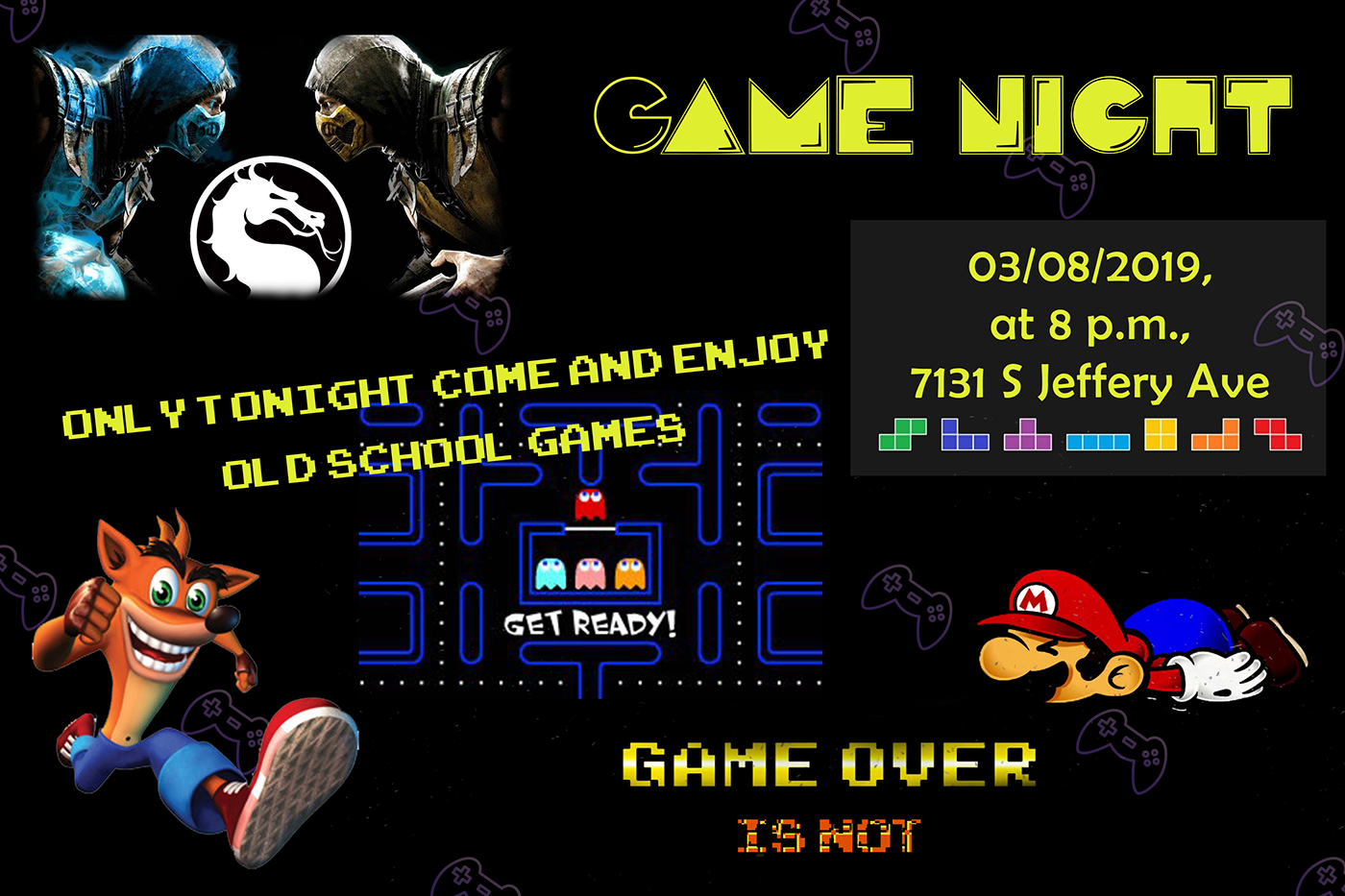
@brazen barn wow nice effect on the gif! How do you manage to do that?
@frozen fox Thank you. It is a combination of After Effects and Photoshop.
This is an arced type extrusion I was going for. Used three "O"s and manipulated in 3D. Wrapped same around a cone to get the arc receding to a vanishing point. Still would like to get to reproducing the tour city destination sequence from "Bohemian Rhapsody"
Day 03 Critique anyone?
Decided to make a quick change to give it a little more direction.
@raven sage I like that, looks like it’s on a 📺 now 😃
@young karma Thank you. It felt like something was missing from the first iteration.
That’s the nice thing I’m finding with computer based design, there’s so much play there. Some of my best work I’ve made on procreate, the ability to undo mistakes easily, to manipulate things it’s very freeing
Here is one i did in the live streams Utopia . https://www.behance.net/gallery/59365713/UTOPIA

Oops wrong tread
i'm a little behind schedule 😉 Its DAY 1 Task , DEADPOOL party 🤘
Day 3: 'Level Up' logo. Tasked myself to keep this as simple as possible.
@young karma Gavin this is really really good, I appreciate the simple designs. I like how you’ve tried different colour combos! 😃
feedback please.
Alright, I guess this will be the final version for now, thanks to everyone who gave me some feedback 😃
I find making logos and text a lot harder in photoshop then it is in illustrator
Feedback please...
oh! i have done it at last
@yeayou thanks for the feedback.
@bitter beacon maybe make the game night text stand out a tiny bit more?
@bitter beacon use some contour light for it (on the top part, for all the letters)
i used soft brushes for glow above the text, seemed too overpowering any higher but I'll keep it in mind ty
I thought that I'd do a retro game night for Day 1 Layers. Would love some feedback.
Hey guys here's my day 3 challenge ... let me know what you think .....
just knocked this version up too
@tepid sierra it looks like the letters smashed in the ground. I like the illusion!
@eternal marsh i feel the speed
I made a better legible version of the day 3 challenge. What are your thoughts?
@signal creek Thank you, I really appreciate it!
@potent sapphire I love this! great job!!
This is DAY_2 - Futuristic Postcard and I know I'm late.
@night isle Nice! You could make it in monochrome for the perfect look. 😃
Haha, it's never too late to submit @warm agate ! You have done a fantastic job finding a really vibrant image (or multiple, if you have combined them into one). The subtle triangles nicely integrate with the entire design aesthetic. The text however almost disappears. So to bring out the beautiful font you have chosen, I would either increase the size, opacity or color of the font 😃 Hope that helps ^^
@young karma I find your text hard to read. I would use a picture of breaking glass as a background to emphasize your text.
My version of Level Up logo. What do you think guys?
this is my day 2 suggestion (spanish 😉 )
@eternal marsh yes! I love that last version! The background harmonizes with the foreground and the 1UP looks fantastic 😄 !
@young karma thx maybe that’s an idea. I’ll give it s try
This is my day 3 project. Comments are welcome.
@glossy trellis Nice job with the blocky letters and neon effect. 😃

@glossy trellis really like the fact that you used a script font for the neon up
@echo dawn Great touch with the dots. Nice work!
@glossy trellis Love this. The contrast between the two sections is great. The neon text is excellent. I would put more room between the Level and the Up. Maybe move the 1st word a bit higher, and get it off the center line.
thanks a ton @lone hare! I dont consider the dots part of the logo, i just consider that a background.
@glossy trellis Let's see, what do we have here... aha! Awesome use of the scan lines, beautiful neon script and well executed glitch effect! Well done! But be careful with darkening bright objects (like stars). If you don't do it correctly, the whites tend to get grey and dull.
@echo dawn Great!
If you just reduce the opacity, notice how the bright star got really grey @glossy trellis
@glacial path nice tip, can you pin that for later reference?
I can give you a link to the psd file if you like
@glacial path Great advice on the stars. I can see that in curves in my head. Like you want to darken only the left side of the curve, and leave the brights unaffected. (I still see curves as D-log-E graphs from darkroom photography/zone-system, haha.)
@glacial path thanks a lot! 😊
ooh, you know what would be nice? a tips and tricks channel! where people could share there most useful ps ideas! @glacial path
Ok so I've done the first challenge! still a couple more to do and then i'm caught up 👍
@echo dawn Yes!
@echo dawn yes! that would be awesome
I just got a chance design my 2nd version.
i dm'd Samantha about it @lone hare @eternal marsh , lets see what happens
@steep quartz Nice work. Interesting use of not-quite-PS4 branding. 😃
I'd love to give some tips 😄
i think we all would
thank you @peak warren i'm studying a bit of branding at uni at the moment 😃 I actully based the design off somewhere local i go to they have alot of PS4's
@glacial path can you ask your admin buddies for that channel?
http://moebest.de/assets/opacity_vs_levels_vs_curves.psd here is the PSD file
@glacial path Thank you absolutely that help .🙏
Thank you guys for amazing tips, so I have put more room between words and also edited layer with stars. What do you think?
@glossy trellis Big improvement! Its more vibrant now.
@peak warren here's it in full on retro style
@glacial path do you have an assets folder on your server or is it some tool you made
like i have s.jmax.io
but thats just screenshots
@night isle 😍 thats soo cool!
would love some feedback on my day 3 level up!
@potent sapphire looks great! but does it say up level?
@echo dawn nah, just a folder on my server 😃
@worldly geysernah I was hoping it would read level up if you read from the bottom up!
@potent sapphire people dont really do that
@potent sapphire Loving the bold colors, and I like the fact you only glitched that one part. Nice work
maybe its just me but all i see is up level
@worldly geysernah then its up level -- lol
@night isle niiiice! Great idea with the apple computer 😄
@potent sapphire haha ok, it looka amazing tho
Hey @gaunt hill Lovely idea with the abstract shapes but why are they all the same color 😮 ? If you add more colors, it would totally make it even more interesting 😃 Well done on the glitch effect and the noise in the background 😃
@night isle That's excellent. I am old enough to remember those. And whenever I see the original Macintosh system font, Chicago, I laugh. (There is an Argentine steak place in downtown San Jose that uses the font on their signage.)
@peak warren Chicago lol
@glossy trellis Great!
@glacial path I tried Lava lamp effect but I ended up like this. I am pretty new to Photoshop. Learning now. Will try it on my own later. Thanks for your feedback.
I wonder what the stats are here for how long we've been shoppin'
@steep quartz wow! I like everything about this 😃 Super cool font, nice layout and great use of the gaming related shapes! You're making it difficult for me to find something that you can improve 😛 So how about a cool overlay/background?
I got it from https://stock.adobe.com/images/real-lens-flare-studio-shot-easy-to-add-as-filter-over-photos/164530626

Adobe Stock
Real Lens Flare Studio Shot Easy to add as Filter over Photos - Buy this stock photo and explore similar images at Adobe Stock
@glacial path wow that looks way better! was that just an image you added to it?
ugh... money...
@glacial path did you pay for that photo just for a demo lol?
no comment
thank you so much! didnt know how to do that before lol😅
haha thats 10/10 commitment
is it illegal to share that image to leanne? @glacial path
I would love to just give you the file, but I can't.
why not
👋
legality?
because https://stock.adobe.com/license-terms says so
Adobe Stock
It's ok i've not use stock images before is it worth using?
@steep quartz absolutely! But I wouldn't use it for private projects unless your really really really like that one particular image
However, if you have a client and you want to make sure that you have the rights to use and sell your work, stock is the way to go
cough removing watermarks is not legal cough. The preview images are also lower in resolution @echo dawn
I've never done it, and would never recommend it
nah but in all serious ive only used it on personal projects.
my work gives me a massive library of stock so it doesnt matter much
after seeing the difference it made though i'll certainly bare that in mind thank you 👍
@glacial path I changed the curve in your example to make it more contrasty. (Is contrasty a word?) Now it looks like the one in levels.
@peak warren it is now!
nicely done @peak warren 😄
Thank you @echo dawn @glacial path . I love the curves tool. It's labor-intensive, though.
Intensive?

Behance
This is my project for the Adobe Photoshop Creative Challenge
Guys this is my #Day3 Creative for PsDailychallenge
Do review
didn't share my Day 1 challenge -- would love some feedback!
@echo dawn I cannot use the curves tool quickly. I fiddle with it. When I want to adjust lots of photos in a hurry, I use the "auto" button in Lightroom. For example, when I take 250 photos in a morning, while walking in the park. Curves would kill me.
@potent sapphire I like your fresh take on the challenge. I think it's not easy to do your own thing and keep within the spirit of these, and following the example too closely makes it look like a copy of what everyone else is doing, so nice job!
@peak warren did you know about this scrub tool? when enabled, you can clickon the canvas once and then drag up or down to adjust the brightness of the particular color
@echo dawn I am sure there is some way to make my own version of "auto" levels, with an action or something. But I am not there yet. (I say this because LR's auto feature undoes purposely contrasty images I take, assuming the excessive blacks are a mistake.)
Also, try ALT/OPT-clicking on the Auto button in the curves panel to get more options! Inside that dialog box, you can try out 4 different algorithms
@glacial path NO! Thank you so much.
@peak warren makes sense, I would never strictly edit a photo in photoshop, I prefer Lightroom any day unless I’m adding, taking out, or changing something
@buoyant pendant thanks!
Thanks for both comments, @glacial path. I need to find a "every ALT, every CTRL, every SHIFT" version of the UI. I am sure there is a guide somewhere. Task for later today. :)))))
@sterile bane I made some revisions on my level up logo based on @bleak fossil recommendations. Which version do you think is better?
@sterile bane @bleak fossil This one has the line patten covering the whole background.
ok managed to use pexels what do you think to this?
Not sure if the screen adds anything to this, but here's my take on the day 3 challenge
@umbral obsidian I really like how you used the glitchy effect to look like a water rippled effect -- makes it looks like it is floating on water
@steep quartz that’s really good! Maybe add some sparkles.
@umbral obsidian I think the second one looks more like it's on a screen
@buoyant pendant very nice!
@young karma WORTHY Logo Design🤓
@potent sapphire Thank you! I was trying to go for a mysterious look and wanted the bottom portion of the logo to look like ripples in the water. I posted my original one on Behance but I'm not sure if I like the water look or the screen look between version 2 and 3. What do you think?
@umbral obsidian I actually liked the water rippled effect -- it was different
@buoyant pendant I could see that as well, the texture is water but I applied the line pattern like @sterile bane did in her tutorial.
well its a start...
@young karma a fantastic start 😮
@glacial path thank you tim:)
Looks like I’m going to be doing two challenges in a day again today 🙄
you can do it! go @young karma go!
@umbral obsidian ❤ That's outstanding. Nice Stranger Things vibe, too.
Hello everyone, here is my day 2 Blending Challenge
Hey guys, what y'all think?
+@tepid sierra liked juxtaposition of the colors; reuse in a Halloween theme project+@young karma liked the simplicity and effectiveness ?"After The Eggs"? My cellphone translator did not tell me. Have to try it on my android phone; Still liked the original; Some of the best things on here are when we wander from the original project guidelines. It's what being creative is about. Explore! @potent sapphire left-to-right right-to-left up-to-down down-to-up it's all semantics back inside your head there are relationships being made with the conception of the words "UP" and "LEVEL" What I liked was the transparency into the inside of the letters "U" and "P" Dimensions well added
@latent lion open the eyes 😉 thanks for the feedback! being creative is one the bests things!
So a little late but would love some feedback