I have several issues with this sketch which I would like to fix
-the anatomy. I changed how buff he is, because in his original design personally he feels too slim (and the arms are too twig-y). So in the sketch, I feel like the muscles are now too pronounced? Comparing to his design I drew originally, I did want him to have bigger muscles, but maybe not this big. I also feel like the abs+pecs are really wrong. He also feels too wide but idk whether I’m just tripping. Also also, I don’t know whether his actual proportions are correct? Lmk if they aren’t.
-the helmet. I did change its shape slightly (changing the eyes and the shape of the bottom) but it feels a little boring now? I don’t know whether to re-incorporate some of the elements of the original helmet back into it (eg, the thick line above the eye holes) but I was struggling to get it to match the perspective of the helmet.
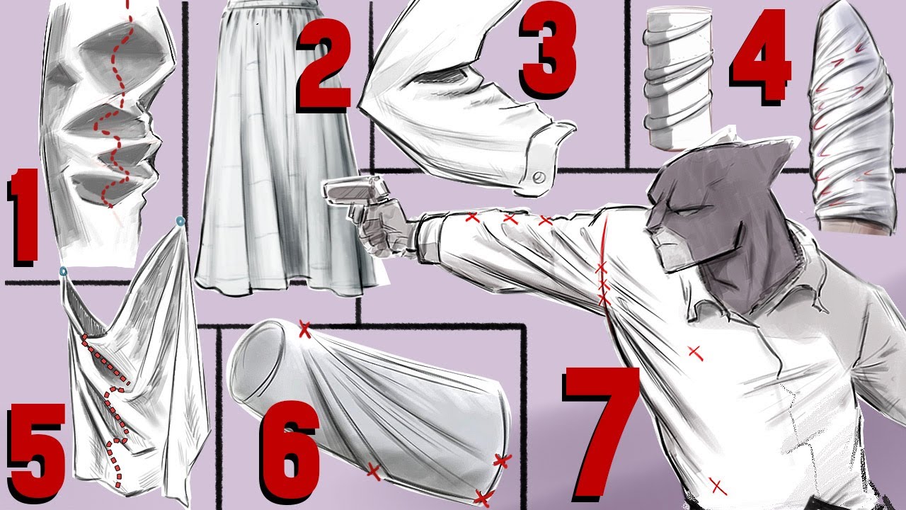
-the trousers. When I was drawing them, I assumed I would like the trousers pulled down instead of his original design with them kinda bunched up, and I can’t really get a good pulled up shape without them looking like spiky balloons. In addition, I drew these trousers too slim and I was struggling to draw them in the same baggy way that I drew them originally.
-finally, the right hand. It looks super wrong. Idk whether its just me, but it just looks a little mangled honestly.
Redlining is encouraged, and I have added his original design for reference.
(Sorry for the mass of text 😭)
Tldr: help with anatomy, trousers, helmet, and the right hand.
#I’m not too happy w this sketch rn.
23 messages · Page 1 of 1 (latest)
I'll explain myself in a second
Great work so far btw
Okay first with the arm, mind that the biceps and triceps peak point have that relation I showed on the pic, the biceps is lower towards the forearm and the triceps (the small head) is higher towards the deltoid, I wouldn't enclose that much the abs, the seem unnatural and I would give them a more flared shape if that makes sense, instead of connecting with one another from the outside they connect towards the obliques, I would lower the V-line start point and separate it from the abs, also represent it a bit on the other side, I would get rid of the blue parts for the t shirt, those areas have tension on the cloth and should not enclose the muscle itself but try to bridge between the volumes, the hand is fine maybe adjust the palm connection a bit.
for the pants i would make more relaxed folds on the main areas and accumulate more cloth on the bottom, also flare them out a bit just bellow the belt, I would round up the helmet side, it seems pointy and if you want to redesign it and make it more complex maybe add a visor (the one I added is quite whack) or search for references of medieval helmets and modernize one, I have a ton if you want
Thank you very much!! This is so helpful!
No problem!! Great design and I hope to see the progress
Oh also I didn't mention that the pockets seem disconnected that's why I marked the gap with an arrow!!
Update, i took your changes and added them, anything to change?
Much better!
I would still deanatomize the shirt a bit
Make soft thin unconnecting lines to indicate the muscles bellow but do this then
Those kind of folds like on the tight one, I was referring to that when I told you that the cloth bridges between volumes
Like in between the pecs, not as there is no vertical line but stretch folds and giving volume feeling
I would try to find a nice video for you
If you’re struggling, consider therapy with my sponsor, BetterHelp. Click https://betterhelp.com/MarcoBucci for a 10% discount on your first month of therapy with a licensed professional specific to your needs.
Learn how to draw clothing by understanding all 7 types of clothing folds!
--LINKS--
MORE ART CLASSES: https://www.marcobucciartstore...
For example
Pipe and spiral folds would be the ones you could find the most useful for the tshirt
Is the shirt a bit better now?