#avatar-ideas
1 messages · Page 170 of 1
 shadow nexus
 somber bronze
@burnt apex  i wish i could jump in rn but i canttt
@shadow nexus the shading for the hair is alright just make the lines a bit darker and thicker 
shadow nexus
Uhhh
 burnt apex
you could maybe just make them thicker around the root and thinner at the end
shadow nexus
Hmm
 hazy falcon
@shadow nexus I'm bad at drawing on mobile
hazy falcon
That's basically the "wwo style" with shading
 quick harbor
hi
shadow nexus
Hi
hazy falcon
Uhm ye I'm better on pc
Btw
Which back item?
I will change the first one in color and make less of them
burnt apex
oooooohh second one is really cool
 quick harbor
Lemme know if we r doin a gravestone so i can start
somber bronze
@hazy falcon reee i just- nvm 
hazy falcon
@quick harbor I need hair!
@somber bronze Wut? I know but I want other options toooooo because idk but I like first more xD
somber bronze
If you wan see my hair shading suggestion 
Just worked upon the one that was already there
somber bronze
I dont flex
quick harbor
@hazy falcon I told u i dont know how to do hair but i can do graveee
hazy falcon
I need a hairstyle, which fits with the shi glasses
hazy falcon
Nooooo
That's the base of the outfit xD I mean just, that it is annoying to find a hairstyle xD
burnt apex
maybe an undercut or a half shave would look good
like this?
i should've used another color rather than orange,,,
hair is still behind the back and the lips have to cover the default mouth
quick harbor
Looks cool i wanna suggest a chnage tho
burnt apex
also are you going to draw eyebrows?
quick harbor
The shields look kinda bare
shadow nexus
At least.
 honest mural
Is that good? Btw that is my first Skin (it is not finished)
İt's not The best i know
But how cares😌
 atomic hearth
Not trying to be rude, but the eye doesnt look like you drew that yourself
why is the mask transparant? and the hair cant go around the neck like that
You might wanna check out the pinned messages, for a nice clean avatar template and some do's and dont ^^
atomic hearth
@honest mural Im srry but everything needs too be drawn by you, you cant copy things from google
 opaque wyvern
@quick harbor okay
 woeful rock
👀
 iron fox
that's so cutee
iron fox
idk how i should shade the hair
quick harbor
@woeful rock did you draw everything yourself?
The eyes on the hood have outline and it looks like the eyes from the person aswell though I can’t see it clearly.
Gradients aren’t allowed.
The eye highlights are mirrored which I prefer them not to be. And maybe try to mover the tongue more in the middle.
@iron fox good start!
Only outlines aren’t allowed and maybe try to maybe make the hair more fluffy. Because right now its a little flat on the head
iron fox
thanks
hazy falcon
@woeful rock heyo you 0w0thats so cute xD it reminds me of a Pokémon.
The problem for me is, that the eyes have outlines ;-; these are not allowed and you have to remove them. Maybe you can make the eyes.... Cuter? They look kinda cold. You could add a pupil maybe. And big highlights make things cuter too xD
I don't really understand the shading on the right site of the hood ^^' it looks wrong placed.
You need some shading on the ears too, because it looks flat. The stars are weird there....
The darker pink part is also weird.... Why did you make it like this?
My opinion to the shirt is, that it doesn't fit with the hood thing. There are outlines and it looks kinda flat...
The mouth is okay and the eyes too, but the eyes have mirrors highlights.
Can I have a picture without hood?
gradient in the hair too
hazy falcon
Why did you remove the details in the eyes?
woeful rock
I'm afraid there will be problems with color gradation again.
woeful rock
iron fox
i tried making the hair fluffier, is it ok?
hazy falcon
Sowwy gallery drawing xD
hazy falcon
The eyes are too big hmm you can make them smaller and for the mouth you could maybe use another smile 0w0
iron fox
alright
i honestly dont know what to do for the mask lol
maybe ill just remove the mouth
 spring mauve
submissions have to be svg, right?👀
hazy falcon
Best case yes ^^ you can ask someone to trace it or..... @quick harbor idk much about formatting because I work with Vektor xD
spring mauve
okayy, ty :>
hazy falcon
Yes yes... You don't work in vector ^^
quick harbor
Thats right!
somber bronze
Submissions don't need to be in vector until they are really wanted in game
hazy falcon
I said best case
somber bronze
Philipp will then ask any tracer of his choice if he wants to trace it if it isnt svg already
But you can always trace it/let it get traced by a tracer whenever you want to
There isn't any other way than tracing sadly 
Converting from png to svg isnt possible rip
iron fox
this is what i have rn haven’t shaded it yet.
hazy falcon

iron fox
idk how i should shade it though.
 reef karma
@honest mural gradient isn't allowed 😅
somber bronze
@iron fox what exactly?
The hair or the fur?
If you want to i could try to show you how i would shade it 
 rotund elm
look at this skin what i made
hazy falcon
@rotund elm you just changed the color with another layer
rotund elm
Jes but i like it
honest mural
xD
hazy falcon
Hey 0w0 is it the last version?
quick harbor
Yeah ^^
hazy falcon
Okay! I will ask others
quick harbor
Thank you
woeful rock
quick harbor
Would that line around the eye of the hat be an outline?
hazy falcon
I won't give feedback to it, because it gets ignored ^^'
 winter falcon
That seems great outfit
hazy falcon
And yes ghost. Already said it tho
 fair steeple
@woeful rock wowww
 gilded trench
@woeful rock OMG!! That so cute! I love it😍 😍 😍
somber bronze
Well if atleast the outline thingy doesnt get fixed i dont think it can get into vote bc no outlines is just one of the basic rules
woeful rock
@gilded trench Thank you very much. I also like your design very much.💕
atomic hearth
@woeful rock I think you should change the colour of the earring/stars on the female outfit, cause the colours blend in a lot
the stars in the eyes are maybe a bit too small
I would prefer if you added some lines to seperate the body and the arms
And please just listen to Hyde, there is outlines on the hoodie eyes which is not allowed. you cant just choose to keep it, cause it won't be accepted like this.
quick harbor
Since noone in dc had any feedback anymore. Lets see what you can come up with what I can improve👀
The purple is out of place with the color scheme
On the hair
It seems to not really blend with the colors around it, the pink looks more like a small supporting color here, and it looks odd to have it as a main focus on the hair
But the concept of the design is super good! I really love this
Arms look weird with the shading
Makes the arms look barley connected
To the body
somber bronze
usually arms dont rly stick to the body either
I think the arm shading is just fine and that's simply how a hoodie works
There are such lines because the sleeves are knit to the body part of the shirt at some point 
quick harbor
@quick harbor I can’t do much with: it looks weird. Since I don’t see why it looks weird. But if you know how I could “fix” it I can look at it
Well i dont make shirts so i dont know how to fix it
Honestly
Looks like the arm is on backwards
Maybe reduce the size of the line that goes to the shoulder
somber bronze
Also i really like the contrast the hair gives as you can see that kind of pink-ish purple in other parts too loke the eyes, the highlights on the octopus-- of wait it's not an octopus bc it has got 7 tentacles 
However i wouldnt change the colour on the hair but adding maybe some more of the colour of the ends onto the shirt instead as the shirt is the only part where this colour isnt represented so that might make it look out of place to some people
i think the line on the shoulder is just a thing that is part of the hoodie
Lemme get a reference pic of it 
 upper geode
I wanna suggest an avatar but I don't have any skills to do it... who can help me?
 hazy falcon
XD
atomic hearth
all minimods shoukd get this outfit, cause it orange
hazy falcon

quick harbor
Did you also do eyes? ^^
 next socket
2nd look better
hazy falcon
Does it look like it? XD
quick harbor
No just wondering ahahha
hazy falcon
@next socket okiow
atomic hearth
I also like the 2nd one more, it's less brihgt and stuff
hazy falcon
Ye knight go xD
hazy falcon

somber bronze
@upper geode you can hmu with it
upper geode
hmu?
quick harbor
@quick harbor does it maybe look weird because the stripes are too high? Becausr I think that’s what is bothering 🤔
somber bronze
Hit me up
quick harbor
I think so @quick harbor
woeful rock
quick harbor
The bow has outlines and the carrots look a bit like plastic because of the shine. So I would sugfest to remove that shine or make it a different colour
woeful rock
OK 💕
quick harbor
@woeful rock oh and could Insee the hair without the hat?👀
And my feedback on the mouth is still valid😁
hazy falcon
My whole feedback is still valid
 jagged belfry
A small question can i post my ideas here?
woeful rock
hazy falcon
Sure ^^ @jagged belfry
jagged belfry
Wowie those are cute
Also okay because i made one but idk if something like it already exists and stuff
hazy falcon
@melon_27 heyo you 0w0thats so cute xD it reminds me of a Pokémon.
The problem for me is, that the eyes have outlines ;-; these are not allowed and you have to remove them. Maybe you can make the eyes.... Cuter? They look kinda cold. You could add a pupil maybe. And big highlights make things cuter too xD
I don't really understand the shading on the right site of the hood ^^' it looks wrong placed.
You need some shading on the ears too, because it looks flat. The stars are weird there....
The darker pink part is also weird.... Why did you make it like this?
My opinion to the shirt is, that it doesn't fit with the hood thing. There are outlines and it looks kinda flat...
The mouth is okay and the eyes too, but the eyes have mirrors highlights.
My feedback from yesterday
quick harbor
@jagged belfry post it when can tell you😍
Dont worry ppl here usually arent to judgemental
hazy falcon
I won't write too much.... Maybe
jagged belfry
Ah i am too shy to post my drawing here
quick harbor
U can send it to my dms if u want
hazy falcon
Dm me? XD
quick harbor
I wanna see too
hazy falcon
I mean... We are open for designs 0w0
jagged belfry
Oop okay
jagged belfry
I'm not the best artist really so some stuff Night look odd but please bare with me
quick harbor
I dont think anything like that has been made but their are a lot of outlines which are unfortunatly against the rules
Dont stree about it though cause thats an easy fix
hazy falcon
0w0 for a first try it's really awesome!
You could make the ears smaller and also the eyes👀 also you have to remove the outlines 👀👀
jagged belfry
Oooop
I'll do
Tho i have No idea why the picture is so blurry but okay
Thank you i really thought i would be kind of judged or something
hazy falcon
Why!? We are also designers ^^ don't be scared but proud of the things you create!
hazy falcon

woeful rock
quick harbor
Is the bow part of the hat or the shirt? Because it is pretty big
woeful rock
It's part of the shirt I will try to make it smaller.
quick harbor
I think you should remove the shine on the rabbit's carrot
 quaint bison
Omg melon I want that outfit so bad qwq
woeful rock
quick harbor
Way better!
Just add some details to the bottons (?)
Or to the t shirt in general
jagged belfry
Jfbfbf i feel like it looks alot better now, thanks for all the tips and stuff
Yes i changed some colors
Also no more derp eyes 😅
woeful rock
It's cute 👀
jagged belfry
Thank you
woeful rock
Do I have to fix it?
jagged belfry
Now that's adorible
quick harbor
I can see it in clan quest or daily rewards
Good job
The front item is pretty flat. Iy could use some more shading. Also hydes feedback for the hood is still valid. And you could add some more shafing to the hair.
quick harbor
Is that gradient on the hair?
hazy falcon
@honest mural gradient is Farbverlauf
somber bronze
@honest mural i would maybe make it a bit fluffier as it's pretty flat on the head
Something like that
honest mural
Oh I think grandit is shine.
Thanks @quick harbor and @hazy falcon
Thank you @somber bronze i make it fluffier
hazy falcon
You have to use clean lines and no brush effect yk?
hazy falcon

somber bronze
You're welcome
jagged belfry
I tried to change up the shirt but idk
jagged belfry
Owo thanks
honest mural
Btw i Like you Profil Pic
somber bronze
@jagged belfry heya
I drew out few suggestions of things i'd slightly change - red
And a suggestion of how i'd shade the hood
For the suggestions,, the hair hasn't really good sharp edges/tips
I'd suggest you to use a smaller brush to sketch the lineart of the hairshape and then simply fill it in with the colour you want the hair to have
The ears could be a bit fluffier,,, and,,, furrier? more furry?
Look more like fur!!!
Also for the eyes usually people either use the almond like shape of an actual eye and i would make the eyes a tad smaller as they are very big right now
Other than that i wuvvv it 
quick harbor
@jagged belfry good to see you are already making progress with your design!
hazy falcon
Nop ^^
somber bronze
Me making gradient is just as likely as surving in space without an astronaut suit
It's your phone quality ^^
Depending on phone quality the stuff looks blurry or doesnt
 lucid scaffold
Which programs u genneraly use?
hazy falcon
Programms are pinned in here ^^
hazy falcon
lucid scaffold
Thx
hazy falcon
jagged belfry
@somber bronze Thanks for all the tips and help, i really am not good at designing but thanks for showing me ideas, i'll try a little better
somber bronze
You're welcome
And i am sure you'll get better from time to time,, they always do
they grow up so fast
jagged belfry
Eeee UwU
lucid scaffold
I respect all designers so much this is so hard.
quick harbor
😂
lucid scaffold
Am i going good?
hazy falcon
Please just serious designs ^^
lucid scaffold
Sorry
honest mural
Yes thets so goooood
hazy falcon
honest mural
It is awsome
quick harbor
Give this guy the designer badge now
 next talon
Would this be ok for post apocalyptic theme? Also any feedback so far? Hair is messy ik
honest mural
What that is SOOO GOOD how have you make it WoW
I love that
next talon
Nop is a sketch
Idk omg I’m just doing something and thought it might be post apocalyptic aa
quick harbor
Only thing im scared of is knowing you this might be a bit overdetailed so just stay aware when ur drawing @next talon
Im sure it will turn out awesome
next talon
Overdetailed where?
next talon
Oh yes idk if I’m gonna do that since idk how to shade fur oof
next talon
It’s kinda hard to make a bg post apocalyptic related I can’t find any idea refs:(
quick harbor
A crashed tank
honest mural
Make it good PLS
I will that skin 
next talon
Yeah was thinking something like crashed cars/buildings too but that’s something I can’t draw easily but I might have to challenge myself
quick harbor
For post apo i recommend looking at the game series named borderlands @next talon
next talon
Noted
quick harbor
Thats where i gave lighze ideas from
I don't think crashed cars would match the avatar :/
Im just naming things for any post apo outfit
Oh k
somber bronze
Basically if everything is destroyed it's not unlikely there will only be wild creatures
Everything erased = back to the beginning and simply things
Just like the... big bang
quick harbor
I have tons of ideas if u ever need any hmu
somber bronze
theory
quick harbor
Yeah exactly
Yes but not normal creatures
Different types that are suited to live on the new enviornment
Will you make both genres or just male?
somber bronze
Why tho? Depends on the apocalypse ur going for
next talon
~~this is the female version ~~
somber bronze
@quick harbor if its for bp it needs to have both👀
next talon
Yes😅
somber bronze
It's obvious look at the lashes etc👀
next talon
This was the ref
next talon
Hahaha
If I ever finish this on time I have like 0 time actually to be working on this
quick harbor
I honestly thought it was a dude
Looking forward to see the male version (if you'll make it)😍
With long hair
Same
next talon
Will make the male version even more male then
quick harbor
Yeaahh
next talon
Females ain’t got time to look pretty in the post apocalyptic x
quick harbor
Lmao
 clear tartan
indeed
atomic hearth
maybe like a big chain fence with plants growing up on it and barbed wire at the top? as a bg
next talon
Noted ty
atomic hearth
your guy lookslikehe could be a sort of mutant escaped from a government project
quick harbor
I kinda wanna start doin mutant themed outfita
next talon
quick harbor
Ye
 rancid shore
Like with broken Windows Steam coming from the engine ext
 chrome tree
you could make the hair go over part of the headpiece thats drawn over the hair?
jagged belfry
That's the last i'm gonna do for today, i'll continue tomorrow if i have to
hazy falcon
atomic hearth
I like this hair I want this hair
next talon
@chrome tree hat is in front of hair:(
next talon
No it’s okay I wanted to actually do that but yeah layer orders:(((
jagged belfry
Coools
next talon
hazy falcon
Petition to change layer order!
next talon
Which one is better? Or should I do smth else totally
chrome tree
i like the first one
hazy falcon
XD
next talon
Not too busy? The bus one
clear tartan
Bus one, also that’s so cool
quick harbor
First
somber bronze
@hazy falcon coughs ||reminds me of #bot-discussions || coughs
chrome tree
its kind of busy but i feel like it adds more (suspense?) to the image
quick harbor
I liked the wolves better but those are pretty cool, too
somber bronze
^ smae
quick harbor
@hazy falcon u did the eyes without tellin me😐
somber bronze
A bus doesnt seem to fit the theme bc she either looks survival-ish and not destroyed-ish
next talon
I’m not sure if I have time to do the wolves since Philipp said he wants the outfits for bp asap aa
hazy falcon
Yes was just a try tho
quick harbor
Ngl those eyes are awesome tho
Philipp never responded to my gun soo
Make wolves and aim for special offer (?) 🤔
hazy falcon
So anyone feedback?
quick harbor
Use the wolves for somethin else
somber bronze
Nah
quick harbor
Yes
somber bronze
I would suggest changing the bg to something more simple fitting the survival theme either
quick harbor
I honestly think it should stay like this😂
hazy falcon
?
somber bronze
Bc the bus kind of looks like a forced idea and out of place with the rough theme going on imo
hazy falcon
@quick harbor no
hazy falcon
I know the rules so I follow them
quick harbor
Yeah, that's why I asked
hazy falcon
@next talon I love it xD wanna help my creep collection? XD
@quick harbor anything to change?
hazy falcon
Okay ^^
quick harbor
Scp is a good ref for creepy stuff
next talon
Xd
quick harbor
@hazy falcon^^
hazy falcon
Then I will discuss it now
somber bronze
@next talon may just some destroyed trees instead?
Fits the savage look more and is not too hard to make 👀
The rest of it looks great though, no more feedback
next talon
Really? Everything is ok?😳
quick harbor
Bus is cool tho👀
clear tartan
^ Ye but might take too much
next talon
Nah imo the bus is a bit too busy even though I do like the idea
somber bronze
agreed nagini
clear tartan
what about some scrap/rusty axes like this
quick harbor
Is this from Rust?
clear tartan
Nop
next talon
Intwestin👀
clear tartan
^ exactly, borderlands
next talon
I’m searching in Pinterest and everything looks so cool but impossible to convert to Wwo style:(
quick harbor
What u lookin at
next talon
Lol my screenshot is more than 8 mb cant show but rn I’m searching for post apocalyptic landscapes
next talon
Ooo hiw about a tent
spring mauve
i mean u could do smth like that but it would be hard👀
next talon
hazy falcon
0w0
clear tartan
Oh gawd
next talon
Btw this is box size
atomic hearth
yeah maybe better if the black hole isnt too visible, the door is nice ^^
quick harbor
Yet this is easier than a bus for you
atomic hearth
its a really cool idea
next talon
quick harbor
Oo flag change
I wanna like
Shoot the fire thing
On the left
Hmmmm has a flamethrower been made before
I love how you detailed it @next talon
Feel like is has
It(
chrome tree
its looks really nice
quick harbor
What's the box size?
next talon
how it would look ig
atomic hearth
the size of the regular avatar bg
next talon
procreate on ipad pro:)
there’s a mobile version for it too if i’m right but i haven’t used that
quick harbor
Oki ty ^^ and gn
woeful rock
 topaz silo
Aww that’s cute. The only problem I have with it are the stars. I believe all the stars should be yellow or just no stars at all
 coarse sage
And the star in the girl version has shadow but the boy’s doesnt
 molten canopy
Wolf Ranger😂
iron fox
LMAO
iron fox
i need help with shading this, idk how should i shade it “cartoon-style” cause usually i use gradients so-
rancid shore
@molten canopy i highly doubt that is copyrighted (power rangers are copyrighted )
molten canopy
No not copyrighted not same detail
coarse sage
It’s not same but like copyrighted idea
hazy falcon
@molten canopy they will take it for another power ranger series
quaint bison
I wove it
 flat badge
Avatar frame in game is so little
Just 3 people from sect game was very crowded
5 people was not acrossing other players' avatar frame?
 grand isle
lol those are individual outfits
quaint bison
Bootiful
But maybe different hair-back- and crown styles:3
En the money thing already exists
burnt apex
and less saturated colors
atomic hearth
That outfit already exists in game
and you cant put it to vote, you submit it to staffwhen its done... these are not done yet
needs more shading and detail, and hair
 novel grove
Paint. net
burnt apex
try using one of the pinned programs, your lines will look cleaner!
novel grove
Isn't it good right now?
 shrewd mirage
Except sketch
You cant fill things with sketch
And the lines arent clean too
I dont like skecth
novel grove
Must be separated But one piece too, right?@iron fox
next talon
Any feedback? Also should I keep the shirts the same or make a more female one for the girl?
iron fox
i think it looks great the way it is now
also i really need help on shading this, i’ve tried searching up videos but none of the shading styles i’ve tried fits
somber bronze
@iron fox i am trying to sketch something out real quick
quick harbor
Still honestly think the top one looks more like a dude but the shirt is fine
iron fox
maybe for the girl just remove the jacket?
quick harbor
Nah
flat badge
Hairstyle look likes Ammon 😂 @next talon
iron fox
lmao
next talon
Anyone got ideas for front item bc I don’t feel this
somber bronze
@iron fox not a pro about shading tbh,,, but maybe something like that?
@honest mural looks better
And yup,, that's allowed 👀
You could maybe improve the shading tho
brrrbb againn👀
iron fox
tysm <3
somber bronze
You're welcome!
honest mural
Pk Thanks
somber bronze
Eyebrow most likely
When people draw animal-ish eyebrows they often do them in the shape of little teardrops
Example - white wolf outfit in game
quick harbor
Ohh
I thought it was like
How do you call it omg
EHM
A birthmark ^^^
Jeez took me long enough
somber bronze
@honest mural something around the red lines for the shading
Thats the style many ppl use for shading hair its kind of like the go to shading style for wwo 👀
iron fox
i finished shading, is there anything i should add besides the background?
next talon
Is this shirt better for female?
shrewd mirage
Thats cool
next socket
 @coarse sage nicee
coarse sage
❤
hazy falcon
@coarse sage are you both planning to add shading in the hair?
coarse sage
Yeah, but i dont know how should i draw...Im bad at making shadow and she's too 
coarse sage
Rip us 
 coarse sage
Where is she 
hazy falcon
She is not here ^^
coarse sage
And do you have any feedback for us? I expect about your feedback so much
rancid shore
vanished
hazy falcon
Back to the outfit. The eyes are pretty big. Maybe you could try to make them smaller and higher placed.
rancid shore
Where is the mouth 👀
hazy falcon
I think there will be one so I didn't say anything xD
coarse sage
Okay i will fix it, thank u so much @hazy falcon about the mouth, we didnt draw anything for it (dont have any idea too ). And the template i get doesnt have the mouth, rip
hazy falcon
I could give more feedback but 👀
coarse sage
But what 🌨
rancid shore
@coarse sage which program did you use ?
coarse sage
@rancid shore Illustrator CC 2017
rancid shore
I dont know anything about that lol
hazy falcon
@coarse sage but I like it and wait for the "last version" so I can conclude everything in it ^^
coarse sage
@hazy falcon Ah okayy, i will make it done as soon as possible, anyway thank u 💓
hazy falcon
Take your time
quick harbor
@next talon I preferred the other one ^^
quick harbor
@coarse sage i love it!!
But the left bun should be a bit better. Its so weird with the hat
coarse sage
@quick harbor okay, thanks for your feedback, i will fix it asap
quick harbor
@coarse sage
You should make a boy one too!
I'd love to see it! 
coarse sage
Oh really, we planned to make a boy but..
quick harbor
If you still have it, I would like to see it!
You can always just copy the girl version.
And then change the eye shape, hair, etc :p
coarse sage
Okay, just planned and we havent made it yet. But i will try a little, thank you 💓
 median portal
@next talon Teach me how to draw senpai
next talon
@quick harbor ill still keep the other shirt for the male tho but ill try something else for female
honest mural
@somber bronze Thanks for so many help 😅
median portal
Ohh yes
quick harbor
Ohhhh
next talon
quick harbor
Coool😍
next talon
imagine the scars and hat on it
 empty vapor
What app do you use to draw?
next talon
procreate on ipad pro
empty vapor
Oh great~
next talon
I have to submit this tonight if I want to have chance to get it to battle pass, anyone any last feedback?
median portal
SO GOOD
 buoyant mantle
bATtLe pAsS?! YES PLEASE! this looks so good!
somber bronze
Hello everyone,,
As you all may know, there is a side server of wwo which is dedicated to designing and designing only!
But,, recently we - the dc moderator team - got a suggestion on maybe adding some channels where any kind of art can get posted!
Simply to receive support, get feedback eventually, show the stuff you're proud of and develop further as an artist.
So, we decided, to add a new category!
It's called #Artist support
From now on and furthermore you can not only develop your designing skills,, but also your general art skills in designer club!
This is a change we are pretty excited about and this message is just meant as a little reminder;
If you want to start designing and receive help from others during that progress or if you are already designing and would like to receive app help, designing help in general and/or develop further as artist make sure to join our WWO Designer Club!
We'd be very grateful if we could welcome YOU in our lovely little server!
https://discord.gg/mqmRHXm
[Approved by Lisu]
quick harbor
👀
hazy falcon
@somber bronze pin? ^^
somber bronze
Sure if you wanna ❤
 blazing swallow
okay. so is there an official layout i have to use to create my own avatar designs?
blazing swallow
i’m dummy
hazy falcon
Nah it's fine ^^
clear tartan
looking forward to them 👀
quick harbor
Same
blazing swallow
who the heck is Lighze
hazy falcon
@blazing swallow if you need help, I'm also inkscape user ^^
blazing swallow
and why are they like in every other design
god i butchered that.
thank you @hazy falcon
hazy falcon
@quick harbor do you think it needs teeth?
quick harbor
Lighze is an amazing hardworking artist. Creating a big variety of skins👀
Now I really want to buy a tablet
@hazy falcon dont ask me about your creepy stuff. Im no expert😂
blazing swallow
i see that 😩 and maybe teeth but that might make the rings look weird
quick harbor
Drawing on mobile with fingersthe isnt that good
hazy falcon
@quick harbor I'm also not an expert!
blazing swallow
we need some spooky designs for the game?
quick harbor
hazy falcon
@blazing swallow ot really, but I like to make spook stuff like Bob and Joshua
Not really *
quick harbor
Feedback for hair?🤔
blazing swallow
the center part with the hairline is a bit... too distracting
quick harbor
Wait, which part
quick harbor
The darker one?
blazing swallow
yes
quick harbor
Oh, gonna delete it ^^
blazing swallow
it’s just my opinion though.
hazy falcon
Too realistic?
atomic hearth
too realistic would be be more holes around where the rings enter the skin 👀
its an interesting idea btw
hazy falcon
More blood?
quick harbor
Maje amazing propic btw😂
 tall geyser
@hazy falcon it looks really good but i think its too detailed to be shown clearly in game?
hazy falcon
I can do it like Joshua's eyes
atomic hearth
amazing wut?
hazy falcon
blazing swallow
oh my tbat is a ghoul if i have ever seen one
quick harbor
Still waiting for this skin to get added
tall geyser
I'm really open to suggestions, especially for the hair i hate drawing hair
quick harbor
Is it gradient what I see on the horns?
tall geyser
Nah its hand drawn
quick harbor
Nope
Or maybe my phone blurs the image
Sorry my bad
Fake gradient tricks everyone😂
tall geyser
😂
quick harbor
Oh no, it's a trap
hazy falcon
@atomic hearth better? .
atomic hearth
the horns look nice, I can always use more horns ^^
I dont really like the little diamonds on the mask, it looks cluttered and doesnt make much sense on a mask shape to me
tall geyser
My first theme was "something with crystals" but i have kinda went out of that path
So what can u suggest me to replace it?
atomic hearth
Perhaps just 1 big crystal in the middle, or a row of 3 perhaps
tall geyser
I'll think of that, thank you @atomic hearth
atomic hearth
@hazy falcon hmm i wasnt telling you to change anything, but yeah actually does look better, more like the rings have been there a while and its kinda scarred up instead of bloody ^^
blazing swallow
@hazy falcon 👀 where is the color dropper thing
hazy falcon
You can just click one color. You make a shape and then click one of the color on the Scala ^^ to remove the outline, you hold shift
Shift and the white square with the "x" in it
blazing swallow
yeah this program frustrates me
it doesn’t work with the hot keys i’m used to for
sai photoshop illustrator and fire alpaca
which i thought was universal
like i can’t even get the template to stay in place. after i push enter it should lock into canva s
i just locked the layer so :/
quick harbor
@blazing swallow you don’t need to use inkscape if you don’t want to. It’s preferred because of svg files but not necessary
blazing swallow
yea that’s why i want to use it.
i found out. i just need to press F7

 empty vapor
I can't think of the topic of this image
hazy falcon
@empty vapor hey ^^ do you want some feedback? 👀
empty vapor
Yes🥺
hazy falcon
Okay! ^^
Okay ^^ so first, I really like it, because it's kinda something else 0w0
Lets start with the hair 👀 the... I will call it shading (dark violet) on top is okay, but you could also add another color between the dark and light color... Because the difference is big. Then you can make the current dark color in the new and add shading in the current color. Just as idea I got, because the left of the hair looks like one bug violet shape and definitely needs more detail/shading/structure. Also it could be, that the bottom part on this site is too far away from the head. If you understand what I mean....
The earring looks pretty big, but I think it's fine. Just one thing: please move it more, that it doesn't "flies" up xD earrings are hanging on the ears 0w0
The eyes are too big 👀 if you make them smaller, please also move them a little bit down, because if not, it doesn't fit anymore. Also you used mirrored highlights in the eyes. You can do it, but it's not used that much anymore
The shirts shading yould be improved a little bit. One sited shading isn't used that much anymore, because it looks weird.
@empty vapor
blazing swallow
tmw the hair you drew looks like cabbage
hazy falcon
@blazing swallow try to make the tips thinner 👀
empty vapor
I will bring it to improve! 💗 thank you very much I can improve it because of your feedback i love u!👍🏻
quick harbor
Hyde you so kind ^^
blazing swallow
@hazy falcon tmw they got no lips
hazy falcon
 @quick harbor
blazing swallow
this is big dumb
honest mural
Is that good?
hazy falcon
@blazing swallow I'm bad on drawing on mobile
 viscid surge
Thats really cool
quick harbor
The eyes are original, I like them!
tall geyser
And this is what i ended up with for today
I really need idea on how to shade the hair, i tried fake gradient on it too and it looked really bad
quick harbor
I love it so far😍
@tall geyser i do believe similar horns are in game though and are the small wings the background?
Eyes may be a little big as well
tall geyser
I don't want to touch the eyes at this point cuz if i make it smaller it will get pixelated more
tall geyser
Well there are a lot of horns ig
tall geyser
I can try to change the color through filter
quick harbor
May i ask what program do you use?
tall geyser
Ibis paint x
quick harbor
Ok i use the same
I still think the eyes need to be smaller because it will still look better when traced into a svg
Also the wing position bothers me because i dont understand what they are connected to
quick harbor
Its fine lol i think some small wings would be cute
tall geyser
Ill make the eyes smaller lile you said
I know that horns look kinda similar to the ones that have been added before, i actually tried to make it a bit more different
quick harbor
Yeah they are fine just wanted to make sure you didnt change them to make them the same
Honestly the eyes could even stay lookin at some of the outfits in vote
But i think it would work better with glasses and stuff if they are smaller
tall geyser
Ok i'll try thank you for your help 👍
iron fox
so uh, any feedback before i do the background?
quick harbor
Looks good for me... but i dont like the black dot above the eye and that the mask? infront of the mouth is so sharp at the end by the ears.. and the gap between the shirt and the thing above( sorry i dont know the word at the moment) @iron fox
quick harbor
yea would say you can call it coat
iron fox
alright, ty for the feedback!
quick harbor
maybe a bit of color transition from the horns to the hair
quick harbor
@atomic hearth hey bro can u help me out rl quick
atomic hearth
Hey dude, sure thing
quick harbor
We arent sure wat to do with the green parts
We were gonna make it like acid what do you think
atomic hearth
the acid idea looks good, but maybe make the zigzag part more like tubes?
like you're pumping acid through it to power the gun?
 waxen lily
Can help me suggest adding details or editing. 💁♀️
 noble canyon
the eyes are too low and the left avatar's ones are too close together
maybe add a cap without top? and I think a ponytail or a bun is more comfortable at the beach/pool if u have long hair
and that's a nice opportunity for a shirtless item 👀 just saying
waxen lily
Thank you so much
coarse sage
Does it look better?
noble canyon
cute but the eyes are too low
and the shirt blends with the back thing
and the bangs shading could be more worked on
coarse sage
Okay thank you
noble canyon
np
quick harbor
@coarse sage looks simple and very well executed! Good job ^^
 soft cliff
Heyy🌟 give me all ur precious feedback pls
quick harbor
The whole thing looks nice, but I don't like the mask and I guess hair needs shading (Idk if you planned to do that)
Is that blue thing mask or glasses?
soft cliff
glasses @quick harbor
quick harbor
And im gonna write feedback hyde style!
My bad, is that just a base
@soft cliff first a question: what theme are you going for?
Glasses: they need to be above the hair layer. I think it looks pretty interesting and im curious how you will develop
Hair: it can indeed use some more shading. Maybe try some bigger shapes as shading instead of small lines. A tip: look in vote for some hairstyles you like and look how other people shade hair.
Eyes: for what I can see they look good
Shirt: looks interesting. I don’t really understand what those little darks shapes are. The thick line in the middle looks like a zipper but I’m not sure, but if it is make it more defined. I would personally put a bigger shadow on the left side just like the hair.
 barren harness
Jin and Hyde's feedback are the best 👏
barren harness
👀
 elfin cosmos
noble canyon
elfin cosmos
noble canyon
the hair is nice but it would be more pleasing if it was centered tbh
@elfin cosmos there are messages pinned with all information you need
empty vapor
do you have this Image? I want Image clearly
hazy falcon
@empty vapor check the pinned messages 👀
empty vapor
Ok thx 💗
hazy falcon
empty vapor
 nocturne moat
somber bronze
@soft cliff looks good imo but it might look better if the glasses thingy was extended to cover the nose too ^^
The shirt looks cool but it lacks shading and arm separations,,, i would add some arm separations in the dark grey shading colour you used
The chain is a detail which seems to be too small to be seen in game, atleast the upper part of it, so i'd suggest making the single parts of the chain the same bigness throughout,, and i think the bigness it has got at the bottom is a good one
For futuristic i'd add some more saturated blue on the shirt maybe to make it look a bit more like a fluroishing, neon, future thingy👀
The shading should either be inverted so -> the parts you left light should be darker instead as usually the shading style is more of the tips being darker rather than the top part being darker ^^
If you want some front item ideas i'd suggest maybe adding like a,,, i dont quite know why but i could picture it with a sort of neon sword? Depending on what ur going for with it ^^
And maybe some wires or something similar as back item?
Also maybe pick up the colour of the glasses a bit more in like the front item/back item or anything else as the turquoise is barely represented in the outfit yet
But that's a great start and a nice design,, i really like it and i can't wait to see the final version 

nocturne moat


opaque wyvern
I see that it is a mask, but if u make an opened wolf mouth on it, it would be really cool. The wolf should baritone his teeth and spit should drip from the corners of the mouth
@iron fox
empty vapor
i want feedback
quick harbor
Hair is too flat in the upper parts and looks unrealistic
Apart from that I really like the hair style
@iron fox mask layer is above hair layer👀
The mask can use some detail, because it’s just a black mask right now.
The eyes are too close together.
But you are doing a good job!
@empty vapor I agree with pumpkin. The hair is too flat on the head. It can use some more volume? I don’t know if that is the right word. The sketch for the eyes js already looking good! Though are those the default eyebrows? If yes are you planning on making eyebrows yourself? Because it’s highly preferred if you try make them yourself
empty vapor
I will improve thank you👌
iron fox
so i have to make mask layer above hair layer? @quick harbor
no expert on wolf teeth but does this look ok?
looks weird, let me change it
quick harbor
i dont really like it..... but at the right ear you might have done 1 or 2 mistakes ( the mask goes on to the ear not like on the left) and hair there is also a bit diffrent @iron fox
iron fox
ah okay, just realized that. thanks lol
quick harbor
@iron fox if you want to do a whole mouth. Maybe it is an idea to do it without the black mask. So like only the mouth
iron fox
i mean i really suck at doing wolf teeth lol
opaque wyvern
the mouth is not so wide and the teeth are sharper at the top and flatter and wider at the bottom. You could also whiten the teeth
Like so
iron fox
ah
quick harbor
@iron fox I love your design!!
iron fox
thanks! <3
quick harbor
I would like it less if teeths are added actually, I like how it looks so cool right now
I don't like it being "creepy"
opaque wyvern
Yes. It is really cool
quick harbor
Just my unprofessional opinions, don't even care about them.
opaque wyvern
It shouldn't be creepy, just like agressive
quick harbor
The teeths being on the mask seem weird imo
quick harbor
No! Don't!
opaque wyvern
But without anything it looks strange in my opinion
quick harbor
The mask looks very nice
opaque wyvern
I Like the Mask to
iron fox
ill draw the mouth and compare it
quick harbor
I think the eyebrows is what should be changed. Currently it looks kinda "peaceful"
opaque wyvern
Ohh nice
quick harbor
Make the eyebrows sharper so it looks more agressive
Nice!
I'm deeply in love with it now!
iron fox
makes a big difference lol
opaque wyvern
I like
iron fox
lol yeah
opaque wyvern
We need your meaning @hazy falcon
iron fox
this was my original idea but thought it looked to similiar to another mouth
opaque wyvern
Okay, that looks strange
quick harbor
Um, it looks bad :/
hazy falcon
I'm outside xD
iron fox
pray
quick harbor
@hazy falcon The hair layer is above the mask layer ,right?
hazy falcon
Na mask is always above hair
quick harbor
Kinda weird?
hazy falcon
Yes it is weird, and we already suggested to change the layer order ^^
quick harbor
Just feeling kinda unpleasant when I look at this
iron fox
yeah lol
quick harbor
i meant it the whole time 🙈
hazy falcon
That's how it is ^^
quick harbor
I love how the design is now. I would love to bring it in game
Hope it's a quest avatar, I cannot afford if it's a special offer
iron fox
lmao same
quick harbor
cough
iron fox
reason i only made male was because i was hoping it would be a clan quest avatar so i could get it lol
quick harbor
lol
hazy falcon
@iron fox can I trace it later and look how it is then? ^^ also I would give you feedback then
quick harbor
@iron fox But actually, if your design gets into the game, you will get it, without doing clan quest/buying from special offer.
quick harbor
🎉
hazy falcon
Okay ^^ I gtg again. I'm back in 30 mins
iron fox
alright.
 tall brook
Perseus
quick harbor
I kind of don't like the eyes. They look kinda too big?
iron fox
looks awesome, and yeah what magi said.
burnt apex
that's really cool!! :000 i'd make the irises bigger, but it's a great concept
tall brook
@quick harborok noted :)
quick harbor
Overall, I think it's cool. But I do think the eyes need fix. But it's better to hear from professional rather than listening to me - an idiot who doesn't know anything about designing haha
tall brook
@iron foxthanks
iron fox
also the irises should expand
quick harbor
I personally don't like the helmet as well. It makes the face kinda odd.
But ehh, don't care about what I said. You should ask from Hyde#0110 instead
quick harbor
Haha, go ask him then. He's gonna give you long comments
iron fox
yeah lol
quick harbor
Hyde is a girl👀
quick harbor
Oof
quick harbor
¯_(ツ)_/¯
@tall brook
I think the eyes are too high placed. The eye shape is a bit weird and the iris is on the small side. I would suggest to look at some eyes in vote and maybe try doing something similar. But that is ofcourse your choice🙌
The hair can use some shading. And maybe add some hair on the left side, because right now the hair on the right is higher.
The shirt could just use some more shading.
Also try to keep a specific light source in mind. BecauseI see some highlights on both the right and the left side.
tall brook
👍 ✅ 👌 100%
burnt apex
thoughts?
 tawny cosmos

 devout basalt

coarse sage
Ok i have done it. So do anyone have suggestions for adding details or editing something pls 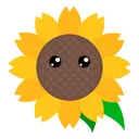
burnt apex
i would make the tips of the hair darker
quick harbor
The shading on the hat are pretty harsh. I would suggest to make the shadows lighter. Also maybe add some more shadows to the hair
coarse sage
okay thx u ❤ i will fix it
soft cliff
- the glasses cover the nose too
- more shading on the hair
- neon effect added

+a little bit more of details on the shirt
 ancient wagon
Good
quick harbor
@coarse sage
You changed the hair!
I love it :3
Still complaining there is no boy version 👀
Would buy that
coarse sage
Yes, i think mix two colors should be better
quick harbor
@coarse sage why is there no mouth?
coarse sage
i dont think people will like to buy it so...
@quick harbor because the template i get doesnt have mouth lol 😂
quick harbor
🙈 i love your avatar
coarse sage
thank uu i will try to make it better
somber bronze
Heya @tall brook
First of all,, its recommend that the iris touches the eyelid/top of the eye as if it doesn't the person looks like they are scared or surprised when i think this look should either be fierce?
I'd also suggest adding a thin eyeline in black and some highlights as the eyes look pretty dead atm,,, as for the armor, it looks good but too plain in comparison to the helmet, try avoiding half shading and add some more highlights/shading to the armor to make it look like iron too
As for the helmet i think the wings are placed too low and maybe a tad too big? I'd maybe put them either where the darker grey part of the helmet begins with the lowest point of the wing and also shade the dark grey part a bit more or either highlight it aswell
Imo the wing on the our left side at the armor isn't really necessary and would probably look better if removed ^^
I'd also shade the blue fabric part a bit further
Thats basically it,,, i really like the concept tho keep up the great work 
@coarse sage
This is sooo cutee
But to be honest i would suggest to add few highlights to the hat and the shirt!
Currently the pink looks a tad out of place as its the only pink item sooo how about making the front item a pink/rosé lotus flower instead? ^^
As this outfit reminds me a lot of lotus!
and i already saw like alot of frog items being made and a flower might fit better👀
As for the hair,,, i'd suggest not making the tips highlighted but rather darker and adding some highlights at the top of the hair instead,,, if you get what i mean?
As for the eyes, the highlights are mirrored what i prefer them not to be and also idk if its only me but the left and right eye look different colour-wise, like the left our left one looks darker than the right one,,,
Also did you add eyebrows/are there eyebrows yet?
If no - you should probably add some
your template has an inverted dark and light side i just saw,,, maybe try downloading the one in the pinned messages instead, that might result in a better final look
If you want to add a mask i would suggest a mouth with some pink-ish lips and a lotus leaf/like a lake leaf inside of their mouth you know what i mean? The ones which swim on lakes and frogs sometimes sit on
Over all this is a very cute and nice design,,, cant wait to see the final version of it!!! 👀
@burnt apex
Looks greeeat,,, thoo i would make some sliight changes
The eyes are still pretty high,, maybe make the mask a bit smaller and less static? Like its two clean edges maybe give it some more edges etc?
Also as for the wires,, they are usually not rly straight but either curved so that is why they aren't recognisable at first/it's hard to tell what they are...
I really love the background and eyes tho,, i also love love love the hair and shirt
Butt maybe make the red parts on the shirt with a more saturated red because they are barely even visible,, also the arm separations could be a bit thicker
But other than that i really loveee ittt and can't wait to see the finished versionnn ❤ ❤
coarse sage
@somber bronze thanks for your feedback, i get what you mean ^^ will fix it as soon as possible
somber bronze
Can't wait to see it 
quick harbor
I'd like an Avatar of the Character Eren Jäger from Attack on Titan. I can't imagine how dope it would look
Could be a copyright issue since Attack on Titan is a big movie or something like that
hazy falcon
Attack on titan is an anime and yes it is copyrighted
tawny cosmos
🤔
hazy falcon
quick harbor
awesome but a bit too spooky for me
hazy falcon
quick harbor
Awesome! On the edge with the details tho👀
As it is I love it
@hazy falcon
Looks like Lisa!
Kidding lol ly Lisa
I really like the eyes ❤
hazy falcon
Ty ^^
honest mural
how can I make the eyes? It is impossible😰