#I cant get a graph to plot my data correctly
1 messages · Page 1 of 1 (latest)
Can you try a statistics graph card instead of using the history panel?
If it has an entity which has a bogus zero value that will mess up viewing statistics in the history panel.
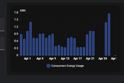
https://i.imgur.com/ktfEbSG.png that seems to work
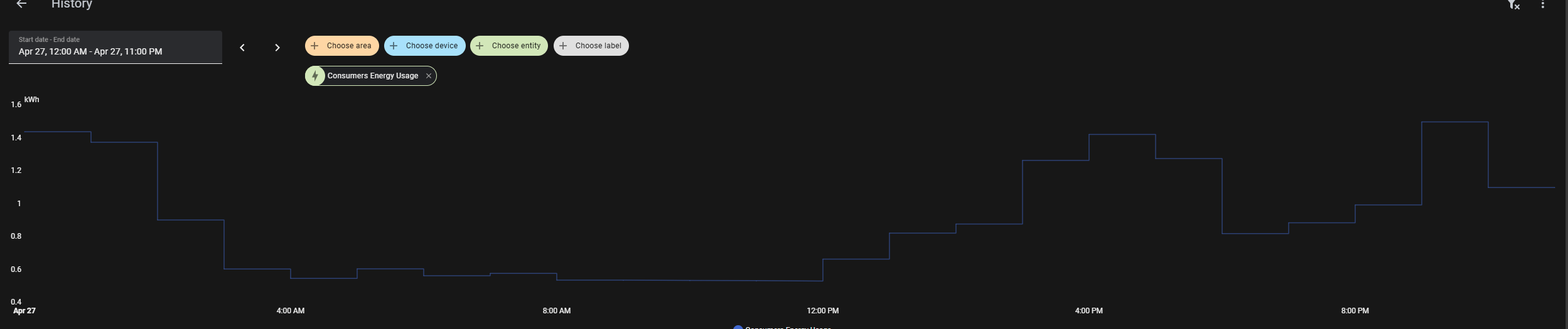
I want it in the Apex Charts "style" though if possible
The numbers dont match the actual data for some reason but at least it works
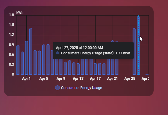
https://i.imgur.com/8viQiD2.png
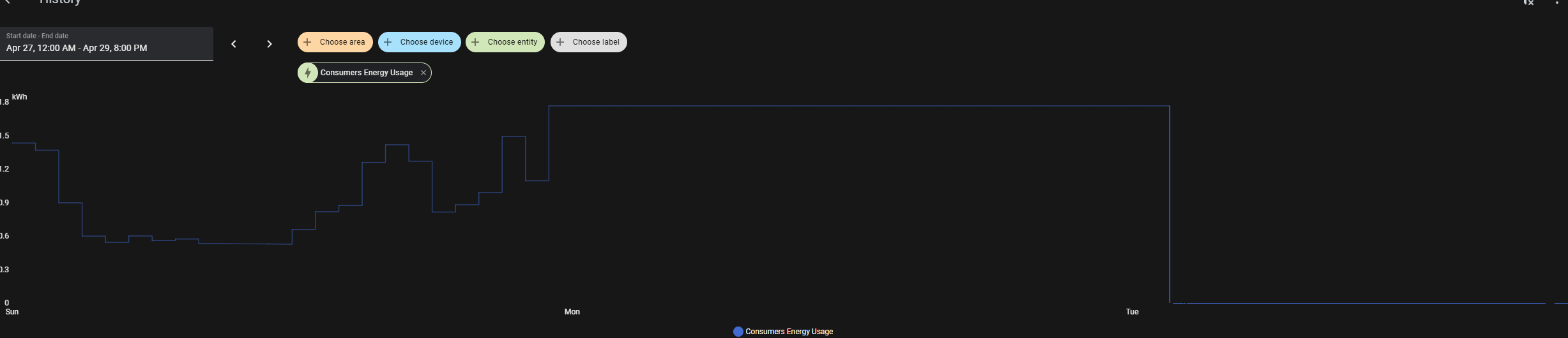
Here's for the entire day of April 27th, measurement taken once per hour it totals to 22.156 kWh for the day
https://i.imgur.com/MhPgGke.png but the graph shows this