#design contest chat
1 messages · Page 20 of 1
Made some progress on the paint

nice
maybe lore wise part of the ship is basically stolen from a morbiter? that's what it looks like to me
Hadn't though of lore but that gives me an idea. Maybe it's made from two unfinished prototypes fused together?
i could see that happening
🤔

uooghhh
what
looks cool
thank
I really like the contrast, looks cartoonist
@desert trail nice job on Mantis there, looks real nice
between the butt mines, nuke placement, claws and everything it just looks very nice
i think i like it more than Kazaakilikpleth
i'm curantly trying to wright up some lore about how it was the origanal before Kazaaakilikpleth was made.
becase funnily it was
noooo i was not quick enough for every orher submission to be mine
i just can't think of a name :(
show me the ship

call it ball weaver
i should've autofired some thrust acutally
but the balls are not going inside each other
autofire thrust??
ah that one
air means for the glory shot
for the glamour shot
O
none probably
metal plate
at least use a 3rd metal so you can do megagigafades
or whatever they're called
where there's 3 of one colour
it does not look good
imo it doesn't look good right now so
easier for you to get master of design then :P
i... guess that's a valid train of thought
it’s a cool ship, unique shape, but it looks like you’re not using an entire layer
that is not true

not particularly one that i like but it is definitely a train of thought that one can have
shadow layer, grey, slightly lighter grey
there is purple :) everywhere
oh


alrightyyyy
the ftl works now
i am officially on a 9 day vacation as of right now, time to spend 300 straight hrs building and painting
looks nice, im glad u implemented a couple of my suggestions
2mil on the dot but i do think this will ruin some people's day

ai can't turn very well
it has missiles to hopefully take out any stupid squib/flankers and its gonna be on autoram so hopefully it wont lose to orbiters
it goes 100 lol
mrt op
somewhat inspired but this is just the form that most mrt cg ships take
yee


well you can
rather difficult to make hooks that can only grab ship sized stuff and not debris or rock sized stuff though
you see the vision?

v3 is a failure 

i have mo idea how to do this center crystal

we going both directions

your brain is big
im cooking this dc
is huge ships allowed
my ship is long and the build grid is, well, not large enough
i dont think so
No

waow
i think its a bit messy tbh

I think the x pattern ones are jarring
like the one in the middle overlapping another one?
They're cool though
how about
vertical
vertical
vertical
vertical
x
diagonal
diagonal
diagonal
I guess id have to see it

i think the fades and the really small gems are the problem
yeah the fades def were some of the problem
and too much detail on the small gems
and the skinny ones
"x" is like a sign of pirates ☠️ or something

Seems better
this tho


Ye
hm not really
why
also here's the Collection finished


pretty
i can say i never expected to blow up my own ship for a glory shot

banshee but better
yea p.much lol
the bottom chainguns cant fire (critical failure) and its overbudget (fixable)
glory shot?
oh

idk if its just me but if a ship has lights i can hardly tell on the ship.png
glory gif

could use a wider aspect ratio imo
it is hard to tell esp. since the lights on this one are dark and mostly used between parts of the ship
ye
full screenshot im just not gonna include all that empty space

its performance against Eos is weird, it beats it, but sometimes it never splits and other times it splits once or twice
my reccomendation is to use some brighter lights to give it a more glowy magical look
i can just brighten all the lights
idk if you gotta brighten em all
they're p. dark since their colours are taken from the bluish-purple used in the paint


lmao epic, send them in as the other two ships lmao
is there a speed requirement for the dc?
uhhh i dont believe theres a hard requirement
just fast enough to not be free railkite food
haha no
the non-flak variant might not be expensive enough actually
only 2facs and 18 crew running the whole ship
why do i always forget sensors :<
ok just checked the smallets Collected is just barely large enough to qualify, though a hyperdrive would also need to be added

a tad repetitive but nice
i have an idea for my third and final ship
a combination of all 4 of these ships

wings, emp, ion core, distinctive shape
wings will be completely aesthetic
cg ion core perhaps
sounds exciting :)
does this evoke whimsy

i was trying to use both negative and positive space
updated ver

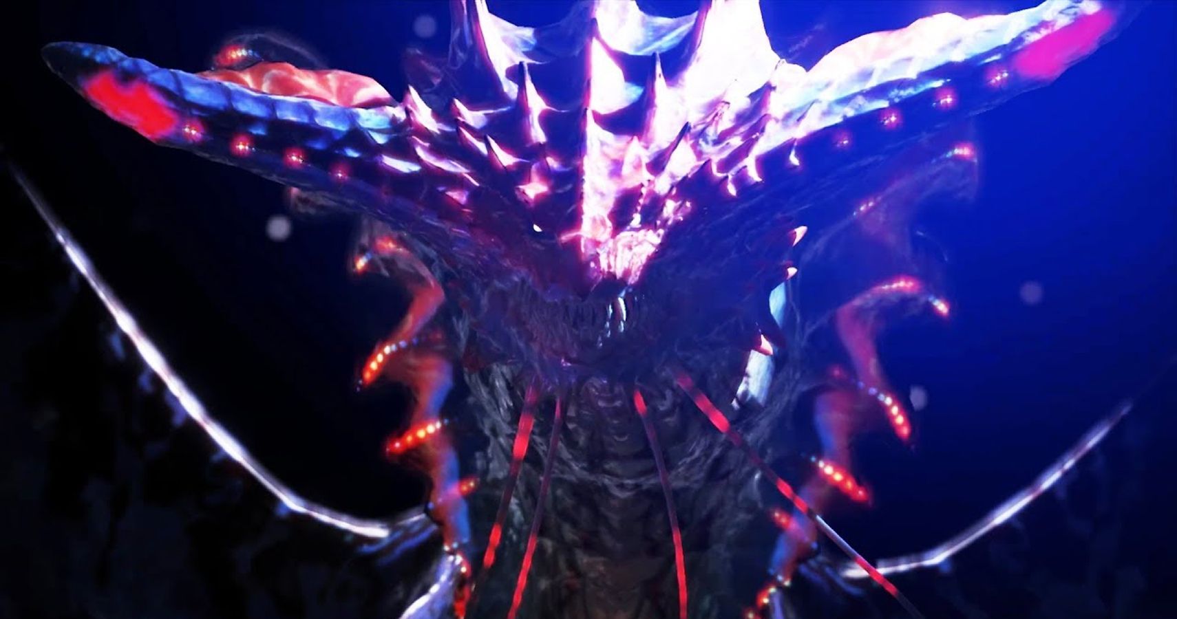
i see a creature in there
whar
Can i see w/o guns blazing

Explain 

That reminds me SO MUCH of that clip of guy hitting a spider with a broom and all its babies coming off its back

You probably don't want to change the name but i might have called it wolf spider
whew
even more glowy ver

im starting to run out of places to put lights

huge improvement i love
im sorry but when i saw this the very first thing i thought was "the gay creachure"
it looks quite nice tho
do you have enough budget leftover for the weapons?
the weapons are already on it below
it's a PD fighter?
thank
no

that will probably be the final verson of this ship/s
200k
i would use that to clean up the same and add some structure in the nuke area imo
having one of hte most decorated, cool looking structure setups and then just nothing below it looks odd
yeah im probably gonna use most/all of it for decorative stuff
oh yeah its not done
at all
i still i have no idea what my 3rd ship will be
all crew in nukes have airlocks?
They will
basically i just have the barest minimum rn there will be more armor and structure all over
u probably also want a bit mroe reverse thrust (rotate the outermost HTs perhaps?) since an enemy touching the structure is probably close enough to have its missiles go around the PD
yeah i will
but you seriously cooked with that structure and concept is great so i'm excited to see what you're bringing to the table
this is like 20% done lol
tho it is probably kinda fragile with practically no armour
who needs armor when theres gonna be no projectiles
lasers and disruptors tho
and also limited lifespan as there are 32 nukes there that will tear through most things in one salvo
there's WHAT
flak would be a little better but its much more expensive
also the pd will look like funi little light show
you know what else has 32 nukes? this

literally twice its size and still has the same no. of nukes
yall already taking glory shots and the contest started like 2 days ago 😭
ich bin speed
my belovered
thank you
voluntas also has 32 iirc and alexander has 34
i am still slightly irritated by aeternum having less nukes than alexander
now that i think about it i should probably make a mine ship
i'm tossing up between:
- Aurora Australis
- flesh ship
- small ship
1 or 2
2/3 of my ships have mines but neither are really the main focus of it (because the ai cant use them very well anyways)
a small ship won't look as cool but also at this rate there's gonna be like no low-level independents
what counts as low level lol
as far as i'm concerned, below 6
then 6-12 is mid level and 12-18 is high level
this ship was initially gonna be about 750k-1m but then shields and pd and thrusters were a lot more expensive than planned
around 200k then?
ye smthing like that
i could submit chevron potentially
or perhabs a 500k version that's even more jack of all trades
hmm i do wanna try my hand at that too but my ships are mostly set in stone. maybe the nuke barge can go
It's a classic problem 😌
The two ships im currently working on are gonna push 2m but my third one im gonna force myself to keep below 1m
your poor pd 💀
y poor
each pd has like 75% unobstructed los
extra armor
actually there are very few honest to god cannon triangles, i might make one
cannon dorito
at a very low cost
fringe has one but it doesnt rly commit to the bit
i agree
This is definitely a nice ship, I remember your "I can't do imperium ships", huh. Great work!
i didnt even notice but apparently these two little strips are the keystone pieces my ships structure and if any of those blocks break it gets splitted

post-alpha salvo relentless nuke barrage is satisfying

damn watching this thing in action is so nice
well back then i was just kinda bad at everything except fringe lmao
i did aeternum partially to prove once and for all that I can do imperium ships
visually i enjoy this ship but mechanically it is objectively fuckass
that being said, why does this fuckass ship beat desecrator
it has 32 nukes surely it's not that fuckass
going well


oh nice
waiting for nick to comment
nick appears offline
he'll come eventually i'm sure
but anyways this tournament my submissions are actually decent

Generally in testing it seems the more compact the enemy the higher the chance of victory
my submissions are just all wtf
(left is 2, i cannot decide which to pick)


i think my last ship will definitely be conventionally painted
Glue them together ass to ass into one ship
yeah sure thing
got it
i promise
its going to be designed incredibly weirdly just like the Tractor Tractor Beam™️ and Sprocketoid Card Booster Pack™️ but i will paint it with normal techniques and not a white/grey and blue/purple colour scheme
both of these ships basically use a sculpting setup except the dark layer is layer 3 instead of layer 2
done 👍

beautiful
so while i planned to kill a bunch of built ins and bring them back as their railfan varients, i don't think i'll do this anymore that ship sucks combat wise

rail liquidator is so hot
indeed
it's perfect for a railswap (flak is actually the perfect dimensions for 0 accel railguns)
turns out my supplier crew didnt even have doors lol
the first time i tested it the ship destroyed its enemy in one salvo
name: 🔥 🔥

@median patio Amazing ship dude, I love all the unique highlighting techniques you've been doing.
Heck yeah, same.
And it all started because of xsnows design contest
Couldn't fill a area up so I put a star there
Then on another ship i had the same problem
And it begun
@elfin venture
I don't even play or watch hollow knight it was just a name that stuck in my head lol
and yet you get the hk reference lol
but thats' fair, Radiant/Radiance is a great name for things
Only know radiance because of terraria lol
oh is it because of those people saying empress is a radiance reference or whatever when it isn't
nearly forgot.
@toxic ocean remember to work on / submit your ships if you havent already. you have 20 days left
20 days feels like 20 minutes
i forgot to fill it in
anyways, i have no more dc related dc ships to make so if anyone wants/needs optimizations lmk
do you know the best way to squeeze 6 cg's in a tight barrel orthogonally
maximizing the defense


just made that :3

i'll make a big ship and paint this one

i intend to make a DC strafer defended by a shield of flak (and maybe good old EMP side weapon ahah)
''Couldn't fill an area'' is exactly how people start messing with custom assets and how they get addicted with it.
chat im cooking
i don't think i am

oooo nice
where


is middle one complete?
put the legened of zelda ocarina of time time travel melody in there
middle and far left
i actually put the piece this ship will be named after there
good enough
the whole ship is based off the piece lol
i decided listening to this piece that it needs 32 nukes
lmao
it's also really funny how undergunned my ships are, despite my pvp ships having so much firepower
how much does middle one cost
i'm talking like 40%+ firepower on my pvp ships and these are lucky enough to have 2 railguns
yeah thats not good but not the worst
i mean it does have 8 mines and 2 16accel railguns
just that usually, i have way more firepower
lemme compare to ictina
okay differences are: 4 flak, 12 pd, more kiting thrust, 8 emp no mines, alot more ammo, shorter railguns
i didn’t even notice the lacka flakka
less shielding too
gl w missiles
it's not meant to fight them anyways
hm i can extend the wings to have some pd
now the shape reminds me of a ship from starsector

hmmm
hm


which one is better?

New
left
Left looks fuller i prefer that
Left looks more rigid
hm this is a bit too chaotic

goes over like 3 styles
but anyways all my submissions are "done" (i'll continue refining them and stuff and i'll post them on 8/19 or 8/20 probably)

Nice :)
hey @toxic ocean what do you think of all the chaos and improper painting on these?
Left one looks a bit more appealing because of the good contrast of the gold and relative similarity between the noise colours. The right one is... I'm sorry, it's not that good.
ik that, that's why i ask you for help
Great shape, bad paint.
You're so weird, Nuki, you very inconsistently make both very good and very... not good, paints.
yeah but like, this ship is the most inconsistent shit ever
When you’re pushing the envelope you’re bound to miss sometimes
i took a nap and half a year between painting sessions on it, like i straight up forgot what i wanted to do with it
i'm going to try to rework the entire paint to be more akin to the center one
\👍

Guh
the elephant explodes violently 👍
lol
(it is genuinely the worst mark in the game rn)
phase weave time

azutec??
indeed
an @onyx pecan reference??
yes
no azu doesn't die
but anyways hopefully i can make an azu ship that is really good so that azu can finally be in the game
i'll rename this to railfans and concrete

instead of railfans and cocain or zombies and cocain
both of which are too obvious of a reference
and then again, railfans like smoking concrete
so it makes sense
how is ai using that
Checks out
nukes for big ship, and rails for swarm control
(it doesn't)
i don't do the combat testing till i have to (when it wins community votes)
hm it almost worked perfectly
except ai fans
which i never intended
i always knew ai tries to fire all of its weapons but come on, not this time
you need to not have a set angle for it to do that
like you can't tell it how to approach
i'm going to try to make it kite or something
and make one of the nukes mines, maybe add a back large shield
it dies too quickly
time to duct tape a block of concrete to the front
i concur
the concrete crown

epic ngl
it helped alot but the shields are still a major weakpoint
its good for career ships to have weakpoints
well not like this
it has a weakpoint it's just that one of them is bigger and takes up everything
like in 3 seconds the reactor dies
you can still attack the rails and cut off all of its firepower
@tired vapor can you help me make this not flicker without removing any thrusters

should the crown be spiky or nah?

is it actually supposd to be concrete
yeah that's why it's grey
i say no then
green stuff is the zombie thingy that spreads on it
concrete no spiky it blocky
sure thing
hm the armor blocks have a funky pattern on them

checkerboard when i zoom out


ls coverage?????
does it though? theres a pretty huge hole that leads like a direct line to the rails
also hm it kinda looks like eviscerator

ig it protects it from flankers which is the point of the rails themselves
it does against ai
against people it's an intended weakness™️
i wa trying to go for a shiny gold look on this but i cant figure it out since the yellow and yellow highlight are the top two layers so i can't use fades

specialized reactor for mrt :despair:
wdym despair 
all the thrust combined should use around 10 power so its not like theres a lot going to waste
11 maybe even
it looked like shinyness from afar
that is like fueling an er of ht from 16 walkway away
ithink you'll have to rework for top layer black if you want to do fades better
i can do fades when I’m using regular triangles and squares but this part is supposed to look flowy
pretty sure this one is close https://media.discordapp.net/attachments/546947839008440330/1261784587521101995/recondite.ship.png?ex=66b09038&is=66af3eb8&hm=041b888bda0e4bbe3a02e11a8f96e1ba60f6cdbe354473cddf22009d66763a2d&

with the design of the ship theres nothing else in the area to power anyways
not full thrust though
third design is the closest thing to what I want
why not use mr module
which one
oh
not cost efficient enough
switching from 4 mr to 1 lr is a lot of money saved
it would be easier to save costs elsewhere
Do you see a way to save ~200k on that third design

the design as a whole doesnt work cause the bottom 2 cg dont fire properly
But i can reorganize them
im just trying to find various ways to do things so i can hopefully fit everything under 2m
8 cg (2 of which on the sides), 8 nukes, 4 emp, at least good enough flak/pd, 100+ speed
do some combat tests for the armor too - against ai, against human piloting wall, rammer, missile barge, missile orbiter (4 mainish damage distributions)
i think u can cut down on a lot of the armor
we going for loooong chainguns

i might also remove 2 of the cg and make the 4 remaining high reload speed versions
mine is so small D:

i sadly dont think i cant fit wings on this ship comfortably
you can certainly save cost on the ions and chaingun
ions?

ai kinda bad at using them yeah
eh

not worth a paintjob
exposed ions plus no reverse
and no armor
even a 700k ai ship can beat it
you could solve both issues pretty easily, is it that close to 2mil?
which ship do i axe

probably between the tb kite or nuke barge
i really like both though. it might end up having to be the cg rammer
love thr baby cannon
yeah the baby cannon is staying
OK!How do you think of it!
it was cool

Thanks!
very shiny
hmmm
looks nice
are you trying to go for an aquatic look?
True
i think the shape of the ion core's structure should be symmetrical
i think it looks pretty good but architects might think its too close to cabal? idk i would ask saris at least
i think it's distinct - shinier and different color and less big curves
Well...Your're right.But how?
OK I'll ask
its def gotta be distinct enough
@mortal cave Will its too close to cabal?
I would say probably
=n= OK Got it
Well,let's just send it to a daily boatload... Waste reuse lol
Should I change the light in the middle to red? Or just remove the lights
True.Thanks!
It's barely above 2 mil
rip
If I changed the pipe to something like this with a 3d feel, it wouldn't be considered as cabal style I think

im a big fan, but this style is probably too cabal-y

it has hard lines and angles everywhere unlike cabal, but everything else is, well, still cabal
The main thing that's strange to me is... How to define it's cabal?Using gradients?
Adding texture to your colorful ships will typically help distinguish as the Cabal is almost always pristine
this might be... far enough? the color scheme is different too

hm
what defines cabal
Texture?
Asymmetry, curves and spheres, pristine and highly colorful paint, and to a lesser extent gradients
alright, im gonna go with this then, it only fills 1 of 5 criteria which i dont think you can get much better than
You mean cabal?
2/6 technically as the paint is completely pristine, but yeah it should be good
Yes
true
=q=
Can I figure out how to modify it so it doesn't look like cabal...I just try 3d feeling pipe...But it doesn't make sense in terms of light and shadow
maybe change the color scheme for one, its one that cabal already uses i think
actually, they really dont use that color scheme anymore
No..cabal don't use it I think...And I don't think the color is the point
i think older cabal ships used to use it, but this one's the only one left, and is also different enough

probably dont change the color then
=q=
i think if you could somehow figure out an alternative to the gigafade it wouldnt look like cabal
but thats easier said than done
Mainly, it would take the ship out of the theme, and if the architect used a new color scheme to paint the cabal, we would say, isn't that a cabal?
well
thats not an issue i think you should be worrying about really
the new color scheme part
as for the theme, idk. i think you could very much find an alternative to gigafade to detail and i think that would be the easiest way to differentiate from cabal
=q=let me think...
i might ditch the tb missile kite too... its a strong ship but its not really fun to fight at all and silouhette-wise looks terrible. i like how this style lends itself to diags so i might make a diag something instead
diag underrepresentation is a very serious issue 
a few ideas:
- single fade, no gigafade (though cabal kinda alr does this)
- block fade instead of with actual fades (using three quarter, half, and one quarter blocks to make a kinda glitchy effect "fade"
- outlines with half blocks
gigafade?What's that mean
actually its not the right term for it
just the style where u have a bunch of fades right after another in a straight line
some alternatives to cabal-style gigafade

the leftmost is an example of gigafade
none of these look particularly great on their own but they work decently in actual ships usually
my least fave is the blocky one
i think the right is my most favorite, it looks pretty unique and cool in actual ships and its a lot more flexible with angles/curves than fades
True Love it
Thanks for your idea!Very good and useful!
the "gigafades" are really pretty on ships but my brain doesn't allow me to do it XD

progress

origanaly i was calling it clusterflack, but i think im going to rename it to Whirling shards of the fractured mind
or just Whirling shards
aparintly the other name is a bit too long
You can bypass name character limits by going to your ships file and modifying the names iirc. But Whirling Shard is cool
beautiful. i think this is an improvement even regardless of being less similar to cabal
@desert trail Whirling Shards lacks hyperdrives

annnnnd, i just realised i forgot to do the power for the hyperdrive....

fix...ed......yay.......
guess the next thing to do is make a 1m ship..... probibly...
Nice ships!!
Excuse me, recently I learn there is a design contest happening, which I want to submit my work. But I'm new to the discord and not know the rule, where is the proper place to submit my work, also is there a rule I need to check? Thank you!
2/3

rule document: https://docs.google.com/document/d/1ep6TRsDYrTVpjDcW5NOMzdUTituBYIbEs9rwQtQT5Og/edit?usp=sharing
submissions are in the design contest submission thread. all design contests use that thread, they dont make a new one every time

Google Docs
August 2024 Independent Ship Drive All relevant information concerning the August 2024 ship drive. For questions ping #Saris0203 in the #design-contest-chat thread on the official server. General Info You must join the official discord to participate. The theme for this contest is inde...
good luck!
bit wordy for sure
Thank you very much!
It’s funny cause I don’t build pvp ships I only do builtins which means every ship I make has hyperdrives but I still somehow forget it 80% of the time
lol
considering using this design for my 3rd submission

Pretty simplistic I'd say, not a fanof the PD wall structure with those extrusions but the structure bits are cool
.
looks prity cool so far
why is the left 321 backwards D: i thought it was going to say e6 lol
should i do the funny and submit a tbrail? i just made one that probably follows all the rules except the sensor and backthrust so it wouldn't be hard to mod it for those rq
how is ai going to use that
wizardry
i'll make it use it somehow
or not
ai uses vanilla railfans better apparently
if you dont have them set to target only they can just spray lead
i had everything set to fire at target
i think ai targets part as soon as it starts fighting anyways
it's just that ai doesn't know how to use tb
Yes but if the part isnt in its line of fire it won’t fire which is why ai cant really use railfans
from my experience the ai actually rotates to fire its railguns
it won't fan but it should fire all the rails
Second ship's hull is done.


wdy’m’?
I wonder if a pseudo CG rammer could work for AI
Also AI is bad at using MRT because it cannot feather.
ai is bad at most thrust because it cannot feather
who needs to feather just hold w
true
who needs to hold w just select the ship and click the enemy
it works ok for rammers but useless in any other ai archetype
To be fair mrt is useless in most other things anyways.
MRT kite doesn't work because kites rely on relatively quickly ramping up and down.
ai can orbit with mrt good enough
Good point I guess, it's the ''HOLD W'' archetypes though, that's what I meant.
yea

interesting
More paint progress.

Looking good so far!!!
gonna have to go back and repolish their paint but i like these dudes

fighting diag underrepresentation in career mode (ignoring imper)
i like all of them especially the newest one
big fan of the biggest one yea
its an unusually inspired layout for me, most of my ship layouts are formulaic to a fault
although i would recommend to change the middle one to a different archetype, i dunno if architects want two ships so similar in appearance and function
theyre at a very different price range and the way to fight them are different, so i think its fine, but ill keep that in mind
up to u at end of the day
although this is a 'ship drive' so i think it is important
how so?
i mean obviously its different but factions have a lot of the design trope of "same line of ships at various cost ranges"
well the goal is to add independents into the game, I would think they would want them all to feel unique
ill keep that in mind ig tho i dont think itll be an issue
i gotta think of names now
they feel like a personification of steel to me, so i am thinking of names related to steel or steelworking
mhm, i already have the lore down and they are very steel-y. basically a no-nonsense mercenary group
could name one of the bigger ones Blast Furnace
sounds scawy and is a steel smelting technique
also melting steel just fits nuke spam in my mind
thats definitely along the lines, but their ships are intended to very much be cold and dispassionate in a way, and blast furnace kinda brings the concept of heat/fire to mind which is a bit opposite
i see
I kinda forgot about this. oops
You'll be glad to know one of my entries will be a diag.
Always so happy seeing architectural elements in Cosmoteer builds by the way.
Trying to up reflection to the rule-set of this contest... Horns are not recommended because they are bad for AI... Decent maneuverability... The rest is basically already checked

I-I maybe overdid the front? May just be my minimalist mind speaking but I feel like the huge structure kinda shadow the stars and white outline
:>


the part at the front looks like one of those buged out eyes faces that cats make sometimes, very good


its very good

Slunk
thats a realy big slug
very unique, though im a bit worried about actual flags of countries in cosmoteer
which is better, red lights or just white?


would appreciate some opinions
im split
Red is inherently more interesting
I'm inclined to agree. I could ask Walt about it but its probably just better to leave it out, if you're not particularly upset about the idea, Concrete
not to mention the greek flag specifically is a very... polarizing topic for some people
Paint's finished. I've decided to call it Sleipnir.

is it an orbiter?
Yeah
Ive never seen cannons on the front of an orbiter
The idea is it'll shoot into exposed sides/rears
? well ig it depends on what you call an orbiter, but its not unheard of in general
if anything its more of an ul design choice, but uls are pretty much faster and lighter orbiters at their core
Hihihi that not intentional 
The intended face on this ship is near the bottom next to the thrust

i dont think ill try lol, i cant get a good working idea
my first 3 failedd
and yet look at everyone here
The thing you don't know is that everyone here also had multiple failures
I know Concrete has had at least 3 ships they weren't happy with
these two clusterfucks were previous failed attempts


plenty of time, dw
what the
1st one was an omniweapon attempt that did not go well
my first was a DC chain orbiter: thrust issue lead to fail
second was a unqiue DC ramer- failed
then a weird ass asym thing which failedd
pain
2nd one was based off of an idea i had for Fringe: a large reactor sticking out inside a very LS shielded barrel to taunt you with
two other failed designs


while the paint one is nice and all, it looks like pretty generic bright sculpting + not a fan of the shape and paint
I then redid the idea as this design which I plan to use

it's basically just a PD wall with a single HE fac module to let it pose a threat (and to kite really slow ships)
now that i think about it basically all my DC ships have used weird defenses
and been defensively oriented
Overseer with lots of shields and TBs + a small amour head and 2 flak, but only 3 nukes and a single CG for 1mil
the Collection which is subpar both offensively and defensively but can split and flank to keep up offense
and now this thing
it initially had numbers mirrored across the centre but i changed it to meaningless symbols that i thought looked better instead
also because multiple people read it as "e621"
What's wrong with it though? If it was politically sensitive then sure, but it's ancient pillars and stuff.
Odin's pet horsie.
24 of august is still less time than usual and I usually submit in the last week

man if only I hadn't wrung out my creative juices
I can refill you if you wish :>
You're saying that you DON'T submit at the last hour?
Unfortunately I value my mental health
Can't relate 😔
this thing is struggling on thrust and shielding

is it time for a complementary cockpit?
hitscan barrel

Where's my buddy ol' pal flak?
vacation
only 3?
i only had 1 success and i grabbed a way older ship inspired by starsector, the rest are all failures, even when i tried to make them work they still kinda suck
also andrea you don't have to compete you just have to have a good ship, since in this contest everyone has unlimited votes
Out of the one trillion ships you make a day we only see 1-5
That's not a good success rate.
yeah but like taht only applies toaesthetic ships
i posted every single pvp ship i have atleast once
Including the worst ones right?
all of them
Because if you do have standards and don't ever show some of your ships that are way too silly for this world to be shown...
Then we are all doomed and the existence of this universe is dependant upon your greater will to keep it standing.
GOSH, don't you just love it when you lose internet and your message is over 10 minutes late.
relatable
also order recived i will now go build the wackiest shit known to man kind and post it in ideas so that maybe i start a new trend for a day or two just like i did with 5er and 7er tbrails
Change the colour and reduce the brightness of the light to make it look a little more comfortable

To be honest, red is a little eye-catching with blue, plus it is very bright, resulting in no focus
=o=
I want to wait and see what people think....if every one think red is better
Okay I won't change it
I don't know if I can submit different versions of a ship, but I don't think that's allowed
i liked the red because it reminded me of the deep ocean, the pink looks like a cartoony version of the ocean to me, which i like less but i agree that the red reduces the focus so thats why i like both
I like your hull!!! I doesn't really like the absurd amount of light but I guess it might have success with other peoples

i like the middle option more than the top but i think red is still my favorite

What's this
Oh got it
ultimately i think it will look good no matter which you do
nice lol
Good. I just decided, and later roseship told me that orange might be good
Whatever, just purple
orange seems a bit off to me personally lol
Also think so,her reason is better with emp and thruster
She just try and also think that not good as she think

yellow is not good D:
How do you think?

(There should be some changes, so it is not the final version lol)
Indeed....tbh I've only been playing this game for 3 months and I still can't quite create my own style....
You could definitely make it not fringy with a color swap
Unfortunately right now it is very fringy
Sadly QAQ
the ship is very good but yeah it is pretty close to shredder

or a larger sprocket
i think if you changed the color scheme you can make it distinct enoug tho
The gear part did borrow from it,just make some small changes
The main body is actually referer from cabal and add something I want
currently your green is pretty similar to a lot of fringes, maybe use brighter or bolder colors and less texture so it looks shiny as opposed to the more rustic fringe
Have tried

Not very good tbh
Well, if there's nothing I can do, I'll just recyle it by send it to sotd lol
i mean if you want to send it you should ask saris
Yes true
i think saris will say the same thing but you never know
I feel guilty about trouble him every time sometimes lol
Yes
he said feel free to ping him with questions here in the announcement post
@mortal cave Sorry to trouble you,does this ship conform to the rules?#1059084974655033415 message
You're right.I've always been a little too polite lol
that's a good thing
well, you can submit, but don't expect the architects to agree with it XD
better to be too polite than not enough
Sadly lol
The cogs are unfortunately a fringe aesthetic, I'm not sure how you would safely put them on an independent ship. You can submit it but it likely wouldn't be accepted.
Got it Thanks!
turn them into

=q=But that misses the theme
I think I just need to make anther ship now lol
more angular
True

Holy shit that looks amazing
really nice looking appearance that fits an independent well
like it's not trying to look good, and is instead trying to just be effective (backed up by the rear being composed basically entirely of weaponry with almost no aesthetic shaping
but looks sick anyways
haha thank you im glad cause that was partially the point
i tried to make it look like a ship that isn't trying to intimidate or threaten you, it just will kill you
you succeeded
it looks a lot like how i'd build and paint a career ship honestly
no funny designs just whatever's effective
armour shaped pretty neutrally with 1x2s for polish and slightly thicker over the reactors
neutral paints, and long lines
tl;dr ship gud
thank u im so glad it turned out well lol
wait why is it called balam's dream im curious
who is balam and why do they have a dream
that one day,
well
Balam was a demon in the bible, and I was looking it up I guess it and many other demons were just removed from the Bible over the centuries, so now it is no longer in the Bible but is still found in Demonology books
Balam is essentially just a very strong general of a legion of demons due to its ability to see the past, present and future
ah nice
tbh with a ship like that, which looks very neutral imo, almost any naming style could work
and there was a song lyric I heard recently that I liked
||War dreams of itself||
That is a good lyric
and I just happened to learn about Balam around the time I heard it
i've inserted lyrics into at least one ship of mine in the past and i plan to keep doing it
so since Balam is basically a mythological master of war, I called it Balam's Dream
fitting
in my mind, the lyric means that war is a self-fulfilling prophecy, and by fighting in war we are causing more wars in the future
So the lore for the ship is that the captain simply loves war, and kills for the purpose of creating more violence and cycles of revenge

lmao yes
No sensor ?

le fixed
ive got news for you...
Corinthian Order is politically offensive towards the nations that don't have pretty architecture 😔
Very robotic I like it.
i keep upvoting everything thinking it's #sotd-submissions :(
ahah
now what i have left to do it make a nex big ship and paint it

called accursed because of the DC setup
-# psst, remember to submit / start working on, your ships if you haven't already. or i will spend 2 years looking for your location to smack you with a baking tray
that being said, i have no ideas for my 3rd ship.....
i do i just have no idea how to paint them
feels like this tournament all my motivation evaporated
I have a paint theme ready
Just no ship
I feel
i've got the themes, terrible ships to apply them to, just no motivation to do anything anymore and i'm out of ideas for the rot on railfans and concrete
If you think you can beat me in a baking tool duel, then you'd be gravely mistaken. You don't want to feel the wrath of my dough flattener
Good point though.
By the way remind me how to do the tiny text again?
Which one
like this?
-# ⓘ This user is under investigation by the police due to kidnapping and attempted murder. • More About

-# tiny text
Yeah that.
space lol
-# bingus
-# ||bingus||
-# dingus
-# multi font thingus
-# (edited)
Whens the next design contest
now
i have ideas that wont conform to any ship
guh
ram cg perhapskis?
agree


almost looks good

mmm
i could see arguments for yes or no
personally i would say no
also it's probably my favorite ship of yours
its been one of my favourites for a while
that looks realy cool
the paint in the middle is just so clean
cleanup

and reverse

...and i forgot hyperdrives
Yeeep

all 3

you need to include the .ship
shoot
yes glory shit is optional
now i forget about the game for 2 months
i think ive finaly figlured out what to do as 3rd ship
combine harvister with mines
basicly
i present Neon Hyper Overdrive


anything before i submit
does this game have an epilepsy warning anywhere
what colors

mmm i dont think hue shift really applies here
this was a serious question btw i dont wanna submit this if it will actually be a danger
i dont remember seeing one
but also idk if this would cause epilepsy
the options to override paint are gone :(
2/3 (possibly)

I don't think so but I'd make a version with slightly more muted colors just in case.
neon pastel underdrive

no that isnt what causes epilepsy anyways
thoughts?

Nice!
this has the same name as my smallest submission from the previous design contest lmao
I thought you did not wanted to go with sculpting though
it is not sculpted?
its shadowed
I haven't a clue of what you all are talking 'bout if dats the case
Yes. The epilepsy warning is an instant kick and ban you get when you use cancer paint in MP
sculpted is when layer 2 is dark, or at least that's what i was referring to when i said i didn't want to do sculpting
this ship's darkest layer is layer 3, and the second darkest layer is the base paint
What if the layer 1 or background is black
also just realised i missed a single fade in a spot fml
HMMMM I still haven't started on my ships, I have the theme in mind but once again I'm afraid of being overbudget and all.
My themed ships are pretty ambitious and most of the time cost more than 2mil, and that's resources EXCLUDED
basepaint is black = layer 0 black or shadowless (i think nuki also calls it "masking"), the terminology isn't very conclusive atm
i do not think there is a name for layer 1 black probably because you don't get a lot doing that and no built-ins do it
I hate this terminology thingy from the deepest of my soul


Come up with a better one, then. Paint has no terminology we're doing our best.
I'd say right one but I love bottom left ship.
I made it for the design contest so, well, ig i succeeded
wait, which right one? top one or bottom one?
Oh I thought you ordered it in a left and right column.