#artwork
1 messages · Page 93 of 1
 umbral rune
umbral rune
umbral rune
Spiky vines and sonic tree
 wide remnant
 umbral rune
Hmmm, cool
wide remnant
Also listen to this while you make it
https://www.youtube.com/watch?v=tE9wC1WUZEo

Best gaming music content!~
The whole collection is availeble on this channel.
umbral rune
Guess I'll need to do it after work
 hushed jay
Sonic CD has a great soundtrack, the PAL version at least. 🙂
 tight monolith
Little doodle ùwú
 surreal bridge
Cute
 wind forum
nice
 tacit arrow
that's more than a little!!
 untold otter
@tight monolith is that mirio?
wind forum
that is Mirio
wide remnant
I can’t remember the name of the other guy
 oak saffron
Oh damn it's Mario
 harsh bear
It'se me mario
tight monolith
It's Mirio and Tamaki ùwú
 brisk jackal
me when no-clip
untold otter
My Fool's Gold team
I wanted to draw Seth(my Alakazam) too, but i couldnt because he didnt fit in the drawing
I guess I'll draw him in another page
 livid herald
Seth, as in the Egyptian god? I am pretty excited then.
 cosmic cloud
untold otter
cosmic cloud
untold otter
@livid herald yes, Seth as the Egyptian god
The Alakazam from fool's gold is based on Anubis, but it actually reminds more Seth lore-wise, design-wise and typing-wise
cosmic cloud
f
brisk jackal
is that a poor attempt at a triple fusion for the unova starters
surreal bridge
its really small
is that a poor attempt at a triple fusion for the unova starters
@brisk jackal yes
 vital delta
Not familiar with any
brisk jackal
i recognized cause the emboar clothing stuff
looks nice but looks like it has too little details from any of them
surreal bridge
so more details?
brisk jackal
i mean
i recommend taking the body from one as inspiration
and fill the shit out of it with the others
vital delta
brisk jackal
nice
brisk jackal
fat snake with a headpiece
thats what you should do
but make it bigger for the love of arceus
vital delta
Is that.. a skull fur?
brisk jackal
what
brisk jackal
mhm
brisk jackal
yes except its a batwolf thing
vital delta
Skullfurs don't have to be of any particular species
brisk jackal
yeah
brisk jackal
gappy
vital delta
Gappy?
vital delta
Ah
brisk jackal
vital delta
wide remnant
The chest thing looks weird and the feet look wrong anatomically
surreal bridge
okay
tacit arrow
ground type treecko
hushed jay
It barely looks like Treecko to me, but it's a cool concept! 😄
harsh bear
I would only maybe replace the tail with a drill and make some round part spikier oder edgier
 fluid spear
That doesn't like treeko to me. and it look like more of a steel type than a ground tupe. as most of it's body seem to be made of metal
But yeah, it could make a cool, non treeko, pokemon
tight monolith
That's alright y'know ùwú, there could be some improvement but you can always practice more!
How's this?
tight monolith
Thankies zD
It's just some practice lmao
Should I keep the lineart black or color it a bit?
untold otter
Is just practice yes
I’m practicing the hands and hair
My worst enemies
Looks great
👏 👏
tight monolith
Thankies ùwú
harsh bear
The head looks a bit small, and that the cloths are so perfectly in line is a bit irratating. The arms dont look good. The hair is cool and i like the theme.
Btw i wanna draw a infinit Fusion Showdown Banner. And ideas wich fusions should bei featured guys?
 pseudo venture
All of my sprites. 
wide remnant
@harsh bear I’d say find out which Pokémon are most used there
 flat girder
Is the banner the background art on the home page?
flat girder
Cool. That's a good idea, there should totally be a fusion one
tight monolith
The head looks a bit small, and that the cloths are so perfectly in line is a bit irratating. The arms dont look good. The hair is cool and i like the theme.
@harsh bear it's a double layered thingy, and the lines are jumbled bcs of the fabric but it's smooth and anatomically correct
harsh bear
it's a double layered thingy, and but it's smooth and anatomically correct i dont get these 2 points
wind forum
Nice
tight monolith
Y'know what it's too tiring for me to explain
hushed jay
Looks cool, don't like it facing forward though if you're spriting it. 😅
harsh bear
progress
hushed jay
Cute and terrifying. 😂
harsh bear
the machoke isnt final yet the others two have their final line art
pseudo venture
Where is Kitsune? 
pseudo venture
😦
harsh bear
this one is drawings the second one is gonna have sprites
wind forum
Epic
surreal bridge
Ty
 final kettle
wide remnant
final kettle
wide remnant
That’s Torterra’s face
surreal bridge
not its not
its cut off because the head parts on flaafy were put there
flaaffy*
the horn thingies
wide remnant
Grotle doesn't have a nose like that
surreal bridge
yes he does
wide remnant
No, his face is green and he has only nostrils, not a separated nose
wide remnant
Also the tusks on the side aren't separate from the jaw
 wide remnant
The expression on his face in these pictures isn't really relevant
Just redraw the face, the body looks more like Grotle
surreal bridge
but im alr far into the sprite
wide remnant
Well, just fix the face on the sprite then
surreal bridge
the head is wider that the torso pls fix
surreal bridge
I wish you could increase the size of the toso to match up a little better with the body
also the left hand it hinda odd
I dont think I should see as much palm assuming its slightly tilted downwards
WAIT DONT
U CAN FIX IN SPRITE ALSO TOrSO MATCHES
wide remnant
wide remnant
What?
surreal bridge
more indent where blazikens fur is
wide remnant
What do you mean?
surreal bridge
v <-- what it would look like
wide remnant
I don’t know what you’re talking about at all
wide remnant
Use the snip tool and draw on it?
surreal bridge
no
 safe shard
 cunning lodge
naw
cunning lodge
its partially based off a mouse
and people have creative freedom to draw what they want so I mean
why not?
surreal bridge
and overly rendered pokemon are cursed aswell
wide remnant
Like in Detective Pikachu?
surreal bridge
they are very close
hushed jay
I love some of the designs from Detective Pikachu (Bulbasaur), others not so much (Gengar). 😅
brisk jackal
how dare you say that to my fav gen 1
hushed jay
Hey I love their designs normally, but Gengar's teeth in Detective Pikachu, yikes... 😅
 muted beacon
Gengar has a weirdly human face in that movie
hushed jay
It does, and it's really unsettling. Which kinda works for a ghost, but still. 😂
muted beacon
Gengar itself is supposed to be cartoony though. I kinda like hideous things however, so those designs were fun to me.
Lickitung is as weird as I wanted
hushed jay
Yeah the weirdness really works for Pokémon like Lickitung. I also really like Mr. Mime's design too. 🙂
muted beacon
Yeah. And the fact that all of Aipom's teeth were incisors is funny to me
harsh bear
Yeah Mr. Mime was great even tho I disliked the design in the games it worked great in the movie
tacit arrow
i liked greninja's and torterra's desings
harsh bear
the first banner is done
harsh bear
thats not important the mons are the important thing and its only a screenshot
surreal bridge
what is the banner for @harsh bear
 unkempt gorge
Showdown
 surreal tundra
I like the fact that they are not very prominent and only drift around like a light fog or something : D
hushed jay
I think it's just that the background clashes a bit. Maybe some darker pink swishes by some of the text could work? 😅
harsh bear
On the website itself it looks good and is zoomed it. Also it is just to blend it into the bg so i think its fine
Are the Mons wrong? This is more important to know
hushed jay
They look great! I really like your style. 😄
harsh bear
this is how it looks ingame
 jaunty shard
Ooh nice!
 lethal fog
Close to finishing my practice map
surreal bridge
nice but i dont think thats artwork
lethal fog
How so?
surreal bridge
How so?
@lethal fog is this for a game
 worthy roost
It would be real dope if you took some time to clean up the assets that don’t exactly fit the style, like the stairs and house
lethal fog
I'm making a fan game with some others currently but no this was just some practice so I can learn to make maps
tacit arrow
a wasp with a browm hat
lethal fog
I finally probably most likely finished the map
hushed jay
It's a really nice map! I'd personally say maybe too many trees dotted around (I really don't like the one in front of the bridge on the left side because it'd be annoying from a gameplay perspective), but I know some people prefer that style. 😅
 spark yoke
i really like that, especially the more natural forest, always annoyed me in the pkmn games that they are on such an obvious grid
surreal bridge
grid?
 exotic bolt
Squares
hushed jay
It's especially obvious in Kanto, which has so many straight line paths that it's just absurd. 😂
surreal bridge
oh
spark yoke
its a bit like the same flaws u can do in spriting in a bigger scale, too many straight lines and 90° degree corners
hushed jay
When I'm mapping I try to go quite open but not too confined to the grid, though in RPG maker every map boundary needs an 8 tile grid around it so you don't see black pixels when you're playing (which happens in IF a fair bit). 🙂
exotic bolt
I kinda wanna try out making a map
hushed jay
This is a map I did that I really liked. 😄
exotic bolt
Although I have not idea how to
hushed jay
Well, the upper half of it. 😂
exotic bolt
im literally just bored and will do anything
hushed jay
You can use ROM hacking tools or Pokémon Essentials to make maps. 🙂
Here's another one I did. 😄
surreal bridge
blaqauza are you making a game
hushed jay
On and off, yeah. Usually come back to it for the first few weeks of the summer holidays. 😂
I've got a whole region mapped out (excluding interiors after the fourth Gym and an evil team hideout or two), just need to put trainers and events in it. 😅
surreal bridge
Oh nice
hushed jay
I tried making it unique by retyping loads of Pokémon (Luxray's Electric/Dark, Donphan's Ground/Normal, Torkoal's Fire/Water, etc.) and adding in the Cosmic and Sound types and giving them to loads of Pokémon, as well as a decent chunk of new moves. Just to spice things up a bit. 😄
I made every final evolution's base stats at least 500 as well so everyone was decently strong. 🙂
surreal bridge
Are you adding regionals?
hushed jay
Yeah, I did a few sprites for them a while back but they're not that good. 😅
This is one of my favourites (though the solar panel isn't done the best). 😅
And who can forget this one? 🙂
spark yoke
somehow looks like a sock monster
surreal bridge
I like them
hushed jay
This is one that isn't as creative, but I like it anyway. 😃
jaunty shard
I still like em
I made a fakemon today
Its known as sugotosis
Its evolution
Sugolord
Sugolord’s mouth was hard
harsh bear
What are the black things around its mouth
 copper gyro
this should be in #spriting-discussion
harsh bear
Some areas in the Evo Lack shading but really cool
jaunty shard
this should be in #spriting-discussion
Oh sry I thought only fusions should be there
Some areas in the Evo Lack shading but really cool
Ok I’ll see what I can do thx
hushed jay
Oh damn, I love those designs! 😄
jaunty shard
Thanks!
harsh bear
if you ever want them to be drawn. i am cheap :3
jaunty shard
Ill see ^^
 fervent meteor
Dudes, want to play some Malls & Mawile with me~? :3
cosmic cloud
Lol
oak saffron
@fervent meteor can you link me it?
fervent meteor
Malls and Mawile isn't a real thing unfortunately. X3
However I know of a D&D 5e Pokémon conversation if you want that. 😄
fervent meteor
I wish! >w<
oak saffron
I'll message later as I'm in a game
fervent meteor
Okie dokie. :3
wide remnant

Music: Oki Doki!!
Composer: Yoko Shimomura
Playlist: http://www.youtube.com/playlist?list=PL0F1CC7E40779F15F
Platform: Nintendo DS
fervent meteor
Rad! 😄
untold otter
Thx~
jaunty shard
Looks great!
tacit arrow
@untold otter looks great!!
untold otter
Thx x)
 slender oak
Looks creepy, Nice Work!
surreal bridge
I rushed into these and I know that’s why the sprites didn’t come out so good
@valid ridge
surreal bridge
I should’ve finalized first before deciding just to go into spriting
 valid ridge
@dim nacelle hey here's the sketches for gothitelle
yeah
if the base is bad
the final will be bad
lesson learned?
surreal bridge
Yeah
valid ridge
the bows looks like asses on these too lol
surreal bridge
Should I keep working with the gothitelle? Or restart it all
surreal bridge
I usually do
valid ridge
and draw your sketch while actually checking
then explain
also, seriously don't rush the sketch
it won't go well
 dim nacelle
yeah dont rush them
valid ridge
i can only get away with it because i have a relatively good idea of the basic rules of anatomy for pocket monster and i draw on a phone so i can import directly
you've seen my sketches, right?
valid ridge
like that
that's for the triple fusion contest
and the final sprite is this
a good sketch makes a good sprite
but don't overcomplicate the sketch either
surreal bridge
I can get away with it most of the time to, but this wasn’t even a sketch
wide remnant
Too bad you didn’t have a good sketch then
surreal bridge
I’ll go for 45-90 minutes
valid ridge
yeah
i think for now adding more time will help you
once you get better you won't need the timing
but now it's kinda... needed
umbral rune
 scenic ledge
hes got some weird legs
 spring sapphire
translate : 75th Indonesian birthday
(Not actual HoF, but edited pict. So i put it here)
brisk jackal
what
spring sapphire
Hall of Fake 😛
spring sapphire
oh god why electrode/electrode
@soft mango it's Voltorb/Electrode
 soft mango
oh that makes sense
pseudo venture
Why?
wind forum
epic
tacit arrow
my two favorite dark bois together?!?!? nani!?!?! and it looks soo good!!! very good job @vague thorn !!!!
 vague thorn
Ty man, but i used the sprite from someone as a template
untold otter
@vague thorn Definetly much less whack than other peoples posts so far
jaunty shard
It’s awesome!
vague thorn
Awwww ty <333
 wide warren
it's feet look somewhat deformed but otherwise it's really nice
untold otter
A very bad drawing made by me of the supreme creator god Arceuspinogodjehovahallahvishnuweegeeharemithrasjesuszeusabakuodinchtulhuakatoshtalosmelkorazathoth
slender oak
Looks cool
untold otter
Arceuspinogodjehovahallahvishnuweegeeharemithrasjesuszeusabakuodinchtulhuakatoshtalosmelkorazathoth is the supreme god that created the multiverse
It generated itself inside a cosmic egg, and when it went out, it created the multiverse
It divided itself in more gods and demons to create the multiverse
cosmic cloud
It is an eeveelution or not?
surreal bridge
it is, from the looks of it
 half flicker
wip
surreal bridge
is it supposed to be almond shaped head?
muted beacon
To me it looks like a face mask or something
surreal bridge
^
half flicker
nah almondhead
jaunty shard
Looks neat
surreal bridge
looks a little like full metal alchemists style tbh
tight monolith
What would be a really cute fusion ùwú?
 tight monolith

brisk jackal
cosmog/dwebble? lol
untold otter
em alicia if it's not too much trouble to draw the milotic / dragonair from your request
tight monolith
Oo lemme try
brisk jackal
wait who u answering
tight monolith
The Milotic Dragonair RN, but I'll try the cosmog dwebble later
wide remnant
This one is pretty cute
brisk jackal
ok knuckles
surreal bridge
yeah
jaunty shard
So like this was a big project for a fan game and i finished it yesterday do you guys like it :point_right::point_left:?
hushed jay
Oh wow, that looks great! Love the style. 😄
 wide warren
it's a sprite
harsh bear
it has some rough edges but looks really cool ^^
wide remnant
It’s pretty good, though the hands look too large on some of them
brisk jackal
first one right hand last one left hand
wide remnant
The last frame
jaunty shard
Ok
wind forum
@fickle holly 🐒 🤖
surreal tundra
see no difference
wind forum
its the same picture
 fickle holly
@wind forum 👀 👌
wind forum
 👌
👌
umbral rune
ThT blatant plagiarism must be punished
wind forum
lmao
 royal delta
I don't remember who this is for but it was in my todo bin:
royal delta
haha turtley does
royal delta
glad to be back, been hella busy with work stuff, so its nice to just do something for fun again 🙂
Ive been keeping up with all the new sprites though, all ya'all are seriously talented and imaginitive 🙂
hushed jay
Wader's the wholesome art person that honestly motivates me to make cool-looking sprites more than contests. 😃
 tired hound
Judging from my previous pixel art do yall think i could have the ability to work with pokemon sprites?
brisk jackal
probably
tired hound
Itll probably be rough at first ngl but I think i can do it
copper gyro
brisk jackal
shut
copper gyro
no u
brisk jackal
nah
tired hound
This isnt really sprite work
copper gyro
🤷♂️
exotic bolt
Ooh i like that Hornet one
fluid spear
Sprites ar artworks too though
pseudo venture
Nice
brisk jackal

pseudo venture
@royal delta welcome back ❤❤❤❤
brisk jackal
simp
untold otter
5 hours of work and I'll be destroying it soon lol
brisk jackal
sad
surreal bridge
very spoop
tight monolith
Oh snap lmao, I was supposed to make Luisito's version lmao
I did my own take of the Dragonair Milotic
wind forum
Epic
 solemn kestrel
When did the Nintendo concept artist get in here
wind forum
yes
jaunty shard
Looks great!
 copper lion
it could be friends with my ninetales/dragonair
wind forum
Nono I just fixed it's pearls
@tight monolith it was too good to notice 😎
tight monolith
Awww thankies ❤️
untold otter
@tight monolith is not my sprite but is beautiful
tight monolith
Thankies ❤️
jaunty shard
Gorgeous!
wind forum
droop
wind forum
😄
soft mango
goofy squid love em
tight monolith
Did a doodle
But I don't wanna continue it since it looks weird qwq
surreal bridge
perspective confusions
 rain agate
There are lots of people on tumblr posting "pokemon crossbreeds" and "pokemon subspecies"
Might not be a bad idea to try and get in contact with the people making to see if they'll allow them to be used for infinite fusion.
Credit to houndoom-kaboom on Tumblr
wide remnant
You could ask them if they wanted to join here
rain agate
I don't know them, and i feel like someone who actually works on InfiniteFusion would be more likely to get results than some rando like me. If that make sense.
Also my mistake, theRiu just reblogged it, the original artist is houndoom-kaboom
Also I have no idea how to PM someone on Tumblr.
wind forum
Houndoom kaboom was on this server for a bit a while ago, idk if they are still here though
surreal bridge
@rain agate what fusion is the ice type one?
rain agate
Houndoom Kaboom has put the pokemon used to create the fusions in the corner of the fusion,
But it seems to be Beartic.
tight monolith
@untold otter I did the thingu
tight monolith
Thankies ùwú❤️
soft mango
bruh it almost looks like official artwork
tight monolith
Almost uwu
surreal bridge
tru
 prime citrus
tracing go brr
harsh bear
Not Bad but the shading needs improvment in many areas
tight monolith
Haha, lmao, it's not tracing love
Also referenced Luis's sprite
Not Bad but the shading needs improvment in many areas
@harsh bear please enlighten us then
jaunty shard
Ooooo looks great
tight monolith
Thanks lmao
harsh bear
Red is not good lightning
The tail looks really flat
The orbs were better on your previous drawing
The top light is nearly not visable
harsh bear
can you explain it here?
Otherwise its consitent and good
Only some small nitpicks
Gj
tight monolith
The top light is nearly not visable
@harsh bear bro, I literally just followed the lighting in Luis's sprite
harsh bear
First thats a Sprite they work with less colours generally, and the placement is mostly correct but executed not good on your drawing
tight monolith
Mmm well I guess it's just my own version
harsh bear
Do as you wish. I know you don't like my critique. But if you want to I could go into further detail.
tight monolith
I'd rather you not
harsh bear
Could I ask why? I see potential in you thats the reason I stated out many flaws even if I looked like an asshole to you.
pseudo venture
neither I like the shading
surreal bridge
Could I ask why? I see potential in you thats the reason I stated out many flaws even if I looked like an asshole to you.
@harsh bear I think this irritated Alicia, you’re being too persistent in something she already said no to, and the “I see potential in you” also can get really annoying
pseudo venture
I don't see potential in you, better? @surreal bridge
surreal bridge
Just saying that is fine but saying that while trying to change someones art could and robably did annoy alicia
cosmic cloud
But saying “thats my own style“ just because you dont want to react to critic anymore...
But thats none of my buisness
surreal bridge
Skeptic shackle sketch @cosmic cloud
cosmic cloud
Such a handsome skeptic shuckle
cosmic cloud
Does the red echidna accept this as a potential emote?
If kj swears to dewack him @wide remnant
wide remnant
What?
wide remnant
Why would you need to ask that?
surreal bridge
is taht a yes or no
wide remnant
Making a sprite is not something I need to approve
surreal bridge
you making said sprite into a emote is tho
wide remnant
I don't know, we'll see if the sprite is good
surreal bridge
ok
lethal fog
Working on possible shinies for my groups regional Breloom, the one with the grey background is the non shiny
wide remnant
What type is it?
 alpine sleet
the purple one looks the best honestly
surreal bridge
depends on type
lethal fog
It's electric type
Personally I like the bottom middle left one
Looks kinda like a steel type lol
harsh bear
I like the blue or pink one
hushed jay
That regional form looks great! And the purple one is really cool, it reminds me of the Shroobs from Mario and Luigi. 😄
 fossil belfry
I really like the pink one! Whats your group about?
wind forum
fly.
lethal fog
We’re making a fan game
surreal bridge
We’re?
wind forum
w
surreal bridge
ebic
untold otter
Chand boi
wide remnant
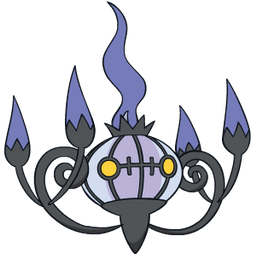
That certainly is a shiny Chandelure with n orange squiggle added for some reason
wide remnant
A recolor of official artwork with a squiggle
untold otter
Chandelure shiny just looks so good
wide remnant
How pointless
wide remnant
I already found it
https://pokestop.io/img/pokemon/chandelure-256x256.png

 untold otter
Also chand boi just looks amazing
wide remnant
That's not where you talk about this, go somewhere else
untold otter
Where can i post owolure?
wide remnant
Nowhere
cosmic cloud
That is something totally different lol
lethal fog
We have to make ATC's in my art class and I just finished one, although I may do a bit more to it
surreal bridge
Looks nice
lethal fog
I never do backgrounds so it's still kinda trash tho
cosmic cloud
atc?
lethal fog
Artist Trading Cards
cosmic cloud
Did someone invent a trading card game for them? Sounds like every artist makes those things
lethal fog
No
It's like little art works you make and you just trade them with other artist, kind of like a business card but more personal
Like this
cosmic cloud
they are all the same size
so i want a card game
i would mine design like a gaming card
 shadow mist
Credit due to albrt-wlson on Deviantart
surreal bridge
incineroar but rock furry
harsh bear
2
tight monolith
Am bored during school, I'll only send sketches, but gimme pokefusion ideas
lethal fog
Drifloon and Qwuilfish
tight monolith
worthy roost
Espeon darkrai? Or is that too complex
cunning lodge
cuute. How about something also cute, like.. Eevee/Growlithe maybe?
wide remnant
What is that? Espeon and who?
cunning lodge
cute smol fluff boi
tight monolith
Ok ùwú
wind forum

copper lion
Trampoline bugs
lethal fog
First three are done and dusted, although I may take a few stars out of the third one
I did change the font
Salvitude: Your attitude towards salvation
Solitude: The state or situation of being alone
Servitude: The state of being a slave or completely subject to someone more powerful
Those are the Definitions of the words
harsh bear
This is the Design @hushed jay and I came up with for the contest
hushed jay
I really love your drawing of it. ❤️
 harsh bear
thank you its really fun to discuss and find a design
surreal tundra
someone ate too many smarties
hushed jay
Currently working on the sprite before bed, I'm thrilled with the design. We brainstormed on it as a team and it was a lovely compromise. 😄
hushed jay
imagine doing a weezing for the contest
@brisk jackal Wait a second... 🤔
surreal tundra
we are fusing all 4 together
brisk jackal
they have already been done
harsh bear
this sound really funny ngl
wide remnant
Post your concept on the final day and then start making the sprite then too
harsh bear
i mean drawing and thinking is not forbidden ^^
brisk jackal
the sprite is already done lol
brisk jackal
everyone should be afraid of Tom Ate Crap
surreal tundra
oh, you are expecting another one of those xD
Nah, that was a once in a lifetime sprite
we definetly have the best name ngl
brisk jackal
yep
brisk jackal
isnt that just galarian rapidash
exotic bolt
wheres the Altaria?
exotic bolt
I kinda like it as just a redesign of a galarian rapidash 
I personally don’t like the hair on the actual galarian rapidash
harsh bear
i know it has some bad areas, but this is the first draft of a lineart for a small competition i wanna particapate in
brisk jackal
looks awesome
harsh bear
its based on you 
harsh bear
you think i am wholesome
brisk jackal
this layer made me laugh
 tight monolith
Mm, for the lineart, it's best to keep it to one layer as to minimize having to find that one dot in between the layers
And right hand is wonky, looks like he's trying to show his fingers, and the legs would need some muscle lines to be the same with what your arms is looking like
And the left side of the chest, the one leading from the torso to the arm is too wide, it looks like he's buff on one side and not the other
harsh bear
i disagree with the one layer thing. i can draw multiple things without screwing over what i already have, and yeah i thought so about some other things. thats why i said it has bad areas but i am fixing them
brisk jackal
i make layers even for doing sprites and draw on the wrong layer 
harsh bear
imagine making only sprites with one layer D:
brisk jackal
only who's good enough works on one layer
fluid spear
no nipples ?
brisk jackal
i like 2
wide warren
where's the altaria
tight monolith
It doesn't make sense tho
where's the altaria
@wide warren it's the cloud aspect and the flying type
wide warren
i don't see cloud
tight monolith
It doesn't always have to be a direct design copy paste
The mane and tail is different
wide warren
galarian rapidash with slightly different colors, hair is now liquid and it has wings
brisk jackal
pip moment
wide warren
bruh moment
tight monolith
Well what's your idea for it then huh?
wide warren
galarian rapidash but with a much more altaria like face, hair becomes clouds, and altaria tail
copper gyro
Add altaria things? Like its head tail etc?
wide warren
possibly also add the thing from the top of the head
tight monolith
galarian rapidash but with a much more altaria like face, hair becomes clouds, and altaria tail
@wide warren but if you look from a perspective, changing the bone structure of a mon would be weird, especially since it's a horse and horses have long snouts, I've incorporated but not fully change it to clouds to make them look more airy
And with the amount of mane compared to the tail, just putting a few bird tail feathers is not going to cut it
The head piece is an idea, but idk
hushed jay
I quite like it, reminds me of the water horse from Frozen II. 😄
tight monolith
Thankies ùwú
exotic bolt
What if you put the cloud around the chest area??
harsh bear
But there is no altaria but a nice little galarian rapidash alt
exotic bolt
I like this galarian rapidash alt
wide warren
definetly better than regular galar rapidash
exotic bolt
Hair was just an odd choice for a fiery horse
copper lion
You made a winged galarian rapidash, with a liquid mane
wide remnant
Doesn’t look like a fusion
copper lion
Thank you sherlock.
wide remnant
Xiapher bully
copper lion
What?
wide remnant
Why would it autocorrect bully to billy, I spelled bully right!?
copper lion
nope, it was billy. Then you edited bully
exotic bolt
Xiapher Billy
copper lion
I admit, I'm a small goat
wide remnant
I’m saying the autocorrect changed it to billy when I spelled bully
copper lion
I got that.
wide remnant
If you want it to be a fusion, make the body blue and change the face to Altaria’s and replace the mane with clouds
tight monolith
I don't want to make it too obvious
exotic bolt
maybe add blue cheeks?
wide remnant
Right now it’s not seeable as a fusion
harsh bear
just scrap the fusion concept make it an alt works better ngl
wide remnant
Looks weird
brisk jackal
very weird
tight monolith
just scrap the fusion concept make it an alt works better ngl
@harsh bear don't tell me what to do :(
wide remnant
Like Native American markings or something
tight monolith
Exactly
harsh bear
bruh i said what i think. it works better without forcing new details on it to call it a fusion
exotic bolt
I dunno
harsh bear
a fusion would have the eyes, wings or tail maybe or colour
just sell it as an alt was my idea
exotic bolt
You didnt wanna make it obvious that its fused with Altaria, and the cheeks are a subtle detail
tight monolith
I'll just say that it's my version of a Galarian rapidash with a dash of Altaria
Happy?
wide remnant
A fusion between 2 Pokémon should be obvious
tight monolith
Eh, I'll just keep it like this, I don't want to spend more time revising it, as long as it looks nice I'm ok with it
harsh bear
true
hushed jay
Yeah I agree with that absolutely. Your version's so elegant. 😄
wind forum
nice
cosmic cloud
yeah its really not a fusion of those 2, maybe look for a pokemon with more white wings
wide warren
if you changed the blue with orange and gave it the thing from reshiram's head you could pass it as reshiram/rapidash kek
wide remnant
I don’t think that’s necessary, especially since we already have a sprite (and therefore a design) for that
https://cdn.discordapp.com/attachments/689428264607023121/700436985940279408/349.78.png
 brisk jackal
ok
 idle elm
Eh, I'll just keep it like this, I don't want to spend more time revising it, as long as it looks nice I'm ok with it
@tight monolith Wow it does literally not look like a fusion between those two mons. Looks more like something not fused. Seems like a regional version of Galar Rapidash
cosmic cloud
@brisk jackal this server has a reputation to stand up to 
brisk jackal
well then id just block
lol.
but you're cool so, i wont unless you continue it frequently
cosmic cloud
nah i am just trash
rain agate
Figure this might be a good place to put this, i'm working on my own pokemon fangame, who's gimmick is pokemon variations, thanks to Dreadwing93's Arbok sprites, and some gimp and imagemagick to create shiny version, i've got the variations for one pokemon done
jaunty shard
It should be in #spriting-discussion imo but they look very cool!
rain agate
i figured that spritework is just for sprites meant for infinite fusion
cosmic cloud
If u just want to show them, this is the right channel
If u want to here some critic and ideas go to spritework.
You can expect critic everywhere tbf
rain agate
Well as i said, i used Dreadwing93's sprites to make these (literally just recolored them and scaled the canvas), so not really something that needs criticism, though once i start making my own sprites for some variations, I am going to be asking for help and criticism.
it worked
wide remnant
Don’t post this type of stuff here
rain agate
ok, so, posting the sprites is ok, but posting them in the content of the whole thing, that isn't ok, got it
wide remnant
No, sprites go in #spriting-discussion
rain agate
oh ok, that's what you meant, i just didn't think it was right to post these particular sprites there, as they're not my work, all i did was recolor them to make the shiny versions
untold otter
@tight monolith the galarian rapidash/altaria fusion looks amazing
Gives an ethereal feeling
harsh bear
hushed jay
Looks cool Retro! 😄
harsh bear
i kinda think its ok , the head isnt the best in my opinion but just wanted to finish it
brisk jackal
awesome
surreal bridge
@harsh bear what software is that
harsh bear
photoshop cs2 is free
surreal bridge
oh im going to look into that
harsh bear
yeah if you have questions regarding the software once you have it just dm me
surreal bridge
ty
cosmic cloud
Photopedia is also a good alternative for photoshop
surreal bridge
@cosmic cloud never heard of it
cosmic cloud
Just try it out, its browser based and for free
wide remnant
Neat
lethal fog
Need to fix Lineart on magician hat but these are some of the ones I drew since I'm not good at pixel art
wide remnant
Is it a Fakemon, or just a character?
lethal fog
Fakemon
wide remnant
Are they counterparts, or the same Pokemon, just one is rarer?
lethal fog
I do more of the Anime looking style, but our other guy does more Sugimoro looking style and we have him make the finished "Official" art
It's like rotom, I have 6 more hats to draw
lethal fog
Fireman Hat, Sailors Cap, Pinwheel hat, Paperbag, Lost Rocky Helmet, and I always forget the last one
Oh this is our Grass starter by the guy I was talking about, ignore the bottom watermark he uses a demo software
lethal fog
Chimera do be protective
cosmic cloud
Cute boi, is that a seedling as a tail?
surreal bridge
cute !
lethal fog
It's a baby snake
cosmic cloud
Then its not a good grassstarter imo...
Not enough plant
tight monolith
@tight monolith the galarian rapidash/altaria fusion looks amazing
@untold otter thank you! ❤️
untold otter
practice with my new tablet
wide remnant
That looks inappropriate
untold otter
inappropriate?
surreal bridge
very mesy loking to
 mystic jackal
Looks like a lot of eggs to me
surreal bridge
looks kinda phalic
mystic jackal
In what way? I just see eggs._.
surreal bridge
Hmm probably would depend on your mind



 surreal bridge
Or Baddon from bad rom
wide remnant
I’m glad you changed that comment
surreal bridge
Your welcome
umbral rune
You have shown me greatness
 frail sleet
untold otter
frail sleet
untold otter
Where you guys see the eggs?
untold otter
I was not convinced by the previous one so I did it again
It is progress, obviously not complete
surreal bridge
Nice @untold otter
wind forum
z
lethal fog
Also you say it's not Grass starter enough because it's not a plant, yet treeko still exists, same with snivy, Grookey has a twig, Chespin
And the Snake still looks similar to a Vine
Not all the Grass starters are plants, they have some resemblance to one though
Sinvy isn't a plant at all, but it's tail is in the Shape of a Posion Ivy leaf
hushed jay
I think it looks enough like its typing. 🙂
cosmic cloud
palmate leaf with three prongs on the end of its tail. This tail is capable of performing photosynthesis, which allows Snivy to move more quickly
Snivy has a leaf not a leafshaped tail
and i dont like treeko 2
and i still like the artwork, but i wouldnt use it as a grass starter. Thats my opinion and you have to live with that
 vapid ridge
To make it more "plantlike" you could make the dark green part on its head into a leaf and have it slowly grow into a lions mane
harsh bear
new idea line art for the competition
jaunty shard
Thats sick ngl
wind forum
epic
untold otter
Ooof I liked
lethal fog
I accidentally clicked on voice chat and the guy started talking 0.0
harsh bear
so we tossed the slowly dying land concept but does somebody has a good idea how to implement something that makes it easier to see that it is a posion type?
worthy roost
I mean I guess you just have of coming out of the volcanos? Maybe the skull and crossbones somewhere?
*smog
brisk jackal
pog
harsh bear
gas was planned but i had something on the mainland in mind
pseudo venture
Mushrooms
harsh bear
yeah i will add there thx ^^
wind forum
@harsh bear instead of mountains what about this?
like the forest is being turned into a power plant 👀
brisk jackal
no
wind forum
yes 😎
harsh bear
the idea is cool , but we wanted a more natural look for this way around
wind forum
fair enough
vapid ridge
You could put the color of dead grass around the mouths
umbral rune
When plants are poisoned they commonly turn black
So add some black on the plant parts
surreal bridge
^ @harsh bear 👀
harsh bear
i added brown they are not dead yet but are near death
cosmic cloud
@wind forum can u draw one of those gory spider tics for me? from the crimson biome
bloodcrawler
or an abeemination ( the item). ||It appears to be that the crafting recipe's ingredients are loosely formed into the shape of a bee.||
surreal bridge
@wind forum what drawing tablet do you use?
wind forum
@surreal bridge Wacom one medium
@wind forum can u draw one of those gory spider tics for me? from the crimson biome
@cosmic cloud sure I'll see about doing it tomorrow
cosmic cloud
noice
harsh bear
finished it finally
brisk jackal
so awesome
 nocturne owl
wow
surreal bridge
I made ghost come out of weezing
wide remnant
It's neat, but I feel like it's weird to still have face on the body and the connecting stone looks weird with Spiritomb's face
surreal bridge
Ohh I think I’ll make the stone just the odd keystone face
wide remnant
Maybe make the Weezing faces look more like they're just carved out statues
surreal bridge
Hmm
That could be a good idea knuckles, but carved out?
I don’t really know how to sprite it carved
wide remnant
I wasn't implying anything other than making it look like a statue
Stone statues are just carved out of a block of stone
mystic jackal
Ditch the stone entirely?
surreal bridge
I made a ghost borb now
Oh
What do you guys think
It’s not the cleanest because I don’t have my Ctrl-z but
¯_(ツ)_/¯
wide remnant
I'd rather not have a dead body
surreal bridge
Why
mystic jackal
Decent concept, but yah... Maybe without the dead birbs?
mystic jackal
<~< >~> Like... If it were a concept for most other things other than pokemon than I'd be mostly fine with it....
but then again there's Hypno kidnapping kids-.-
surreal bridge
And drifloon
wide remnant
Maybe make them stone birds that are crouched and have their heads tucked in, kind of like zen Darmanitan
lethal fog
First prototype of a Gardavoir Girafarig
surreal bridge
I though so to
lethal fog
Gardevoir has a white body, the back of Girafarig is a dark brown
surreal bridge
And it’s not gardevoir head right now
wide remnant
He's still working on it
surreal bridge
Oh, sorry
wide remnant
You should just use Gardevoir colors imo
lethal fog
It’s the first prototype plus I don’t want to just overlay the two so I’m trying to bring features of both
wide remnant
That's the first time I've ever used "imo"
lethal fog
Maybe, I might try and bring some green but I liked the contrast of the light to dark more
surreal bridge
I’ve been studying facial structure and it’s really bad I know but what do you guys think
wide remnant
Using the Gardevoir chest spike to replace the Girafarig back spikes is a good idea, but why are they all doubled?
Gardevoir only has a singular spike in its chest
lethal fog
Otherwise it would look more like Girafarig’s normal, plush Mega Gardevoir has two
lethal fog
?
wide remnant
I guess mega Gardevoir's does split in two
lethal fog
I’m explaining my thought process on why certain things are there, I’d like it to actually look good and not, oh look gardevoir overlaid onto a Girafarig whoopee
wide remnant
The main thing to do is give the head Gardevoir features
lethal fog
I wanted to be more creative, and yeah
wide remnant
Also, maybe ralts or Kirlia for the Chain Chomp tail?
mystic jackal
Ralts might be better for the tail thing
wide remnant
Or maybe even Gallade
mystic jackal
I could see that working as well^
lethal fog
Thing with that though was everyone has done a pre-evo for the tail
mystic jackal
because it makes sense
wide remnant
That's because it's usually a cool idea
lethal fog
Yeah, but if everyone is doing it, it’s not going to stand out
wide remnant
Another thing: make sure to show the dress is visible on the other side too
lethal fog
I’m trying to make sure it isn’t to humanoid either though
wide remnant
Just his head
Parts of his head
Like the hair piece and head blade
If you try too hard to not change the faces, it won't look enough like Gardevoir
lethal fog
I’m trying to hard to not make it humanoid, so I think I’m gonna opt for Mega Gardevoirs Ear things
wide remnant
Normal Gardevoir has those
lethal fog
Mega Gardevoirs has a bit more
wide remnant
mystic jackal
They do
lethal fog
Like Mega’s is a bit more pronounced
mystic jackal
I mean, yah, you aren't wrong
wide remnant
You could keep the Girafarig head shape, but I would suggest changing stuff like the eyes and maybe adding the hair curling forward
mystic jackal
I always forget what normal Girafarig looks like cause it's been a while since I've seen one- Imma look it up real quick