
#request for critique
33 messages · Page 1 of 1 (latest)
Wow those look lovely!!
I’m not a pro, just a scrub so take my advice with a grain of salt but I think hitting them with some highlights even if it’s a quick dry brush to accentuate the contrast
Really it’s the water and fire ones that seem to need a highlight most
Water one still needs highlights and eyes done. Wanted opinions before I highlighted in case there were changes I should make to the blending first.
Fire one still need reds and blacks done on the top half. Will highlight sparingly with black and perhaps some white in the center as well.
Stone and air are much much closer to finished in my opinion
stone and air look great and on point
Your blends are lovely
Again
I am but a mere pleb tho so grain of salt
stone might benefit from some ideas from this thing, even if just some green washes hinting moss here and there: https://www.instagram.com/p/CO27GaNnRrn/
WIP of this Great Green (blue) Idol from the incoming KS of, you will find a full stl and 3D printable army of orcs and goblins, and some beasts like this one!
Likes
835

Yeah basically what was said, they already look good but if you want to improve, more contrast will help. Air one looks the most finished, I think the stone one could use some deeper shadows too. And fire and water you already said you're gonna highlight further
Yeah some small additional color on the stone is also a good idea!
I love the stormy air
For fire, the highlights need to be reversed, fire is the most bright in the inside and red/brown outside.
This might help:
https://youtu.be/p9CEPB1OSwI
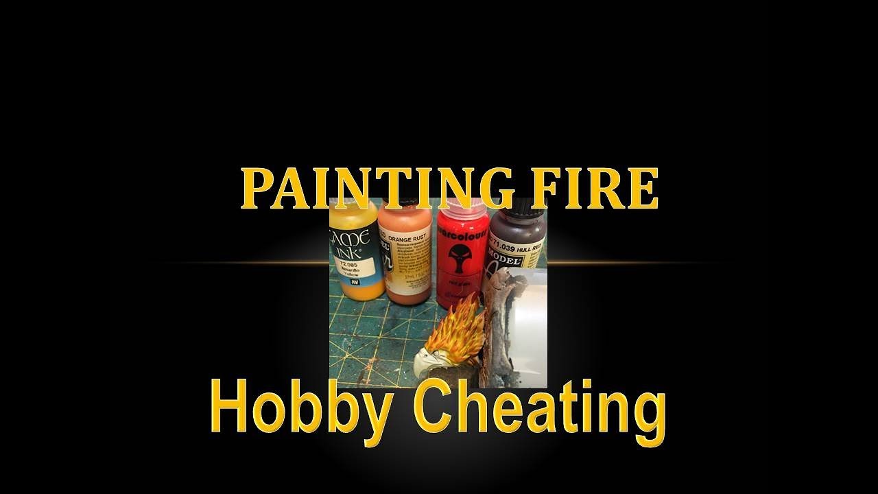
In this Hobby Cheating Turorial, I take you through a quick method of painting fire that can have striking results. Fire presents a unique challenge (being the opposite of how we normally highlight) but can be a lot of fun to paint and add real pop to your minis. Hope you enjoy.
Twitter: @warhammerweekly
Vince's RPG Podcast: https://itunes.app...
Or maybe not reversed since you did let the brighter on the inside for some parts but accentuate the red/brown on the outside bits to make it clearer that it is this way
Adding some brown and dark green wash with care on some parts of the rocky one seems like a good idea for visual interest
Added the highlights to the water one! Thanks for your feedback. How is this looking?

Yep I need to do reds and blacks on the fire one for the top half. The fingers are going to be 70% black when I’m done then I’ll probably end up doing a black “highlight” in a few key areas to smooth areas as well. The top part will look more similar to the bottom (yellow->orange->red->black) with the hot center of the mini (heart and face) being more yellow than others to draw focus on those hot center pieces. At least that’s my general idea
This is a great image thanks so much! I would say pushing contrast is my weakest point as a painter. I really need to push the shadows on this guy. Always just get scared I’m gonna ruin it lol. But I 3d print so idk why I’m so nervous (can always either strip it or print another)
Sorry for no advice but those look great, where did you get them?
Artisan guild, 3d printed by me
Here is my updated paints. (And yes I did get very very lucky with a spill about 5 minutes ago)


Any chance you and/or @mighty isle could take a look at the updated pics and let me know your thoughts?
Water one looks good! For the fire one, it's also a lot better. If you really want to spend time on it you could smooth out the blends a bit, but it looks good regardless
Also, what's the yellow you're using in it? Not sure if it's just the pic, but it kinda looks like a greenish yellow
I really like the fire and air elemental.
The fire one is definitely better than my own attempt at fire. Maybe if you want it even brighter you may try to add a few touches of white here and there, may be not necessary though. Depends if you want to make it more agressive/explosive... At the moment it looks hot but in a good way (cosy armchair hot that makes you want to go near it to warm up), maybe that's just me. Or maybe you can glaze back some yellow on some of the red to see how it goes. I am no expert at fire as I said so don't ruin it with my bad ideas ^^!
For the storm, I wonder if a light OSL from the thunderstrikes would work, maybe just lightly drybrushing some blue on the 'clouds' around them.
Be careful not to overdo it though, start very light and repeat if needed.
I think it’s the sepia base bleeding through a bit. Should have done a white/grey base on this probably, or a stronger/brighter yellow/white. Biggest regret on the fire elemental but not the end of the world. It is definitely less green in person, but not a vibrant yellow as I would like if I were to do it again
The one thing I was missing was a vibrant good coverage yellow and I really didn’t think about it when priming/prepping so did my usual sepia wash and sand dry brush which really helps contrast paints pop, but I don’t have yellow contrasts and realized too late that the yellow needed a vibrant white under it to really have that hot center glow
Tempted to try this, very tempted. Not done OSL before except for a tiny try with some fire once… worried I’ll mess it up but might be worth a try