#art-discussion
15 messages · Page 55 of 1
 peak oyster
 stark shard
yea :S though one day I'd like to make it
peak oyster
maybe some kind of fuckery with midi files and on the spot translation from midi to actual instruments, and then read the midi file to get the info?
stark shard
probably
 carmine jolt
ceasefire vibing
 round moth
i like this
 autumn leaf
Sergeants from opposite sides watching their lieutenants loose their way around a field
 desert forum
Warden RedCross
 rocky tiger
quick sketch
Poppy Keeper of the hammer from LOL
 stray bay
it look good
 runic linden
@carmine jolt Reminds me of this convo I had with a collie yesterday.
 eager rain
Does anyone in here have a Colonial or Warden helmet PNG lying around?
Just by chance
stark shard
https://puu.sh/FLFlC/da56a3cd13.png alright guys 🙂 now I just have to UV it and texture 😄

and then I can rig the gears to go up and the prop to spin 🙂
and then put it into Marmoset for beauty renders
runic linden
Looks good, maybe make the gears a bit bigger
stark shard
I referenced a set of schematics o wo this is apparently their size ._ .
runic linden
In a place
 daring fox
Beyond the sea
She’s there waiting for meee
My lover stands on golden saaaaaaaands
And watches the ships
That go saiiiiiilin’.
 pallid tangle
colonial be swroding
carmine jolt
"while you studied the game, i studied the blade"
stark shard
 runic linden
Ooh, definetly getting some CW-21 vibes here
stark shard
taking a break before I move over into substance painter
stark shard
https://puu.sh/FLMBB/90e856cb95.png mmmmm them UV's

 half spear
Can y'all stop using white backgrounds
Shit hurts my eyes
Plus it's better for yours too
Use dark backgrounds
runic linden
Why not use white background?
half spear
 buoyant crest
I tend to use light grey background and a med red for lining for the contrast
You can always use filters to turn it black, or just straight up use clipping masks over the line work and ensure you get every spot
Anyhow, @dire plinth any tips on digitally colouring paper drawings?
pallid tangle
a character from my fanfic lmao
carmine jolt
my OC wields a shovel fite me
buoyant crest
Very expressive, gives a lot of character to the... characters 🙂 @pallid tangle
pallid tangle
i dont know if that was intentional because u understood the character's condition or something else
pallid tangle
also did ur oc @olive cove
 cosmic bough
ngl he looks a bit like me though thats probably cuz of the glasses
 dire plinth
@buoyant crest 3 ways:
colour sculpting. You add base cours and work on that, based on the outline, constantly keeping track of the image underneath.
make an outline and color shapes (Image 1)this is the straightforward comicbook and manga style. You make a liner outline or polish the outline digitally so that it is straight and clean. Afterwards, you colour with a base colour, a mid-tone that will allow gradients above and below it. Colour the outline and make it blend into the drawing and there you have it.
gray values, outline, colour balance, polish (Image 2) this is a bit more advanced, as it starts in gray tones, an outline is being shaped and then the gray tones will all recieve an overall colour that you are going to blend with all the colours, like a primer, but coloured. So, the final result is what you can see in my Morrighan drawing, in which purple dominates every shadow and it feels like it is present everywhere.
buoyant crest
Hmmm
dire plinth
For the 1st method an ex is this one:
There are many other ways, but these those I use
buoyant crest
Reason I am asking is because I tried it in the past, but it didnt give nice results imo. The issue I encountered is getting the colours right for light colours, as the contrast sometimes works poorly
I'll fetch an example
dire plinth
Oh, I see, then try painting jn maximum 3 colours.
buoyant crest
Yeah, I should've framed my question better with an example
This is the stuff I am refering to; it looks quite mushy along the borders of some lines.
Mainly the left lower arm guard looks better on the left picture, while the mail looks better on the right
((this was an old test drawin btw from 2019; it was an attempt to digitalize a 2018 inktober drawing))
dire plinth
Hmm, a great thing to do is to try and get to paint in just a few colours. A good thing to keep in mind that shadows have less details, so, we use less saturated colours for them. Light areas are easier to see, so they should be more vibrant. Now, if it is closer, it should be more saturated, yet darker, than when something is far and it is less saturated, but brighter.
Take everything under the question: how is this related to that?
There isn't a general rule, actually
You can male closer things to the camera darker and things that are far away lighter
But then you will have this case, in which, the left arm should be darker than right arm. Why? Because it loses focus. You don't want people to foxus on the arm that it is just swinging in the air.
This is the art in essence, not accurately describing something, but enhancing
 remote lynx
I can never really grasp coloring or more specifically shading. Like, the Collie with the binoculars has several shades on green on him, but I just see the single green color in various amounts of light.
¯_(ツ)_/¯
buoyant crest
@remote lynx colour can be described in many ways, but you usually divide it in three aspects. One I'll advise is: intensity, hue and saturation.
cosmic bough
Should i make the Carbine bigger? It came out a lot smaller then i expected.
remote lynx
seems appropriate to me
cosmic bough
I thik its a bit too small beacouse of the magazine
buoyant crest
@dire plinth Thank you for the info. Not exactly I was looking for, but definitely useful. My gist was the issue with the lines itself during digitalization, as I cannot get the contrast right. I was wondering if you have expierence with it
@cosmic bough I think it can be slightly bigger. But more importantly, I think you have a fish-eye like view of the carbine, as you can see the front of the reciever and magazine, but see the side of the barrel
remote lynx
my shading boils down to "lemme add a little bit of grey/black on a seperate layer on top of it " 
cosmic bough
This is what i made it after
remote lynx
Maybe this helps to estimate the size
I think the Carbine in Foxhole is slightly larger than that
cosmic bough
How bout this size?
remote lynx
You see the dimple in the stock?
afaik it's always the case that you should be able to wrap your hand around that and still be able to reach the trigger
that ought to the upper limit
cosmic bough
Yeah but this guy has a bit smaller hands than the Foxhole characters
remote lynx
So wouldn't the carbine be smaller also?
cosmic bough
Good point
remote lynx
I still think the hands ingame are too big
cosmic bough
Yeah but thats beacouse of the artstyle
Ok i think ill leave the Carbine as it is at least for now thanks for the feedback
remote lynx
I've seen that pose before, I just can't find it anymore
rocky tiger
single layer is hard
buoyant crest
@cosmic bough you should zoom out the model more; a 3d model viewer has a wide angle lense
which doesnt fit with the angle of the rest of the picture
rocky tiger
YES
 cobalt tinsel
I do shading on my tree quite simple. I take a bright colour. and for every colour I take. the shading is 25% darker. then only one direction gets shading.
left-up is lighter. everything else is darker
and with the shadow I generally dont bother. its see through and generally matches the shape at a 45 degree angle. that somehow matches the shading
and then I scale it down using photoshop lol
buoyant crest
Shadows aren't simply darker; they are also less saturated and vaguer
cobalt tinsel
¯_(ツ)_/¯
thats what I meant Iguess? I couldnt find the right word but they are black and less saturated
buoyant crest
ah, didnt catch that 🙂
cosmic bough
@buoyant crest Damn your right, it looks better when zoomed out thanks. Now i have to redo the whole thing... thanks.
cosmic bough
No its alright
buoyant crest
The other parts are creative liberties 😉
cosmic bough
I deleted it anyway
dire plinth
@remote lynx if you think like that, it is corect. But then comes the fact that light is not just white. It depends on the light source. The helmet is also another green variation, closer to Red, than blue, also, more saturated.
cosmic bough
There it is. I wanted to add shading but i messed up the layers so i would have to redo a lot of things.
This is what i made it after. WW2 propaganda poster from Slovak State.
Btw. it says: To fight for nation and state
buoyant crest
@cosmic bough what program do you use, because you might experiment with clipping masks to get shadows anyway
cosmic bough
Krita
buoyant crest
oeh, looks fancy
alright, what you wanna do is create a layer on top of your current drawing, then find the 'blending modes'
These determine how a upper layer affects a lower layer; the regular form is that if you draw at 100% opacity, you cover the lower layer, and if you draw at lower opacity, you can see thru
but you also have other forms, where instead of straight up covering, it only covers the lower layer over one channel (think only the hue is affected). Or they subtract the higher layer from the lower
https://docs.krita.org/en/reference_manual/blending_modes.html here is the page in krita with an overview of layer settings regarding blending @cosmic bough , You can have a look thru them and you should definitely trey them all out at some point, because knowing how to work with layers can simplify a lot of jobs
Overview of Krita's blending modes.
seeing that your line art is straight up black, you can attempt adding shadow by using the darken mode (the top layer will only cover the lower layer when the illumination is lower) and using a lighten to, well, lighten up stuff (but you will have to keep track of the line art if you want that to stay pure black)
Hopefully this can solve your mess up 😉
remote lynx
@dire plinth the shading ends up as the color itself (dark green instead of green) whereas I always keep seeing it as a layer on top (of the green).
cosmic bough
There we go. Added a simple shade.
stark shard
@buoyant crest one thing you could try is coloring values first. Work in greyscale to determine where all the highlights, mid tones, and shadows should go, then using layers above your value painting start adding colours. If your drawing application has blending modes, the overlay, multiply, and color Dodge are great ones to use
buoyant crest
I am aware, but I was trying to give a simple instruction to Buk how he can do some shade without too much redoing
Or is it a really off tip regarding my earlier question? @stark shard
stark shard
Your earlier question
Plotting out your values as soon as you can is really powerful
buoyant crest
Then its really off as I was asking for how to solve lines for scanned art
stark shard
I mean, I paint scanned art plenty
Most of the time I scan in sketches and then finish them digitally
buoyant crest
Yeah, that is what I am looking for 😃
buoyant crest
What my issue is, is that the lines end up grumbly whatever I try
Or really dark, or with random grey spots
stark shard
Then, why not forgo the lines you sketched, and use them as a guide to inform your coloring
Digital Art has the lovely ability of ctrl+z haha
You can refine anything as much as you like
On top of that, are you familiar with the histogram?
stark shard
You could try using that on scanned paper to remove paper texture, and solidify scanned lines
Then just take a brush and fill in the pieces that are a bit off 😁
stark shard
Are you familiar with clipping masks?
buoyant crest
Praise cliping masks
I always try to teach new digital artists about them, because I have found they are mighty usefull in simplyfing things
stark shard
Which way do you use them personally
https://puu.sh/FHNSe/0d2951d37d.png. I found out helpful to separate out the overlapping limbs in this demise fanart
 buoyant crest
I usually put lighting and patern on base colours
But I use it mostly to colour line art and texturize advanced shapes
I remade some propaganda posters for Corona, so I would use the destortion naturally existing on the poster over the digitally added parts to masl them naturally
stark shard
hmmm looking more at your art on a bigger screen not my phone anymore I can recommend using variable line weight to help clear the much a bit
that is, drawing lines with confidence, but also more intent on where to place weight
buoyant crest
I dont think I have done any digital art (outside of design) the past year 🤔
Oh, except some small doodles when I discovered I could easily convert them to Whatsapp stickers, like my pfp
stark shard
I don't particularly have examples of digitally coloured examples, but I do have some scanned inktober stuff from a few years ago
but you see how the lines have varying thickness to emphasize things?
stark shard
do you not have a drawing tablet?
buoyant crest
https://instagram.com/pjoots_artdump?igshid=nie8gbvtr8xh if you scroll down 15 pics, you get to my 2019 actober
Welcome back to Instagram. Sign in to check out what your friends, family & interests have been capturing & sharing around the world.
stark shard
I mean... you can get the varied line weight with fineliners 🙂
simply go over the sections you want to emphasize weight on with your pen but slightly skewed to add weight
buoyant crest
@stark shard For digital art, I have an innuendo intuos pro, but I havent had much time for drawing due to study and responibilities
stark shard
and then to thin the lines most fineliners are already thin, but you could even go as far as lifting the pen completely and dotting lines
buoyant crest
True
I am still experimenting a lot
I am very used to ballpen drawing, so I am used to having pressure dictate darnkness
stark shard
I highly reccomend getting some Micron pens
buoyant crest
But I have most likely landed a job at my uni as illustrator at the paper there, so I guys it suffices
And I didnt solicitate for it, I was contacted, so that was cool
 severe carbon
I don’t have enough paper space to draw the soldier holding her hand, so I’m debating tracing both in krita separately then sort of editing them together
pallid tangle
 drowsy garnet
@severe carbon what do you mean you don't have space?
do you want them to hold hands like high up
pallid tangle
severe carbon
@drowsy garnet That was the idea
drowsy garnet
oh i see
remote lynx
@olive cove Quite a while back you talked about a book cover you did. I wanted to share this album but I couldn't find it. Now I have, so here it is. https://imgur.com/a/9y127AS
 round moth
its ok i have art depress too
 left wind
First time?
 craggy halo
Finally got around to making a better looking version of our Clan's Coat of Arms. Points to who ever can guess which anime I got this from.
buoyant crest
@round moth How so?
round moth
well
hard to make good contrast and clean shadows and lights
i prolly just need to mess around more but damn bro
i often only do very low contrast shading to hide messiness
buoyant crest
Can you show an example?
round moth
most recent piece uhhh, very apparent that im underutilizing the darkest shades
i use them far too conservatively
light shade too is like
too thin and non noticeable?
i woulda shown my piece before this one too but there the low contrast makes sense, as its a cloudy and foggy piece
but here where theres a clear red white light source from behind the character
i coulda made the piece more contrasted
buoyant crest
Try making your piece in black and white first
it gives you a good view on the dark and light spots
you can colour them later using layers blending modes
But I think the contrast of darkness is pretty okay
you dont want your drawing to turn out black and white y'know
The only lighting "mistake" I would say is the shoulderplate lacks highlights, and that the shadow on the helmet doesnt match that of the breastplate (mistake between contation marks, as I see not how the lighting would work, perhaps I am overlooking something)
The size and strength of lighting is very subjective to style, taste and type of lighting. But what also is important is consistency, as picking a different light origin for every object can confuse the eyes and lead them away from what you want focus on.
@round moth Do you do your shadows on the colour layer, a seperate layer or a clipping mask?
round moth
clipping mask
buoyant crest
Cool
Also noteworthy about the shadows: It seems like you are using hard and soft shadows at the same time, sometimes in unison
round moth
thats something i experimented with strictly for this piece
buoyant crest
Aight, that is fine 😉
What I would do is, make the base colour of the whole drawing medium gray and then put your shadow mask over it; can you send that in here?
round moth
mmm, i can only do that with the hard shadow layer
as the soft layer is practically another color layer
buoyant crest
That is fine
round moth
buoyant crest
aight, I have to eat now, but I'll back in a few
buoyant crest
@round moth Alright, what happens in the drawing, is the shadows go all over the place, and it is hard to figure out what exactly is going on. Consistency is key, so before doing shadows and such, you need to determine where the light is coming from.
round moth
yeah exactly
buoyant crest
I here (attempted to) desict the direction of your lighting, which as you can see flows in multiple directions
round moth
sense of direction isnt really there haha
buoyant crest
The breast implies top front lighting, the helmet a direct right, the arm behind the guard a front/direct downward lighting
What you want is simplifying the shapes a bit
because you know how to do lighting on cubes, cilinders and balls I may hope?
round moth
yeah of course
buoyant crest
Because if you can do that, you just need to turn your drawing in those
I here have an example of the major shapes
Now this ofcourse doesnt keep track of shadow cast by other shapes, but using these shapes gets a right base to work from, as these shadows defintly are cast whatever other shapes there are in the space
round moth
oooooooh
honestly i feel proper stupid for not considering imagining it like this starting out with lightning
buoyant crest
Hahahaha, we all have that at times
It is sometimes just a case of getting a different...... angle
get it? light angle? its a joke!
anyhow
Now I think you did a fabouless job on the helmet, so I would use that to determine your lighting point, and work form there
when you get the major shapes, you start making global shapes of smaller parts
and then smaller
and smaller
round moth
Ill prolly redo lightning on this one based of off this
As I feel pretty happy with outlines
And think itd be a waste otherwise
buoyant crest
Its a cool design and I think getting the lighting right will just let it stand out a little more 🙂
if you need help, you can always come by here 😉
buoyant crest
Nah, just drop them in here; you will get help way quicker (and often more expert people), and the lurkers also learn something 😉
round moth
ah alright, works too
desert forum
Army bicycle. 1905 years
 olive cove
@remote lynx ooo those look awesome
severe carbon
Steel tire??
remote lynx
There's something about that 70s/80s art style that I just absolutely love
stark shard
@round moth you could add some rim light to push contrast more. Just make a clipping mask to your drawing and take a light color, maybe a pink or something, and colour just around some of the edges
round moth
thats what i did, just that the color was so faint and the lines so thin that its barely noticeable
stark shard
Boost it haha
peak oyster
hey does anyone have a massively sized image of the warden and colonial logos???
 daring ferry
They are pinned in #foxhole-creative
peak oyster
thank you
cobalt tinsel
ooh hey I made another tree
its bit weird
it misses the droopiness of a tree
but oh well
 cerulean anvil
It's so tiny.
cerulean anvil
For the love of fuck please upload a 400x400 image.
cobalt tinsel
better?
cerulean anvil
Much better. Thanks.
Btw, how would one classify this pixelart? Is it 8-bit or 16-bit?
I am curious what people see in order to judge.
buoyant crest
I think this is avant-guard pixel art
peak oyster
It defo looks 16 bit with the colour depth
The two browns are way too close to one another
For 8 bit
cobalt tinsel
its the same brown but 25% darker
the scale is 64*64
why? because trying lower scales goes really wrong
then you get trees like this
buoyant crest
cobalt tinsel
I also recorded myself making this
which was pretty fun
I got a 2 minute timelapse
now I just need some royalty free song
buoyant crest
Instragram TV time
cobalt tinsel
I did
buoyant crest
The term is also tied to some other things related from the 8-bit, 16-bit, 32-bit and 64-bit area's, and is very often used in pixel art discussions
cobalt tinsel
I dont see how it applies to me. I have 4 colours at best
buoyant crest
The colours are too close
buoyant crest
a game boi colour could only display 8 bit, so you'd have to pick from that spectrum
cerulean anvil
I'm still lost. Lmao
So it really depends on the size of the pixel for this "distance"?
buoyant crest
cobalt tinsel
I mean, you can draw alot sprites that dont have to be the same size
buoyant crest
interestting graph that answers your question
cobalt tinsel
so in theory, you could draw something with an 8 bit resolution. but it could be as big as the empire state building
buoyant crest
Yes
If you are mad
Because 8-bit is a craftmanship
But one should be aware that simply using 8-bit colours doesnt make it 8-bit art. You have such a thing as true and stylized 8-bit. You see, devices like the Game Boy colour could not only display only 8-bit colours, but also a limited amount of different colours per 4x4 square and a limited amount over the full screen, beside other limitations. That makes true 8-bit, while some people might not be aware or consiously decide not to 'obey' these rules, making stylized 8-bit; it is art, made to look like 8 bit
buoyant crest
4*4 per square is nothing lol
That is not what it says honey
cerulean anvil
The original gameboy.
buoyant crest
I mean that every 4*4 square on your drawing has a limited amount of colours
and the GBC is an example ofcourse
the processors differ a lot between different companies
cobalt tinsel
how big is each individual square then?
cerulean anvil
Where images were only one green and two to three shades.
buoyant crest
@cobalt tinsel are you on crack? 1 pixel; square is 4 pixels by 4 pixels making 16 pixels.
buoyant crest
Go to bed
cobalt tinsel
but the square is 16 pixels
buoyant crest
It was a detail, dont focus on that
8-bit means a single pixel has 8-bits to store colour. If you want true 8-bit, there is a lot more reading involved
cobalt tinsel
no I am trying to reason here how that would be explained memory wise. like there is a limit to how much information a single pixel can hold.
buoyant crest
Because 1 Mb of data was the size of your finger and cost you $100
So you limit the information density
current computers do that still, but on higher bit density
PNGs use 32-bits by default (of which 8 transparancy)
reason by large PNGs take a lot of storage space
And is the same reason why gifs are super small videos; they limit the bit per pixel, thus greatly decreasing file size
cobalt tinsel
riight
because it increases exponentially. 8 bit is 2^8. and 2^16 for 16 bit is a fuckton more
buoyant crest
Correct
cobalt tinsel
but if I save a drawing with 8 bits of colour as a PNG? does it reserve 32 bits of memory automatically?
buoyant crest
Well, most drawing programs give you the option to decide the bit density of a drawing
so if you draw 8bit, it will select the 32 bit by default, because the 8bit colours are in a 32bit colourscheme, and computers are dumb, so you would have to do it by hand
cobalt tinsel
so yeah it just reserves a bunch of unneeded memory for that file I guess?
buoyant crest
many programs require that you select it upon creating the template, while others can do it when saving and some can do it half way, depends on the program
cobalt tinsel
and if I do it the other way around? I use 32 bits for colours and I save it as 8 bit?
buoyant crest
then it compresses all the colours
you overlay the 8bit over the other, and then select the old colours
its all messy, i wanna sleep
buoyant crest
Last thing I share for the curious; https://en.wikipedia.org/wiki/Game_Boy_Color#Hardware
A GBC screen is 160x144 pixels. It has a sprite size of 8x8/8x16 (which means larger drawings would consist of multiple sprites), with a max of 40 on screen and 10 per line and 4 colours per sprite. The total amount of colours on screen was 56, eventhough it had a palette of 15bits (yeas 15).
Oh, and one of the colours per sprite was transparent, so effectively only 3
peak oyster
Also
on I think the NES
it could only display up to like 8 sprites on each plane
as in up/down and left/right
buoyant crest
wouldnt suprise me
The NES[49] uses a custom-made Picture Processing Unit (PPU) developed by Ricoh. All variations of the PPU feature 2 kB of video RAM, 256 bytes of on-die "object attribute memory" (OAM) to store the positions, colors, and tile indices of up to 64 sprites on the screen, and 28 bytes of on-die palette RAM to allow selection of background and sprite colors. The console's 2 kB of onboard RAM may be used for tile maps and attributes on the NES board and 8 kB of tile pattern ROM or RAM may be included on a cartridge. The system has an available color palette of 48 colors and 6 grays. Up to 25 simultaneous colors may be used without writing new values mid-frame: a background color, four sets of three tile colors, and four sets of three sprite colors. The NES palette is based on NTSC rather than RGB values. A total of 64 sprites may be displayed onscreen at a given time without reloading sprites mid-screen. The standard display resolution of the NES is 256 horizontal pixels by 240 vertical pixels.
Fuck, now I am reading about old tech again, I wanted to sleep
see y'all
cobalt tinsel
nighty
 fluid saffron
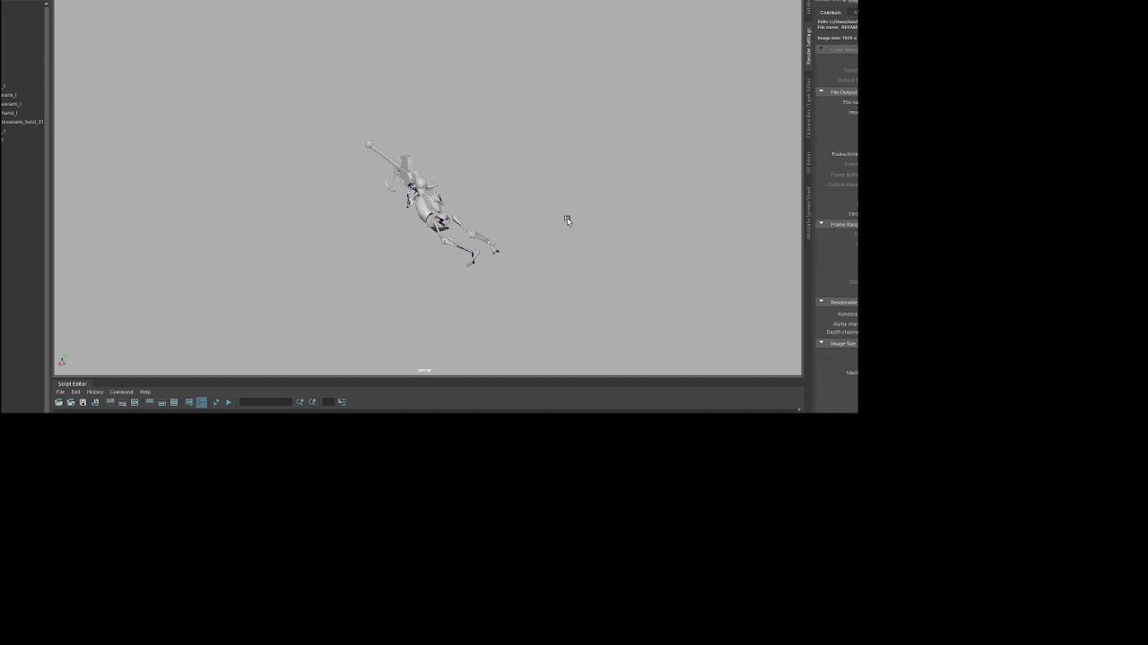
ATR_Prone shooting revamp, now with actual operation of the bolt! Any critiques would be nice.
plus heres a YT link https://youtu.be/7eDu9AhWOTQ
 cosmic bough
Is that the Foxhole AT Rifle? Its strange that it has bolt on the left side
fluid saffron
yeah it is the foxhole at rifle, bolt is on the left side
fluid saffron
well the stock is the right side of the guy, so I think it would make more sense to put the bolt on the left but idk
cosmic bough
No. If its on the right shoulder the bolt should be on the right that way the operator uses the hand he has on the trigger not the one he is holding the stock up with
Even if it was for the lefties he would have the stock on his left shoulder
remote lynx
I thought it would be cool to put some of my most played custom characters from (RPG) games into a group photo, inspired by those Overwatch pictures.
I ain't no artist like lercas, so I gotta make do with cutting them out of screenshots with wildly varied lighting conditions
sizes are sort of to scale
took me way to long to cut them all out, too 
 nocturne void
@cosmic bough its an AT rifle i think he's right for putting the bolt on the left side cause when will you ever be aiming the rifle while standing plus its alright the germans do it with there assault rifles cause its faster than charging the rifle with the other hand
peak oyster
The neck should be connected directly to the back of the head
As in like
There shoupdn't be that ga0
*gap
severe carbon
More like this?
cosmic bough
@nocturne void I dunno man. Id say it makes more sense on the right side as the AT guns are usually back heavy and left hand is used to hold them up.
severe carbon
Or this
cosmic bough
Look at the Lathi for example.
nocturne void
thats why the bipods there to support the rifle while aiming so no weight is put upon the shooter and yes most bolts are put on the right cause its been burned in to gun design because it feels natural but not always natural
for example the AK charging handle on the right side not really great for reloading with your off hand
cosmic bough
Id say thats beacouse youre not holding the AK in the centre of mass
Its better to have charging handle on the left side if its a back heavy weapon beacouse its easier to just rotate the weapon so that it points upwards with your right hand then let the back of it go downwards and then lifting it up.
Its a stupid explanetion but i hope you get what i mean
nocturne void
yeah no could you explain it better
cosmic bough

Shooting my friend's full auto STG-44 made in 1944.
Look how he tilts the weapon upwards
Its to allow him to easily hold it in one hand
Its beacouse most of the weapons weight is in the back
cosmic bough
Not really. Try to reload a rifle this way
It works for double handed weapons with magazine
nocturne void
awkward and clunky yes i know but with an AT rifle youd want to be action ready be able to send more rounds at your target
while laying prone
cause against an armored vehicle you wont have a second chance possibly
cosmic bough
Yeah but holding the grip all the time isnt gonan do you much good. You still need to cycle the bolt. Which is easier and faster done by your right hand (if your not leftie) + Left hand can hold the gun in place while you do that
nocturne void
its the same way with the bolt on the left cause:
1.faster operation of the bolt with your off hand cause its not doing much by holding a rifle that has a bipod
2.faster reloading of the rifle cause you can quickly pull the mag out and operate the bolt all in succession
3. you can still hold the rifle on target with your right hand
and these are good reason for the bolt on the left or right but the operator will find a way to use the weapon comfortably so i think we wont get any where by arguing about the bolt placement cause we can both bring up great evidence for both sides
cosmic bough
Yeah thats a fair point. So basically our conclusion is that its usually on the right side beacouse of regular rifle
nocturne void
yeah
pallid tangle
 rancid carbon
Everyone was drawing cool OCs and stuff so I thought I might join in. Here's a redraw of Koedem Claire!
(WIP)
carmine jolt
how do you guys come up with names for caoivish people? do you go with germanic names?
rancid carbon
I no joke just smacked my keyboard a few times and ended up with Koedem. Name stuck cause I liked it haha. For the last name, I went with a french based name, but this was before we really understood that Caoiva is more gaelic than french. but hes not Caoivish anyways I mean what.
for other characters I tend to go with a more irish sounding name, such as Annah Sherida
or gaelic that is
cerulean anvil
It's so clean. I like it!
 static iron
I would say bottom right.
 analog pike
https://gamepedia.cursecdn.com/foxhole_gamepedia_en/thumb/b/b0/Machine_Guns_showcase.png/1000px-Machine_Guns_showcase.png?version=ea8cd475066a2e8d59117fdcdcaf1017
so, it appears that HMG, based on barrel diameter, will use .30 cal, but whether it will be 7.92 or 7.62 I don't know

but it can be also .50 cal
buoyant crest
@cerulean anvil is that sans undertale?
cerulean anvil
FUNI JOK
autumn leaf
I bet the machine gun and heavy machine gun are the same 50cal
Also thats really weird how a infanty machine gun is 50cal
rancid carbon
imo they should make the MMG a 30cal
autumn leaf
Yeah i was thinking that
For the halftraxks and heavy tanks i get it, but for a fun one soldier can carry..
Its a stretch
You can carry a US 50cal
Itd be tiring immediately
Also, i think the model of the SIG is just the MG model with a tube on top
 wind night
Not having the HMG use 50cal would be weird since it's the same gun as the HT
autumn leaf
Eh, its been in use since the first days of the game so fuck it
Still mad about the SIG
wind night
Why?
autumn leaf
Becuase they clearly went the quick way making it
Im excited for the heavy weapons though
Also, i wonder if they will fix trenches
Because right now its almost impossible to kill someone whos in a trench unless you use explosives
nocturne void
I think that was done on purpose to make player think of ways to push and not make a giant trench system like we did in ww1 cause there are some things that work excellent for trenches such as the sniper rifle your able to actually kill people with it and storm tactics work as well
autumn leaf
Thats why i always just get a bunch of noobs, get some quick guns, and storm a trench over and over. People say im wasting resources and shirts, while they dick around in their trenches getting bombed. Atleast im trying, im pushing, even if it takes five waves we get into the trench and start making gains its better than sitting on your ass for three hours till the enemy bombs your defences to death then walking in to clean it up
severe carbon
Can I add that 12.7mm is larger than .50 cal?
autumn leaf
12.7 is 50cal..
severe carbon
Technically, yes, but in military literature, 12.7 usually means the soviet round with more powder
autumn leaf
Oh shit, you learn something new everyday
nocturne void
yeah just russian m2
daring ferry
Who was working on Foxhole SftD?
buoyant crest
Result of an experiment of digitally colouring. I should have made the original drawing larger, as I had to remove a bunch of stain. (dont mention the posing, I did it flat on and had no warm up)
Reference drawing
Now that I look at it, I should have done the background a little tiedier, oh well
analog pike
Steampunk Colonial soldier
 near folio
The helmet looks a bit warden
rocky tiger
severe carbon
Why do warden officers always have 40k vibes
I want French officers, not commissars
 silver dove
I sure the founders of 82DK had a hand in establishing that culture within the foxhole community.
desert forum
In internet
 bleak elk
Disgusting. Really disgusting.
What's even the point of this?
 bleak helm
i unironically would drive that. that's fucking cool
rancid carbon
yeah its pretty sick
left wind
pimp my ride it is
buoyant crest
Its the only gender
autumn leaf
That car os fucking awesome
 blissful heath
it looks like a car from the future that's shitty by future car standards
like how we see 90's cars as shitty nowadays, they'll see that car as shitty in the future
severe carbon
Implying at some point in the future, that’s the norm
runic linden
To be fair, that car......doesn't quite look...well....snazzy
severe carbon
It also doesn’t look like a car
runic linden
that too
severe carbon
Comrade Music
severe carbon
 halcyon lantern
I guess since non-foxhole stuff is allowed here
Here's an Edgelord girl (Edgelady?)
 high ledge
Now this is something I need to draw
static iron
Anyone got a high res warden flag image?
bleak elk
Yeah. Just looked that up.
buoyant crest

 queen cloud
 smoky oxide
cosmic bough
smoky oxide
cosmic bough
Im pretty sure thats not lake, that looks like road
smoky oxide
Its a road lake @cosmic bough
cosmic bough
Ah i see. Like a lake of asphalt.
 wet vigil
Didn’t fixed it yet but will return later
carmine jolt
tfw no hot caoivish gf
desert forum
Anime
queen cloud
Assassin's Creed Foxhole
cerulean anvil
She's smug.
 brazen grove
brazen grove
brazen grove
1 he's feeling it, 2 increased vigor, 3 looks like the scream, 4 it's his last march.
autumn leaf
@cosmic bough i like the idea that the wardens use Imperial Japanese bayonet type flags
cosmic bough
Thats actually from a Czechoslovakian poster from ww1
I just added it cuz i liked it
carmine jolt
@cosmic bough im conflicted between 2 and 3
peak oyster
when u be WALKIN
carmine jolt
woa
he walk
brazen grove
articulated L E G S
peak oyster
for the record, there are 6 joints in each leg
buoyant crest
Overenigneered, love it
rocky tiger
why am i make a gif of this
buoyant crest
slow blink
runic linden
Slightly low res though
rancid carbon
A quick color fill to see how it would look. might practice actually coloring on this one lmao, but for now too laze
 vital storm
@cosmic bough those are incredible
buoyant crest
How it feels to trying to help some peeps
Reference to that one dog wants you to throw his ball without taking it
bleak elk
bleak helm
got bored and decided i'd make a camouflage inspired by ww1 makeshift patterns. i think it'd fit the wardens pretty well considering they're more about tradition than practicality, and their uniforms reflect that by literally just being the horizon blue uniforms.
buoyant crest
weird combi of straight and curved lines
bleak helm
supposed to be a sort of mix of organic and geometric shapes. disruptive but also concealing look to it
cosmic bough
Hey where can i get my hands on cropped out Warden emblem. I tried searching on google but all the pics are too smal.
severe carbon
Screenshot one in game, then crop it in Gimp or krita
buoyant crest
@cosmic bough @severe carbon they are in the pinned of #foxhole-creative
cosmic bough
Thanks
 analog salmon
daring ferry
analog salmon
daring ferry
Has anyone made low poly colonial and warden characters?
bleak elk
buoyant crest
@remote lynx love you babe, just gotta.... practive
pallid tangle
lmao imagine bringing a gun to a swordfight
blissful heath
not as cringe as bringing a hammer to a gunswordfight
buoyant crest
twhunk @blissful heath
blissful heath
fucking cri-doo
rocky tiger
photoshop by @mighty jolt
 mighty jolt
You did all the job no need to tag me :D


 pallid tangle
I like you too <3
buoyant crest
Get drawing! Test with digital drawing using a different sketching method than usual. Yes, I might have made the arms too long, but I actually think that is because the leg's perspective is not executed ideally
daring ferry
nah
how dare you criticize the holy blue uniform perfectly fitting in a white or green environment
 covert salmon
Here is the thing
38m was designed for use in the marshes of hungary
This pattern is a very european design, and likely not the most effective in Veli
Look at the colors, sure, the red would be useful in Allod's or nearby regions, but the white color in it wouldn't be useful in the green environments
As a whole, it would look quite nice on a smock or parka over the warden uniform
buoyant crest
welp, time to get color sceme of all the regions
cobalt tinsel
Region specefic ammo
 dense widget
@bleak elk Something is wrong in that photo the trench isn't outright exploding...
bleak elk
That's because of Italian Grace that car has.
dire plinth
@covert salmon weell regarding warden uniform, their uniform is french, no doubt
daring ferry
is this low poly colonial ok like that?
blissful heath
i actually need a low-poly warden and collie model for a project
daring ferry
Well, it will take me some time to do them as it is my first 3d model
blissful heath
That's perfectly fine, I don't need them in any hurry or anything
 wispy schooner
@daring ferry I need this on my desk before the standup tomorrow morning, make it happen or find yourself another job
 analog yoke
https://www.twitch.tv/lisek1989
Doing some foxhole piece coloring based on a clanmate lineart. Feel free to shittalk WN or the piece in chat
 cosmic bough
Not really Foxhole related, hope thats not a problem
autumn leaf
@cosmic bough what is it?
rancid carbon
Go kiwi guard go
drowsy garnet
does he shoot lazers from his eyes?
olive cove
@brazen grove Would you mind if I used that flamethrower sketch you did as a reference/base for a drawing? I wanna see if I can make it a fully colored image and using the designs Jack<3 made for the flamethrower soldiers
cosmic bough
Warden recruitment poster.
 spare pendant
daring ferry
spare pendant
daring ferry
fixed
autumn leaf
hANd
daring ferry
progress
left wind
slender
buoyant crest
insert da vinci man circle drawing
Just make a photo of yourself and compare @daring ferry
 grizzled tree
@olive cove you mind if I use your concept for a suggestion?
bleak elk
HT-Truck mashup.
cosmic bough
Damn that looks cool. Kinda looks like schwere wehrmachtsschlepper
bleak elk
And this thing...
bleak elk
Why not?
cosmic bough
?
bleak elk
Recently I came back to browsing unholy vehicle creations on Pinterest. It's addictive.
And now nothing surprises me.
queen cloud
optional draw
bleak elk
Ah yees, child soldiers.
olive cove
@grizzled tree that concept art isn't mine, if you're talking about the flamethrower soldier designs it's Jack<3's
And @brazen grove thanks, yeah I just really like the composition and all it's really cool, I can do the hands and stuff using other ref, etc
brazen grove
Lol, you know i was talking about the 3d hand
daring ferry
@bleak elk where did you get these 3d models?
grizzled tree
Alright thanks
olive cove
Ohh lol sorry I misunderstood
queen cloud
optional draw
@queen cloud in the beginning,i want draw an Adult woman,...oh ok,that's an indiscreet ... my bad.
severe carbon
Lisek does some great profiles
static iron
Yeah
severe carbon
More profile drawings
autumn leaf
That he does
daring ferry
is the helmet ok like that?
 muted marsh
nice moustache
bleak elk
 warm holly
ohh. that lovely
near folio
Yes
grizzled tree
Ah yes the Flack-Kannonine98
bleak elk
Hit me up with more ideas for crossing different vehicles.
Or should I say...
Crossbreeding?
 eternal zealot
Half tracks?
autumn leaf

This song is 9001% Vegeta.
All credit goes to team four star and the creators of dragon ball z
link to original song: https://www.youtube.com/watch?v=hle2-bGDh10&user=TeamFourStar
I had to remake the last minute or so of the video because my video editing software crashed bu...
moustache
bleak elk
HTs? More specific?
grizzled tree
HT with Aft turret on top
analog yoke
yo all, streaming that foxhole drawing if anyone is interested. Can also shittalk warden navy which is always fun
daring ferry
3D model of a blueprint i made a while ago
(i can put the moustache on it if you want)
cosmic bough
Yes
daring ferry
moustache
cosmic bough
Yes
 sick relic
Maybe you don't have enough audience
olive cove
@daring ferry I feel like the eye slits would be closer to the brim of the helmet
unless you're going for a specific style or something then ignore me
muted marsh
Either way, exquisite low poly moustache
 gloomy walrus
help
brazen grove
hepl
rancid carbon
eplh
brazen grove
runic linden
elph
daring ferry
@olive cove like that?
olive cove
uhhh at this point I'm just nitpicking, but if you move it up just a tiny bit you should be perfect for where your eyes would usually be when wearing a helmet
Those if you don't want to move it up more, it's perfect still
Like it won't hurt it no matter what you do, it's just a matter of preference and if you're stylizing things
rancid carbon
Some concept for some character for some concept of a story that I have some concept of writing
buoyant crest
@brazen grove I can feel that drawing
daring ferry
that shield is epic
remote lynx
shield fellow reminds me of this
Agents of Virtue: CHARITY
high ledge
damn
remote lynx
Agents of Sin: WRATH
high ledge
Gimme suicide bomber in this form
remote lynx
runic linden
Wooaaaahhh
high ledge
yeah It seems I have seen some of his earlier works
daring ferry
that dude does amazing stuff
high ledge
ye
remote lynx
There's a lot of good stuff on deviantart, but as with a lot of sites like these, best to stick to the top layers and not dive too deep beneath the surface.
round moth
 remote lynx
told you
brazen grove
it hits the fan
 odd berry
Spread the hell of blazing fires
rocky tiger
dream team
round moth
i like the armband thing going on
high ledge
A fox in his foxhole
analog yoke
stream is up for that apc drawing i'm doing if anyone wants to watch
brazen grove
a bit laggy
severe carbon
Timmy over here about to become the war’s first aviator
 glad mural
someone could do a collie propaganda about wardens eating babies xD
 weary shard
Stop it your making me upset team demo man lost
glad mural
hehe
pallid tangle
oh my god
cosmic bough
Propaganda you said
peak oyster
I feel like the first one has much better shading, honestly
autumn leaf
Moustache
dire plinth
@severe carbon hah, that's nothing. My grandpa downed so many german planes in WW2.
He was entitled "the worst mechanic Luftwaffe ever had".
brazen grove
hahaha good one
 willow remnant
First try with my first real software
buoyant crest
Getting the hang of it? @willow remnant
willow remnant
Well i still don't understand 90% of the layout but it was time to let go Paint 3D
Even though I feel like I insult the software by my drawing level
rancid carbon
lol same
Im still out here using the standard brush too scared to mess with the settings haha
 jolly trout
 rigid plaza
Goofy had a bad day
half spear
This is a little cursed
buoyant crest
@rancid carbon using normal brushes is an insult to art programs
the beauty is in the brushes
desert forum
daring ferry
Wtf
left wind
death
rancid carbon
@buoyant crest haha. Clip Studio has some fine standard brushed tho.
 dry smelt
A touhou post in foxhole dc, now that's something
brazen grove
i mean why not
drowsy garnet
I'm not good at making shadows
but they're good enough for profile picture i think
pallid tangle
redoing old 2015 art again
cerulean anvil
Sneak peak.
buoyant crest
Is it a puppy?
cerulean anvil
It's as precious as one.
cobalt tinsel
What a good looking puppy
rancid carbon
What in gods name
runic linden
and when that don’t work, use more gun
 obsidian trench
 bleak elk
He's giving directions to all interesting place in the area
pallid tangle
daring ferry
is the model ok like that of do you think i can adjust some stuff?
(ill add the parka if there is nothing else to add or modify to the model)
blissful heath
the joint at the wrists seems off
I suggest making the hands a bit thicker seeing as it's slightly cartoony
daring ferry
there we go, i also changed the rotation and position of the hands a bit
runic linden
Which one's better? This?
Or this?
Also why the hell did I not consider doing silhouette art? Nor why did anyone not consider silhouette art for Foxhole?
pallid tangle
Both look good in their respective ways man
and yes someone considered some silhouette art for foxhole yes
runic linden
oh well...
runic linden
Why did I not realise that sooner
runic linden
thx
rancid carbon
also @pallid tangle ngl Rush looks like a toxic gamer smh
runic linden
It's literally just, copy paste the artwork on top and fill it over with two contrasting colours
pallid tangle
@rancid carbon because its a painting of his old minecraft skin
rancid carbon
haha
pallid tangle
you know
rancid carbon
nice work
rancid carbon
oh yeah yeah
runic linden
Anyways, I'm probably setting either one of the two as a pfp
daring ferry
the silhouette one would look great on the back of a card game
rocky tiger
severe carbon
Mummy makes great art
runic linden
^^^^^
blissful heath
when it comes to drawing mother knows best
severe carbon
runic linden
(O_O)
runic linden
what?
autumn leaf
Ummm, i looked
runic linden
oh you poor soul
autumn leaf
Not ganna lie, not my proudest fap.
cosmic bough
jesus...
runic linden
In terms of Foxhole art
carmine jolt
@high ledge WTFF??? SOMEONE BEAT ME TO IT SHIT
high ledge
get good
carmine jolt
morbid curiosity is the downfall of a man
autumn leaf
I mean, thats a red flag right there
severe carbon
Insert some neutral hippy saying about both sides really being the same
blissful heath
"you're wrong. there is zero difference been good and evil. you moron. you fucking imbecile"
 raw sinew
@runic linden I'm aight with you basing your trailer thing on my documentary, though the theming of 19's more modern than WW1 if that's what you were going for.
runic linden
I was going with basing the trailer off Trench Warfare Update
which is probably a little late
raw sinew
Hey, you're talking to a guy who thought that documentary would take 2 months to make instead of 12 🤷♂️
raw sinew
But you seem to be moreso practicing rather than doing a whole project, so it's really up to you. If you wanna go for a fictionalized movie trailer about what if the Hermit's Rest Attack Force succeeded or some other crazy idea you're free to do so to.
runic linden
ok thanks
 runic burrow
I tought that @high ledge Nsfw server was a joke
daring ferry
@runic linden you can make the 1917 thing be animated very easily
color selection the black part in GIMP/ add an alpha canal / inverse selection / delete selection, and export into a video editing software where you just have to slap it over the animated background you want
runic linden
I’ve kinda done basically that
Just colour select the black background, crop a few things like lighting from the logo and slapped it on the Foxhole Silhouette
runic linden
Oof moment right now because I have to pay for the full thing if I want to export it
daring ferry
which software do you use?
analog yoke
https://www.twitch.tv/lisek1989 doing pfps for 82 DK, shittalk on clan man bad welcome
runic linden
@daring ferry Videopad
daring ferry
Maybe try another software, using an open source one could be a good idea as they are free
bleak elk
runic linden
Welp, gonna have to redo the whole trailer all over again
rancid carbon
ooo, are you making a foxhole nation or just diesel punk one
daring ferry
Maybe try kdenlive, it's a good one for keyframing stuff like nametags
runic linden
Is it free?
daring ferry
Yes
runic linden
I’ll give it a try
severe carbon
Magic wielding parody brits
rocky tiger
more members
runic linden
Ooh
daring ferry
can this be still be counted as low poly?
cobalt tinsel
Yes
bleak elk
@rancid carbon
Nah. Just reposting pics of vehicles I like. Hopefully someone takes inspiration from them.
buoyant crest
ah yeah, the classic
high ledge
severe carbon
Very neat lines
drowsy garnet
something clearly went wrong, but what
 near aspen
It’s very good so far. I do like it.
 flint leaf
the cannon is at a different angle to the turret
at least to my eyes
it looks like it's facing forward while the turret looks like it's turned about 45 degrees to the right
otherwise, the lines look very neat
runic linden
Can someone find a picture of nuked Jade Cove on the map for me? Just need it for something.
@raw sinew Say....do you have a picture of the map of nuked Jade Cove?
pallid tangle
sfm art i did yesterday
rancid carbon
oo hittem with the double watermark hehe
rancid carbon
Working on concepts for a jumpsuit/uniform, moar Aries.
buoyant crest
Always one obvious so people quickly can look up your other works, and one sniky to fight the art stealerw
severe carbon
Modelled an MBT a while ago, and 3D printed it. The revised version now has more ERA
cobalt tinsel
Print the threads apart and motorize it
 uneven sorrel
im making this tank for a project of mine, what do you guys think?
uneven sorrel
thanks, im trying do some mix of a sherman tank and some french designs
buoyant crest
Yeah, the side has a Char 1B feel, but the hull nose leans Sherman. Upperhull feels a bit like a? idk Somua S35 or R35, but centered
The turret is harder to determinate
rancid carbon
One thing I found makes tanks look extra fantasy is the russian style giant mantlet
But I really like that design haha
buoyant crest
I think having the lower hull match in angle with the tracks always looks neat
rancid carbon
This is an actual tank but it strikes me as some dieselpunk nation vehicle because the russian mantlet completely breaks it from both western and eastern style
uneven sorrel
now i see what you mean
 gloomy lodge
 grizzled karma
 night bronze
I like this design alot
cosmic bough
@uneven sorrel Damn thats awesome. I see the slimness of FT-17, Schurtzen like side armor and Sherman like front armor (the bearbox bit). I wish i could draw like this for my project 😕
night bronze
thats all great and all... but look at those nice tracks
uneven sorrel
yeah its not done yet, im still looking for a good turret
cosmic bough
This is my medium tank design. Im still thinking it over and it still doesnt fit quite right
Also the quality is not as good as yours
But hey at least i have a naming system that im quite satisfyed with 😀
uneven sorrel
the concept is what matters, the quality is just a detail ;3
i like that design
feels very ww1
or early 20s
cosmic bough
Thanks, thats what i was going for
buoyant crest
@uneven sorrel That turret makes it look like a tank that would have been made by France if it hadnt capitulated in 1940
bit like the M3 Lee and M4 sherman, but now with the Char B1 and your design
 inland cradle
My First Art, what do you Think?
rancid carbon
bit dark, hard to pick the details apart. Otherwise, looks pretty cool!
buoyant crest
Indeed, I would pick some lighter colours. Can be only the blue or only the gray, but contrast would make it more pleasing for the eye
inland cradle
Thanks for your Feedback :), really appreciate that!
I light it a little bit up, but my next picture should have lighter colours 🙂
 pseudo acorn


 carmine jolt
POV: You are a hostage at the Moscow Theater
daring ferry
this needs to stop.
cosmic bough
🤔
daring ferry
Well, they are on the same rig and are linked into one object, but still behave differently
peak oyster
Is the weight painting the same on both parts?
daring ferry
make him move less his arms around and not stay angled forward
buoyant crest
I love how it is just 3 frames
daring ferry
he is more in a running animation like that
try something between this and a standing position
buoyant crest
uhhhhh
that is not how people walk
the right leg should be stretched and the arms swing counter direction of the leg
drowsy garnet
it's just 3 frames couse I'm just learning how to animate and draw in general
but youtube tutorials help a ton
@daring ferry thanks for tip
left wind
Cartoony walk
 deft cliff
Great mo!
buoyant crest
When someone asks why you havent uploaded in a while
bleak elk
This tank is just beautiful.
If sides vere angled like t-34 I would consider it to be the best design of ww2 medium tank.
It's just like Panther and t-34 were merged.
If sides vere angled like t-34 I would consider it to be the best design of ww2 medium tank.
rancid carbon
eh
the t34s sides were good, but also one of its problems
you lose a lot of space by angling the sides
and the t34 was cramped as it was 😄
bleak elk
Well, everything for the protection.
Turret is higher though.
So more space for crew
Hmmmm
What if...
We made turrets in the middle of a plane?
360 degree rotation ones?
bleak elk
I'll fucking draw it tommorow
rancid carbon
I always thought that would be cool for a super heavy bomber
bleak elk
I love idea of ww2 era gunship with big ass belly turret
rancid carbon
I drew one with the turret on the top a while back