
#Can I get some ideas on how to make these kinds of thumbnails better please? Thanks!
9 messages · Page 1 of 1 (latest)
Hi @eternal wigeon, This appears to be a low-effort feedback post. Low-effort feedback requests tend to get fewer responses and may be considered as an attempt at self-promotion.
We encourage you to provide details about the areas you'd like feedback on.
Here are some issues that were detected:
• Post is very short
• No mention of platform or content type
• No mention of what kind of feedback is wanted
• No media link or attachment found
Its a pretty distracting background. Looks like a blurry ingame screenshot of your main character.
Would look into layers and modifiers in your photo editor because this just looks like 1 layer.
A good thumbnail is something that is learned overtime making adjustments.
Heres the how and why of thumbnails that might put something in perspective.
https://youtu.be/0TolBiTrUg4?si=rCc7z9dwKER1MLV6
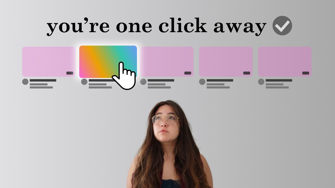
Here's how to make a killer YouTube thumbnail to blow up your channel.
FREE DOWNLOADABLE PDF VERSION
https://www.aprilynnealter.com/pl/2148121080
TOOLS MENTIONED (aff. links)
ClickPilot: https://clickpilot.app/?aff=Wbbjo
ThumbnailTest: https://thumbnailtest.com/?via=aprilynne
IDEATION VIDEO
how to come up with a killer youtube idea (to blow u...
I feel like the background is too colorful and Goku blends in with it. Make him stick out more, maybe make his drop shadow black instead of blue, add an outer glow to him, make him bigger and more to the left (I’ll provide a photo), blur the background a bit, and maybe make the text a bit bigger.

big respect to you for bringing out the paper and pen to help out the guy
hahaha
nice
Seemed easier to draw what I was thinking than to type it 😅