
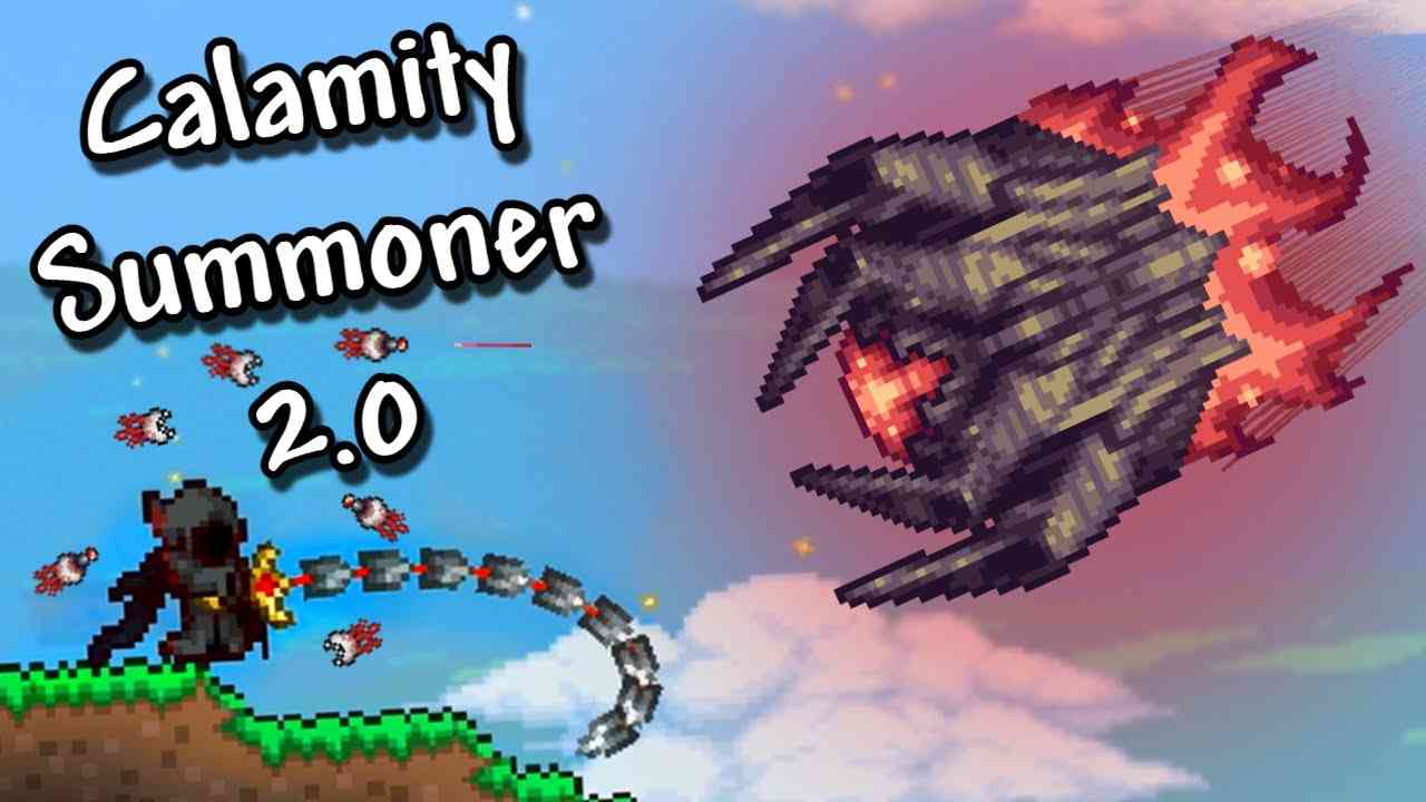
#Thumbnail for the second part in a series.
13 messages · Page 1 of 1 (latest)
I like the idea of the video
and the thumbnail has the right idea
If i were to improve it i'd make the text a bit bigger and put it higher up
kind of like this one
Check out my thumbnail! I'd love to get your feedback on my latest thumbnail design.
yeahh boio boio is great at that
thx for the advice ill try to do something like that, and also something with a border for the text
Thanks for showing me that!
no worries shadow!
Is this better?

I like it, lets try move it slightly to the right and put a drop shadow on the text.
Alright, I see that empty space, so I can definitely move it. Also, I added a shadow, but I guess I could make it a lot more visible, I'll fix that tomorrow, gotta be done for today. Thank you for the help